
Technique Tuesday: Drawing Revelations with Dan Thompson
20130930-221046.jpg
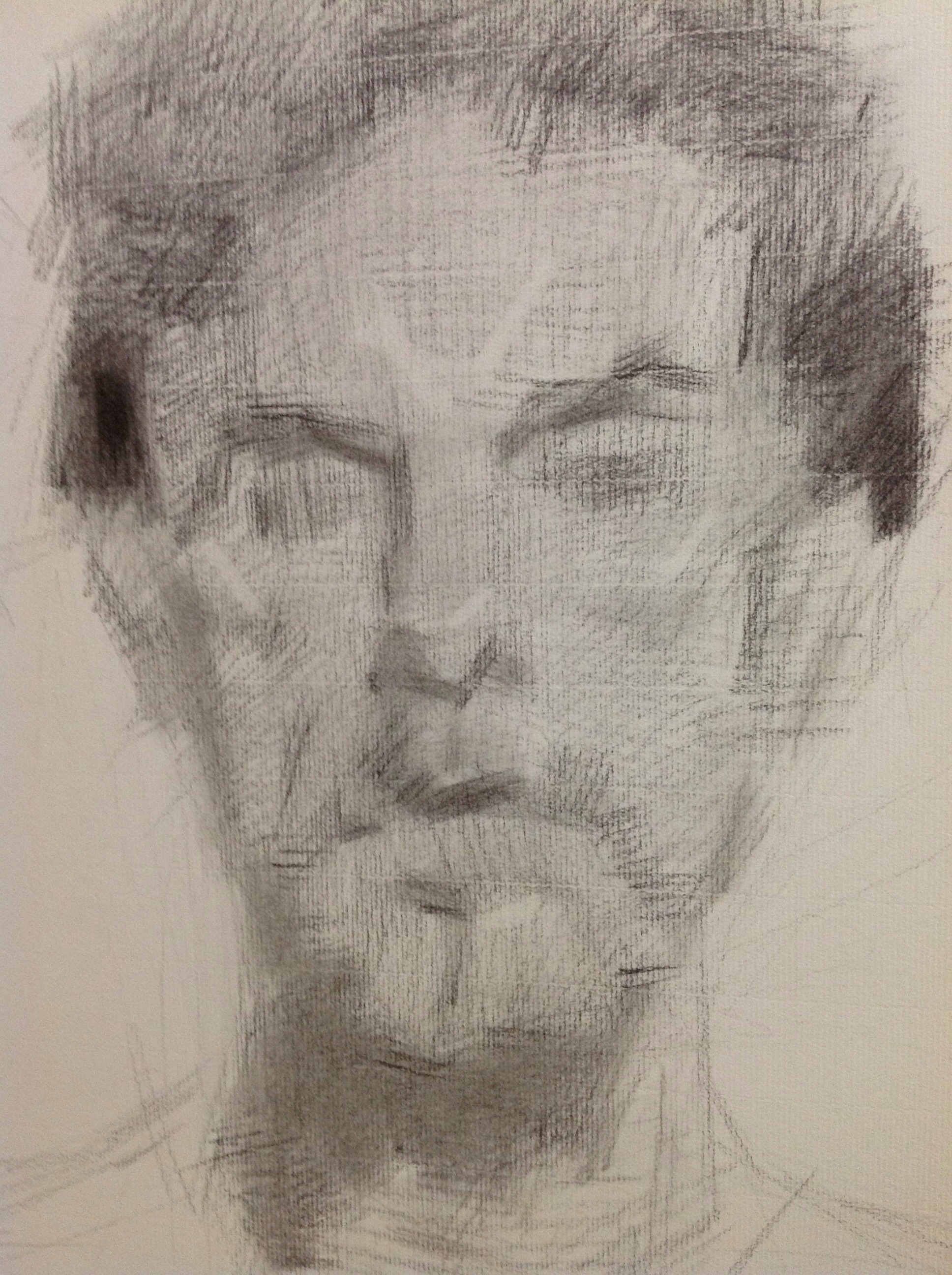
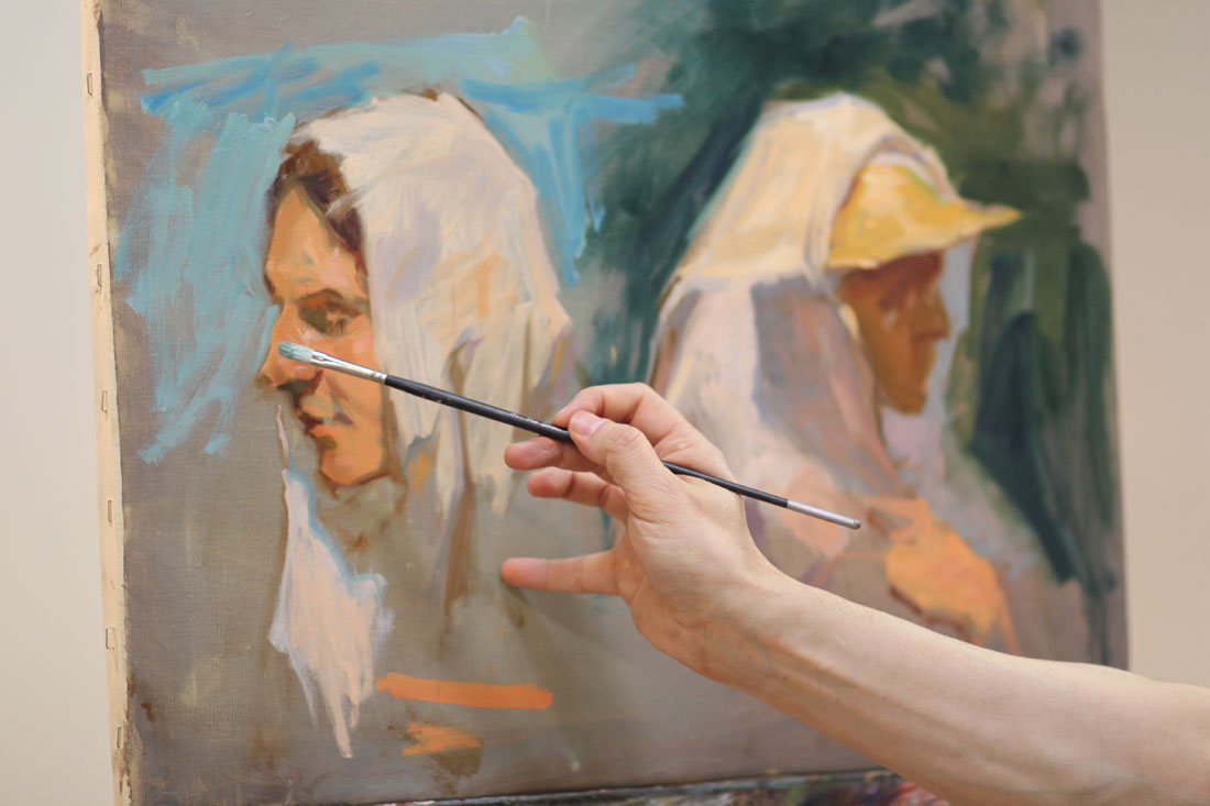
In August I attended yet another workshop with Dan Thompson. 2 actually, back to back. Both of them on drawing. I see Dan as a cosmic guide on my life long journey as an artist. He leaves little bread crumbs of wisdom to follow on the path to improvement. Most recently he left me with two life changing concepts. The first is the revelation of what "closed" and "open" drawings are. Closed drawings are those with specific contours. They are precise, drawn from the outside in and do not allow much room for alterations. Open drawings are the opposite. They are built from the inside out. They are more mass than contour, they are flexible. They are forgiving. I had never heard these terms before, perhaps because I did not attend a particularly traditional art school. Hearing these terms allowed me to understand my own frustrations with my drawing--most noticeably a tendency for strong contours. To think that I could simply reverse engineer my drawing technique to get at the quality I want in my work was literally mind blowing! And the last revelation I received from Dan's workshop was to approach each effort in drawing and painting as if making a "proposal". If you get it wrong, so what! Just alter your proposal. Brilliant right? And it totally takes the pressure off.

Technique Tuesday: Super Glue and Richard Schmid
20130924-080401.jpg
On the latest podcast of Artist Mentor's Online, artist Molly Schmid shares that her father, Richard Schmid (author of Alla Prima and Alla Prima II) often rearranges live flowers on still lifes by gluing them into place as needed to achieve the best composition. Genius, right? Well that's why he's Richard Schmid.
You heard it here first folks. OK, second. To get your own copy of Richard's Alla Prima II before its completely sold out click here.

At the Finish Line
20130906-201220.jpg
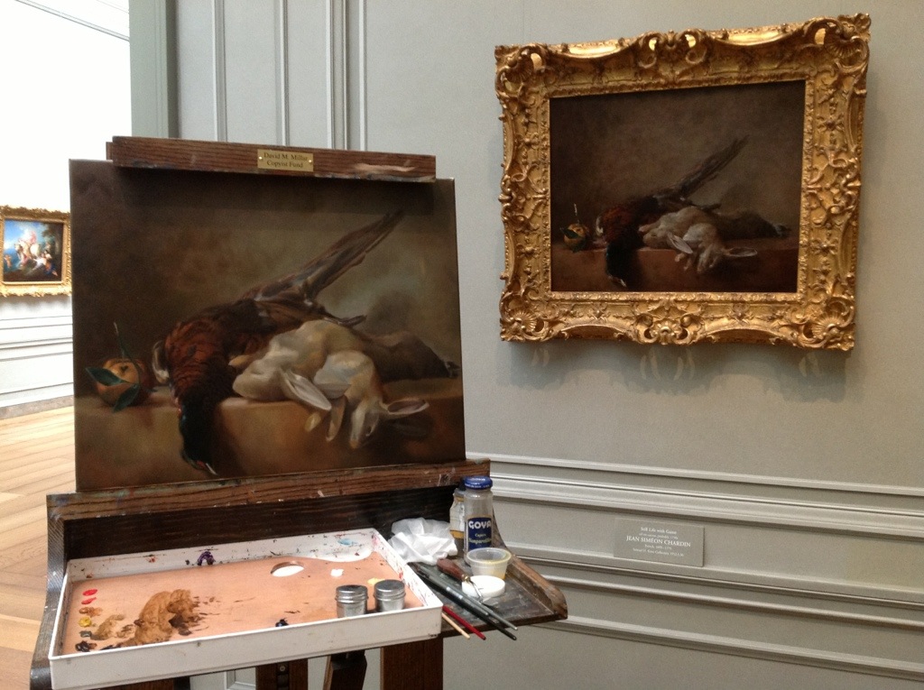
I am literally one session away from finishing my copy of Chardin's "Still life with game" in the National Gallery of Art's permanent collection. I basically have a little more refinement in the rabbits left and then I am calling it finished. Good thing too because I'll be putting my copying status on hold at the NGA while I take a full day of classes with Robert Liberace starting in a couple weeks.

20130906-201322.jpg

EDENtifying Your Writing Process: An Interview with Novelist, Elisa Nader

"Chilling, suspenseful and evocative, ESCAPE FROM EDEN is one of the most surprising love stories I’ve read in ages. Elisa Nader is an exciting new talent in YA fiction and her first novel will have people lining up to join her cult. Consider me the first member.”- Bennett Madison, Author of THE BLONDE OF THE JOKE and SEPTEMBER GIRLS
My friend Elisa Nader has done something really amazing, she has become a published author. To me that is up there with walking on the moon, winning an Olympic medal, finding the cure for cancer (ok, maybe that last one is a stretch). But it is the kind of thing that many people aspire to yet few ever achieve. As a professional in the creative arts, I pay close attention when someone like Elisa punches through the glass ceiling. And you should too no matter what your medium because a successful model in one creative field can often be applied to another. Elisa's first novel, ESCAPE FROM EDEN is a breath of fresh air in an often predictable YA genre. She has a background that many of you reading this blog can relate to as an art major with a BFA in painting and printmaking from Virginia Commonwealth University in Richmond, VA. It was at VCU that she began writing her first novel, but quickly cast it aside as her love of music took hold, and she picked up a bass guitar. Three bands and five years later, she moved back to Washington and rediscovered her love of writing, penning arts and entertainment pieces for the Washington City Paper. But, once again, writing took a back seat. After a stint at The Washington Post as a lead website designer for the Arts and Entertainment section, she began a long career at AOL as a creative director, working alongside such companies as Time Warner, Travelocity, MapQuest, Bebo, Moviefone, and many more. Since leaving AOL, she spends time writing, raising her seven-year-old daughter, and working alongside her husband in their new venture, Mag7, a User Experience Design collective.
Below is a synopsis of the plot from ESCAPE FROM EDEN:
Since the age of ten, Mia has lived under the iron fist of the fundamentalist preacher who lured her mother away to join his fanatical family of followers. In Edenton, a supposed “Garden of Eden" deep in the South American jungle, everyone follows the Reverend’s strict but arbitrary rules—even the mandate of whom they can marry. Now sixteen, Mia dreams of slipping away from the armed guards who keep the faithful in, and the curious out. When the rebellious and sexy Gabriel, a new boy, arrives with his family, Mia sees a chance to escape.
But the scandalous secrets the two discover beyond the compound’s façade are more shocking than anything they ever imagined. While Gabriel has his own terrible secrets, he and Mia bond together, more than friends and freedom fighters. But is there time to think of their undeniable attraction to each other as they race to stop the Reverend’s paranoid plan to free his flock from the corrupt world? Can two teenagers crush a criminal mastermind? And who will die in the fight to save the ones they love from a madman who’s only concerned about his own secrets?
And now, the interview.
SLA: Is Mia's artistic drive a reflection of your own? As a former art student do you still draw or sketch?
EN: I think her artistic drive comes from me. I knew I wanted her to have something forbidden in Edenton, but wasn’t sure what. I used to journal when I was in my twenties, but all my journals were essentially sketch books with drawings and random writings. I thought that would be perfect for Mia, Materials are so scarce in Edenton — paper, pens, pencils -- , she’s forced to sacrifice old drawings by erasing them from journal to create new ones. I thought it was an interesting dynamic in the story that maybe only artists would understand. Sacrificing something in order for a new idea to come to life.I don’t sketch and paint as much as I used to. Over the years, I’ve found my creativity has taken on different forms: Graphic and web design, interior decorating, writing—so much more writing.
SLA: Is famed portrait painter Nelson Shanks the inspiration for the likeness of "ginger haired" Reverend Elias Eden? It's ok to confide in us. No one reads this blog anyway.

35_1nelsonshanks
EN: While this portrait of Nelson Shanks DOES resemble the Reverend (blue shirt and all!) you’ll never guess who I had pictured in my head when I was writing the character.

ZGwatermelon
Yep. Zach Galifianakis
SLA: Please define your writing journey. How did you begin? How did you hone your craft? How did you get "discovered" and then ultimately published?
EN: I’ve always written - either in my journal or once I got a computer, I wrote on that. I started writing a story about a indie band on the road when I was in college, but it never went anywhere. I mean, I spent YEARS on that thing. Never showed it to anyone. I did some writing for The Washington City Paper, arts pieces and long-form articles (link http://www.washingtoncitypaper.com/search/site?q=elisa+nader), but web design took over my life and I spent years doing that until I left my corporate job in 2008. That’s when I decided I was just going to write already and stop thinking about writing. I took a class online at mediabistro.com. The classes are taught by publishing industry professionals, so my instructor was an editor from Harper Collins who loved the story I was workshopping (different manuscript than ESCAPE FROM EDEN) and passed on to a literary agent friend. He saw a lot of potential in it, but was so busy with clients he wasn’t taking on any new clients but he gave it to a partner in his company, Upstart Crow Literary, and she loved it. It’s funny how things work out. My agent Danielle Chiotti is the perfect agent for me. She’s very editorial, which I love, and has helped my writing immensely.
One evening, when I was trying to work on a new writing project, I got the idea for ESCAPE FROM EDEN. My old manuscript was out on submission (that means editors at publishing houses were reading it, deciding if they wanted to buy it). As soon as I had the idea for EDEN, I realized that my other manuscript wasn’t good enough. I asked Danielle to stop submitting it and she supported the idea. A year later I had EDEN written and we submitted it. It was sold two months later.
SLA: How would you describe your writing process? Did you use any specific techniques for writing and idea generation such as story boarding that you could share with us?
EN: I sit down and write. That’s pretty much it. I outline a scene before I write it — but sometimes I just see where the writing takes me.
I always have an idea where the story is going to go, and for me they have to be high concept ideas. These are stories you can describe in a sentence, for example: Teen girl living on a commune tries to escape, only to discover the deadly secrets of the cult. I like to write big and high stakes stories with plot twists. Do I always do that? No. But that’s aways my goal.
SLA: Who would be the supporting characters in your life who helped you reach the milestone of published author?
EN: My husband, Brent Canfield. He’s so, SO supportive. I’m very lucky.
My best friend for over twenty years, Kami Greene. She’s read almost everything I’ve ever written!
My critique partner Nina Berry. She’s made me such a better writer over the years. I cringe at the crappy stuff I used to send her. She’s published novels, written screenplays, wrote TV shows. She knows writing and great stories. I took the mediabistro.com class with her and discovered she gave the BEST feedback in the class. That’s when I asked her to be my crit partner snagged her up as my own.
And my agent, Danielle Chiotti. I ADORE her. She’s supportive and caring and, like I said, editorial. I sent her a box of bacon once, I love her so.
SLA: While stalking you on FaceBook & Twitter, I saw that you recently attended the Romance Writers of America conference in ATL. Please describe that experience. Was it your first writing conference? How helpful was it in terms of net working etc.
EN: This was my third writing/publishing conference. I was really there to support my crit partner Nina who has a book coming out with Harlequin Teen. I’ve also been to a couple SCBWI conferences (Society of Children’s Books Writers and Illustrators).
Conferences like that are fantastic because everyone is there for the same reason, same interests and it’s just so easy to meet and talk to people. And make industry connections. It’s such a safe haven from the outside world. I see how people become addicted to conferences - being surrounded by like-minded individuals who get you.
SLA: What peer to peer mentoring societies would you recommend to aspiring writers?
EN: First, a look at taking a writing class in whatever category you’re writing in — Non-fiction, Memoir, YA, etc. Like I mentioned, I took a class at mediabistro.com and it was really the best thing to happen for my career.Look for writers groups in your area — You can do this by joining local chapters of writers organizations. There are so many, and with a few simple search terms, you can find one that caters to what you write.
Get a critique partner. A TRUTHFUL critique partner. Someone who’s writing you respect and love. Someone who is going to tell you when your writing sucks and that you need to fix it. This person needs to be a WRITER, someone who understands the craft of writing. Not just a reader. And if you’re lucky, they are a strong writer you can learn from.
SLA: Who are your favorite authors & books? How often do you read?
EN: I read almost every night. Sometimes when I’m writing, I don’t read books until I’ve figured out the voice. I don’t want to be unintentionally influenced by someone else’s writing.
I read a lot of Young Adult, New Adult, romance, mysteries, and thrillers. I was really fortunate to get two of my absolute favorite writers to blurb ESCAPE FROM EDEN, Michael Grant and Bennett Madison. I LOVE Laini Taylor and how she can make words seduce you. I have so many favorite writers. So, so many. I think right now Matthew Quick is really at the top of his game. Can’t see where he takes his next book.
SLA: What do you have in the pipeline now as far as your writing?
EN: I’m working on a new book inspired by the movie The Legend of Billie Jean. Yeah. Exactly. We’ll see how it turns out.
SLA: If you had one really good piece of advice for aspiring writers out there, what would it be?
EN: Read Stephen King’s ON WRITING. Read that book and it will make your writing better. I promise.
SLA: What advice could you give us that would apply to anyone in the creative arts?
EN: Don’t pay attention to what the “trends” are in your creative area. Create whatever feels right to you. And don’t give up. The moment you give up creating what you love, they win. I don’t know who they are, but they win and you don’t want them to win, got it?
SLA: Please feel free to provide some shameless plugs now. Will you be making any author's appearances soon & where? Where can your fans follow you online?
EN: I LOVE SHAMELESS PLUGS!
I’ll be at the Fall for the Book festival, 9.22.13 at One More Page Books at 4pm for the YA Books Panel:
http://fallforthebook.org/2013/08/01/childrens-book-and-ya-authors/
There’s a Goodreads giveaway of ESCAPE FROM EDEN - enter for a chance to win!
http://www.goodreads.com/giveaway/show/62309-escape-from-eden
And you can find me online here:
(this is my tumblr and my blog)
Facebook.com/elisanader.author
SLA: Thank you Elisa for allowing me to pick your brain. Your answers have been extremely inspiring and enlightening. Thanks again!

This Studio Tip is Being Brought to You Today by the Letter "F"

20130718-220811.jpg
As in the letter "F" for filching, because I can't take credit for this wonderful studio tip. The bragging rights to this goes to my talented artist friend Gavin Gardner (wuz up, Gavin?). Gavin announced on Facebook a while back that he started using these little condiment containers you find at fast food restaurants to store his paint mixes in. And I thought upon reading that, "Brilliant!". So I stored that little nugget in the back of my head like a squirrel hiding nuts for Winter. And recently when I was having lunch with my son at Moe's and getting his requested servings of salsa, my eyes froze upon the image of a tower of condiment containers and the proverbial light bulb went off in my head. I grabbed a bunch of them while chuckling delightedly under my breath in a sinister evil villain laugh and brought them home with us. I did not get around to using one until tonight but man was it worth the wait--in a kind of life changing way. I am pretty sure this will become a permanent part of my studio repertoire.
Thanks Gavin!

Study Hacks on the "Deliberate Rise of Stephen King"

.
The following is an obvious statement: Those of you reading this post probably enjoy reading other blogs too. To prove my theory correct, I would like to submit to you a new blog to add to your reading repertoire.
Cal Newport, the author of Study Hacks, is a Computer Scientist and Assistant Professor at Georgetown who is interested in "why some people end up leading successful, enjoyable, meaningful lives, while so many others do not". His posts are filled with real life examples of people who have made it in their fields and on techniques for improving one's productivity. I think it is important as an artist to find inspiration and models of business outside of our narrow field. That is why I really pay attention when I am given advice by a successful person in any of the creative arts--regardless of their medium.
Below is a great post about Stephen King and how he never allowed rejection to derail his goal of becoming a successful writer. Very inspiring!
http://calnewport.com/blog/2013/06/01/the-deliberate-rise-of-stephen-king/?utm_source=feedburner&utm_medium=feed&utm_campaign=Feed%3A+StudyHacks+%28Study+Hacks%29&utm_content=My+Yahoo

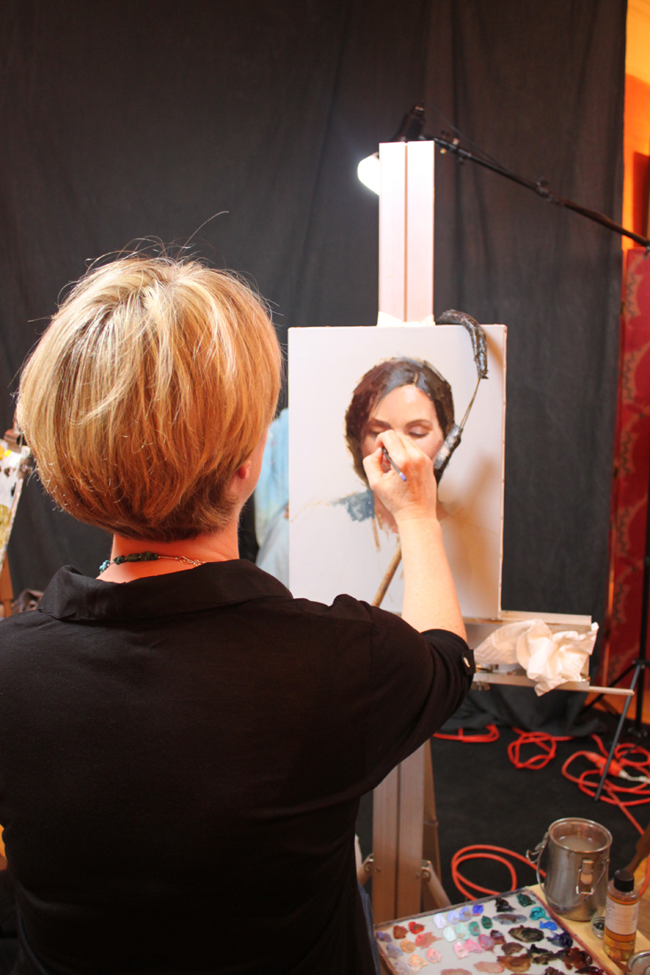
Workshop Wednesday: Dan Thompson 4 Color Chalk
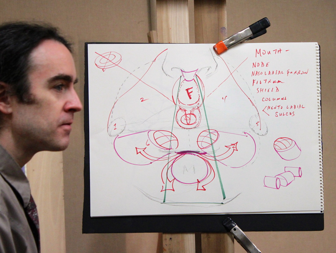
Dan Thompson with his diagram explaining the anatomy of the nose and mouth.
Back in December I had the real pleasure of attending my first Dan Thompson workshop at the Art League in Alexandria VA. Dan happens to be teaching another workshop next weekend on March 23 & 24 and believe me when I tell you that it is completely worth your time and money to attend if you can. I had pages and pages of notes from his first workshop on anatomy alone, something I had not expected from a 4 color chalk portrait drawing class.
In full disclosure, Dan and I have some shared history--as in we both attended the Corcoran School of Art back in the 90's. Dan graduated two years before me but I still remember his amazing realism and sensitive self portraits which stood apart from every one else's work simply because no one was painting like that at the Corcoran then or even since. Flash forward 18 years post his Corcoran BFA, an MFA from the Graduate School of Figurative Art of the New York Academy of Art and Dan is now a highly respected artist & teacher. In 2006 Thompson co-founded the Grand Central Academy of Art in New York. In 2008, he co-founded the Janus Collaborative School of Art in New York. In addition he has instructed privately at Studio 126 in New York and is on the faculty of Parsons the New School for Design, the New York Academy of Art, The Art Students League of New York, and Studio Incamminati, in Philadelphia, PA. In 2007, Thompson was selected an ARC Living Master Artist. To say I am proud to know this generous artist & gifted teacher is an understatement.
And now without further ado, my notes from his 4 Color Chalk Workshop, straight from my archives of workshop "awesomeness":

Thompson_4ColorChalk_Echorche
Notes of Materials & Drawing Aids
-Uses Othello & Conte pencils in red, black, yellow & white.
-Capitalize on chalk based material early on in your drawing because it is easy to remove.
-Also uses Kremer pigments, Lapis Lazuli, Smalt Blue, Red Ball chalks, vine charcoal & shammy.
-Be careful when working on a toned paper not to lift the ground when erasing.
-Best watercolor wash for paper- raw umber, ultramarine blue & dioxazine purple. Shoot for a cool colored neutral.
-READ the John H. Vanderpoel book, "The Human Figure" published in 1907. A must for understanding proper figure construction based on anatomy.
-"Figure out someone's technical model for planes of the head & use it!"
-Likes Strathmore 400 artist's series paper or semi tooth laid paper like Ingres etc. Must be ph neutral and 100% acid free.
-Get yourself a resin cast skull for serious portrait drawing ($250 --Bone Room, Berkley CA.)
-Take an écorché class (without skin) for accurate muscle awareness. Steve Perkins @ Janus School--excellent écorché instructor.
Notes on Anatomy of the Face
-The temporal ridge, where the side of the head meets the front resembles a covered bridge.
-The back of the skull resembles a pentagon in shape.
-Planes in the face follow each other, upward planes flanked by downward planes creating a rhythm.
-The underside of the cranium & jaw is shaped like a woman's high heel when viewed from the side.
-Occipital bone is the lower point on the back of the head.
-There is a "triple curve" from the outside flare of the nose stepping along the outside of the mouth.
-The eye socket drops in a series of steps & terminates in the the lower eyelid furrow. -The node of the mouth is the convergence of different muscles.
-Lines or creases form perpendicular to the muscle fiber (look for this).
-You can craft the nose out of a block, "door stop" form of the nose.
-Emphasize the under plane of the nose.
-A common mistake when rendering the nose is to not go past the eye lid with the nasal bone.
-"Alar cartilage" is the ball of the nose, shaped like an olive. It comes from the tear duct, twists & drops into a V shape
-The nose is a lesson in triangles.
-There is a rim in the enclosure of the nostril that often gets overlooked, make sure to include it.
-Develop your own secret figure reference (canon) for what anatomy should look like so that you know when it differs in an individual.
-There are 5 transitional planes in the nose when looking at it in profile beginning with the bridge, curving around the tip and ending in the plane before the lip.
-Ears will get bigger as people age.
-From the side an ear looks like a little capital D within another D.
-The ear comes out from the head like a door suspended open by the "concha" or hollow next to the ear canal.
-The helix is the upper curve of the outer ear.
-The anti-helix is the y shape with the ear.
-Draw in pairs when you can; feet, hands etc. Each completed form helps define the other.

Dan Thompson's beautiful finished 4 color chalk demo.

Detail of Dan Thompson's 4 color chalk demo.
Notes on creating the 4 chalk drawing
-Test out your pencils on your paper.
-Red pencil + stump = warm
-Red pencil +white pencil= cool pink
-Red pencil+ yellow pencil= warm orange
-Red pencil + black pencil= cool violet
-Black pencil + yellow pencil= warm green
-Helpful to have a pencil the same color as your toned paper should you erase too much of the base color away.
-Shellacking makes paper more resilient.
-Look for the simple design in light & dark.
-Think more about what's there and not adding to what you are seeing.
-Focuses on his "scanning eye" that sees quickly to give him information of the forms.
-Pulls lines through & out of drawing-trajectory.
-Works at life size of slightly smaller. -Focus on gesture, that way you get into the spirit of the pose.
-Abbreviate what you see to encourage the mobility of the eye around the portrait.
-Keep areas (measurements) open, allows flexibility to accommodate change & correction.
-Flat patterns of dark & light.
-Charcoal vines are great for the initial layout. They make you think broadly, no detail & are very forgiving.
-If you pretend not to "focus" on the model you see big forms better.
-It is useful not to think of features in the beginning, only shapes & their proportions to each other.
-Search for the 2D. Squint to see "flat" shapes.
-Find a fixed variable based on life size and note it down on your drawing. Then allow for "flex" in other directions to improve your drawing.
-Does not lighten his darks in the beginning. Instead keeps them a a false value--all shadow the same tone to help him arrive at the underlying forms.
-Pay attention to the things that artists ignore like the neck & ear. It will make you better than the average artist.
-Be careful when your drawing transitions from the 2D to the 3D. This is where the integrity of the drawing can begin to break down.
-Be aware of your eye level & what impact that has on your drawing.
-Turn the light off to see what your model's head movement is (and not what the light is doing).
-Highlights should be indicated in a directional manner along anatomy references. They are place holders.
-Often uses two whites when drawing. One is kept really sharp for detail, one more blunt for softening edges.
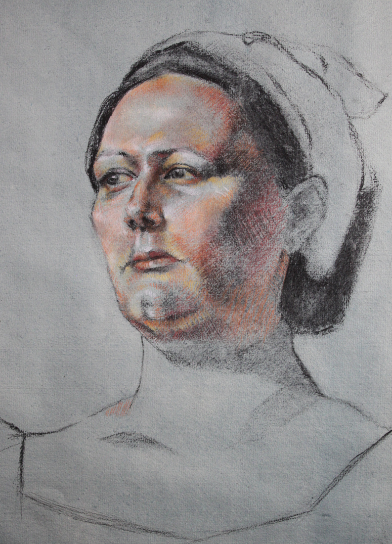
My drawing from Dan Thompson's workshop.
To register for Dan Thompson's portrait painting workshop at the Art League in Alexandria VA on March 23 & 24 click here. http://www.theartleague.org/school/course_desc.php?class_id=1075
Hope to see you all there!

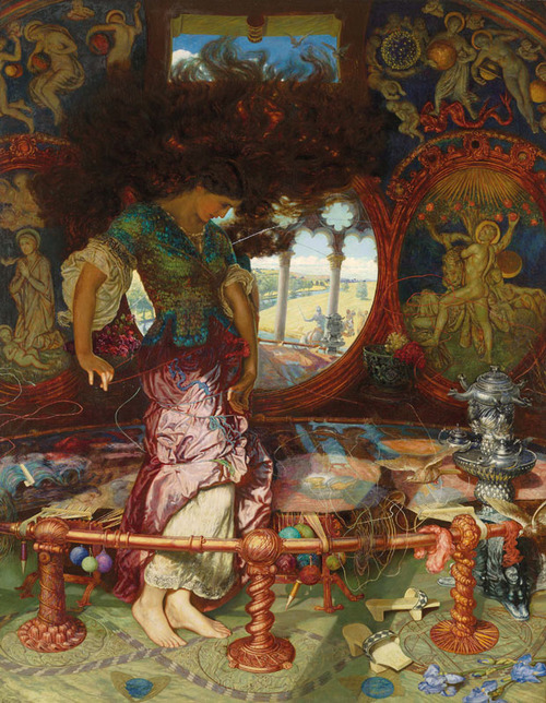
Pre-Raphaelites: Victorian Art and Design, 1848-1900 @ the NGA
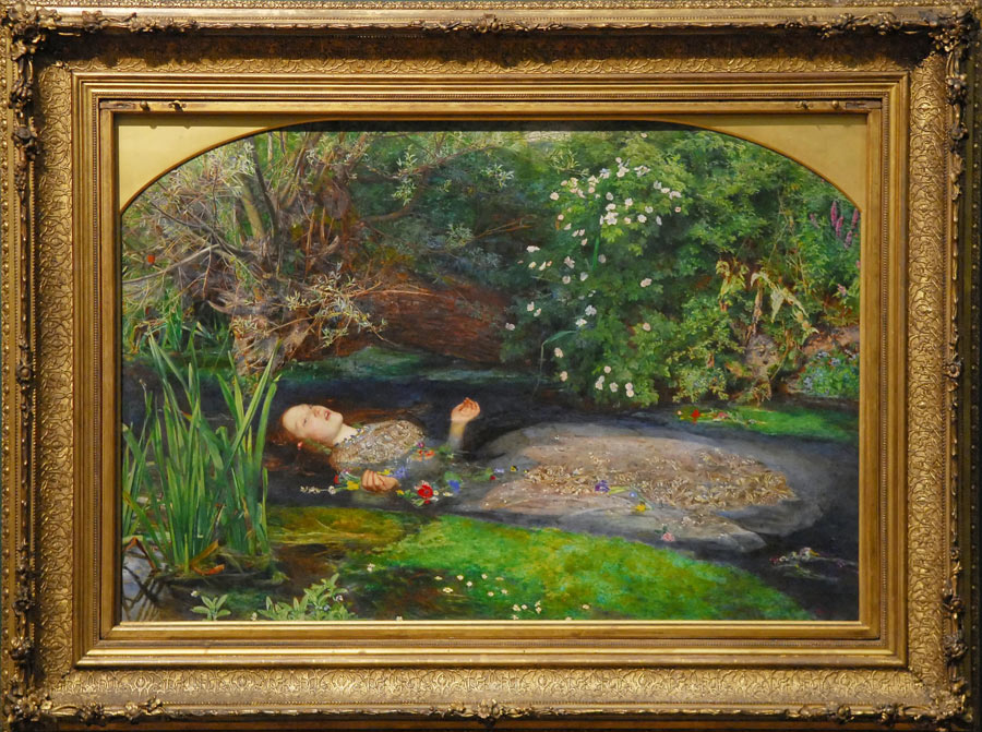
"Ophelia" by John Millais.
Last Friday I went to the National Gallery of Art (NGA) to work on my copy of Largillière’s Canoness only to discover that it had been taken down and put in storage. Apparently this happens every once in a while. I was actually OK with its disappearance because to be honest, I was getting bored of the Canoness. Soon I will be starting on a new copy of a still life by Chardin which is located in the same salon. Fickle, I know--but I am sure Ms. Canoness will get over it someday.
You may be asking yourself what I did with my suddenly wide open schedule that day. Hello! I went to see THE Pre-Raphaelite exhibit, of course! And WOW was I happy I did. This exhibit has managed to acquire some of the most famous Pre-Raphelite paintings ever painted, such as Millais' "Ophelia" and Rosetti's "The Annunciation" along with so many others. New to me is the work of William Holman Hunt, his "Valentine rescuing Sylvia from Proteus" is now one of my new favorites. The caliber of this exhibit is so good that I plan on seeing it all over again--something I rarely do.
The Pre-Raphaelite Brotherhood (PRB) founded by William Holman Hunt, John Everett Millais and Dante Gabriel Rossetti in 1848, grew to include not just painters, but poets and critics in an effort to return back to a more moral sentiment in art & literature during the Victorian period. It was essentially a reaction to the modernization and industrialization of England.
"The group's intention was to reform art by rejecting what it considered the mechanistic approach first adopted by Mannerist artists who succeeded Raphael and Michelangelo. Its members believed the Classical poses and elegant compositions of Raphael in particular had been a corrupting influence on the academic teaching of art, hence the name "Pre-Raphaelite" (Wikipedia)." The PRB embraced historical genre painting in particular, by depicting stories from the Bible and their native Arthurian legends.
I have included in this post several images of the famous works from the exhibit to whet your appetite (click to enlarge). As if you weren't hungering for it already. Enjoy!
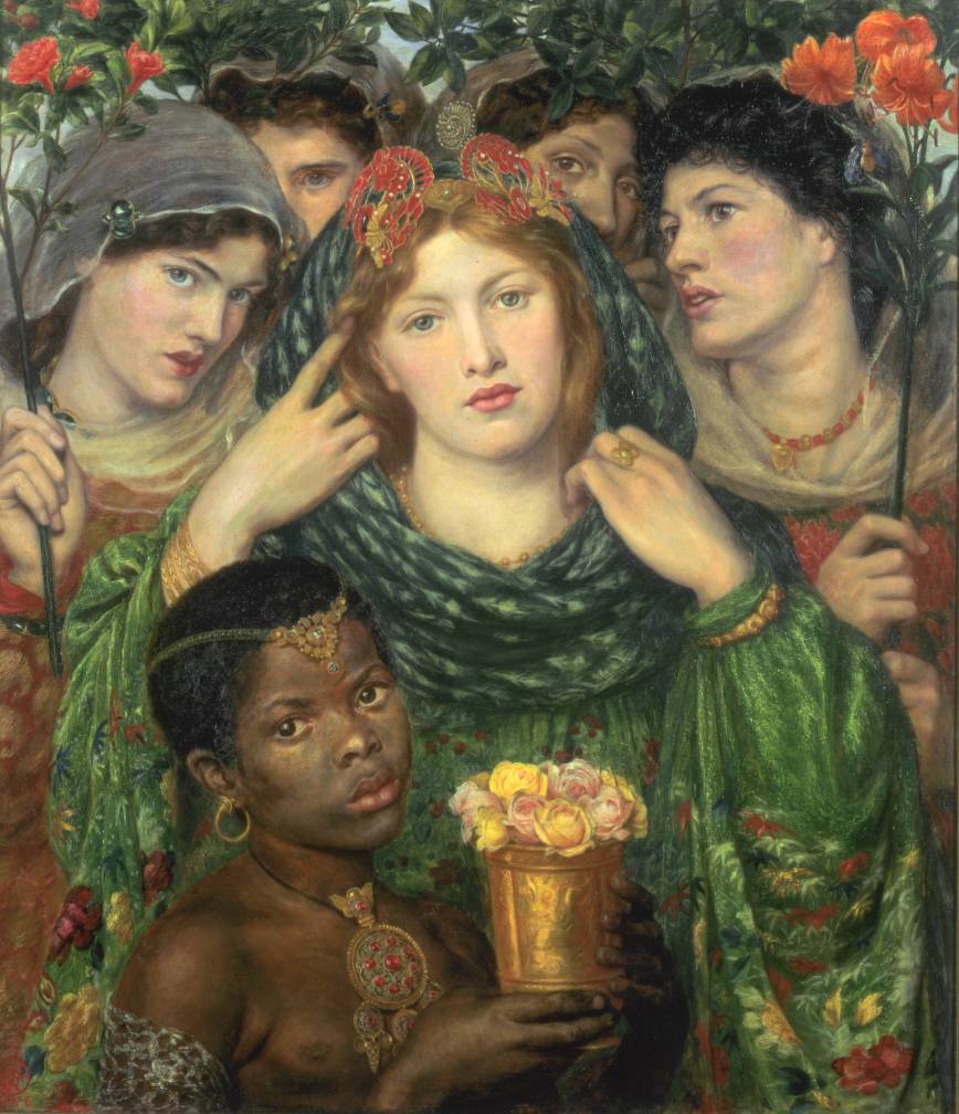
"The Beloved ('The Bride')" 1865-6, by Dante Gabriel Rossetti.


1858 Henry Wentworth Monk oil on canvas
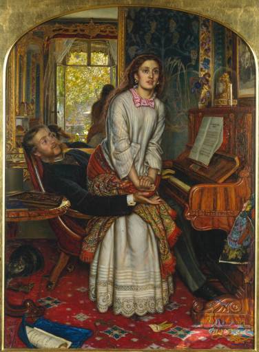
"The Awakening Conscience" (1853). William Holman Hunt.
"The Awakening Conscience" (1853). William Holman Hunt.

Edward Burne-Jones

"The Blind girl", John Millais.
"The Lady of Shalott" (1886-1905) by William Holman Hunt
"The Lady of Shalott" (1886-1905) by William Holman Hunt

Copying at the National Gallery of Art, Washington DC
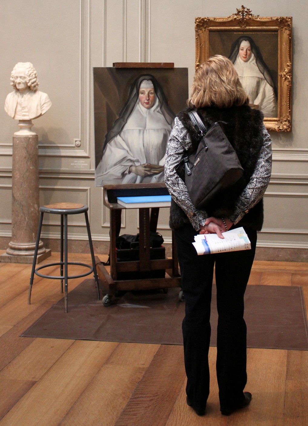
Copy of Nicolas de Largillière's "Canoness" at the National Gallery of Art.
One of the best perks about being an artist and living in the Washington DC area is the opportunity to become part of the "copyist program" at the National Gallery of Art (NGA). The copyist program, run by the Registrars Office, allows artists to apply for the privilege of painting directly from the permanent collection. I am happy to say I am one of the copyists at the NGA and you can find me painting there weekly. Painting at the NGA is a thrill for an artist but is also very challenging and in my opinion extremely humbling. After all, they don't call the artwork hanging on its walls "masterpieces" for nothing.
There are of course some constraints/factors an artist must observe when painting which include the maximum size a copy can be, proper handling and disposal of materials, dealing with variable ambient lighting (due to the large covered sky lights) and regular interruptions from well meaning, curious visitors to the gallery. Here are some of the amusing comments I hear most often while copying, along with my typical answers:
"Are you a student?". I am an artist who is working to improve her technique. Painting from masterpieces is one of the best ways to do that.
"How many hours have you been working on this". I have lost count but I paint almost every week for 2 - 3 hours at a time.
"Why are some of your colors different?". I strive to match the colors as best I can but my paint formulations are more modern & the lighting changes within the gallery which impacts how I mix color.
"Something is wrong with x, y or z...". Painting is a process, there are always areas that need refinement.
"I like your painting better". Thank you? (I never really know how to respond to that). But my goal is to copy as accurately as I can.
Another interesting aspect about copying is that there are always people taking your picture, and some even ask to pose with you! Personally I think the fascination stems from the perceived mystery around art making. People assume proficiency in painting is unattainable for the average person--it is not if you work hard enough at it. I tell visitors all the time that if I worked as hard on my golf game as I do on my painting, I would be a tremendous golfer. But my favorite aspect by far of copying at the NGA is watching the faces of the littlest visitors light up with amazement when they see me in action. I make sure to stop whatever I am doing to answer their questions and tell them with a smile, "you too can do this one day. Just make sure you never stop drawing".
Interested in applying to the copyist's program at the NGA? Click on this link for more details (scroll down to the bottom of the page). http://www.nga.gov/education/volunteer.shtm

Close up of my copy of Nicolas de Largillière's "Canoness". About 65-70% complete.

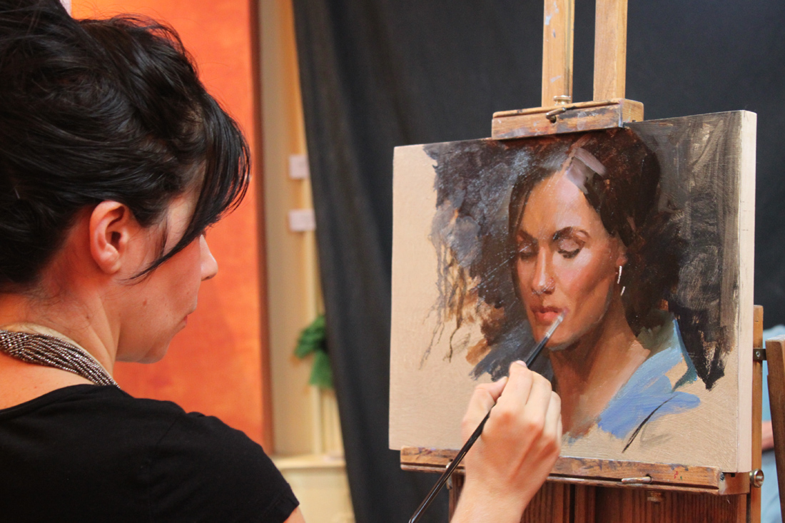
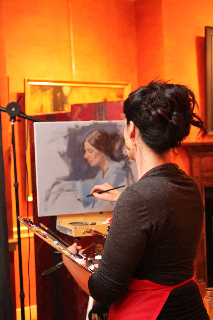
Workshop Wednesday: Robert Liberace's "The Classic Portrait from Pencil to Watercolor"
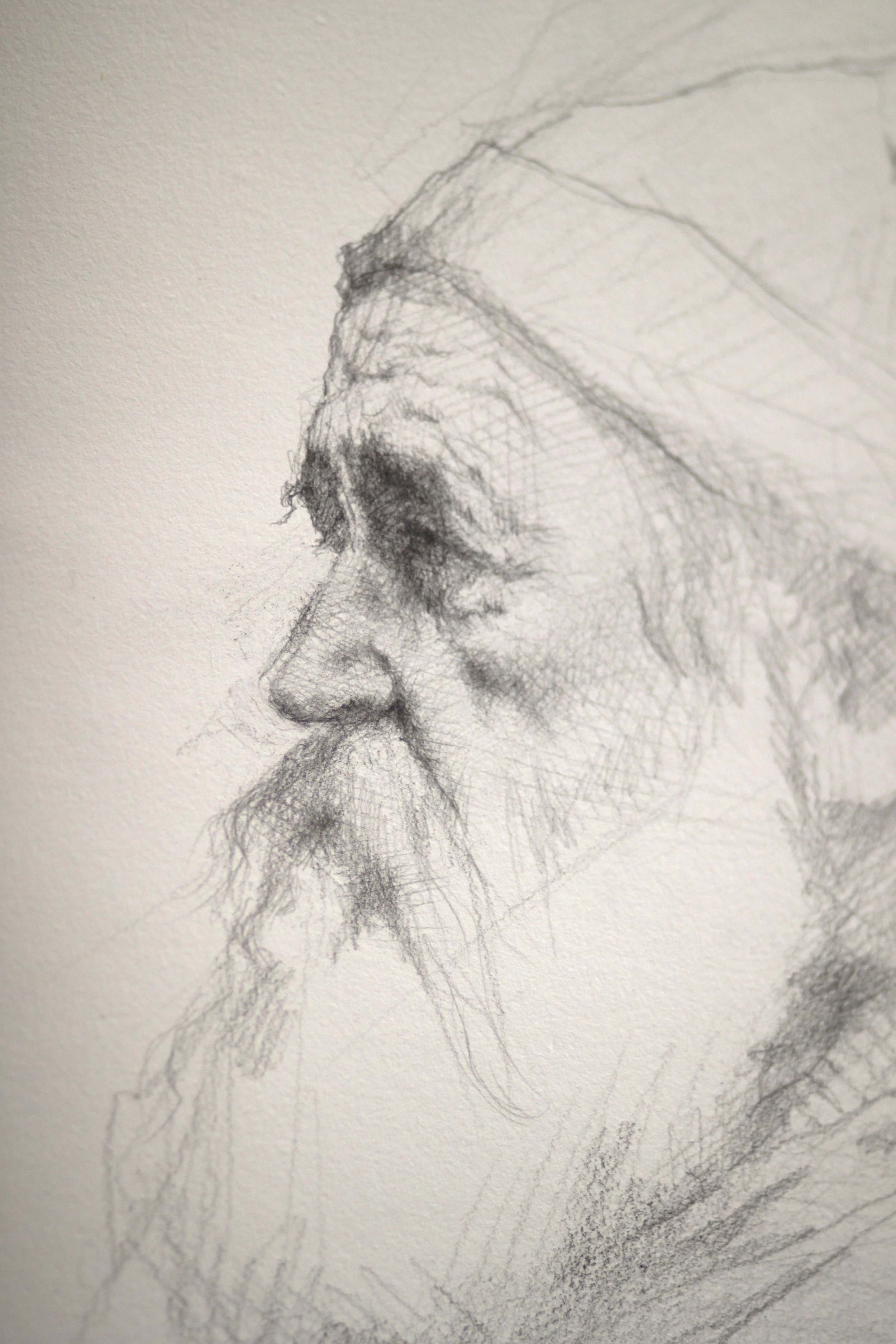
Liberace_Drawing
Several weeks ago I had the pleasure of attending yet another of Robert Liberace's fabulous workshops at the Art League in Alexandria VA, this one on drawing & painting portraits (watercolor). Every time I find myself in one of Liberace's classes, I am made aware of how much there is to learn about this thing we call "art". Specifically for me I am interested in learning how Liberace makes his work look so elegant and at the same time so dynamic. Every stroke has its purpose and I am working towards accomplishing that same thing (er... at least attempting to).
Here are the notes and photos I took from the workshop (click on the photos to enlarge). It is my honest wish dear reader, that something in the post will resonate with you (and with me) and we'll walk away as better artists or at least more enlightened ones. And how could we not when we are privy to the inner thoughts of a modern day master?
Day One, Drawing the Portrait:
Tools:
Mechanical pencils, bic
Works mostly in HB, uses harder or softer pencils occasionally to achieve his values
Anything beyond 2B gets too dark in his opinion
Nibs
Watercolor
Ink
Notes:
Follow the (Charles) Bargue idea
Strong light & shadow
Liberace loves TwinRocker paper, Canson "Mi Tientes" too
Looks at Ingres for fabric
Treat every detail of the picture like a portrait
Likes to paint in watercolor on a smaller scale like Fortuny
Box out your shadows, map them out then slowly add midtones
Ingres faces are almost decorative--like and engraving but with "spots of action"
Really study Ingres--get a good book on Ingres' drawings!
Make shapes that are so clear & obvious, terminator shading
Add pentimenti flying through there
Tieopolo liked to add "marks of 3" in his drawings, very Venetian technique. Sargent employed this as well
Looser shadow & animated but still differentiation of light & dark
(Tiepolo) Begins with charcoal before ink
Simple mass of shadow
Fortuny used black, umber & sienna in his watercolors, shadow always finding form
Zorn used monochromatic watercolor with opaque white on top for emphasis & highlight
If you ever need to steady your drawing or watercolor readdress area with a contour line
You can add a little water to a brush and dilute an area of a graphite drawing (works the same way as in a watercolor), good for evening tones or for contours

Liberace_WatercolorPortrait
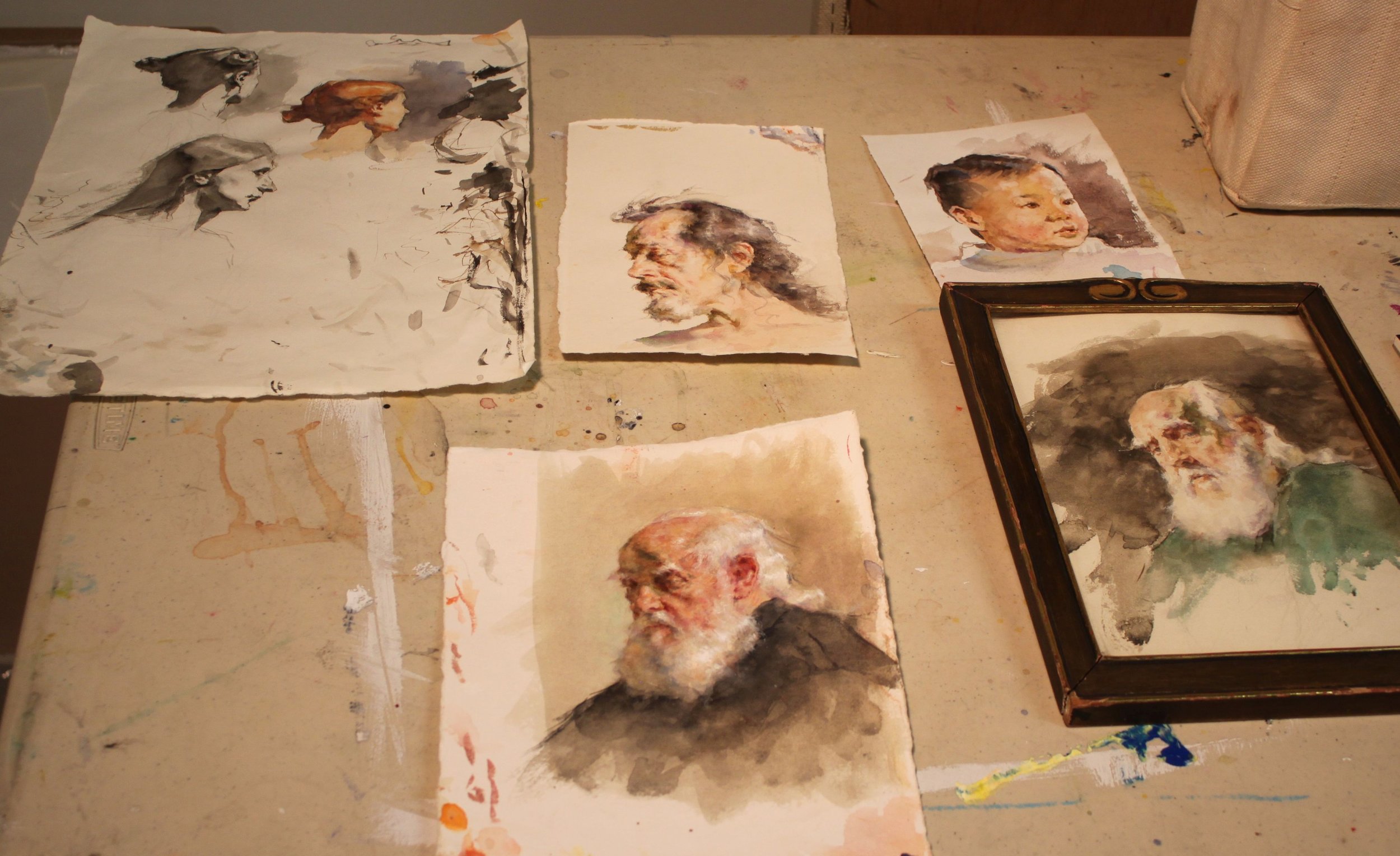
RobLiberace_Watercolors
Day Two, The Portrait in Watercolor:
Notes:
Begins sketching in pencil, then jumps into watercolor
Quick assessment of light/shadow
Will often begin by doing a quick "Tiepolo" style study with one tone, maybe throw in an accent
Loosely sketch in pencil, then adds a gestural contour in watercolor
Adds mass & shadow
Try not to be too specific with lines, be more suggestive--"it is what gives that romantic feeling"
"Your job is to find out where the light is ending, the more you break that up the harder your job becomes"
"Melt" the detail into your shadows if you aren't so sure where they begin
Connect half tones to the shadow & "feather" it out
"It is really all about editing what you see"
Liberace_WatercolorPortrait_Day3
Day Three, The Portrait in Watercolor:
Palette:
Burnt Sienna,
Black,
Chinese or permanent white,
Cadmium Yellow Light (or similar bright yellow),
Cadmium Red ( or similar bright red),
Ultramarine Blue.
Optional Palette:
Alizarin Crimson,
Manganese Violet,
Cerulean Blue,
Pthalo Blue,
Viridian Green,
Pthalo or Hookers Green.
Notes:
When sketching his gesture he holds his pencil at the end
Puts in markers (enveloping)
Blocks in his "axis lines"
Liberally throws crimson wash over the whole face & "melts" it out
Drops in yellow & violet for the beard
Throws in black for the uniform
Shadow on face, a warm green made of black & yellow & sienna
On the nob of the nose uses a little extra red
Drops in extra water for the fold of the eyes--orbital fold
Draws eye, ties it in to the shadow then carefully marks the lower lid with it
Goes back and forth between different temperatures
Will add half tones in when there is not a lot of shadow to delineate form
Thinks in planes, color & temperature all the time
Ties a lot of the elements of the eye together to simplify
Soften edges
Loves TwinRocker heavy text, light art weight, calligraphy cream paper
On halftones he is careful not to leave heavy block ins
"I don't want to plan things too much. Sometimes watercolorists work to tightly--allow spontaneity"
Moves in with smaller brushes
Will use watercolor & a bristle brush to scumble areas
Puts color in shadows
Will refine edges on strokes he doesn't like so that is will dry as a mass that he can paint on later
Really "feathers" a lot of these edges out
Likes to see a lot of shape & pattern to a form like Sorolla & Fortuny
Will erase at the end with a "perfect pencil" (eraser pencil with brush at the end) & then uses a white charcoal pencil to add highlights with
Chinese white paint is used at the end over dry white paint when needed (alla Zorn)
LagoArthur_OldSaltDrawingjpg
Hope your holidays were as wonderful as ours. Wishing you much artistic growth and success in the New Year!

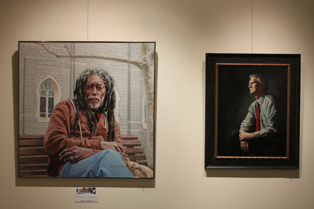
2012 "Expressions" Portrait Competition Finalists

KurtSchwarz
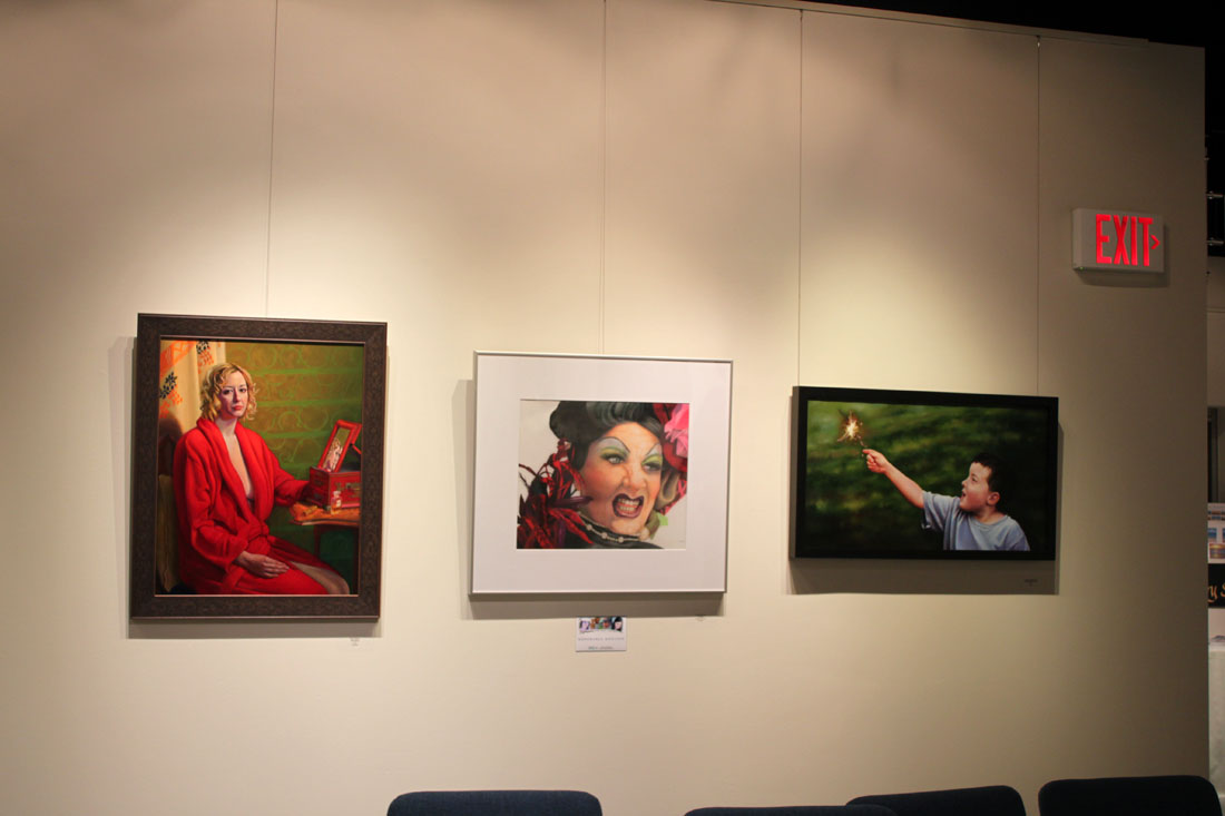
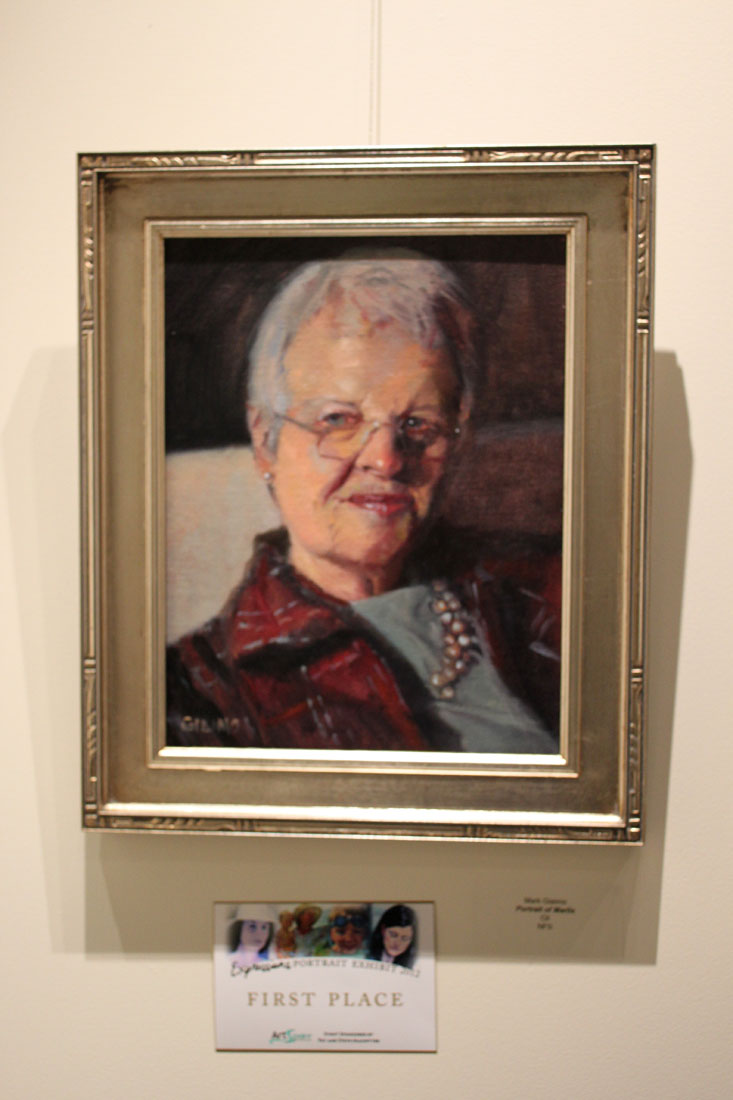
Saturday night I had the pleasure of attending the opening for the 2012 "Expressions" portrait competition at Artspace Herndon. This is my second year as a finalist and I can proudly tell you that the caliber of this year's show is exceptional. The jurors, artist Tricia Cherrington Ratliff and Caron Broadway Moody, of Broadway Gallery did a wonderful job pairing down the 107 submissions into a show of 25 portraits showcasing a strong display of technical achievements. Of those 25, Judge Kurt Schwarz had the difficult task of selecting the winners and after much admitted deliberation, awarded 1st place honors to Mark Giaimo, "Portrait of Marlis" (oil), 2nd place honors to Lorena Selim, "Waiting for Mr. Right" (oil) and 3rd place honors to Gavin Glakas, "Decisions (My Wife Jasmine)" (oil). Two Honorable Mentions went out to Suzanne Vigil, "La Rue" (colored pencil) and Ron Primm, "Dray" (oil).
Below are just a sample of the paintings on display, including one of my own (click on the images to enlarge them). The exhibit will be up through December 9th. Click here for directions and a link to the Artspace Herndon Website. If you live in the DMV it is a show not to be missed!
Expressions2012_2

Expressions2012_3
Expressions2012_7

Expressions2012_1

Expressions2012_4

2012_11_10_2672
Expressions2012_6

Expressions2012_9

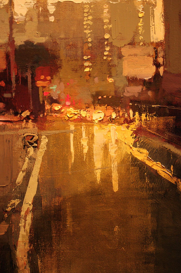
Who's the Man? Jeremy Mann!
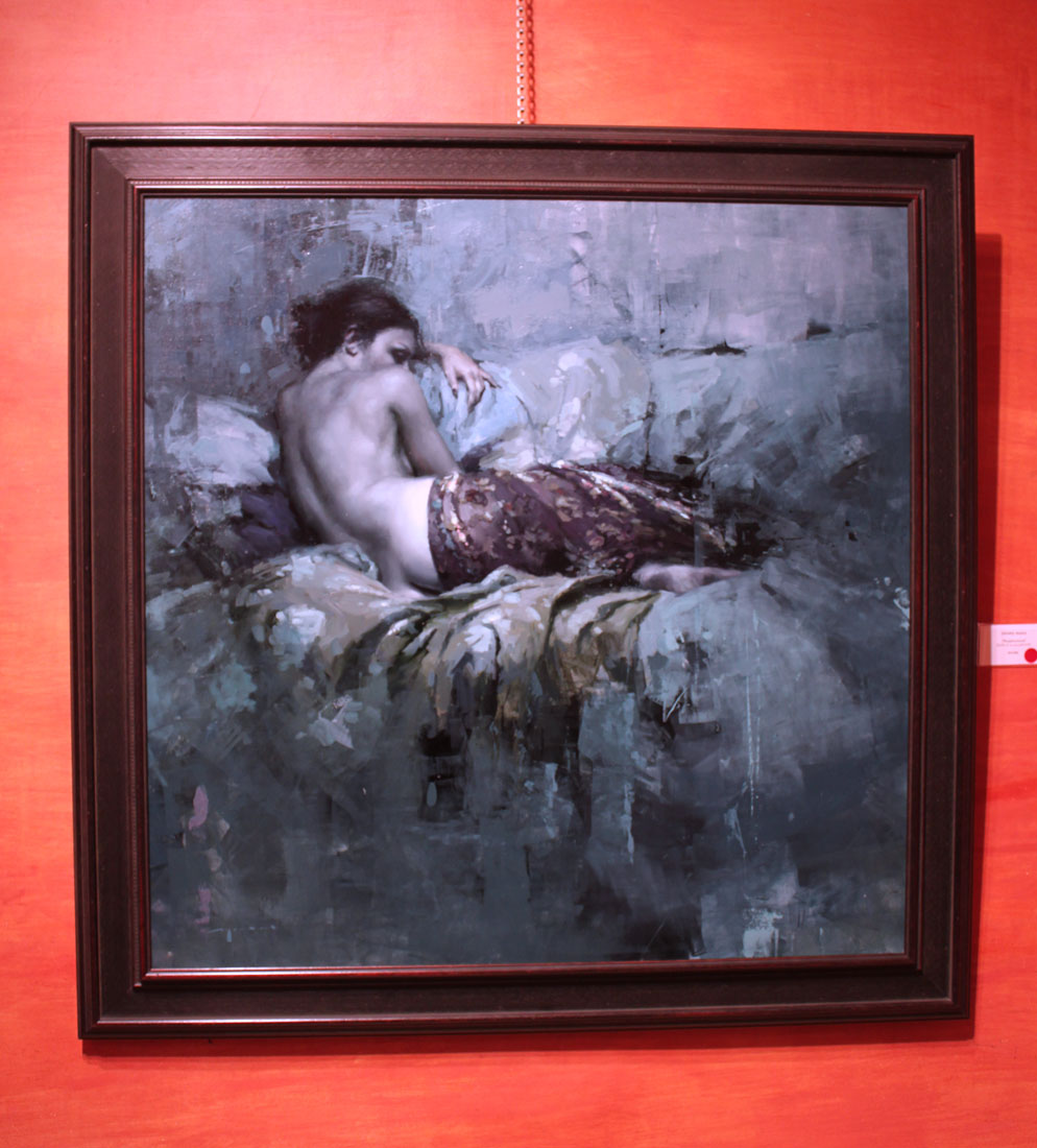
JeremyMann10
Last Friday I attended the opening of Jeremy Mann's "The Realness" show at the Principle Gallery in Old Town Alexandria mostly due to his hype as American Artist Magazine's, "25 Artists of Tomorrow". And you know what I found out? He more than lives up to it!
Mann is what I would call a "painter's painter". His paintings completely seduce you with his play on textures, predominantly tertiary color harmony and lost & found edges, all while maintaining a strong level of realism. He is known for working with non traditional tools such a squeegees and brayers (that last one I wrestled out of him) as well as his brushes. Mann admitted to me that he likes to use which ever tool will achieve the most ambiguous mark as in "how the hell did he do that?" Personally I find his work extremely inspiring because getting more "painterly" with my technique is exactly what I am gunning for now. You can be sure I have already placed a couple of brayers in my Amazon shopping cart. I am sure Mann would be thrilled to know this.
I managed to take several detail photos of his paintings to share his brilliance with you (click on the photos to enlarge them). What I did not manage to do was write down any of the titles. Luckily the Principle Gallery's website provides all those great little details! Want to see more of The Realness show than what I am showing you here? Then check out their link at http://www.principlegallery.com/artistView.new.pl?artist=155

JeremyMann11

JeremyMann3

JeremyMann4
"After the Storm". 48" x 48". Oil on Panel. Artist, Jeremy Mann.
JeremyMann5

JeremyMann7
"Still Moments in Teal". 21" x 21". Oil on Panel. Artist, Jeremy Mann.

JeremyMann8
And to see more of Mann's amazing work visit his website @ http://www.redrabbit7.com/

Jonathan Linton's "Art Group"

JonathanLinton_Alex
The life of a professional artist is often an eremitic existence. We toil away by ourselves in our studios without human contact (except for the frequent face book checking--ok, maybe that part is just me) and often regret that we don't have another set of eyes to look upon the evolution of our paintings. Jonathan Linton, award winning portrait painter, children's book illustrator and co-founder of the Horizons Art School in Ashburn, VA has a brilliant solution to that problem and calls it--the "Art group". Jonathan is opening up his studio space at the Horizons Art School for a select group of artists to get together every Tuesday to paint, discuss art, share technical expertise and critique each other's work for a nominal weekly fee. I am beyond thrilled to have been asked to join the group and look forward to working more closely with Jonathan, an artist I truly admire.
Below is a candid snap shot taken just this morning from our first painting session together. All of us had a blast working on our individual projects and talking "shop". Personally, I think Jonathan looks rather fetching in his bow tie, don't you?

Art Group
Interested in joining? Jonathan has a few slots available. Check out the Horizons Art School web site for more details and contact information. One word of caution--since I am one of the first members of the group I have elected myself responsible for the hazing of new recruits. I hope you like painting in togas. Muahahahahaha.
http://www.horizonsartschool.com/
And for a look at Jonathan Linton's work please click below.

Good Artists Evolve into GREAT Artists {If they work hard enough for it}
I have been doing this whole art career thing for a little while now, albeit it a little off and on due to the joys of parenthood. And I have learned a couple of things over that time and here is one of them: Greatness does not instantly manifest itself in an artist--an artist has to WORK AT IT. Now this is not something that the top dogs in the art world might admit to. I would imagine that they would prefer that we all see them as some kind of Greek god who sprung perfectly formed out of the elbow of their mothers. But I have proof that what I say is in fact true! Allow me to present to you 3 artists of immense fame & talent who once, not too long ago, were making not as great art. Exhibit A: Daniel Sprick{ b. 1953 }
Sprick has to be one of my most favorite living artists. His oil paintings exude a sense of place, time & mood unlike anyone else except for perhaps Claudio Bravo (who sometime Sprick's work reminds me of). Below is an example of the work we have come to love and recognize him by.
Daniel Sprick 25
And here is an older painting of his recently sold on Ebay for $2,995.00.

Older Daniel Sprick painting
There are 16 years that separate the creation of these two paintings. Although the older work is relatively "good" in execution and has some nice variety in its brush strokes and edges, it is a rather ordinary painting and certainly not at all in the same league as its modern day counterpart. I would not have linked these two paintings as having been created by the same great artist. Do you see what I am getting at here? Gives the rest of us hope, doesn't it?
Exhibit B: Lucien Freud {1922 - 2011}
Lucien Freud is an artist who comes to mind immediately when I think of the evolution of a great artist. His work was always very psychologically charged (the apple here did not fall far from his Grandfather's tree, Sigmund Freud) but there is most definitely a crudeness to his earlier work which was very much nurtured by what was happening back then in modern painting. However, he did eventually evolve into a highly realistic artist with great technical ability who worked until the very day he died at 88 years of age. Below is a typical example of the work he became known for.

lucien freud I
And here is a painting from early on in his career.

kitty freud
Again, there is a 38 year difference between these two paintings and just look at how different they are from each other. One is extremely flat and the other extremely convincing in its realistic rendering. Now I think that Freud could have been satisfied with with his early style as it is most definitely engaging (looks a lot like an Alex Katz here to me), however he chose to evolve in his artwork and what he evolved into is something truly remarkable with highly realized skills in painting a subject from life. Not an easy thing to do, believe me!
Exhibit C: Salvador Dali {1904 - 1989}
This summer I went to visit the Salvador Dali Museum in St. Petersburg FL and I was floored when I noticed the technical gap between Dali's earliest work and the work in the prime of his career. The tour guide made sure to point out to us that day how exceptional his work was back then and how within it you could see the "seeds of his greatness". I could not have disagreed with her more! I found his early work to be very average in both the traditional techniques in which he studied and his experimentation with modern styles. And it was this enlightening discovery which gave me the idea for this post and has encouraged me along the way. Below is a painting that I saw in person at the museum which was created when he was already well established. It blew my socks in wonder over its highly technical rendering.
SalvadorDali-Table
And here is one of his early works when he was still trying to figure out his style & direction. I think I could find something similar in a local yard sale.
dali-self-1919_640x794
My take away message from this post is this: Do not allow yourself to be discouraged from achieving great things in both your work and your career. You only have to put in the hard work and persevere over time to achieve it. Now that doesn't sound so unattainable, does it? So what are you waiting for? Go get your buns back in the studio!

Artist Mentors On-Line, Blog Talk Radio

SNL’s Schweddy-balls sketch
I recently stumbled across this really informative Blog Talk Radio show called Artist Mentors On-Line that I have been listening to in my studio. They have had a great line up of artist interviews leading up to the Weekend with the Masters Art Conference in San Diego including Jeffrey Watts, Juliette Aristedes and Tony Pro. However, I can't get that SNL "Schweddy Balls" sketch out of my head when I am listening to it. Anyone else having that problem or is it just me?
Check out this recent episode of AMO featuring the amazing Jeffrey Watts: http://www.blogtalkradio.com/artistmentorsonliine/2012/07/25/jeffrey-watts-weekend-with-the-masters-series-interview
And to see the infamous SNL "Schweddy Balls" sketch I am referring to, simply click on the photo above.

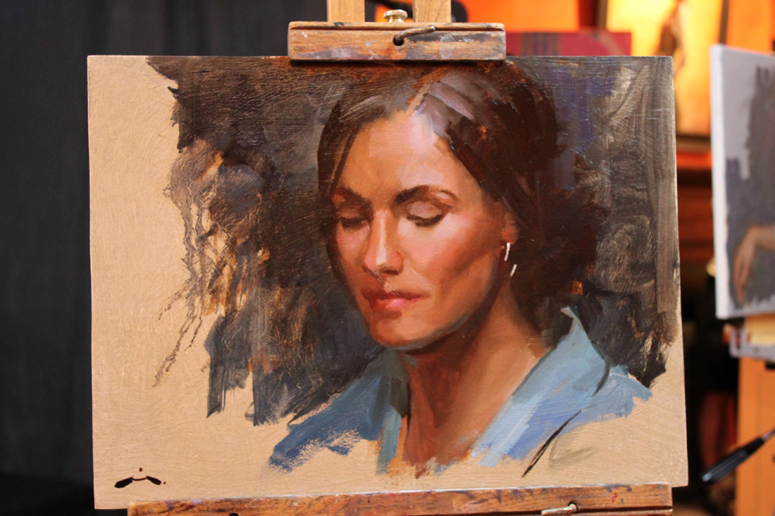
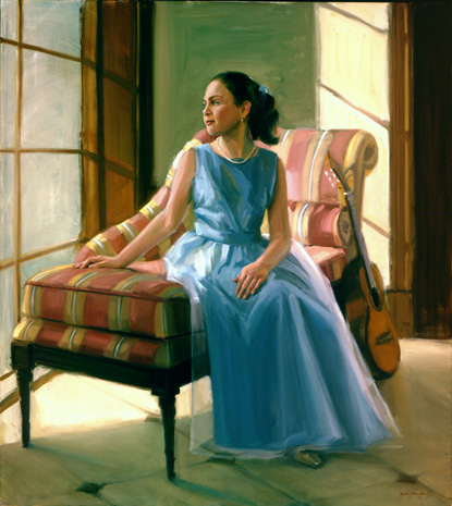
Women Painting Women "Face Off"--Taking Names and Kicking A$$!

WPW_FaceOff_1
"Veni, Vidi, Vici" was the apparent motto for Mia Bergeron, Rachel Constantine, Cindy Procious & Terry Stickland this past Friday night when they came to town to show off their mad painting skills during the Women Painting Women "Face Off" at the Principle Gallery. The WPW ladies were set up in the middle of the gallery and painted from the same model with periodic breaks from 6:30 - 9:00 PM. I'd like to tell you that I took copious notes to share with you about their alla prima technique but that would be a lie as I spent most of the time two fisted, juggling my camera and glass of wine. And in complete disclosure, me and my homie arrived half an hour late so we didn't get to see their initial block-ins. But I can tell you that by the time we arrived they all already had really strong starts on their paintings and it only got better from there on out.
On a personal note I want to thank Mia, Rachel, Cindy, Terry, Alex & Diane for a great GNO (as well as my homies Dana, Tricia & Liz)! And thanks to Michelle, Clint & Meghan at the Principle Gallery who really know how to throw an awesome opening.
Here are some pictures I took from that night. If any of them are blurry, blame it on the yummy chardonnay.
WPW_FaceOff_MiaBergeron1
WPW_FaceOff_RachelConstantine1
WPW_FaceOff_CindyProcious1
WPW_FaceOff_TerryStrickland1
WPW_FaceOff_RachelConstantine2
WPW_FaceOff_TerryStrickland2
WPW_FaceOff_MiaBergeron2
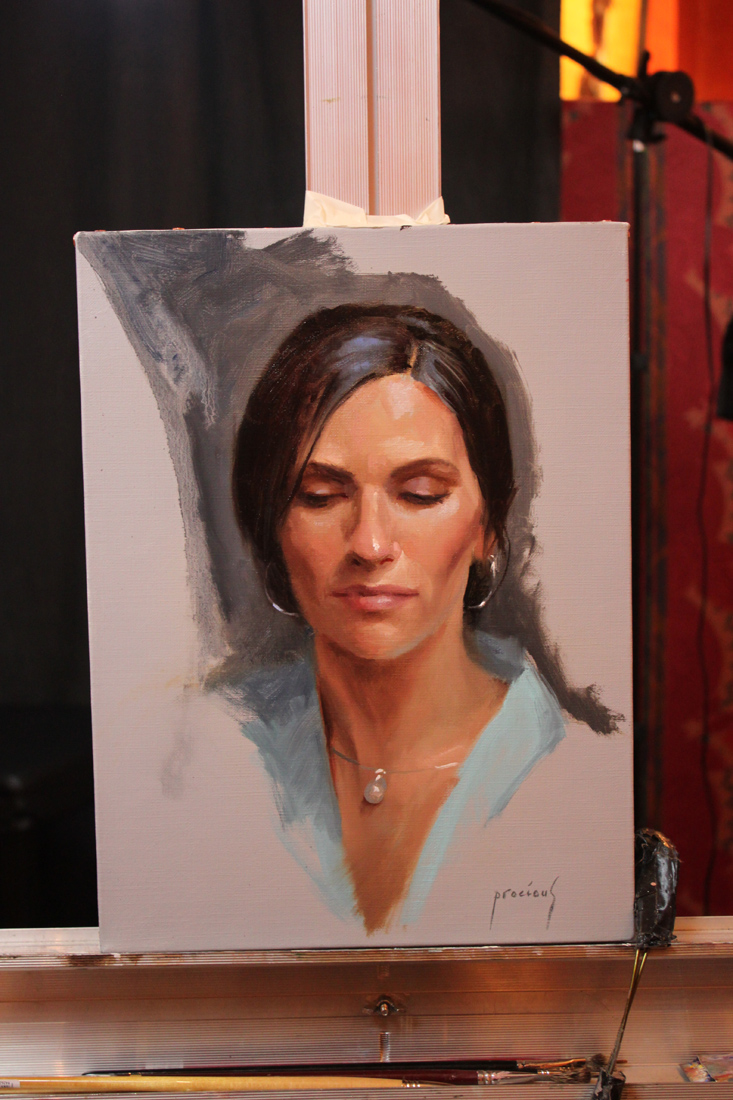
WPW_FaceOff_CindyProcious2

WPW_FaceOff_2

Neal, Whyte & Lindstrom: "The Various Paths to Success"

Step into my time machine back to the date May 27th, 2012 when I attended a panel discussion by artistic luminaries, Michael Shane Neal, Mary Whyte and Bart Lindstrom at the 2012 Art of the Portrait Conference in Philly. I take a lot of notes during classes, workshops and conferences. Some of them never surface again, and some like these lucky notes born under the right astrological sign, actually make it into a blog post. You might not always get the latest breaking news here (try CNN for that) but if you are seeking a blog about painting & technique served with a little witty banter on the side--then you have come to the right place! Now please sit still while I adjust the flux capacitor on this thing. This is what makes time travel possible: the flux capacitor! First, you turn the time circuits on. This one tells you where you're going. This one tells you where you are. This one tells you where you were. You input your destination time on this keypad. Say you want to see the signing of the Declaration of Independence [Jul. 4, 1776] or witness the birth of Christ [Dec. 25, 0000]. For this trip we'll be traveling way back in time, er 3 months back to May 27th, 2012 so you can experience this panel discussion in person. Hold on!

Graffiti_500x500
Mary Whyte: On Promoting Work & Income
You must have a web site, an on-line presence.
Put up only your best work.
Make sure to have contact info up front; phone, email etc.
Make a "take away" brochure that holds dates, relevant publications featuring your work.
Press-how can you get more of it? Donate a portrait of a community person.
Make a contact everyday--reconnect with old contacts. Contact your "wish list" of people you want to buy your work.

Lindstrom_kimandkimberly
Bart Lindstrom:
Keep a log of who are your collectors.
Create relationships with these people. Remember them, remember details about them. You become "their" artist!
Courtship, friendship--it is the same idea with your collectors.
Donate portraits to private schools. Entry level products that they can upgrade to something else you offer. Why private schools? Because these parents have the resources.
Keep your work current on your website. Always be culling (removing). Better to show a consistent painting style & have less.
Make it easy for people to find you.
MichaelShaneNeal_Rachel.
Michael Shane Neal:
Attend high-end private school football games and throw up your cards during touchdowns!
Get out of your studio. Get people to know you & understand your work. Make sure what you write about your work is concise & frequent.
Diversity is important. Paint everything, every subject. It opens up your clientele!
Stay positive! Develop a support structure.
Don't undervalue good old-fashioned hard work. It will make up for a lot of shortfalls.
When you get in the studio strive to improve as an artist every single day.
The business side is important but more important is becoming a better artist. You must do both.
Google people out there who are retiring and introduce your work to them.
You can even set a "Google alert" for people retiring from specific fields i.e. Universities.
Bart Lindstrom:
Make yourself enjoyable to be with. 1). Learn how to make an exquisite product. 2). Show it to as many people as possible.
Agencies need an amazing example of your work & then photographs of consistent work. They are looking for someone who is easy to work with.
Take the initiative (with agencies), get their email & send them your best images. You have to make these relationships.
Learn how to do demos and do them often.
Michael Shane Neal:
Get a list of everybody that is there at your art events & contact them personally.
Consider speaking--create a 20 min power point presentation showing your images & studio shots. Talk to your audience about your work and your images.
Mary Whyte
Will host small dinner parties in galleries & then give a small tour of her work.
Michael Shane Neal:
Spend some time teaching. You will always find people who know less than you do. It helps to build name recognition.
Mary Whyte
Has a manager and an assistant. Her husband makes her frames & he has his own frame making assistant.
Michael Shane Neal:
Began by doing everything himself. After 10 or 12 years he paid an intern to work for him.
Bart Lindstrom:
Trade your art for services. Stop excessive spending so you have more time in the studio (less bills to pay)
When you talk about your work to someone else allow for a "moment of reflection" ( to bloom). Allow your message to sink in as they are viewing it.
Michael Shane Neal:
Be quiet when people are looking at your work. Let them absorb it. Kinstler calls it the "deafening silence". Get comfortable with it.
And one last thing Marty, I'm sure that in 2020, plutonium is available in every corner drugstore, but in 2012, it's a little hard to come by so I am afraid you are stuck in Philly. Sorry. But look on the bright side-at least you will have time to really see the relocated Barnes collection!

Workshop Wednesday: Robert Liberace's "Velázquez to Sorolla", Days 4 & 5
Liberace’s Sorolla Demo start.
Some of my best pictures from Rob Liberace's recent Velázquez to Sorolla Workshop come from Days 4 & 5. So you are in for a real treat here! Sorolla often painted his subjects outside from direct observation, following the effect of light on his models as they enjoyed a day at the beach or a picnic in the grass. Rob's palette below really showcases those atmospheric qualities.
Thalo Blue and Green
Cad Yellow, Orange, Red and Rose
Ultramarine Violet
Viridian
Lead White
Umber
Stand Medium (Linseed oil)

Liberace’s Sorolla demo detail.
Here are the notes I took during Days 4 & 5:
Lay down your colors so they have good body and mass to them.
Whites are warm, warmed by the sun.
Shadows cool.
Always have a definite end to your light.
Cast shadows will not receive a whole lot of reflections.
Quick & strong strokes--don't blend. You will only "muddy" it.
"Blast in" lights.
Blue in core shadows, gold in reflected light (in shadows) are a classic Sorolla treatment. Use White + Orange for gold.
Realist painting requires "hump, ridge, terminator, core".
Make sure your highlights are applied with small brushes if you are working on small scale.
You should be able to cut (theoretically speaking) pure color out of a Sorolla painting. He did not use much blending.
Cad Red, Cad Yellow, touch of Cad Rose + White is the recipe for the Sorolla flesh tone.
Masses in big planes first and then breaks up that base color with light & shadow.
"Each time the model poses pick one area to bring to a full alla prima finish. Then move on to another area when he/she poses again."
My painting inspired by Sorolla on Day 4.

Workshop Wednesday: Robert Liberace’s "Velázquez to Sorolla", Day 3

Liberace_Fortuny_Gesture
On the third day of his Velázquez to Sorolla Workshop, Rob Liberace covered the working methods of Fortuny (Mariano Fortuny Marsal) 1838-1874. He painted the full figure (as seen above) to take advantage of the wonderful costumes the models were wearing. This for me was one of the most exciting aspects of the workshop. How often do you get to paint a guy in swash buckling boots like the ones the model is wearing? Um, not often enough.
Rob's Fortuny palette consisted of many of the paints used for his Velázquez palette with the addition of Flemish White, Cadmium Red, Yellow and Orange and Alizarin (which back then would have been fugitive).
Here are my notes taken from that day:
In the 1870s new colors were beginning to appear like chrome yellow & cadmiums so artists began to see more color in the transitions of light. Greens & purples in the shadows, lemon in the highlights.
Fortuny did not use white in his underpaintings--essentially taking out a step & then jumped into his color.
Begins with a gestural drawing in Umber over a Sienna wash to wet the canvas.
Don't smooth or polish over the anatomy of your paintings. It makes them look like mannequins.
"The few curves that I put in are purely decorative. Draw in angles."
Angle, angle, angle. Find the shape of things, the "high ground".
Try to find the "high points" or directions in the fabric.
Applies paint on the face thickly on the large planes of light & thins it carefully around the features.
"My brush is a pencil, not a brush. If I think of it like that I can get a better handle on the detail."
"On the lips don't draw severe lines. Use color to dapple & disintegrate the line. Fortuny did this a lot. Watteau too."
"Everything I do I want my surfaces to look really good".
Liberace_Fortuny_FigurePainting_Detail
Here is the first painting I was happy with at the workshop. Felt like I made an alla prima break thru with it.

LagoArthur_Fortuny_Day3Painting
And for a little more info on Fortuny, check out this link to Armand Cabrera's Art and Influence blog.

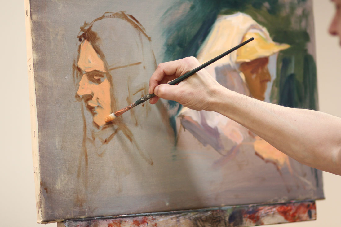
Workshop Wednesday: Robert Liberace's "Velázquez to Sorolla", Days 1 & 2

Liberace_Day_1_Demo
Today wrapped up the 5th day of Rob Liberace's Velázquez to Sorolla workshop and I count myself extremely fortunate to have been one of the attendees. I have taken several of Rob's classes locally here at the Art League in Alexandria VA, but this is my first workshop experience and I have to say I am now a big fan of them! Having 5 consecutive 6-hour days with Rob's excellent instruction helped me to really discover some bad habits that I fall back on in my alla prima painting. There is something about the directness of alla prima. The speed at which you need to commit to your decisions--that really allows you to see the flaws in your work. So what are my flaws when it comes to alla prima? Well for one I have a tendency to round out everything in my gesture and use a strong contour line. I have 2 theories for why I do this. 1). I am a reincarnated WPA artist. 2). My alma matter should have beat it the sh*t out of me while I was back in school. Instead I was actually encouraged to follow it as it was viewed as part of my "unique style" and "identity". Well dear readers, do you know what is the quickest way to kill realism in your alla prima? Adding curves!! Hence you can understand my frustration and my desire to break this dirty little habit. Luckily for me, Rob Liberace literally has all the answers and being in his workshop this past week lit the proverbial "eureka" light bulb above my head. Hallelujah!

Liberaces_Velazquez_Palette
Liberace_Paint
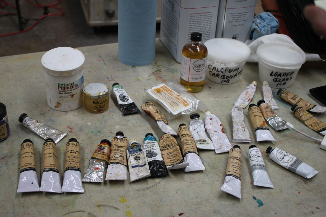
The following is the historically accurate palette he used for the Velázquez part of his workshop. Most of the paint is from Natural Pigments, Da Vinci and Daniel Smith:
Vine Black
Iron Oxide paints (Umbers & Siennas)
Yellow Ocher
True Naples Yellow made from lead
Vermillion
Madder Lake (for purple) or Carmine Red
Lapis Lazuli
Cobalt Smalt
"Sleeping Beauty" Turquoise (Daniel Smith)
Earth Green
Malachite
Medium-Linseed + lead (Maroger medium)
Calcite Powder
Leaded Glass Powder
Wax
And here are some of the copious notes I took during his workshop. I hope you find them as enlightening as I did:
Try not to use the word "hard", think "firm" or "soft" when thinking about edges
Fuse like values, an elegant painterly device
Use "feathery" edges where distinct facets of light intersect
Begins by putting in little "tick marks" to lay in composition & proportions, quick gestural drawing
Make sure you stay very sharp and angular when laying down your figure
Contours and shadows have "highs & lows" that the paint must forcibly lead too
You must amplify the color notes hinting in your subject
Paints on denim, cotton, linen, cotton & silk herringbone fabric he finds in the fabric store
He is fastidious about his surfaces and will size his fabrics first before applying coats of gesso. The right surface is essential in the overall success of a painting!
Spreads calcite, umber & oil on his canvas before beginning (in Velázquez manner) to give a little "cushion" for his paint
Uses bristle filberts in the initial painting stages
Uses shadow masses to help delineate form, chiaroscuro. Academic stuff, lots of planes. Hatches in the shadow.
Puts in the nasal line and "sweeps" across it to blend it in with the face
Step one is monochromatic underpainting
He is sure to extend his lines and exaggerate gesture for a better composition
Uses a wedge of paper towel to cut in lights in his underpainting
Often employs the back of his brush handle to break up paint ridges and "erase"
Goes for the big masses first when laying down paint and spreads it out
Get your anatomy down in the underpainting
Big mass of value, one light source, bigger brush
"Zipper like" approach to edges of value to get a more volumetric feel
Every stroke is "crumbly, jiggly & wiggly"
Know where the "hump" of a form is so that you can decide how obvious to make it--softer or firmer
Use the opposite color temps in your glazes, on a warm ground use cool etc.
On day 2 he will reactivate the shadows by adding umber to them but no color, also a little black as needed
Begins glazing over his underpainting by applying a thin amount of wax & green glaze to the face to help knock back the warm temp and give him something to paint into
Turns his brush to make it not such an "obvious mark" (holds brush at the end & perpendicular to the canvas)
Takes hard edges & relaxes them by feathering across them
Will add a little color to his shadows as long as there is no white (use a clean brush!)
"You see a lot of scumbly broken strokes in Spanish painting"
On painting hair, "follow the light as it jumps from one strand to another"
Velázquez was extremely aware of the topography of his forms and is subtle. Does not blend but feathers & hatches his edges instead
If an edge becomes too soft he will re-establish it, always making corrections, a back & forth of edge handling

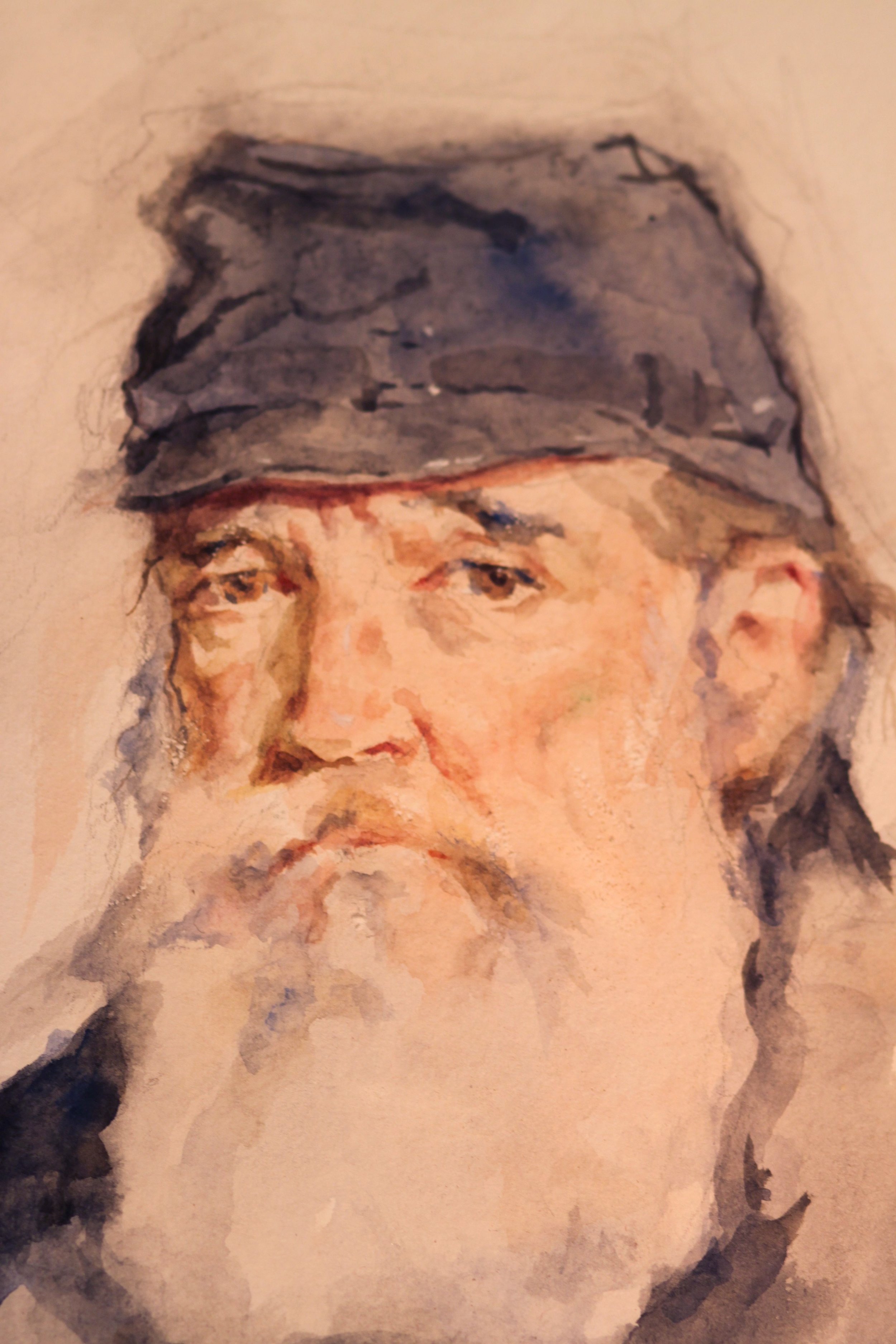
Liberace_Velázquez_DetailOfOldMan