
Art Tourist: Seeking Andrew Wyeth

Suzanne Lago Arthur outside of Andrew Wyeth’s studio
Last November, my family and I made a very special pilgrimage to the Brandywine Museum, but more specifically to the studio of the late great Andrew Wyeth and to the Kuerner Farm that he immortalized. I have been a huge fan of Andrew since my childhood and a couple of years back was also able to visit the Olson property in Maine that he made famous in his painting "Cristina's World". Little did I realize that the great man is buried there or I would have introduced myself to him properly, paid my respects and thanked him for all the years of inspiration.
Every year since my trip to Maine, I have promised myself that I would go see his studio in Chadds Ford, which is only open for part of the year. And every year it seems I would miss the window. But finally during last November I made it and on the very last weekend that it was open. Hooray!
So you may be asking yourself why I am writing this post now? Because the studio is open again for tours from April 1st - Nov 20th. Chadds Ford is beautiful during this time of the year. If you are a fan of the Wyeths as I am, you will not want to miss the opportunity to experience their world and the huge impression they left behind in the Pennsylvanian countryside.
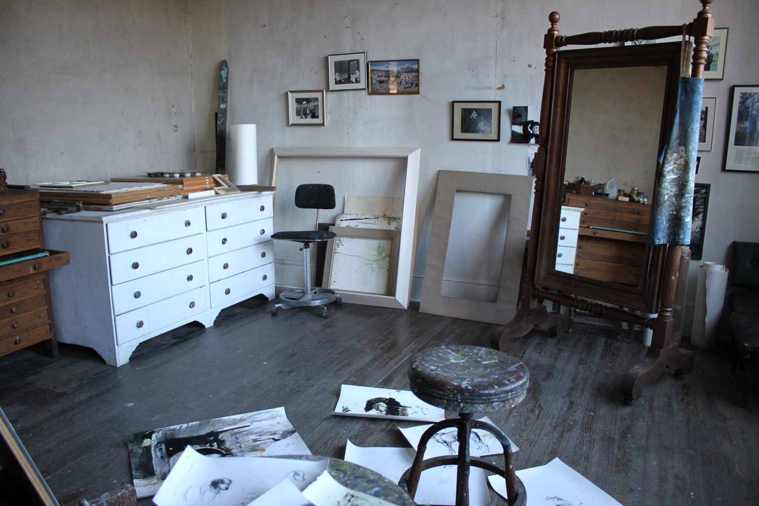
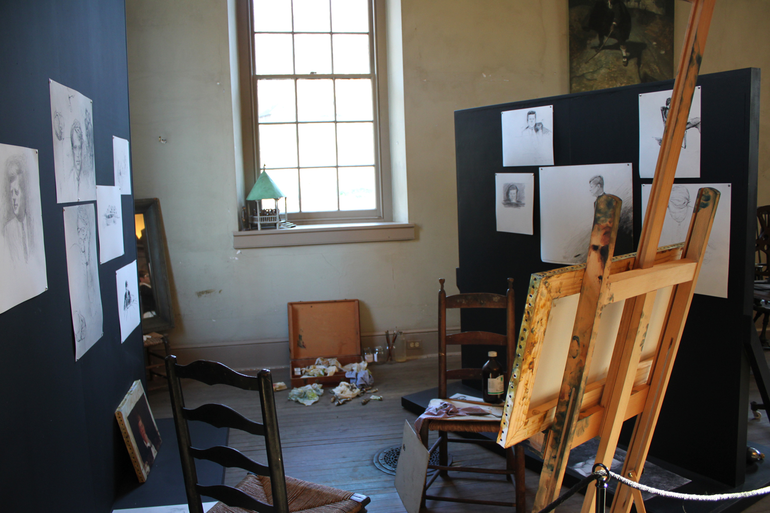
Andrew Wyeth Studio, Chadds Ford, PA
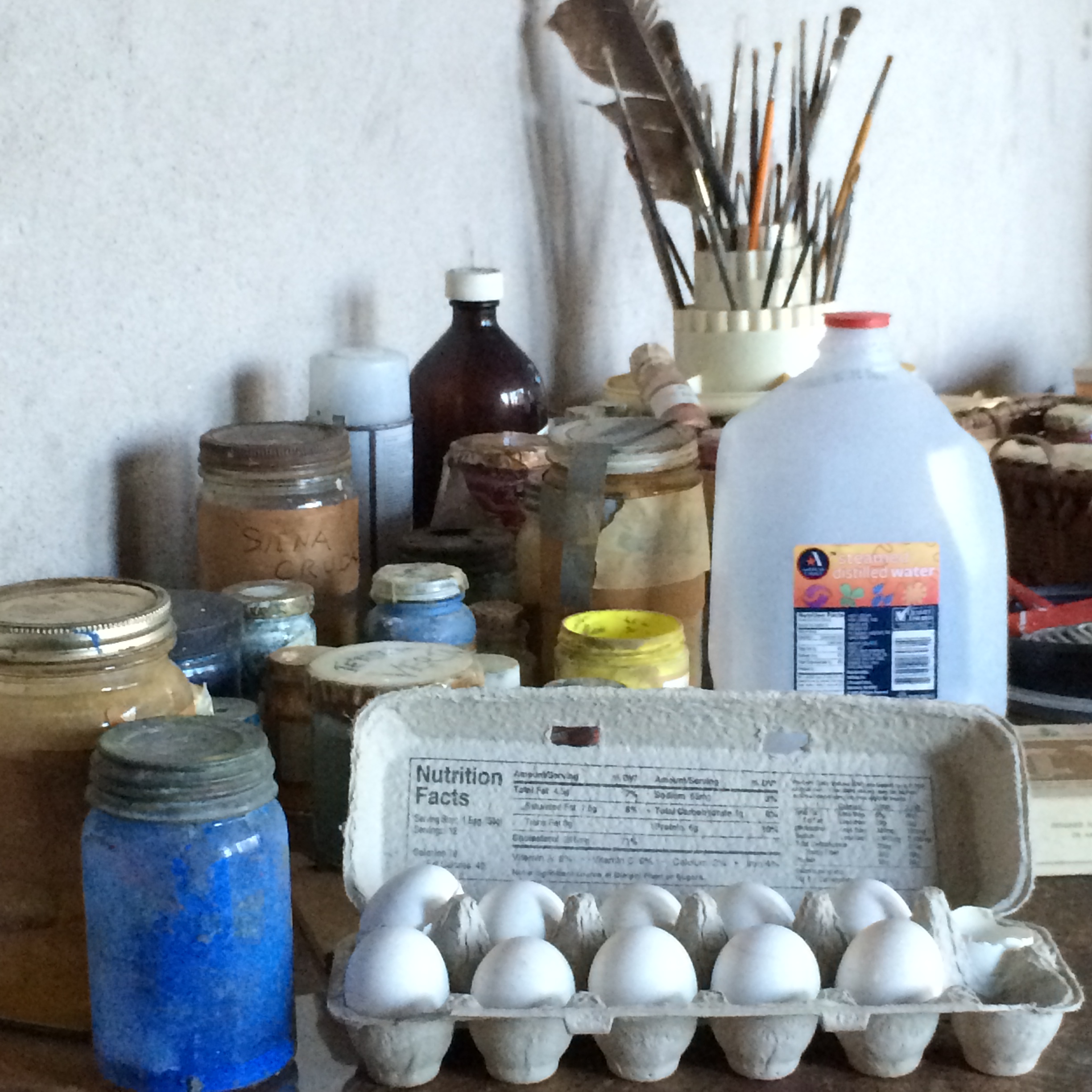
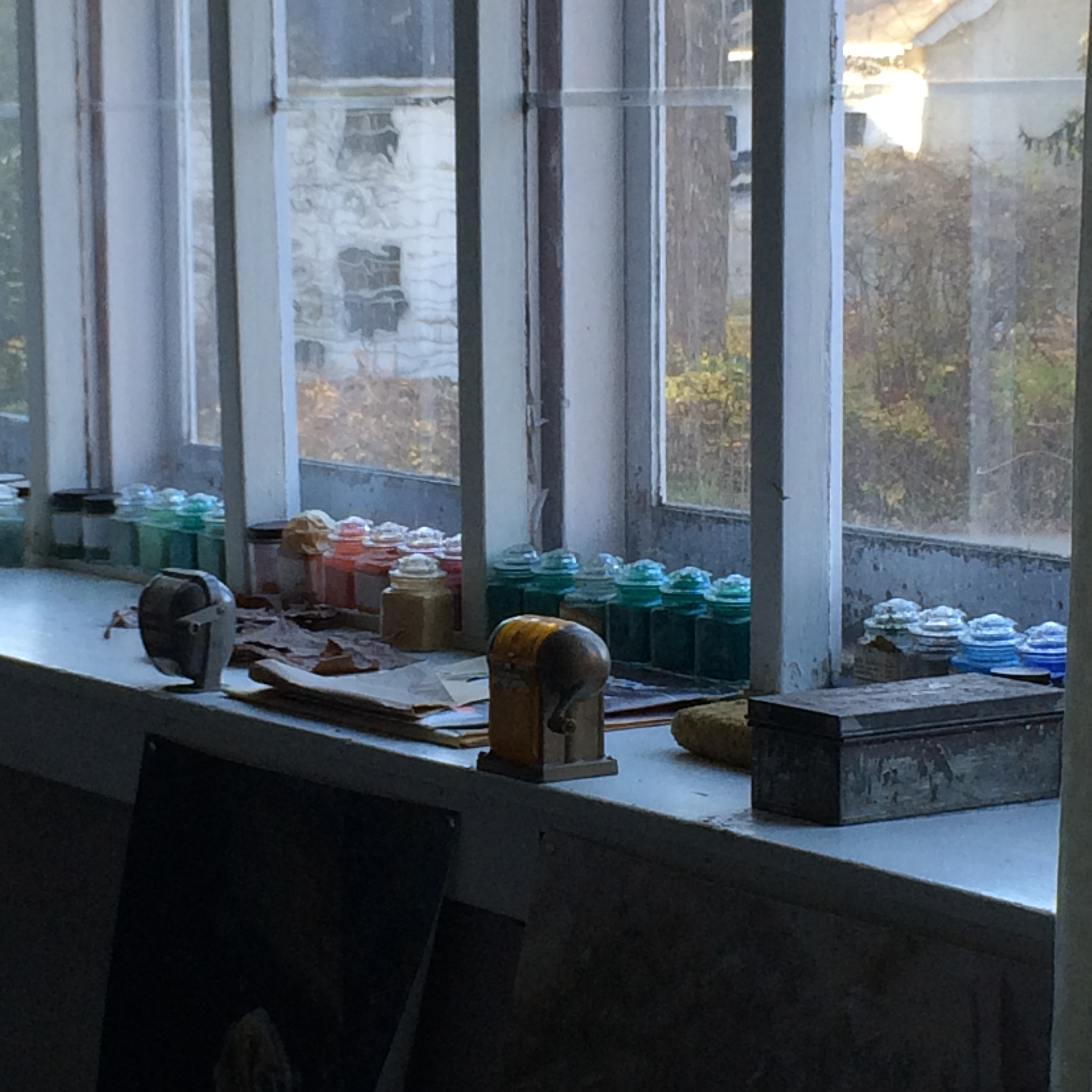
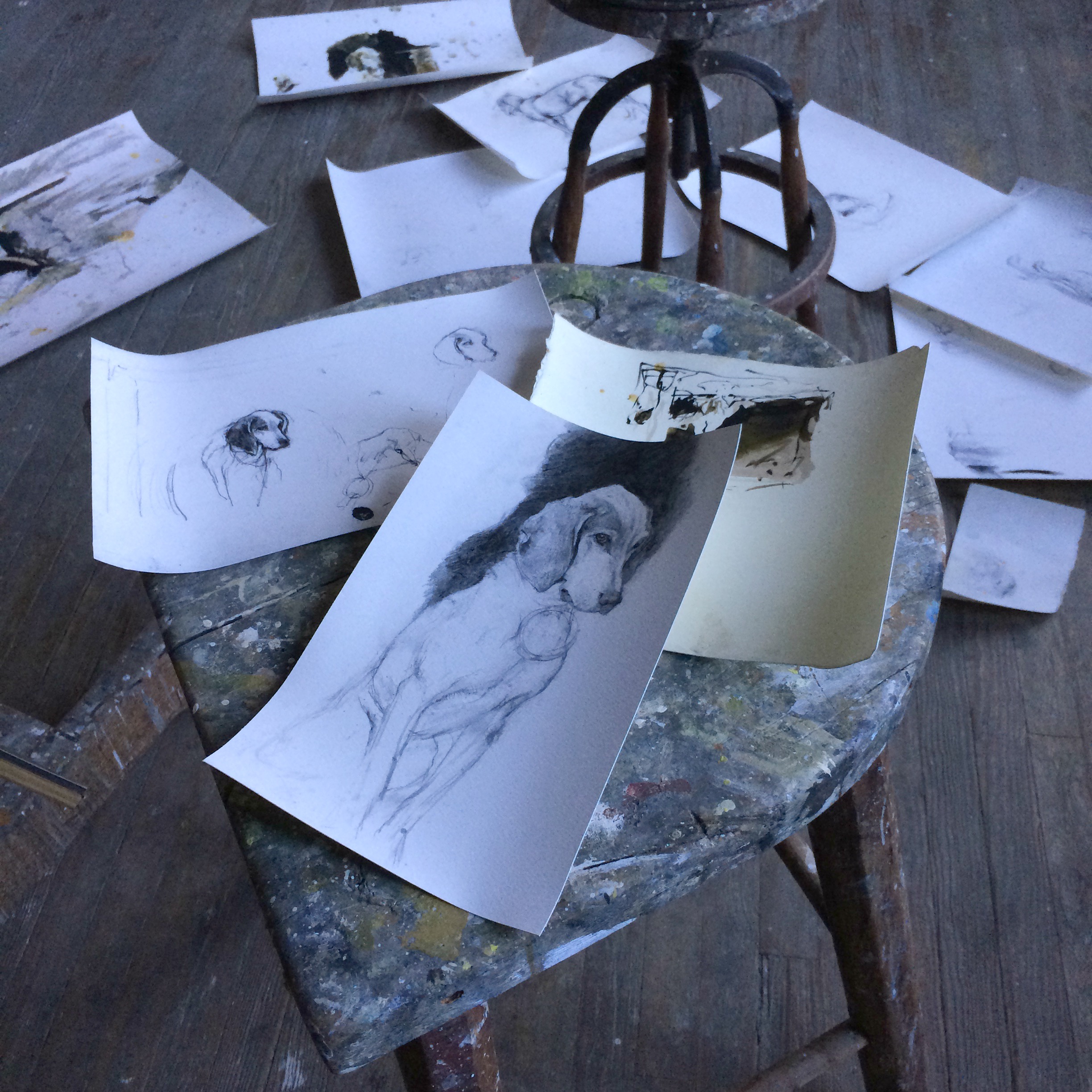
Andrew's studio is set up exactly as the artist left it. As if he has just stepped out of his studio for one of his regular walks in the surrounding countryside. There are drawings (reproductions) strewn throughout the floor. Egg tempera supplies still await his skillful hands and jars of luminous dry pigments line a window's ledge.

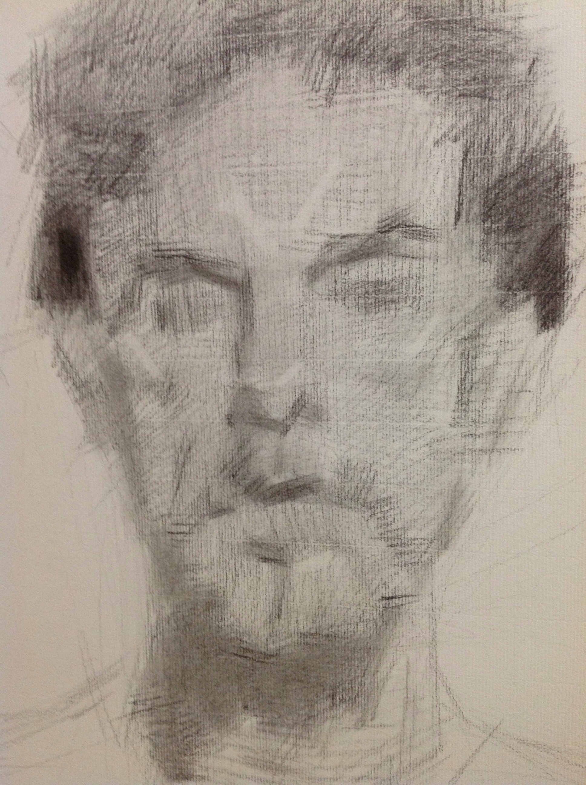
Copy of Andrew Wyeth drawings
Jamie Wyeth’s Corner, Chadds Ford, PA
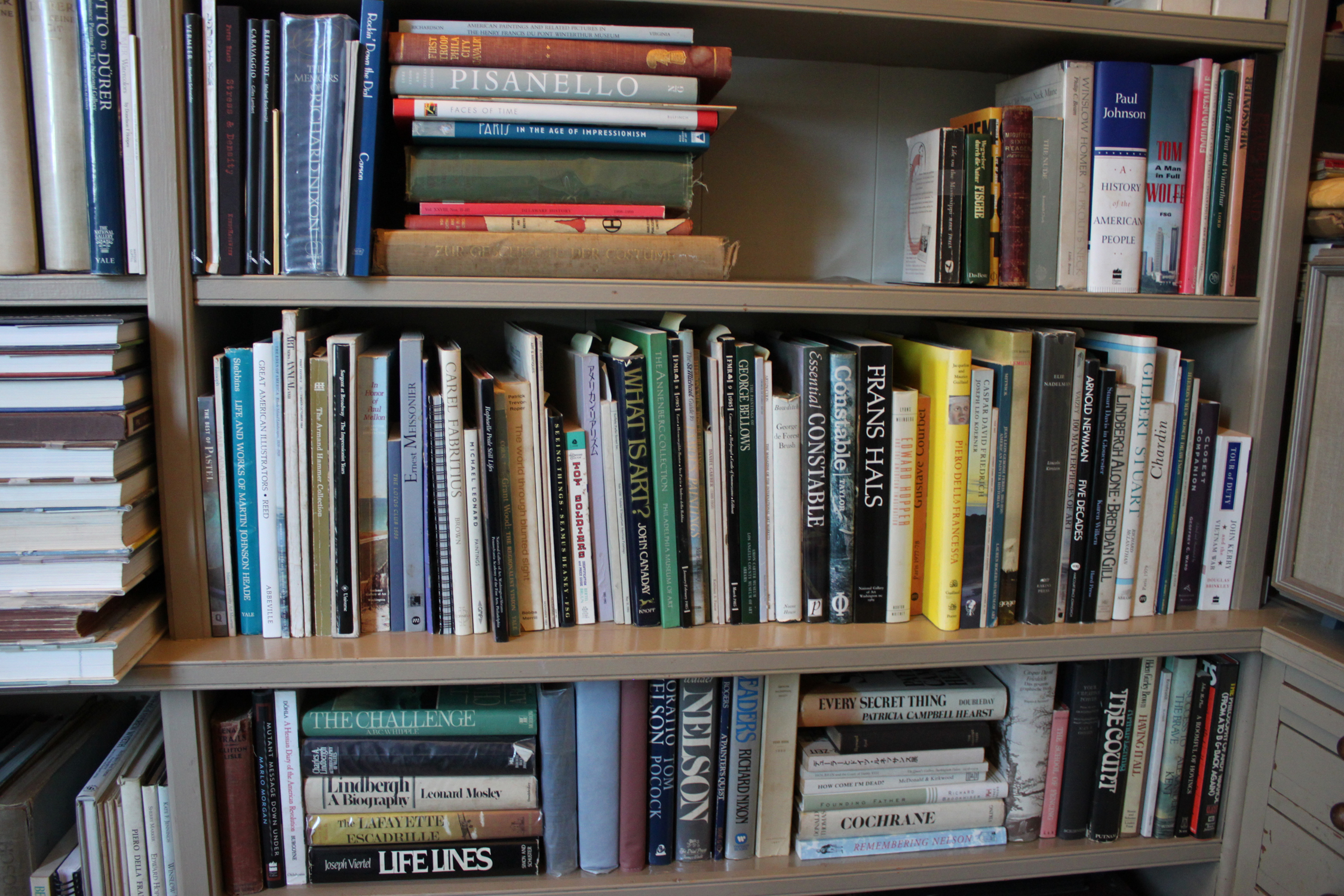
Andrew Wyeth’s Book Collection, Chadds Ford, PA
We were able to see the Kuerner Farm as well which was a huge treat considering that Andrew produced over 370 works of art on the property. There is a wonderful book documenting his time and productivity on the farm called "Wyeth at Kuerners". It is out of print now but if you are able to get a hold of a copy, I would highly recommend it. It contains a personal narrative told by Andrew on each of his paintings from this series including all the preliminary drawings. It is an invaluable insight into the process of a great American master artist. I got my treasured copy from a wonderful friend (thank you again, Karen) but I have seen them available any where from $8 - $249. The curatorial staff at the Brandywine even reads from it during their tours.
The Kuerner House
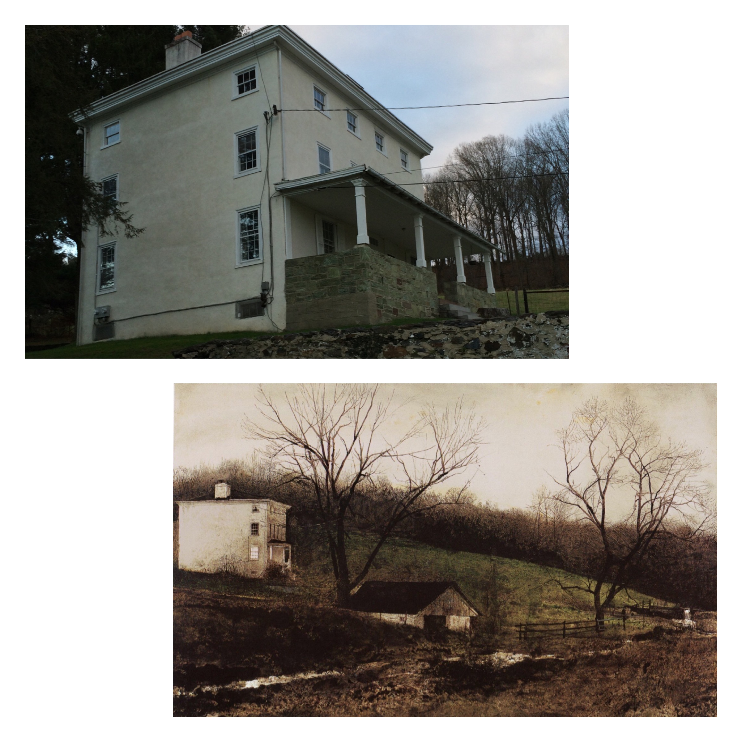
Kuerner House, “Evening At The Kuerner’s”, Andrew Wyeth

Above the sink in Kuerner's Barn. Painting by Andrew Wyeth, “Spring Fed”

My tired son enjoying the view on the Kuerner front porch after a long day of “arting” with Mom.

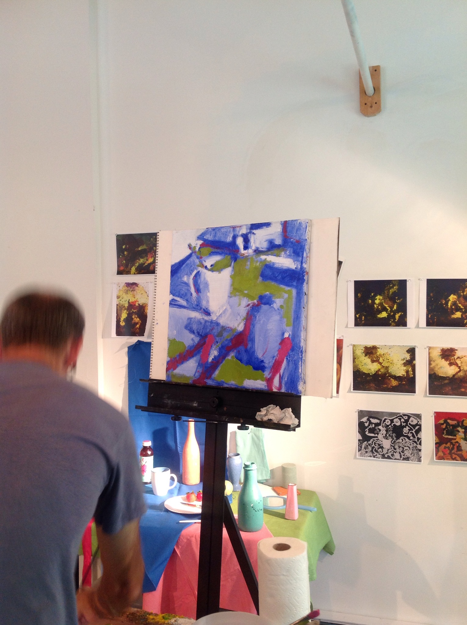
Workshop Wednesday: Rick Weaver's Abstraction for Realists

rickweaverdrawing
I've had the pleasure of taking two workshops from the artist, Rick Weaver. Rick has extremely impressive credentials having received his formal art training in New York at the National Academy of Design, the New York Academy (now known as the Graduate School for Figurative Art), and the Art Students League. He studied painting and drawing with a number of notable art instructors, including Robert Beverly Hale, Ted Seth Jacobs, Ron Sherr, Harvey Dinnerstein and he earned his Master of Fine Arts from the University of North Carolina-Greensboro, where he was influenced by the sculptor Billy Lee.
I can tell you from experience that he is a deep thinker who stretches your mind alongside your skills. He seems to come at things always from a new angle and perhaps this is because he is both a sculptor and a painter, and extremely accomplished at both. I've discovered that the best teachers show you how they think which is much more powerful than learning someone's style. Rick is definitely that kind of teacher. If you ever have the opportunity to take one of his workshops, I would strongly encourage that you do so.
Below are my notes and photos I took during his workshop this past July which was hosted in the beautiful studio of Francie Freitas. Thank you Francie for having included me in this wonderful workshop.
Rick Weaver Workshop Abstraction for Realists July 22 2014
[Rick began Day 1 of his workshop by having us look at prints of masterpieces he intentionally distorted digitally (using filters) to better show us the degree of abstraction underpinning the work.]

IMG_1606-0.JPG
When you look at a great masterpiece in a museum, if you pay attention you will always notice an emphasis on composition.
"Ask yourself why an artist did things. Why a cloud there? Why that shape?"
Great painting is a combination of formal elements; line, shape, color & value organization.
Space is not a formal element but it collects form together for us. So does rhythm, so does light. Visual weight etc.
"There is a natural trade off between the amount of resolution (finish) you want and the base abstract power of the painting."
"Making a painting is not copying nature. Old masters made significant changes to what they observed in making their paintings. Be aware of this and be sensitive to it in your work."
"Make yourself make changes for the better in your work."
There are 3 main elements of painting 1. Subject Matter, what you see in the painting, direction of etc. 2. Form= line, shape, color (value) 3. Content

IMG_1608.JPG
The early stages in a painting are an opportunity to give your painting a strong abstract power to build upon.
Don't think of objects as separate. Think of them as joined, like in their shadows & forms, color.
If you think in terms of object you are ultimately separating. If you think inclusively you will see all kinds of connections.
Like in figure, the shadow is often indicative of the color of the drapery.
Show those connections.
Rounded lines are organic.
Angled lines are inorganic.
There should be a strong connection between form & subject matter.
Square, is a non directional shape, neutral. Look at Lincoln Perry. Be wary of putting something right in the middle because it will be weak.
Look at subject matter and see it as pattern within the rectangle. (Matisse)
There aren't really any definitive books on composition out there that I am aware of but these books are a start:
-Erle Loran book on Cezanne composition
-Andrew Loomis' book on perfect mean
Things you can physically do at the start of a painting to think formally:
Connectivity/Unity-literally make things connect in the beginning.
Always make a rectangle on your page to set up your boundary, picture plane.
"As soon as you put a silhouette you are making an object". Draw a two dimensional shape showing how the subjects link into each other from edge to edge, line to line. Work from the edge of the picture plane in. You can get in touch very quickly with the whole thing this way. Picture remains open, promotes flexibility.
You can use a more organic or architectural line.
No line has anything to do with the object. It functions just form connectivity. Same thing with tone, divide the subject into 2 or 3 values.

IMG_1611.JPG
"If I can't get a preliminary sketch to say/do what I want it to in 3 values, I never go further with it."
What seems to visually connect to you? You got to want it. Make it connect. Be on the hunt for those 3 values and only those values.
Vertical spacing pushes things towards you.
Horizontal spacing pushes things away.
Pay attention to your "sit down" (object touches plane) spacing will give you the horizontal space.
Paying attention to negative space will give you the vertical spacing.
Ideally make your circuit within a minute round the entire drawing for that first exploratory line.
Exercise to just allow things to connect more than anything else (mine was too slow).
Am I able to move into the picture? Is there ground plane? Foreground, middle ground, back ground?
Day 2
Demo 4 color palette, primaries + white Permanent rose, Ultramarine blue (or thalo blue), cad lemon

IMG_1620.JPG
Subject of demo: Hue-the most problematic issue of color.
Gestural start, linking forms. One continuous line.
Thinned down ultramarine
Uses a brush larger than he's comfortable with to keep him from drawing objects.
Holds brush perpendicular to surface, carving shapes as he masses in.
Tries to think in terms of three values, light, dark mid tone.
When he starts adding local color he looks to see where else it shows up, shadows, reflections etc.
"As I am working I am trying to reinforce my idea (initial gesture/approach) with the way I paint. Being consistent with the same approach through out the painting."
"The last thing I want to do is complete an object with this approach. I want to keep things open."
"I am starting to think about the quality of lights anything in the light has both yellow and red to it. You must use both."
"I really try to keep it formal, stay away from object making as much as possible."
"With the figure, I approach the same way but if I want a more traditional approach I take more care with the drawing. "
I will go back and introduce the (unifying) line in drawing while painting (as many times as needed).
IMG_1628.JPG
On a personal note I want to thank Rick for helping me to stretch both my thinking and my technique. I will be back for more workshops. You can count on that!

Technique Tuesday: Teresa Fischer's "Go To" Brushes and Brush Cleaning Method
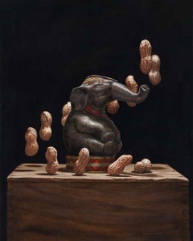
"Peculiar Pachyderm". Oil on panel. Artist, Teresa N. Fischer.
One look at Teresa N. Fischer's paintings and you know you are seeing something revolutionary in the field of still life painting. Her theatrical and witty compositions are often clever observations of childhood experiences, inferred by the juxtaposition of antique toys and other still life objects. One has only to look at her painting "Peculiar Pachyderm", one of my all time favorites and a finalist in The Artist Magazine's 30th Annual Art Competition, to feel and see the magic in her work.
Teresa is a graduate of the Savannah College of Art and Design where she met her husband, the illustrator Scott M. Fischer. She is an award winning member of both the Oil Painters of America and the International Guild of Realism and has been a finalist many times over in the Art Renewal Center's, International Salon.
I had the immense luck of meeting Teresa several years ago and instantly found a nurturing and supportive friend who was willing to share her experiences with me, have studio chats via Skype and even meet for dinner on the occasion she's in town for one of her openings at the Principle Gallery in Alexandria, VA.
In keeping with Teresa's generous spirit, she is actually sharing twoTechnique Tuesday tips with us today! Hooray! Here is the first:
"These are my two favorite brushes that I use. Robert Simmons white sable series 721 one strokes (a long bristled flat) and series 750 script (a longer bristle liner round).
I don't use a lot of small round brushes for my fine detail work. For me I find them difficult to use. They either don't keep their points which can be frustrating or hold enough paint. With the 750 script I can pull a very clean thin line, and the point gets really thin which allows me to do very tiny details. In this one brush I have a greater choice over the thickness of those details or their size.
Of the series 721 one strokes (flats), again I prefer the longer bristles. I like the spring of them. Shown in the picture (above) is the 1/4", my other favorite size is the 1/2". This is my work horse brush. I lay almost my entire underpainting with these two sizes. I can block in bigger areas and turn it on edge and drag a very nice clean line. I find that very versatile. If I get too caught up and tight, I grab the one stroke and start blocking and chiseling the form. It feels more like I am sculpting with paint.

TFischer1
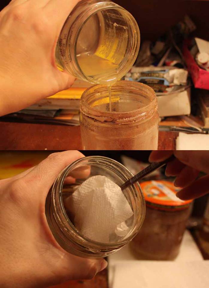
The other thing I do is I rarely use turp to rinse my brushes. During a painting day I use walnut oil to rinse my brushes. Mainly to try to be healthier and my brushes seem to like it. At the end of the night, I give them a rinse in turp or OMS, them wash them using either Masters brush cleaner or even Palmolive dish soap. Because the walnut oil is a little more expensive I don't want any to go to waste , so I utilize the two jar system. After the oil settles, the oil and sludge separate.
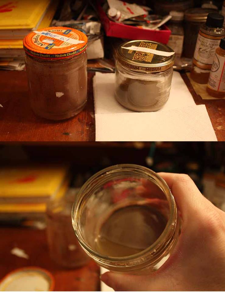
TFischer3
I then carefully pour the clean oil off into a empty jar. I clean out the sludge that is left with a napkin and the end of a brush handle to swirl it around with. And as you can see, my favorite jars to use in the studio is salsa jars."
Tfischer4
Thank you Teresa for sharing both these wonderful tips and your amazing art work with us today!
Teresa's painting, "Carrot - O" was recently featured at the 15th Anniversary Show at the Elliott Fouts Gallery in Sacremento, CA. Here is a link to her really informative blog post detailing its creation. Enjoy!

600_TNFischerCarrotOsml

Technique Tuesday: Drawing Revelations with Dan Thompson
20130930-221046.jpg
In August I attended yet another workshop with Dan Thompson. 2 actually, back to back. Both of them on drawing. I see Dan as a cosmic guide on my life long journey as an artist. He leaves little bread crumbs of wisdom to follow on the path to improvement. Most recently he left me with two life changing concepts. The first is the revelation of what "closed" and "open" drawings are. Closed drawings are those with specific contours. They are precise, drawn from the outside in and do not allow much room for alterations. Open drawings are the opposite. They are built from the inside out. They are more mass than contour, they are flexible. They are forgiving. I had never heard these terms before, perhaps because I did not attend a particularly traditional art school. Hearing these terms allowed me to understand my own frustrations with my drawing--most noticeably a tendency for strong contours. To think that I could simply reverse engineer my drawing technique to get at the quality I want in my work was literally mind blowing! And the last revelation I received from Dan's workshop was to approach each effort in drawing and painting as if making a "proposal". If you get it wrong, so what! Just alter your proposal. Brilliant right? And it totally takes the pressure off.