
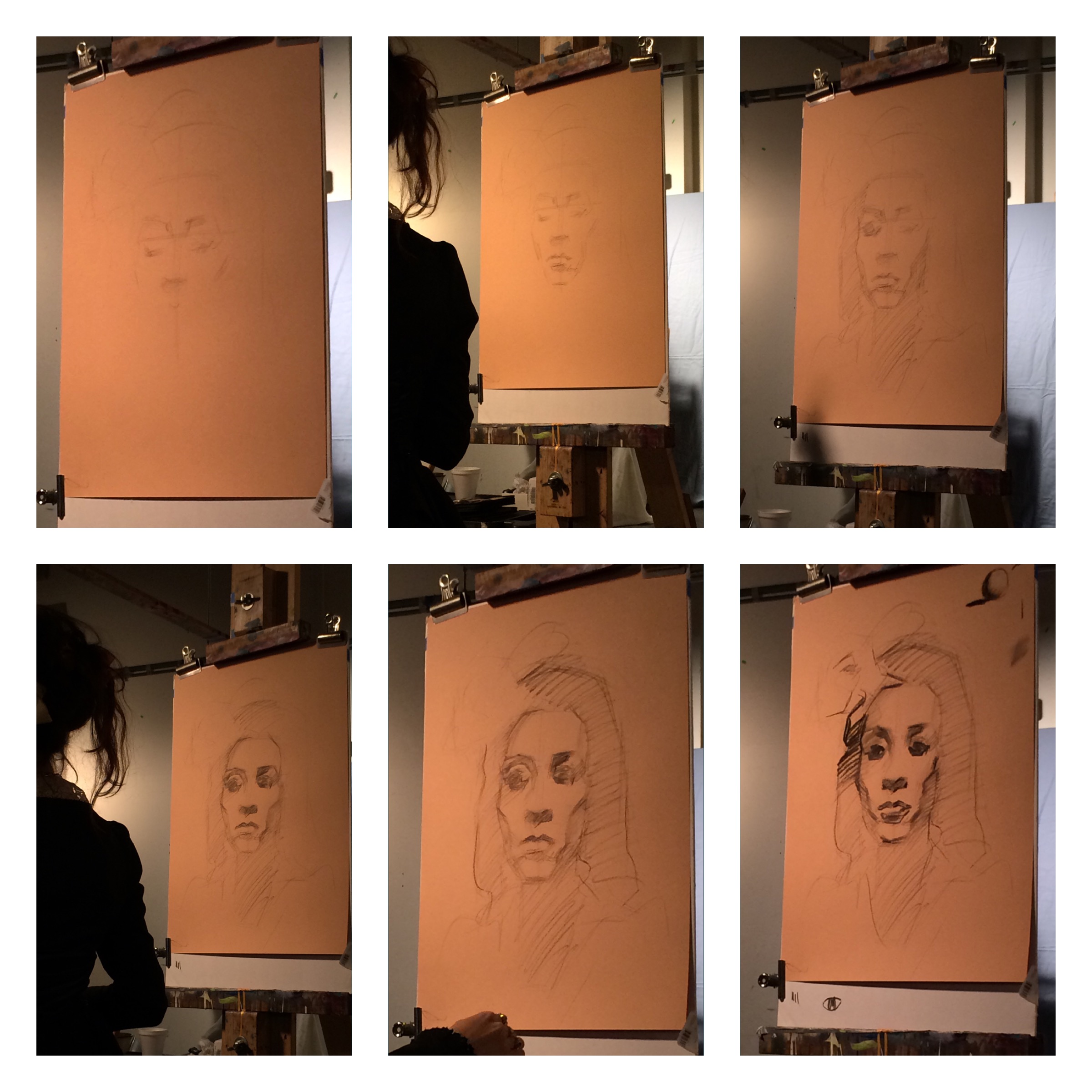
Workshop Wednesday: Robert Johnson

RobertJohnson_IMG_4700
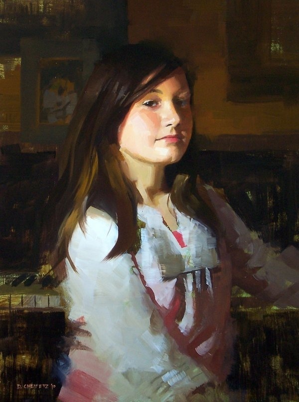
Twice now I have had the pleasure of taking a Robert Johnson workshop. Both at the private studio of a wonderful friend of mine in Purcellville, VA. This most recent workshop occurred during the record breaking deluge of rain we received in Northern Virginia. However, despite the rain spirits were bright and the painting "spell" cast by Johnson was magical.
Robert Johnson is a master painter of exceptional skill and technique. His marks are in essence calligraphic--and he admits to having been inspired early on by the Japanese art of Sumi-E painting. This influence is evident in his work and separates his approach to oil painting from his contemporaries. The way he applies paint is a performance all on its own. He delicately controls the lift & pressure of his brush to accurately render the ephemeral quality of his subjects. Any opportunity to study with him is not to be missed.
One of the highlights of this recent workshop for me personally, was meeting an honored participant, the noble Statesman from Virginia--Senator John Warner. Senator Warner stands with other notable Statesmen (such Winston Churchill), who have turned from politics to painting later in their career. I thoroughly enjoyed the Senator's recollections of his time both as Secretary of the Navy and as a United States Senator as well as his anecdotal stories of celebrities and personalities he has known along the way.
Below are my notes that I took during both of Robert Johnson's workshops. I have placed them in categories to make them easier to understand and apply:

RobertJohnson_IMG_2336
Composition
-Decide which direction the viewer will travel through your painting.
-Concentrate on negative shapes, variety, design. Decide whether your design will go off the canvas--if so, let it go off in several directions or it will look like a shortcoming.
-You want variety in your set - up. Its inherent in nature.
-Seek a feeling of movement. Good proportion: mass of flowers to greenery to container.
-Using the convention of "polarity"-the juxtaposition of opposites, allows both objects to acquire visual impact. i.e. vertical/horizontal, bulky/delicate.
"The function of the background is to support the "prima ballerinas". It should not detract from the main event. The background should not be as thick, the values not as saturated ed, the edges not as hard, etc."
-"Strive to get depth, even on a front to back composition."
-"The eye goes to hard edges, more paint & bright colors. Be aware of this and design accordingly."

RobertJohnson_IMG_2380
Materials
-Works on double primed lead supports.
-Preferred medium mixture: 5 parts stand oil, 5 parts Gamsol (OMS), 1 part damar varnish.
-Lays in an "imprimatura" wash with cobalt, viridian & transparent red oxide. Puts down marks on top in a rhythmic patter which he sometimes allows to show through in the final product.
"What do mediums add to your painting? They loosen up piles of paint, make longer brushstrokes like in the background and can create transparency"
-"You need flat brushes to get at the delicacy of the flowers. Paint them with the thought that if you blew on them they would move."
-"All brushes should come to a nice sharp edge. Even your filberts."
-Begins laying in his drawing very loosely-brush held way back, long brushstrokes. Thins down paint with turps (OM).
-Paints with only one glove on his "painting" hand.

RobertJohnson_IMG_2360
Rendering
-On levels of importance: Values, then Edges, then Colors
-Johnson wipes out the flower masses with paper towels from his initial drawing to set up the structure . He lifts quite often.
-He recommends creating charcoal drawings on toned paper to get used to "lifting out lights. Wipe out like an artist--your touch should have the feel of going over a peony."
-"Paint the subject as if it is a under single source light. Ignore the ambient light."
-"Don't ever leave anything on your canvas that is confusing. Make it clear."
-Johnson often redesigns as he is painting. He will mutter to himself, "Let's make this little guy (a yellow peonie bud) white."
-"The moment you touch your canvas, everything should be done with artistic intention."
-"Don't think about sugar bowls and roses-think about shapes and how they relate to one another."
-"There is no democracy in art. The big forms always win."
-"Get to your final painting stage quickly so that all you have to do are revisions. Finish the big statement as quick as you can."
-"Always remember that perpendicular planes reflect the light the most. If you are having problems seeing or drawing try to remember that principle."
-"Try to put the light down horizontally-it will stand out more. Implies ridges."
-"The Rembrandt effect": Horizontal then vertical marks, ending on the vertical.
-THE 5 MIN RULE: "When you make a bold statement there is this instant fear that you have done something wrong. When you have that urge to change it-ignore it. Take a deep breath, recognize what is happening. Give yourself permission to modify it--but only after 5 mins."
-"Strength and boldness lead to more strength and boldness. This is the purpose to the 5 min rule."
-"Learn to make good descriptive brushstrokes. As the painting evolves each stroke should be laid down as if it is never getting lifted."
-"Maximize the utility of the highlight. Give them breathing room in your design."
-"The light (within a painting) can describe the intensity of the light on the subject, the surface texture, direction of the light, the contour that it is going over."
-On painting flowers: "Start with the outside shape of the flower, get that accurate. Then strive for the dimensional -the light and dark of it. Only then have you earned the right to paint a petal. Work abstract to detail."
-"Say the most with the least. Be precise and you can get away with suggestion."
-On the second day of a painting Johnson begins reworking the canvas by reapplying the background color so he has something to paint into.
-On painting rugs: " Try to establish a pattern. Don't be a slave to it. Rugs should have a clear, paintable pattern to them. Use the weave of the canvas to describe the weave of the rug (sometimes scratches the paint away with the side of a palette knife to reveal the weave). Say the most with least. Allow the materials to do the work for you. Go back in and restate the design of the rug but avoid getting mechanical & uniform with your brushstrokes. Use a light touch, get the paint just on the tip of your brush and drag it into place."
-"Brushwork should be a muscle memory thing. You should be able to render the object just by looking at it with your eyes."
"Just lay the paint on. No scrubbing. The paint will look better if you just allow it to do what it naturally does."
-"You need a blend of soft and hard edges. Let the soft edges dominate. Use hard edges sparingly. Especially in the background. "
-"If you can do it in one stroke it looks better. Start with a very light touch and then apply pressure-the stem will be painted naturally going from thin to thick."

RobertJohnson_IMG_2373
Values/Colors
-Follows thick lights/thin darks rule.
-Gets a highlight on quickly to key in the values.
-"A trick from Sargent's portraits: Add more light/color to the shadow of a subject--just past its contour. It helps turn form more and gives a sense of air."
-"Within the dark areas there are accents. The opposite in value of highlights."
-"We never think "dark" (values) with flowers but we should."
-On foliage: "Layer light over dark, dark over light--adds dimension. Overlapping planes also give you dimensional".
"Cast shadows are extremely important. Get them in early. They keep everything honest, related. The main thing I think about here is getting them dark enough and in the right places."
-On greenery: "Ultramarine blue + Cad yellow pale + something from the red family. Always sneak red into your greens."
-On painting red roses: "Don't make lights, lighter- make darks, darker. White only makes red look chalky."
-"Be careful painting yellow roses. It is the color most easily adulterated. It turns the key way down when other colors are accidentally introduced to it".
Recommended Reading
-"Painting Techniques of the Masters", Hereward Lester Cook
-"Russia, the Land, the People"
-"The Painted Word", Tom Wolfe

RobertJohnson_IMG_4717

RobertJohnson_IMG_4718

Art Tourist: Seeking Andrew Wyeth

Suzanne Lago Arthur outside of Andrew Wyeth’s studio
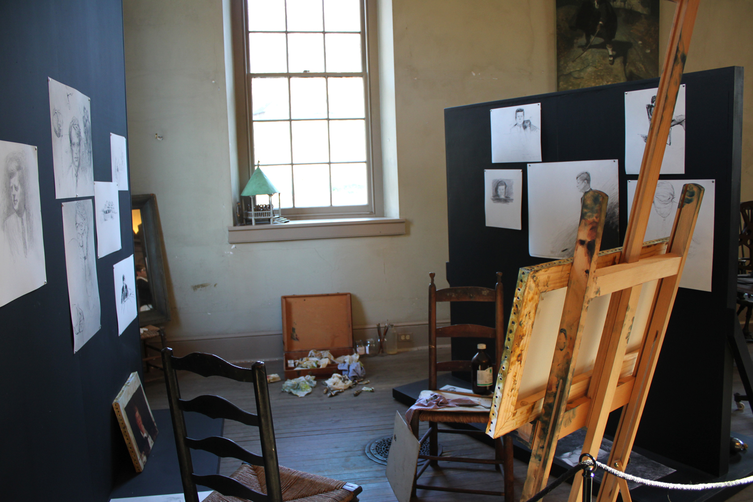
Last November, my family and I made a very special pilgrimage to the Brandywine Museum, but more specifically to the studio of the late great Andrew Wyeth and to the Kuerner Farm that he immortalized. I have been a huge fan of Andrew since my childhood and a couple of years back was also able to visit the Olson property in Maine that he made famous in his painting "Cristina's World". Little did I realize that the great man is buried there or I would have introduced myself to him properly, paid my respects and thanked him for all the years of inspiration.
Every year since my trip to Maine, I have promised myself that I would go see his studio in Chadds Ford, which is only open for part of the year. And every year it seems I would miss the window. But finally during last November I made it and on the very last weekend that it was open. Hooray!
So you may be asking yourself why I am writing this post now? Because the studio is open again for tours from April 1st - Nov 20th. Chadds Ford is beautiful during this time of the year. If you are a fan of the Wyeths as I am, you will not want to miss the opportunity to experience their world and the huge impression they left behind in the Pennsylvanian countryside.
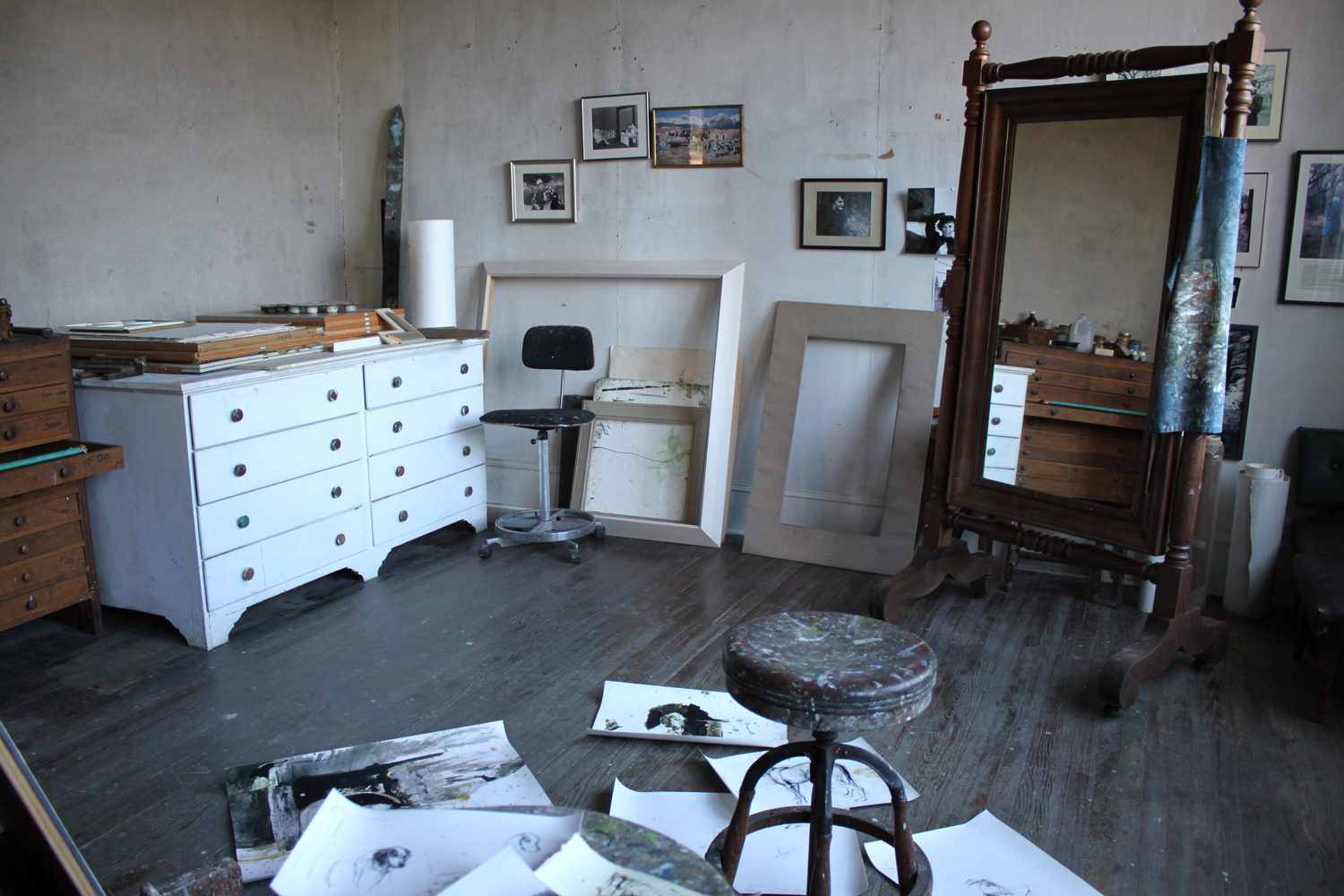
Andrew Wyeth Studio, Chadds Ford, PA
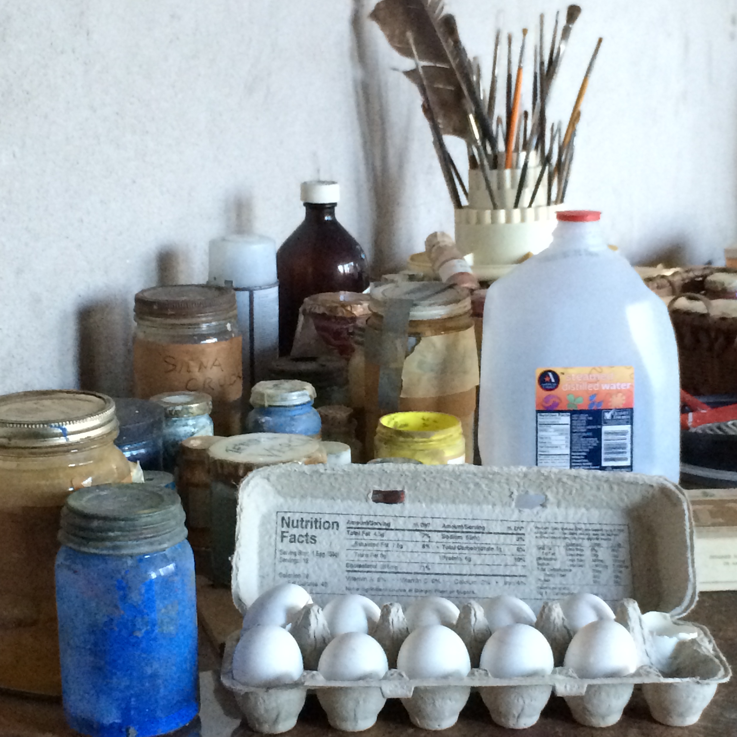
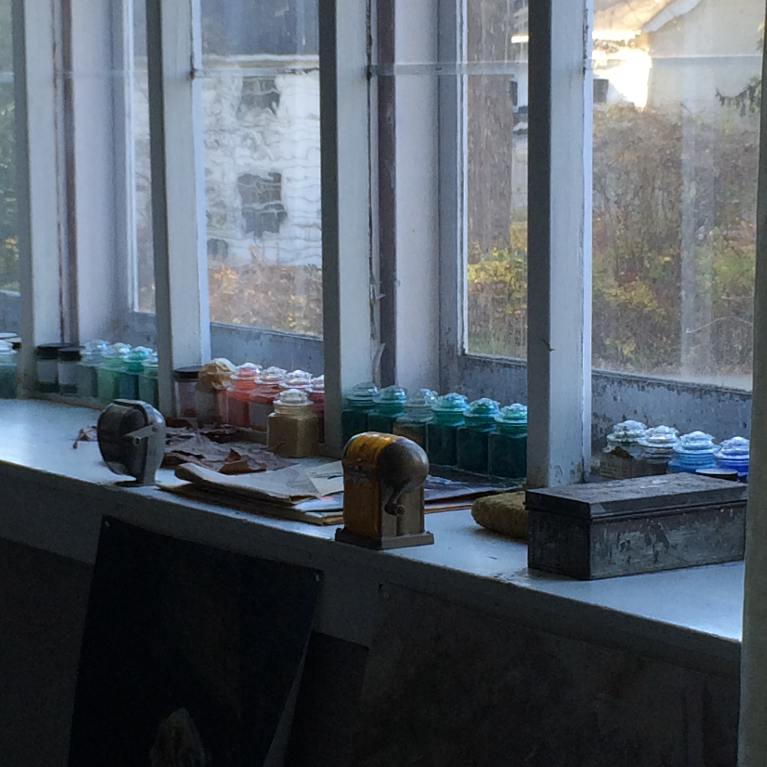
Andrew's studio is set up exactly as the artist left it. As if he has just stepped out of his studio for one of his regular walks in the surrounding countryside. There are drawings (reproductions) strewn throughout the floor. Egg tempera supplies still await his skillful hands and jars of luminous dry pigments line a window's ledge.

Copy of Andrew Wyeth drawings
Jamie Wyeth’s Corner, Chadds Ford, PA
Andrew Wyeth’s Book Collection, Chadds Ford, PA
We were able to see the Kuerner Farm as well which was a huge treat considering that Andrew produced over 370 works of art on the property. There is a wonderful book documenting his time and productivity on the farm called "Wyeth at Kuerners". It is out of print now but if you are able to get a hold of a copy, I would highly recommend it. It contains a personal narrative told by Andrew on each of his paintings from this series including all the preliminary drawings. It is an invaluable insight into the process of a great American master artist. I got my treasured copy from a wonderful friend (thank you again, Karen) but I have seen them available any where from $8 - $249. The curatorial staff at the Brandywine even reads from it during their tours.

The Kuerner House
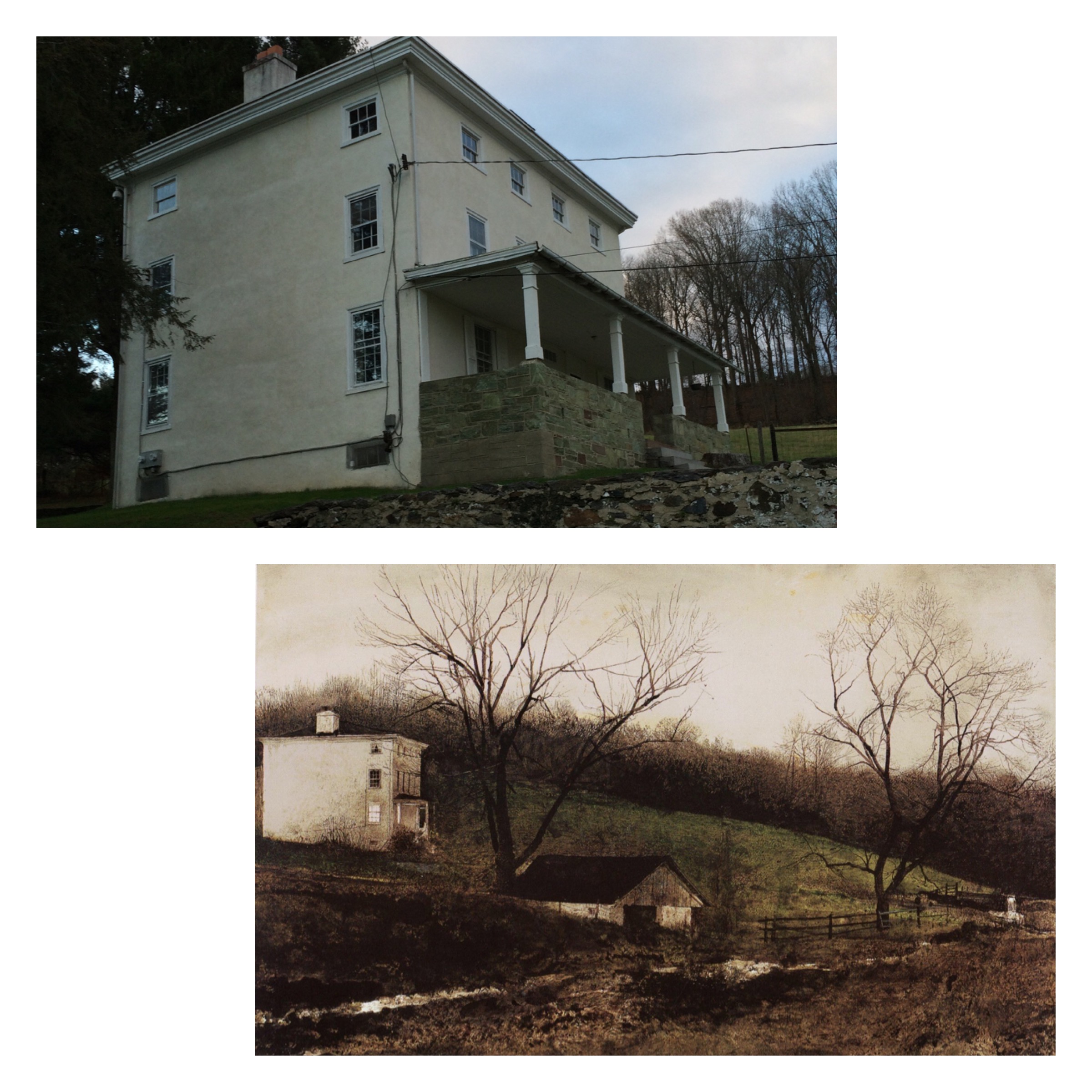
Kuerner House, “Evening At The Kuerner’s”, Andrew Wyeth

Above the sink in Kuerner's Barn. Painting by Andrew Wyeth, “Spring Fed”

My tired son enjoying the view on the Kuerner front porch after a long day of “arting” with Mom.
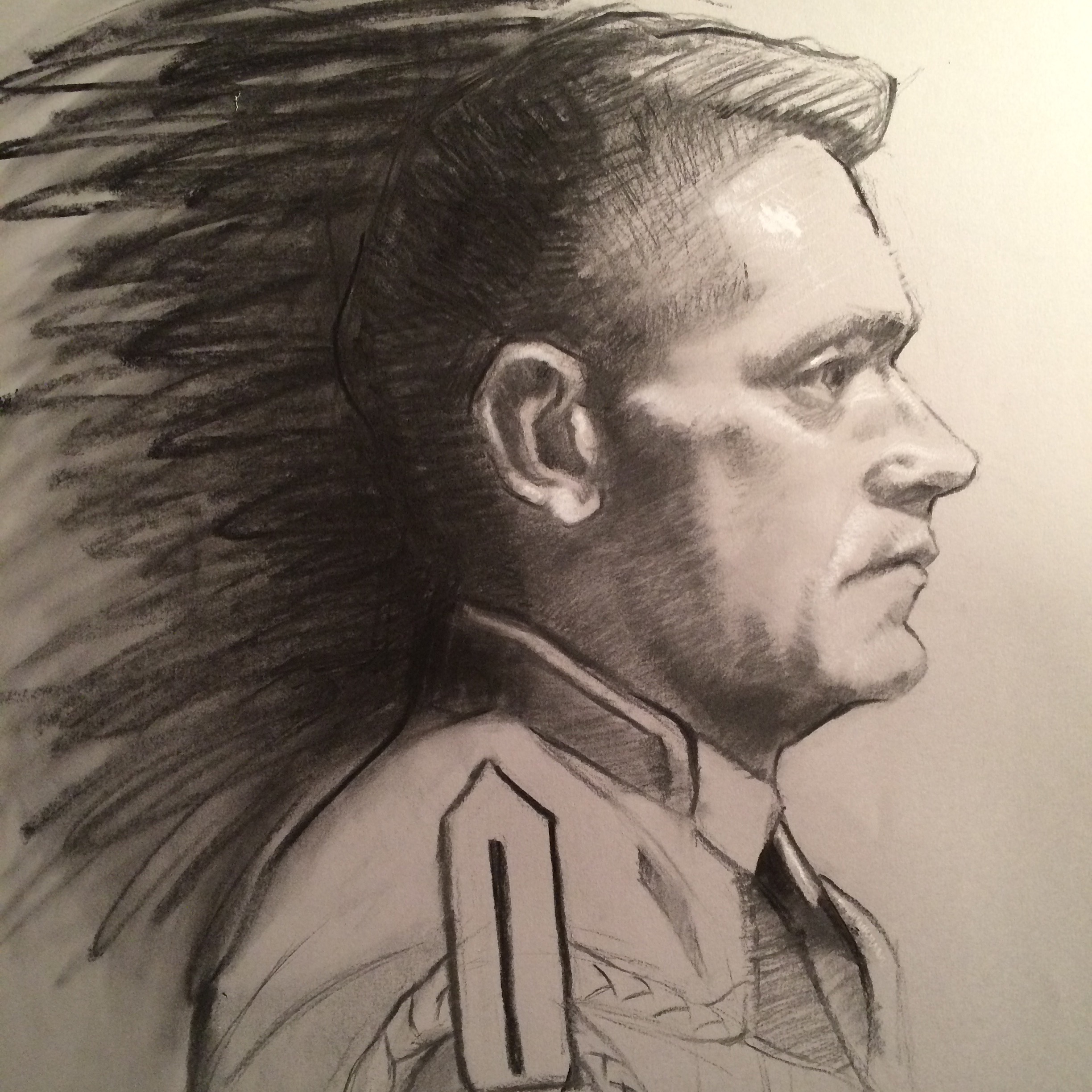
Workshop Wednesday: Teresa Oaxaca, the Figure in Charcoal

TeresaOaxaca_LaPrimavera_3227
This past weekend I ushered in the New Year with a bang by attending Teresa Oaxaca's "Figure in Charcoal" workshop at the Art League in Alexandria, VA on Jan 2 - Jan 3rd. Considering that just the day before the workshop I was a little sleep deprived--and ok, maybe still "recovering" from the festivities, I was really happy and perhaps a little surprised when everything "clicked" for me during the workshop. But perhaps I shouldn't have been, Teresa Oaxaca has a lot to share with her fellow artists so listen up.
Full disclosure: I have been a big Teresa Oaxaca fan from the very first moment I met her in Rob Liberace's classes at the Art League. In fact, I own two of her self portrait drawings and one of her etchings (hint: when she says something is unsold over social media, that is your cue that you can purchase it). Teresa is one of my favorite contemporary artists and in my opinion the most promising. I just love the boldness of her charcoal drawings, the mixture of the gestural abstraction and rendered form. They are exquisite. And the fact that Teresa herself is super sweet and down to earth--I just knew I could learn a lot from her and I definitely did.
The following are my notes from the workshop and I hope you gain as much enlightenment from them as I did.

TeresaOaxaca_Demo
-Teresa's block-in is a big envelope, very loose, light & gestural.
-Sometimes the looseness (gesture) from the beginning is kept through the piece {I would add that it is this initial gesture that gives so much life & contrast of textures in her drawings}.
-She begins with a jumbo soft charcoal piece and initially adds a center line, eye line & forehead line followed by the shadow shapes of the eyes and nose. The rendering of the mouth and chin come second.
-Prefers Canson Mi Tientes paper (smooth side) and vine charcoal.
-Teresa uses a lot of straight hatching lines. "Easier to get structure in and keep it that way."
-Usually works life sized and steps back from the easel often to check her drawing.
-If you want to use crazy, energetic hatch lines like Sargent did in his charcoals (and Teresa does) you must have a solid geometric structure underneath {This subtle but powerful advice was one of the things that really resonated for me}.
In process shots from Teresa Oaxaca's charcoal portrait demo.
-"Geometric shapes render & anchor the drawing."
-Her subjects start off looking more exaggerated in the beginning and then get more accurate as she continues working.
-She spends most of her time developing the light & shadow areas and then will knit them together.
-The nature of charcoal is that it is just dust. Get used to the fact that you will be constantly readdressing your darks throughout the process of creating a drawing.
-Uses a brush to soften along the core shadow on a cheekbone or will just drag the charcoal across.
-Shadows are solid, mid tones are a combination of blending or hatching (veiling).
-"I like to put the directional changes in the shadow shapes."
-She will often put a little speck of white chalk highlight in order to key her values {again, advice worth the price of admission right here}.
-"If your drawing is failing it is because you are not obeying the light/dark patterns."
-Ask yourself on the simplest of Master drawings, "What makes this really work?". Dissect and understand it.
-Most of the drawing will be carried by the in-between places that are either smudged or hatched.
-Make sure the shadow pattern is correct, even on a smaller form like the eye. The big shapes still need to be rendered on the smaller forms. Same rules apply!
-If you know you don't have time, stick to developing structure.
-She often veils in highlights on the planes of the forehead.
-Sargent spent all of his time on the structure and would throw his characteristic slap-dash bravura mark at the very last minute.
-If you don't plan on rendering an area leave it as a block-in or else you will be forced to fully resolve it.
-Gesture is the foundation of a minimalist drawing.
-Take pictures every half hour, it will reveal your own process to you. It also works as a mirror to show you your mistakes.

SuzanneLagoArthur_JamesPortrait_Process
SuzanneLagoArthur_JamesPortrait
I want to personally thank Teresa for a wonderful workshop experience. Prior to this workshop, I never felt completely in control with Charcoal but I definitely feel more in control now and intend on practicing with it more often.
You can follow Teresa Oaxaca and her blog at her website www.teresaoaxaca.com, on Facebook at www.facebook.com/teresaoaxacafineart, on twitter and Instagram at @teresaoaxaca.

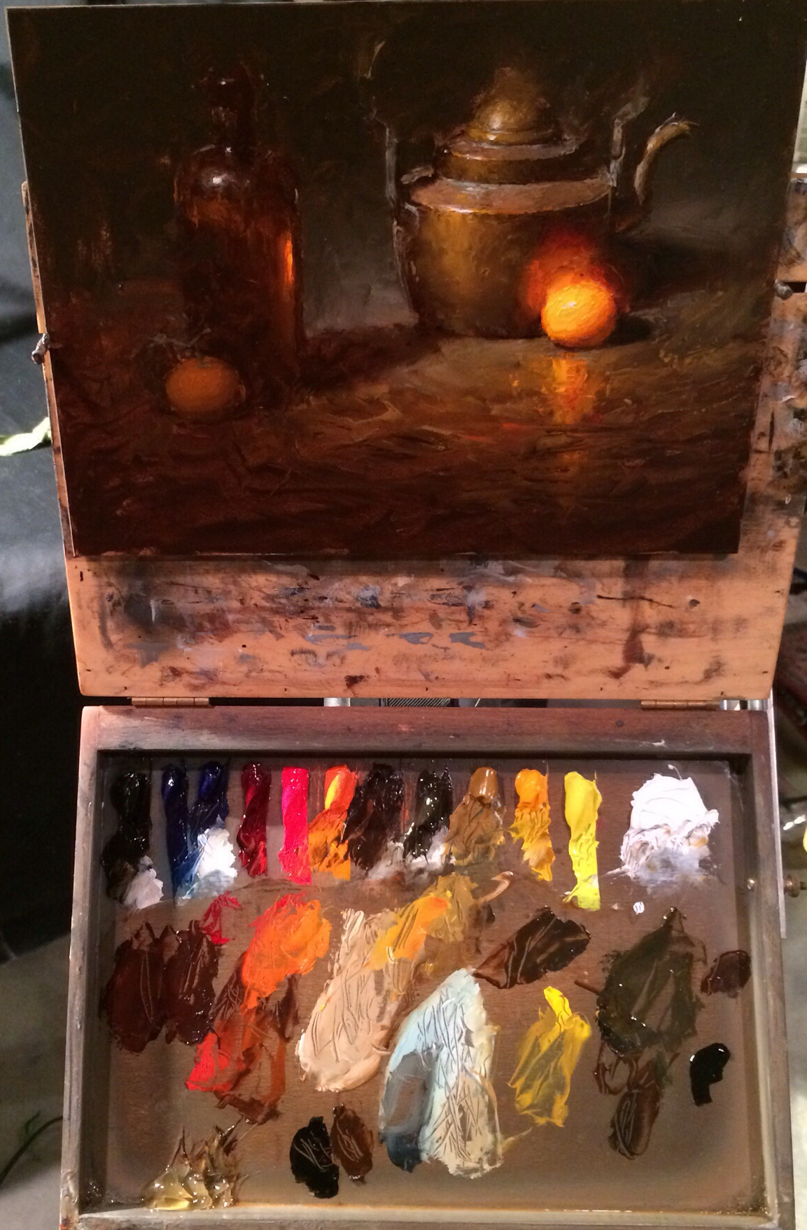
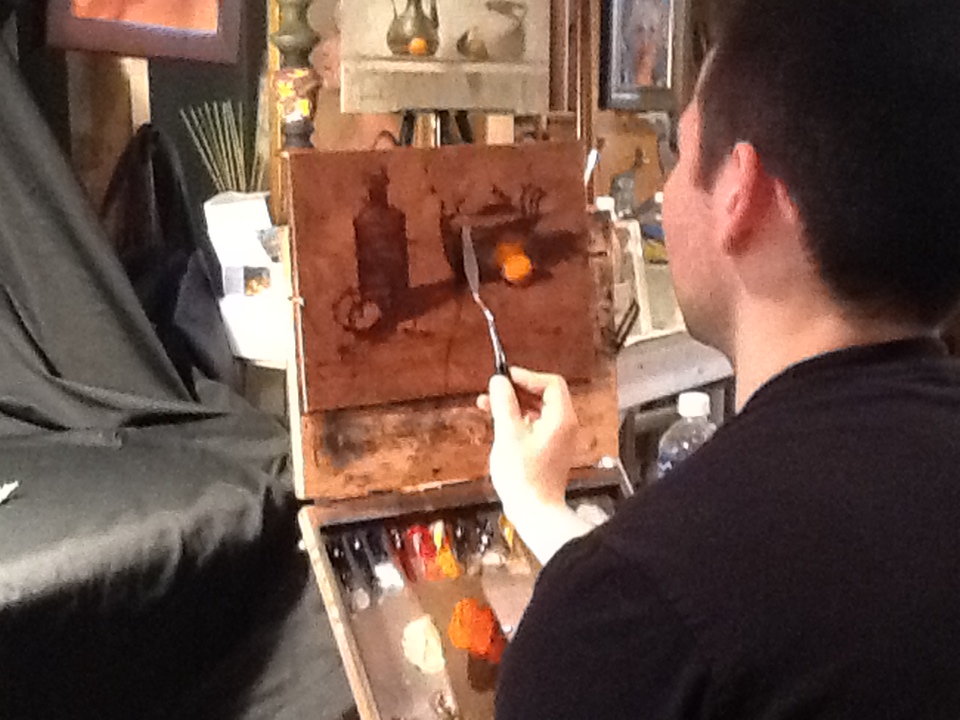
The Making of "Mortui Spinus Tristis"

2015-4-22_StillLife_MortuiSpinusTristi
I thought it would be fun to show some process shots of one of my most recent paintings. I found this sweet little goldfinch one day after she flew into my window. Once I got over the sadness of the whole thing, which took about 30 seconds, I ran into the house to get a freezer bag because I knew she would be the subject of a painting one day. Fast forward about a year, I found myself recently in search of a still life subject to paint under artificial light because it had been raining day after day and the light was horrible for the projects I currently had up on my easel.
So I pulled Franken Goldfinch out of the deep freezer and began placing her on objects in my studio. From a previous experience with a Franken Rooster, I know that frozen birds tend to thaw out really quickly under hot artificial light. So my strategy was to paint the bird alla prima (in one session) which took about two hours from start to finish. This includes redrawing the initial under drawing a couple of times until I had the composition just right to line up with the golden ratio.
The next day I began working on the plate. The following day I finished the Blue Willow design. I did the painting in about 8 hours spread out over a couple of days which I was able to accomplish because I put my covered palette, my painting and my subject back in the freezer in between sessions. I simplified the Blue Willow pattern considerably as I was only interested in getting the "feel" of it. However in future attempts at blue & white pottery, I know I will want to approach the design more abstractly.
The title of this painting means "The death of the Goldfinch" in Latin. Spinus Tristis is the Latin name for the American Goldfinch. Coincidentally, "Tristis" means sorrowful in Latin. It adds to the significance of the painting which for me is an homage to a delicate and beautiful life.
This painting, “Death Of the Goldfinch/Mortui Spinus Tristis” is currently available for purchase.

IMG_2058
Who Makes Up Your Brain Trust?

One of the biggest secrets to success must definitely be to surround yourself with people who support your ambitions and who also push you to evolve into your greatest potential. Obviously your greatest supporter should be your partner in life but it is also equally important to establish a strong support system among like minded colleagues. I am blessed to have many artist friends who are my advisors and who continually inspire me. However there are two in particular that I turn to most often for advice, Elizabeth Floyd and Jonathan Linton.
So how does this brain trust work? Well it all begins by being in frequent contact with one another in support of each other's work. I text or call Elizabeth and Jonathan regularly with my thoughts, questions or WIPs (work in progress photos). Elizabeth and I text daily and have regular FaceTime chats to go over our goals and projects. We plot the course of our individual careers by making suggestions to each other in the areas of commissions, competitions, technique and thematic ideas. Liz and I read ALOT and we are constantly referring books to each other to help us grow. Many of the books I am currently reading are those that Liz has given me including this Hammershoi book she sent me for my birthday to help inspire a series of paintings I am currently working on (thanks again Liz :) ).

Jonathan is a hugely successful portrait artist with many years of experience and a former instructor of mine. You may remember Jonathan from this post. He is the guy I turn to with my nuts and bolts questions on anything having to do with the field of portraiture. And he fortunately lives nearby (or unfortunately for him?) and has yet to lock the door on me when I come by his studio practically unannounced. Jonathan will give me honest feedback on my work and has a keen eye for anatomy and painting/drawing technique. He can always diagnosis what is "wrong" with a painting and if I get his seal of approval on something I know the client will love it.

So who makes up your Brain Trust? If you don't have one in place now I would seriously suggest you think about putting one together because positive relationships like these can add a whole other dimension to your artmaking. But think carefully about who you will let into your circle of trust. You should feel safe and respected with the personalities you surround yourself with so that you can freely share your innermost creative thoughts to them--and likewise, they to you. The right partnership will be obvious and will leave you feeling inspired every time you connect with them.
I plan on interviewing other artists and creatives for future blog posts on this subject. Do you have a remarkable brain trust? If so please drop me a line and tell me about them and how you work together; suzanne@lagoarthurstudio.com. Thanks!

Best Studio Practice: D-Lead Wipes and Soap

31-+6ELKn+L
At the risk of sounding like your mother {stern finger pointed in your direction} I am going to insist that you wear latex gloves every time you paint in oil or any other toxic medium for that matter. Think of it as my own painterly initiative modeled after the "safe sex" campaigns of the 90s. Wear a rubber, every, single, time. But you can take this Best Studio Practice one step further by using D-Lead hand wipes & hand soap. Originally created for fire arm enthusiasts, D-lead wipes & soap break the electromagnetic bond between skin and lead and other toxic heavy metals. Both D- lead wipes and D-lead soap products are inexpensive and are an easy way to protect yourself from serious health risks due to our profession
According to estimates made by the National Institute of Occupational Safety and Health (NIOSH), more than 3 million workers in the United States are potentially exposed to lead in the workplace. Lead interferes with a variety of body processes and is toxic to many organs and tissues including the heart, bones, intestines, kidneys, and reproductive and nervous systems. And Cadmium poisoning is possible due to its low permissible exposure limit, over-exposures may occur even in situations where trace quantities of cadmium are found. Cadmium is carcinogenic which is a scary word for cancer (as if that needs to be any scarier) and cadmium dust inhalation and cadmium fumes may cause flu like symptoms including chills, fever, and muscle ache sometimes referred to as "the cadmium blues." More severe exposures can cause tracheo-bronchitis, pneumonitis, and pulmonary edema. Symptoms of inflammation may start hours after the exposure and include cough, dryness and irritation of the nose and throat, headache, dizziness, weakness, fever, chills, and chest pain. Clearly to avoid air-borne inhalation a good HEPA air ventilator is advised. I purchased mine through Jerry's Artarama and even had my flexible health plan pay for it.
So make your Mama proud. Put on a rubber every single time & be sure to run your HEPA air ventilator when painting in your studio. Enough said, now go clean up your room!

Mastering Work Flow: Jiro Dreams Of Sushi

IMG_2309
A while back I came across this amazing documentary of Master Sushi Chef Jiro Ono, owner of Sukiyabashi Jiro, a Michelin three-star restaurant. I told anyone who would listen, especially artists, that they HAD to see this mind blowing film. You may be asking yourself now "what does a sushi master and an artist (or any other profession for that matter) have in common?" The answer is deceptively simple, mastery of one's craft through a conscious and disciplined daily practice.
Right from start of the film, Jiro issues this edict: "Once you decide upon an occupation you must immerse yourself in your work. You have to fall in love with your work. Never complain about your job. You must dedicate your life to mastering your skill. That's the secret of success and is the key to being regarded honorably."
Jiro approaches his craft in the way of "Shokunin" (meaning artisan), the Shinto belief in executing everything perfectly, every single day, over an entire lifetime. Anything can be approached in the Shokunin way, no job is considered inferior or beneath oneself. The wisdom here is obvious and applicable to anyone's life.
I kept having to stop the movie to take notes. Here is some more advice worth remembering:
"It really comes down to making an effort & repeating everyday"
"It has to be better than the last time. That is why I am always tasting during preparation"
"Each of our vendors are specialists in their field (i.e. surround yourself with excellence and use only the best materials)"
"All I want to do is make better sushi. I improve bit by bit, day after day and progress forward. But no one knows where the top is"
"In order to make delicious food you must eat delicious food (in other words, in order to make great paintings you must see great paintings)"
"Without good taste, you cannot make good food (educate your tastes)"
"If your taste is not better than your customers how will you impress them?"
http://www.youtube.com/watch?v=rhXEML1yKwQ
Jiro Dreams of Sushi is available on DVD through Amazon and streaming via Netflix and ITunes.

My 2015 Word Themes

new-years-resolutions
On this last day of January I want to share with you a strategy that my friend the talented floral still life painter, Elizabeth Floyd, shared with me. It is the exercise of adopting "Word Themes" to direct your efforts during the New Year. Word Themes are motivating and inspiring, but do not bog you down with the minutiae of specific goals--great for those who don't have that all figured out yet. It is a mantra you keep running in your head as you plan your daily life. Check out Liz's blog post for her 2015 Word Themes here. My words for 2015 are "More", "Limits", and "Rebirth". Now at first glance the first two seem contradictory but in my mind they actually go hand in hand. "More" stands for completing more work and being more prolific. But as someone who tends to put my blinders on and work unceasingly through my commissions, I realize that I need to set "limits" to my day in order to be more healthy and balanced. For instance, instead of squeezing every minute of studio time during the period that my son is in school, I will instead work one hour less so I can ensure I get my daily exercise and have time to take care of my home (believe me, it needs it). It also means that I will begin working on several projects at the same time so that I can create my own body of work outside of my portrait commissions which will enable me to participate in gallery shows once again. And lastly but most importantly is "rebirth". There are deep creative influences beginning to surface in my work right now and I am filled with excitement of where they will take me. I hope my words help you to come up with your own and if you do embrace them, drop me a line here and let me know what they are.
Bring it, 2015! We are ready.

Workshop Wednesday: Rick Weaver's Abstraction for Realists

rickweaverdrawing
I've had the pleasure of taking two workshops from the artist, Rick Weaver. Rick has extremely impressive credentials having received his formal art training in New York at the National Academy of Design, the New York Academy (now known as the Graduate School for Figurative Art), and the Art Students League. He studied painting and drawing with a number of notable art instructors, including Robert Beverly Hale, Ted Seth Jacobs, Ron Sherr, Harvey Dinnerstein and he earned his Master of Fine Arts from the University of North Carolina-Greensboro, where he was influenced by the sculptor Billy Lee.
I can tell you from experience that he is a deep thinker who stretches your mind alongside your skills. He seems to come at things always from a new angle and perhaps this is because he is both a sculptor and a painter, and extremely accomplished at both. I've discovered that the best teachers show you how they think which is much more powerful than learning someone's style. Rick is definitely that kind of teacher. If you ever have the opportunity to take one of his workshops, I would strongly encourage that you do so.
Below are my notes and photos I took during his workshop this past July which was hosted in the beautiful studio of Francie Freitas. Thank you Francie for having included me in this wonderful workshop.
Rick Weaver Workshop Abstraction for Realists July 22 2014
[Rick began Day 1 of his workshop by having us look at prints of masterpieces he intentionally distorted digitally (using filters) to better show us the degree of abstraction underpinning the work.]

IMG_1606-0.JPG
When you look at a great masterpiece in a museum, if you pay attention you will always notice an emphasis on composition.
"Ask yourself why an artist did things. Why a cloud there? Why that shape?"
Great painting is a combination of formal elements; line, shape, color & value organization.
Space is not a formal element but it collects form together for us. So does rhythm, so does light. Visual weight etc.
"There is a natural trade off between the amount of resolution (finish) you want and the base abstract power of the painting."
"Making a painting is not copying nature. Old masters made significant changes to what they observed in making their paintings. Be aware of this and be sensitive to it in your work."
"Make yourself make changes for the better in your work."
There are 3 main elements of painting 1. Subject Matter, what you see in the painting, direction of etc. 2. Form= line, shape, color (value) 3. Content

IMG_1608.JPG
The early stages in a painting are an opportunity to give your painting a strong abstract power to build upon.
Don't think of objects as separate. Think of them as joined, like in their shadows & forms, color.
If you think in terms of object you are ultimately separating. If you think inclusively you will see all kinds of connections.
Like in figure, the shadow is often indicative of the color of the drapery.
Show those connections.
Rounded lines are organic.
Angled lines are inorganic.
There should be a strong connection between form & subject matter.
Square, is a non directional shape, neutral. Look at Lincoln Perry. Be wary of putting something right in the middle because it will be weak.
Look at subject matter and see it as pattern within the rectangle. (Matisse)
There aren't really any definitive books on composition out there that I am aware of but these books are a start:
-Erle Loran book on Cezanne composition
-Andrew Loomis' book on perfect mean
Things you can physically do at the start of a painting to think formally:
Connectivity/Unity-literally make things connect in the beginning.
Always make a rectangle on your page to set up your boundary, picture plane.
"As soon as you put a silhouette you are making an object". Draw a two dimensional shape showing how the subjects link into each other from edge to edge, line to line. Work from the edge of the picture plane in. You can get in touch very quickly with the whole thing this way. Picture remains open, promotes flexibility.
You can use a more organic or architectural line.
No line has anything to do with the object. It functions just form connectivity. Same thing with tone, divide the subject into 2 or 3 values.

IMG_1611.JPG
"If I can't get a preliminary sketch to say/do what I want it to in 3 values, I never go further with it."
What seems to visually connect to you? You got to want it. Make it connect. Be on the hunt for those 3 values and only those values.
Vertical spacing pushes things towards you.
Horizontal spacing pushes things away.
Pay attention to your "sit down" (object touches plane) spacing will give you the horizontal space.
Paying attention to negative space will give you the vertical spacing.
Ideally make your circuit within a minute round the entire drawing for that first exploratory line.
Exercise to just allow things to connect more than anything else (mine was too slow).
Am I able to move into the picture? Is there ground plane? Foreground, middle ground, back ground?
Day 2
Demo 4 color palette, primaries + white Permanent rose, Ultramarine blue (or thalo blue), cad lemon

IMG_1620.JPG
Subject of demo: Hue-the most problematic issue of color.
Gestural start, linking forms. One continuous line.
Thinned down ultramarine
Uses a brush larger than he's comfortable with to keep him from drawing objects.
Holds brush perpendicular to surface, carving shapes as he masses in.
Tries to think in terms of three values, light, dark mid tone.
When he starts adding local color he looks to see where else it shows up, shadows, reflections etc.
"As I am working I am trying to reinforce my idea (initial gesture/approach) with the way I paint. Being consistent with the same approach through out the painting."
"The last thing I want to do is complete an object with this approach. I want to keep things open."
"I am starting to think about the quality of lights anything in the light has both yellow and red to it. You must use both."
"I really try to keep it formal, stay away from object making as much as possible."
"With the figure, I approach the same way but if I want a more traditional approach I take more care with the drawing. "
I will go back and introduce the (unifying) line in drawing while painting (as many times as needed).
IMG_1628.JPG
On a personal note I want to thank Rick for helping me to stretch both my thinking and my technique. I will be back for more workshops. You can count on that!

Face Off Heavy Hitters

PrincipleGallery_FaceOff_Aug14
The most happening place to be last Friday was at the Principle Gallery in Old Town Alexandria for their annual alla prima portrait "Face Off" featuring gallery heavy hitters; Mia Bergeron, Elizabeth Floyd and Cindy Procious.
What is that you say? You didn't know about it? Well I guess that just proves you're not as cool as me. Luckily I am feeling generous today and will give you this brief little wrap up.
Veteran Face Off champions Mia Bergeron and Cindy Procious went toe to toe with a new tenacious challenger, Elizabeth Floyd over 3 hours with plenty of breaks in between for schmoozing and attending to their adoring fans. It was obvious early on that all of them had a good likeness of the model, Mr. Franco Landini, who is the owner of several Old Town restaurants including Landini Brothers and is something of a local celebrity.
Events such as these at the Principle Gallery always attract the hippest artists from the local painting scene. Besides my fabulous self in attendance were Jonathan Linton, Rena Selim, Susan Gallagher O'Neill and Abigail Davis Muncy.
Honestly, next time you should really just come see it for yourself. But until then you will be able to watch it on Youtube and I will post that link here when the Principle makes it available.

What are you painting?

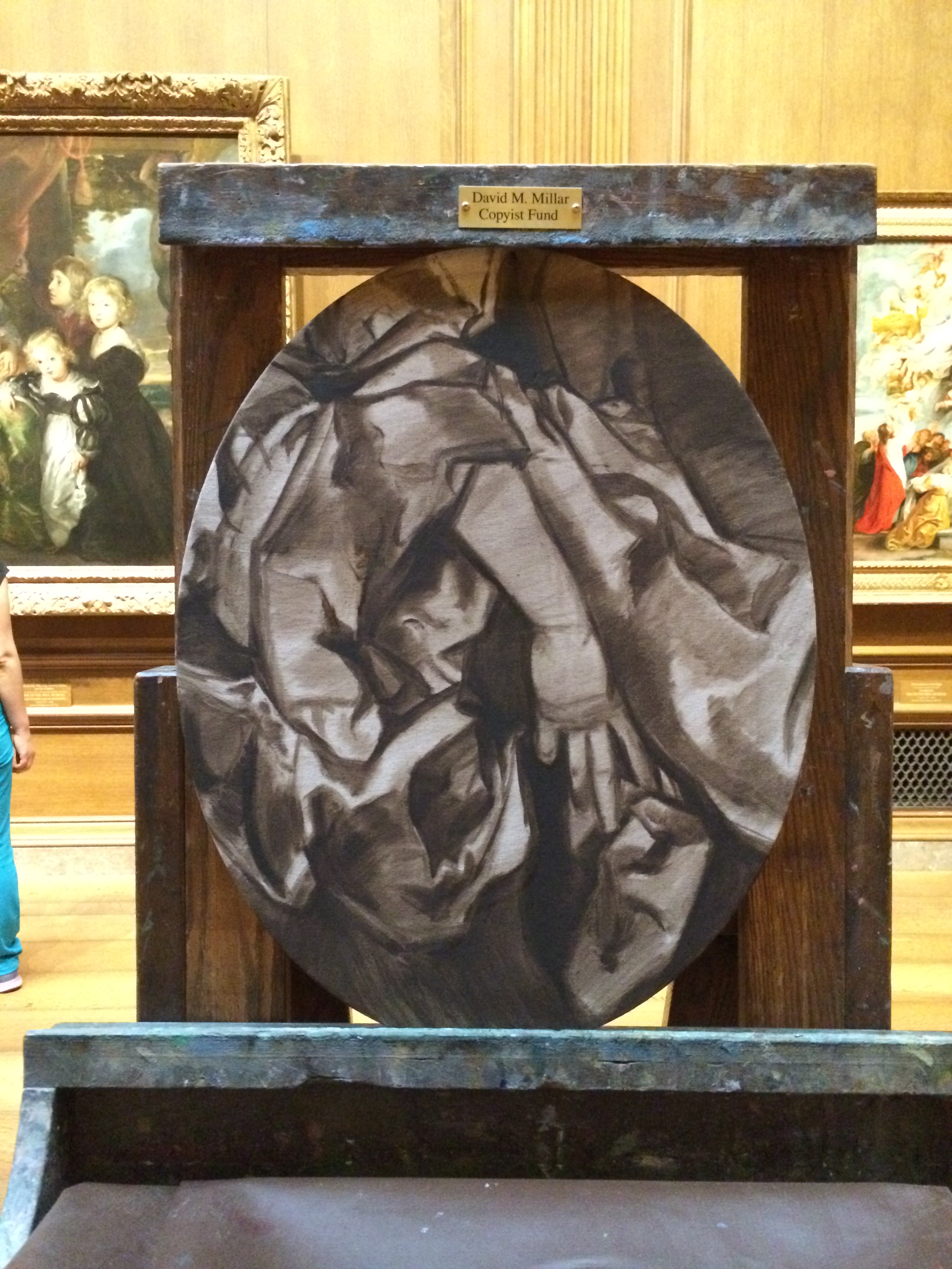
SoestCopy_Aug7_a
I'm only about 9 hours into copying this hand study of a portrait by Gerard Soest at the National Gallery of Art here in Washington DC. The reaction to my copy by the public has been extremely entertaining and at times has had me in stitches, like today. I guess visitors are not used to seeing a person paint only a small portion of a painting in the collection, and the oval shape I chose to emphasize the dramatic swirl of the dress and the gesture of her hand is unexpected and definitely throwing people off. But what seems to be the icing on the proverbial cake is that it appears to people that I am not painting the picture in the right color. Um, what gives?!! [Insert Valley Girl tone here]
Well there are some really good reasons for all the choices I have made so far in regards to this painting. The first decision I made, that of doing only a hand study of the larger painting is because I only have the months of July & August to copy and I thought by narrowing my subject I could get more accomplished in that time. Second, the oval shape is an intentional decision as far as the composition. In addition, if I have more time, I will paint another oval of her other hand to have a matching pair. And lastly, the colors you see before you are just the underpainting known as a "grisaille". The areas that are more grey are called a "closed grisaille" meaning they include white, plus the umber I used previously and prussian blue to achieve the overall modeling and value relationships. Those are the areas that I painted today. I will indeed get around to the actual color of the painting, eventually, in thin glazes of color. It is the way this painting was painted and since I am more of a direct painter, learning this technique is part of what drew me to the painting.
Below are some of the amusing things I have overheard/ or been asked directly while painting in order of frequency:
"What are you painting?" (Um, a hand and her dress....)
"Are you trying to paint abstractly?" (Yes, actually. A strong abstract design is the basis of all realistic painting)
"Dad, I don't get itttt!" (Snicker)
"Esa mano esta horrible/That hand is horrible" (Said by someone who doesn't know I speak Spanish. Ouch? ;)
I'll end this post by saying that painting is a process that is sometimes not self evident. So hang in there with me, eventually you will be staring at the exact doppelganger of that hand. Just don't hold your breath waiting.
SoestCopy_Underpainting
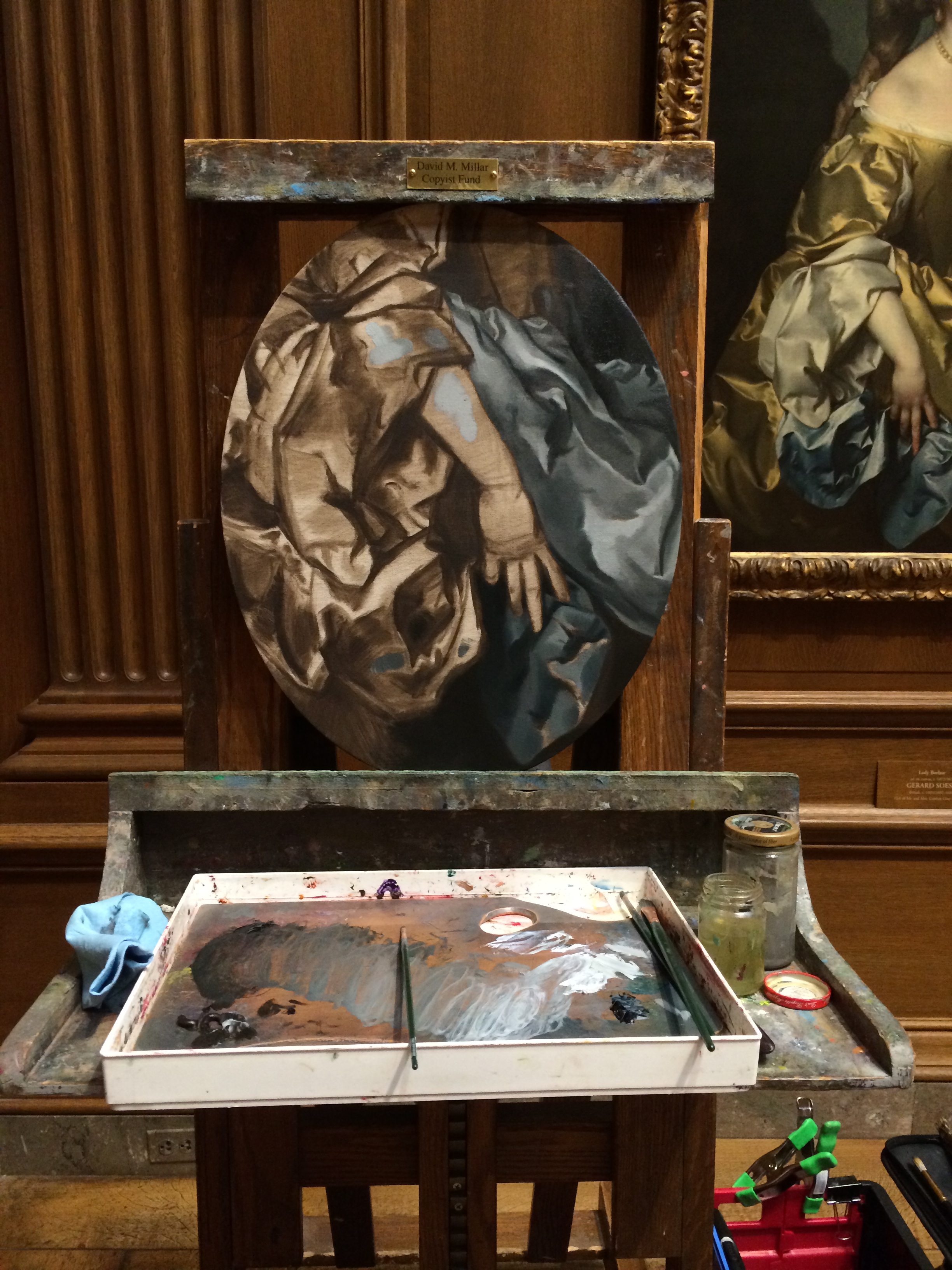
SoestCopy_Aug7_b

Maria Causey on Visiting the WLAST Studio Tour and Collecting Original Art

 http://www.olamarinteriors.com/blog/2014/08/05/add-personal-style-into-your-interior-design-with-local-art
<a href="https://lagoarthurstudio.files.wordpress.com/

Western Loudoun Artists Studio Tour (WLAST)

WLASTPostcardSLA
I will be participating again in the WLAST tour as a guest artist at Franklin Park Arts Center, stop # 32 in Round Hill, VA this weekend, June 21 & 22 from 10 AM - 5 PM. The paintings above, and many more including examples of my portraiture will be on display and for sale. I will also be conducting paintings demonstrations through out the weekend. Consider making a day of it by visiting the studios of more than 60 artists in Western Loudoun Co. You will see painters, potters, print makers, sculptors, jewelers, fabric artists, photographers and so much more! There will be something to suit everyone's taste & interest. I hope to see you there!

Technique Tuesday: Dirty Brush Holder

20140603-212145-76905459.jpg
I came across this Technique Tuesday "hack" recently when I discovered the amazing alla prima portraits of Felicia Forte on Instagram. A student of hers brought her a bag of dried beans one day and suggested that she use them to hold her dirty brushes in place while painting. I saw that post and said "Eureka!", most probably out loud, and then ran upstairs to my pantry where I had stored many bags of dried black beans (a must in any Cuban American kitchen). I chose to use an old but cherished mug which features a ghosted image of my Mom and son as my new dirty brush container. My Mom was the one who taught me how to make black beans the traditional way--so it seems only fitting.

Mastering Work Flow: Black Boards
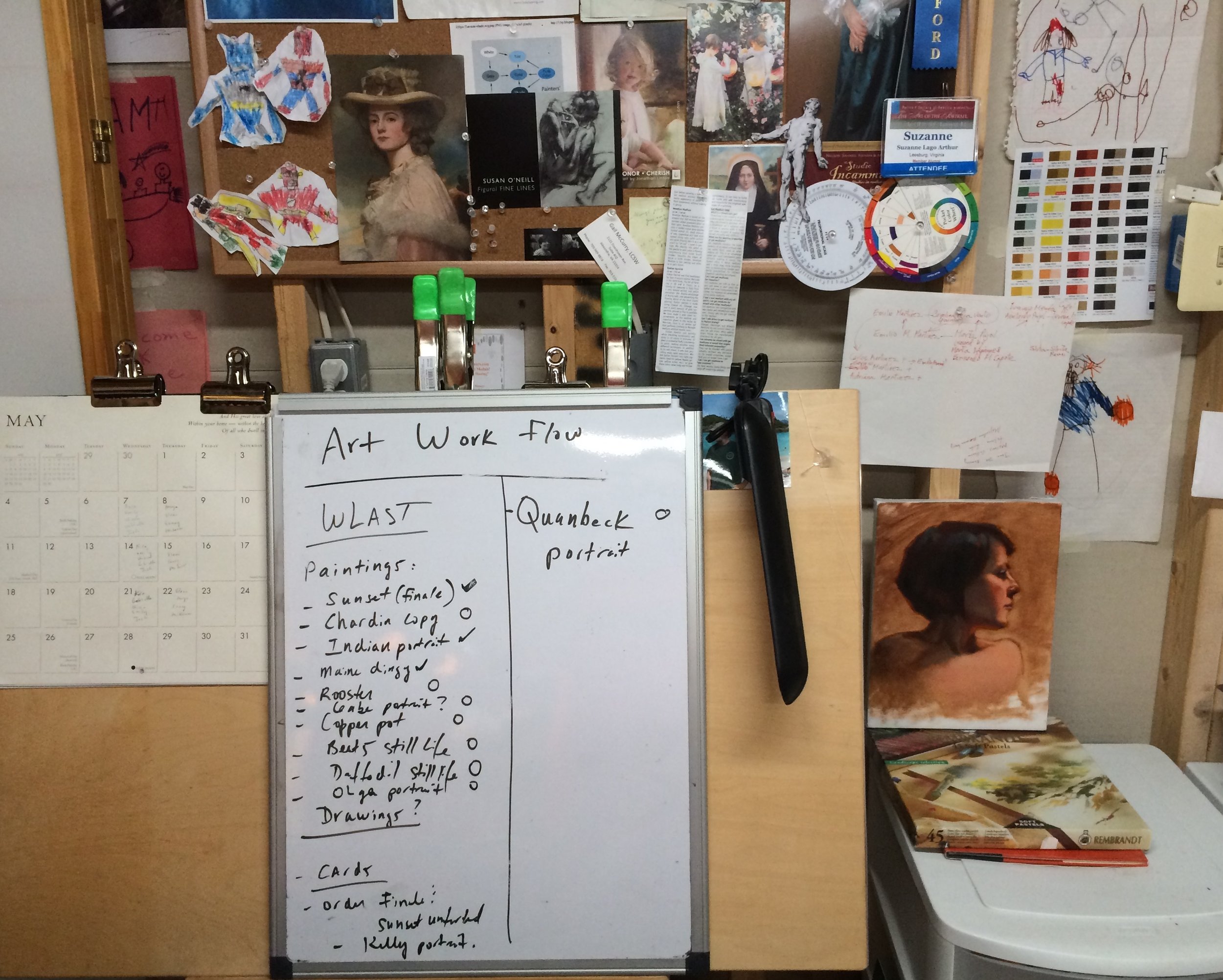
WorkFlowBlackBoard.jpeg
Here's a little peak inside my studio. I am currently working hard at getting a body of work together for the Western Loudoun Artists Studio Tour (WLAST) which is scheduled for June 21 & 22. At the same time I have a double portrait commission half way done. I need to work on all my projects at the same time and I need an easy, daily reminder of where I am in each of those projects. I grabbed this low tech Mastering Work Flow technique from my bestie, Dana Aldis a couple of years ago and I find it really helpful to keep one on task while avoiding pulling out all of your hair.
At a glance I can see what the project is and whether or not it is complete (check mark = done, "o"= open). I could take this one step further and diagram out how long I think I have left on each project and then schedule my day accordingly. And I might just do that as I get closer to my deadlines.
Or I could just simply ignore the white elephant in the room...

Mastering Work Flow: Manage Your Day to Day
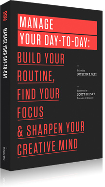
Image
Dear Readers- I have been selfishly keeping something from you. For a little while now I have been reading books and following blogs that are dedicated to improving schedules and harnessing creativity on demand: that is mastering the perfect daily work flow.
It began when I cam across Cal Newport's awesome Study Hacks Blog. Then one day I stumbled upon the Accidental Creative podcasts. From there I discovered 99U and their book Manage Your Day-to-Day: Build Your Routine, Find Your Focus, and Sharpen Your Creative Mind (The 99U Book Series) which I would like to share with you today. What blew my mind about all the above is that there is a whole industry of academics and professionals whose sole focus in life is how to improve your creativity. This is clearly untapped material for all of us working in the creative on demand industries. Whether you are a fine artist, graphic designer or writer, the techniques are universal.
I highlighted almost every page from Manage Your Day to Day but here are some of my favorite quotes and suggestions:
"Specifically, it's our routine (or lack thereof), our capacity to work proactively rather than re-actively, and our ability to systematically optimize our work habits over time that determine our ability to make ideas happen."
"Creative work first, reactive work second. This means blocking off a large chunk of time every day for creative work on your own priorities, with the phone and email off".
"Certain times of the day are especially conducive to focused creativity, thanks to circadian rhythms of arousal and mental alertness. Notice when you seem to have the most energy during the day, and dedicate those valuable periods to your most creative work."
"Frequency makes starting easier: Getting started is always a challenge. It's hard to start a project after a break. By working everyday, you keep your momentum going. You never have time to feel detached from the process."
By utilizing the suggestions in this book I have improved my daily work flow and it has made all the difference. I now rise everyday at 6 AM, even on weekends when I get some valuable hours in the studio before my family is really up and moving. I have returned to painting every day, and I mean every single day and it has made things run more smoothly by allowing me to keep my head focused on my projects. And lastly one of the biggest take aways I took from this book was to leave my reactive tasks (those demands made on me by others such as text messages, emails and phone calls) to the afternoon after I had gotten my studio time--the most important proactive time--out of the way for the day.
So if you don't hear from me immediately, you now know why. ;)

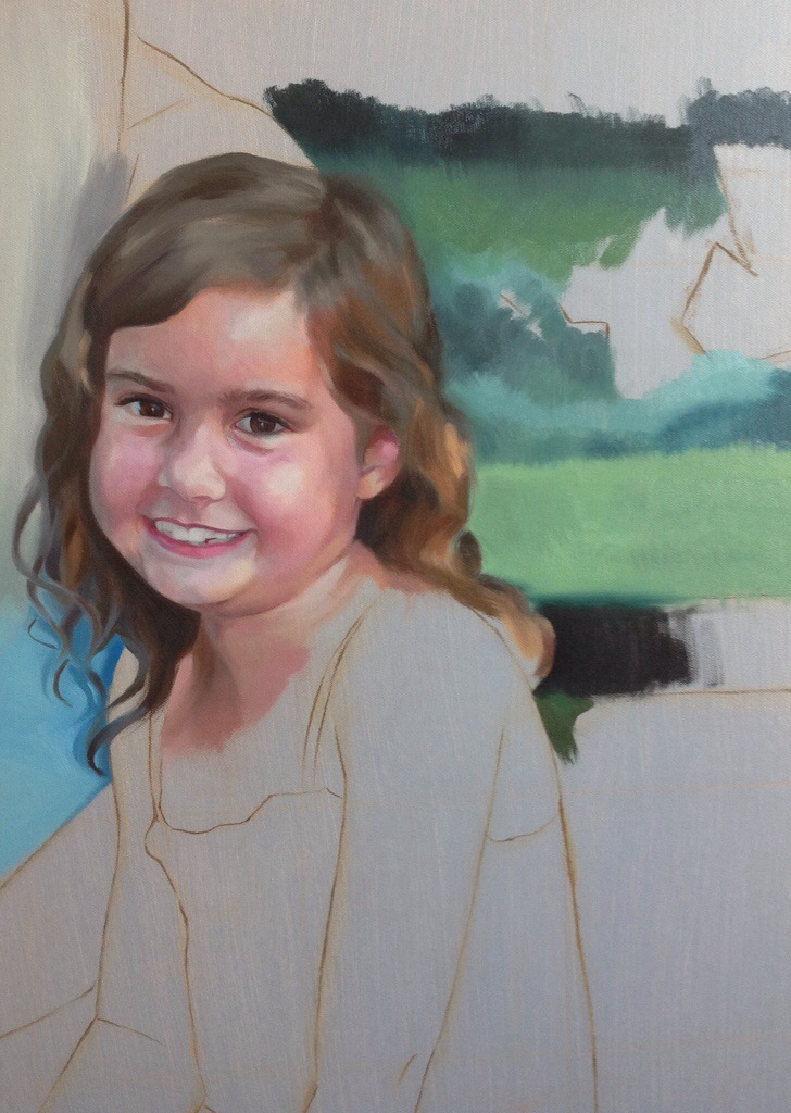
What's On My Easel
20140322-202336.jpg
This sweet little girl is part of a double portrait commission I am currently working on. You can't really tell from this picture, but I am using a lot more paint here and aiming for more expressive brush strokes all around. And another new approach for me is the palette I am using, it is basically the Zorn palette with three additional colors (Cad red, Cad yellow light, Yellow ocher, Black, White, Prussian blue and a color similar to Magenta).

Impasto Logs 6: Pure Awesomeness

Impasto Logs
I have been anxiously awaiting the latest installment of David Cheifetz's awesome painting podcast. It is one of my absolute favorites to listen to when I'm in the studio. Not too long ago I went on a bender and heard ALL of them while painting and was left wanting more. So I was really happy today to discover that he had published a new one, #6 in the series, on the subject of composition which was a topic he covered in great depth at the recent workshop I took with him. Imagine my surprise then when I heard him mention my name, in particular the copious notes & blog post I wrote about his workshop. I was literally grinning from ear to ear when I heard it and somehow managed to keep a paintbrush moving in my hand. Thanks so much for the shout out, David! You totally made my day!
To listen to David Cheifetz's wonderful podcast, please click on the Impasto Logs logo above.

Technique Tuesday: David Cheifetz Workshop Notes
David Cheifetz's knife painting demo from our workshop.
"Paint with paint"
The mantra most frequently uttered by the masterful David Cheifetz at the 3 day painting workshop I recently participated in was simply, "Paint with paint". And David really meant it. In his demos his brush or palette knife was always fully loaded with a glob of yummy paint every single time he touched his canvas. We quickly discovered that he wanted each of us to do the same.
It was such a frequent utterance that fellow painter J Lyndon Douglas cheekily observed, "Amazing that paintings are made with paint. I think what I have been producing until now could be called smudgings." After laughing and probably snorting at his statement, I realized that J was really on to something. To see the amount of paint David Cheifetz skillfully uses while painting is a true revelation. Anything less just looks flat & lifeless in comparison. It has me very much rethinking how much paint I use in my own paintings, or smudgings as J would say.
Here are my personal notes from the workshop to share with you all. Many of these concepts were new to me. Enjoy!:
-Emphasize the values in your primary subject and dilute them everywhere else. You want your darkest dark and your lightest light on your primary subject.
-When setting up a still life, contrast secondary objects by picking darker subjects against the light of your primary subject. Always think dark vs. light.
-Think groupings. Don't scatter your subjects too much so or else they will compete against each other.
-"I always go for fear in a painting. If you are uncomfortable about something in your painting that is a good thing, it pushes you. Try to have at least one thing in each painting that makes you feel that way."
-Before you start a painting get a clear mental picture of what you want to paint. Sit, stare at it. Imagine it completely in your head the composition, area of focus, values and edges. Then begin to paint, and only then.
-Think surface/fabric. Do the folds add to your area of focus? If not take them out. Simplify.
-Make sure the light is directed on your primary subject.
-Example: When painting a ball of yarn, subdue any strings that leave the main form (skein). It should not compete with the ball of yarn itself.
-Example: Killing an apple (secondary object). Subdue it by not rendering it as well, more flat. Subdue chroma, value, everything.
-Your set up (composition) is just a tool for your narrative. Don't feel chained to it if it is not right.
-Cheifetz prefers to paint small. Mostly 9 x 12, 8 x 10 or 11 x 14.
-He sets his palette up from transparent colors to opaque. His colors include (but not in order): ivory black, phthalo blue, ultramarine blue, alizarin crimson, cadmium red, cadmium orange, burnt umber, raw umber, yellow ochre, cadmium yellow, cadmium lemon and titanium white.
-You want your lights to be painted in mostly opaque colors because they attract the most light rays visually.
-Begin your under drawing by getting in the abstract shape of the shadows.
-Indicates the table line. Positions objects within the composition by making vertical and horizontal marks.
-He prefers compositions that are eye level. They elevate ordinary objects by bringing it to a "human scale".
-He prefers to paint on a dry panel (no oiling in).
-Use enough medium to be able to draw. Prefers Gamblin's Megilp.
-A tip on drawing straight vertical lines by hand: Make micro adjustments back and forth as you lay down the line. The overall impression will be a straight line.
-Jumps right into massing the objects & shadows (like an open grissaile). He immediately moves into his lights with color (direct painting) working first on the highlight of his main subject and moving out from there.
The early stage of David Cheifetz's knife painting demo.
-Put one or two generous strokes of paint before changing colors. PAINT WITH PAINT!
-Paint your backgrounds as lovingly as your objects.
-Lays his color down with filberts in long tiles.
-When painting a portrait, pick your area of focus and then let everything else melt out.
-Begin your painting with your subject and end it there.
I want to personally thank our host for the workshop, artist Tricia Ratliff of Agile Arts Atelier for conceiving this workshop and inviting me to participate. And thanks above all to David Cheifetz for his exceptional instruction and the individual attention he gave to each of us. I'd like to also add that David hosts his own awesome podcasts called The Impasto Logs that are all about painting and are especially wonderful to listen to when painting, or smudging.
20140211-215011.jpg

Technique Tuesday: Cleaning Up Your Act {and Brushes}

Last week I brought you Teresa Fischer's tip to clean your brushes with walnut oil. And because I had begun to hear similar things from other artists and because even Rosemary herself of Rosemary & Co. recommends cleaning your brushes with oil, I had decided to try it for myself. Then last Friday at my weekly class with Rob Liberace, my art cohort Carter Corbin brought in this product called Jack's Linseed Studio Soap and offered to let me try it. When I looked at the bottle I instantly remembered that I had a little sample of it waiting for me at home that I had never opened. So thanks to Carter, I then did something I never do after workshops & classes, I actually cleaned my brushes. It was such an amazing experience with this product! It is all natural, made simply of linseed oil & soap. And like conditioner on hair, my brushes eagerly soaked it in. I am proud to say I have officially reformed my ways and now clean my bushes everyday with a combination of Teresa's technique (wiping the color off with oil in between uses) and then using Jack's Linseed Studio Soap at the end of the day to thoroughly clean them. Goodbye stinky, toxic OMS! Turns out I never really needed you after all.
I want to thank Teresa & Carter for opening my eyes to this new Technique Tip and also Susan Gallagher O'Neill for serendipitously picking me up a large bottle recently at our local art store. I have the best art friends!