
Technique Tuesday: Teresa Fischer's "Go To" Brushes and Brush Cleaning Method
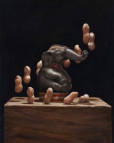
"Peculiar Pachyderm". Oil on panel. Artist, Teresa N. Fischer.
One look at Teresa N. Fischer's paintings and you know you are seeing something revolutionary in the field of still life painting. Her theatrical and witty compositions are often clever observations of childhood experiences, inferred by the juxtaposition of antique toys and other still life objects. One has only to look at her painting "Peculiar Pachyderm", one of my all time favorites and a finalist in The Artist Magazine's 30th Annual Art Competition, to feel and see the magic in her work.
Teresa is a graduate of the Savannah College of Art and Design where she met her husband, the illustrator Scott M. Fischer. She is an award winning member of both the Oil Painters of America and the International Guild of Realism and has been a finalist many times over in the Art Renewal Center's, International Salon.
I had the immense luck of meeting Teresa several years ago and instantly found a nurturing and supportive friend who was willing to share her experiences with me, have studio chats via Skype and even meet for dinner on the occasion she's in town for one of her openings at the Principle Gallery in Alexandria, VA.
In keeping with Teresa's generous spirit, she is actually sharing twoTechnique Tuesday tips with us today! Hooray! Here is the first:
"These are my two favorite brushes that I use. Robert Simmons white sable series 721 one strokes (a long bristled flat) and series 750 script (a longer bristle liner round).
I don't use a lot of small round brushes for my fine detail work. For me I find them difficult to use. They either don't keep their points which can be frustrating or hold enough paint. With the 750 script I can pull a very clean thin line, and the point gets really thin which allows me to do very tiny details. In this one brush I have a greater choice over the thickness of those details or their size.
Of the series 721 one strokes (flats), again I prefer the longer bristles. I like the spring of them. Shown in the picture (above) is the 1/4", my other favorite size is the 1/2". This is my work horse brush. I lay almost my entire underpainting with these two sizes. I can block in bigger areas and turn it on edge and drag a very nice clean line. I find that very versatile. If I get too caught up and tight, I grab the one stroke and start blocking and chiseling the form. It feels more like I am sculpting with paint.

TFischer1
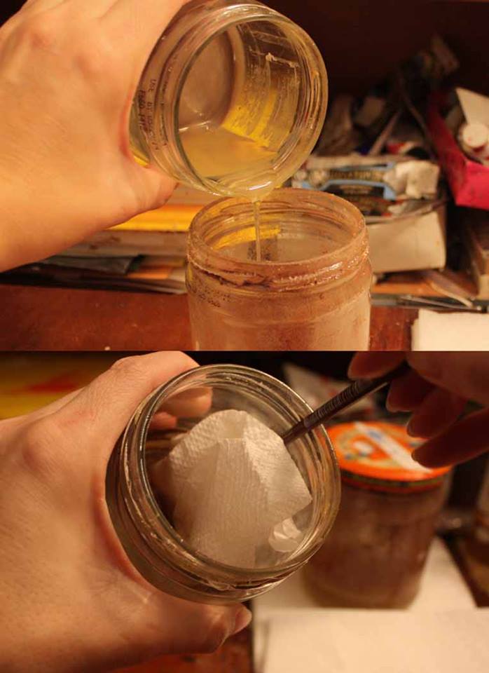
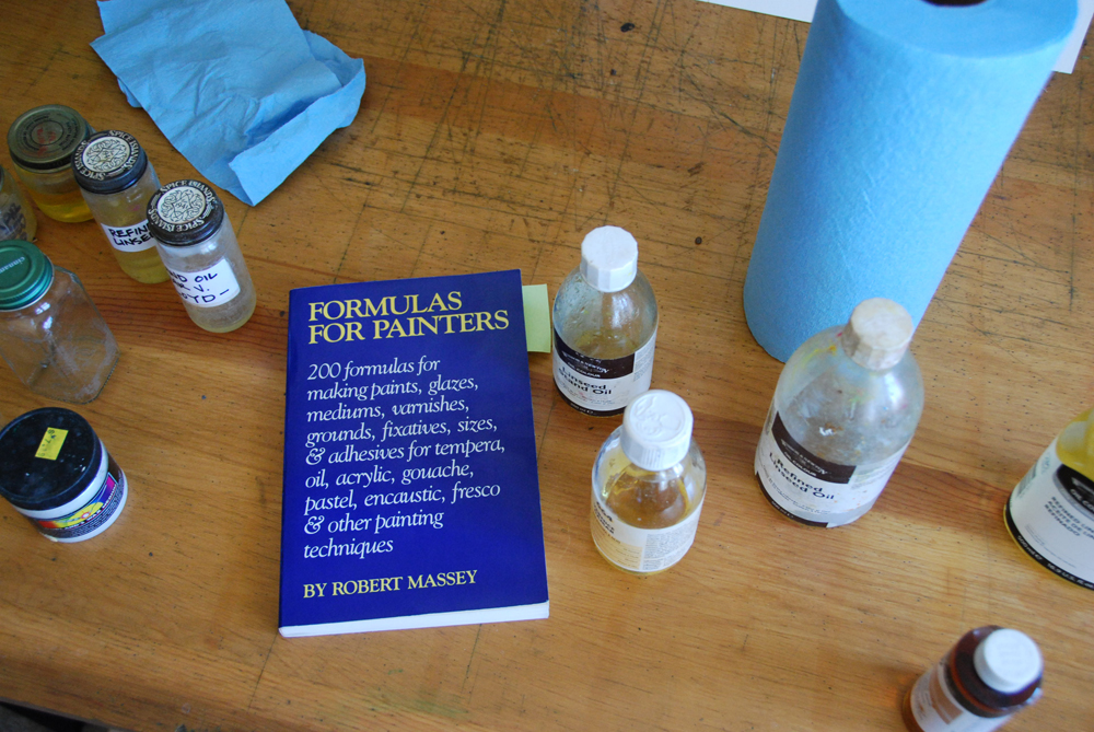
The other thing I do is I rarely use turp to rinse my brushes. During a painting day I use walnut oil to rinse my brushes. Mainly to try to be healthier and my brushes seem to like it. At the end of the night, I give them a rinse in turp or OMS, them wash them using either Masters brush cleaner or even Palmolive dish soap. Because the walnut oil is a little more expensive I don't want any to go to waste , so I utilize the two jar system. After the oil settles, the oil and sludge separate.
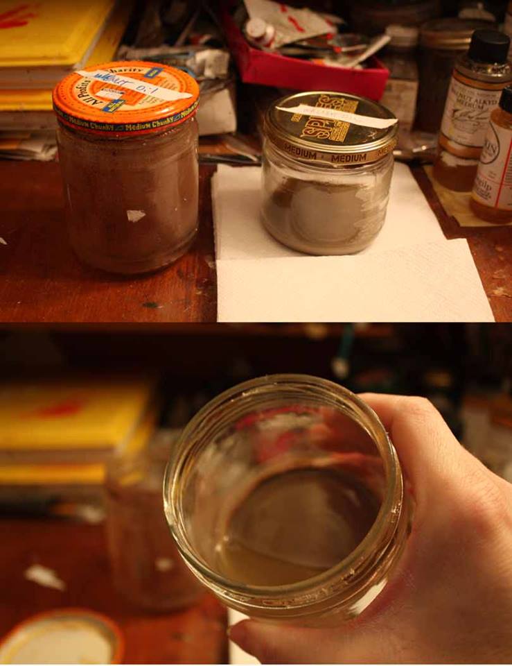
TFischer3
I then carefully pour the clean oil off into a empty jar. I clean out the sludge that is left with a napkin and the end of a brush handle to swirl it around with. And as you can see, my favorite jars to use in the studio is salsa jars."
Tfischer4
Thank you Teresa for sharing both these wonderful tips and your amazing art work with us today!
Teresa's painting, "Carrot - O" was recently featured at the 15th Anniversary Show at the Elliott Fouts Gallery in Sacremento, CA. Here is a link to her really informative blog post detailing its creation. Enjoy!

600_TNFischerCarrotOsml

Technique Tuesday: A Value Tip From Artist, Carrie Waller
CarrieWaller
One of the highlights of 2012 for me was definitely striking up a friendship with artist, Carrie Waller who is part of my "artists mentoring group". This special group of 8 female artists meets once a month via video conference to discuss the best practices and approaches to the business side of our art careers. There is a lot of about Carrie that I admire. Besides being an award winning, internationally recognized watercolor artist, she is also a military wife and mother to two young sons. Carrie's work is known for being bold, dramatic and full of light and color. She has had art published in Watercolor Artists Magazine, Pratique Des Arts (France’s #1 art publication), Splash 14 and several local publications. Most recently she won the grand prize for Daniel Smith’s annual competition, a prize worth $10,000. Carrie is a guest co-host on Artists Helping Artists the #1 art blog radio show. She is a signature member of the Louisiana Watercolor Society and has her art in collections around the world.
Here is Carrie's Technique Tuesday tip in her own words; "I'm often asked what medium I paint in because my paintings don't look like the stereotypical watercolor painting. My intention since I began painting in watercolor, was to push the limits and see how bold I can go with color. My biggest tip for watercolor artists and artists in general is to make sure you are going dark enough. Whenever I see a weaker painting 9 times out of 10 it's because the values aren't dark enough. To achieve my darkest darks in watercolor I use a mixture of Daniel Smith watercolors Indigo and Sepia. It creates a beautiful rich dark that is flat and not shiny."
Carrie's tip really got my attention because I recently had the same epiphany in my alla prima painting which I discovered from taking regular classes with Rob Liberace. In order to paint expressively with minimal brush strokes in the alla prima way, your values must be spot on. This lesson hit home for me recently while working on the background of my recent commission. I had painted this haystack beautifully with minimal economy of brushstrokes, only to find the value was off which was forcing the haystack too forward and taking away from the importance of the principle figures. So I had to scrape the paint down and begin all over again. In class Rob will often say, "There is no color that is wrong, only the value". Now I truly understand what that means.
Thank you Carrie for sharing this very important Technique Tip with us today.
Technique Tuesday: Podcasts

One of the best weapons in my arsenal to fend off insanity while working on lengthy commissions is to listen to podcasts. Let's admit it now, those details in a painting that are so pretty to look at are sometimes a pain to paint. Podcasts can help you get through it. Here's a list of links to my current favs. Check them out, you may find one or two that are new to you. You can find most of them on iTunes or by going directly to their site and subscribing to them. Lastly, I should mention that I only pick podcasts that are around an hour long. I don't want to waste my time hitting play often.
1. National Gallery of Art Lectures on art history, artists and exhibits at the National Gallery of Art.
2. NPR: TED Radio Hour The inspiring Ted Talks but curated around a theme which lasts one hour.
3. WAMU-FM: WAMU: The Diane Rehm Show Topical interviews on politics and culture.
4. NPR Programs Fresh Air More topical interviews on politics and culture.
5. Impasto Logs with David Cheifetz Painter David Cheifetz shares his take on the practice of painting.
6. Sidebar Nation Highly entertaining interviews and discussions about everything in the comic & animation worlds. Past interviews have included James Gurney and William Wray.
7. Artists Helping Artists Discussions surrounding art marketing, boosting your sales and on-line presence.
8. Art Share Fantasy world artists/Illustrators and writers share the tales of Cons and the industry in general. Humorous panel of hosts.
9. Hush- Topeka and Shawnee Co Libraries A great podcast showcasing writers and genres of literature introduced by entertaining librarians.
10. Artist Mentors On-line A good pod cast on painting that has some heavy hitters for interviews including Jeffrey Watts, CW Mundy, Tony Pro and Rose Frantzen. However the hosts remind me a little (OK, a lot) of this cult classic SNL sketch.
Do you have a favorite podcast you'd like to share? Please leave the link as a comment. Thanks!

Technique Tuesday: A Tip from Elizabeth Floyd

"Persimmons on a Wooden Crate" by artist, Elizabeth Floyd. Oil on canvas. 2013. Available at Principle Gallery, Alexandria VA.
My wonderful friend & painter, Elizabeth Floyd is the talented artist behind the "Bountiful Observations" series of floral still lifes and the creator of the beautiful persimmon painting above. She also writes a really awesome creative lifestyle blog which you can subscribe to here. Her lovely paintings will be included in the Small Works 2013 show at the Principle Gallery in Alexandria VA in December. Elizabeth has graciously agreed to share this Technique Tuesday tip with all of us today:
"My tip that I find invaluable is that I like to use spice jars that have a metal lid when mixing my batches of medium. I have found that these spice jars are the best because it is always better to mix small batches of medium and the threading of the metal lids are some of the best available. Baby food jars do not work well over the long haul because the lids do not have quality threads and deteriorate over time."
Floyd_tuesday-tip-1

Floyd_tuesday-tip-2

Floyd_tuesday-tip-3
Thank you Liz for allowing me to feature your tip today! This is one that I for sure will start incorporating into my studio routine.
And to all of you in the States, especially to our service men & women abroad--may you have a Happy Thanksgiving!

Technique Tuesday: Walking Canes Ain't Just for the Infirm
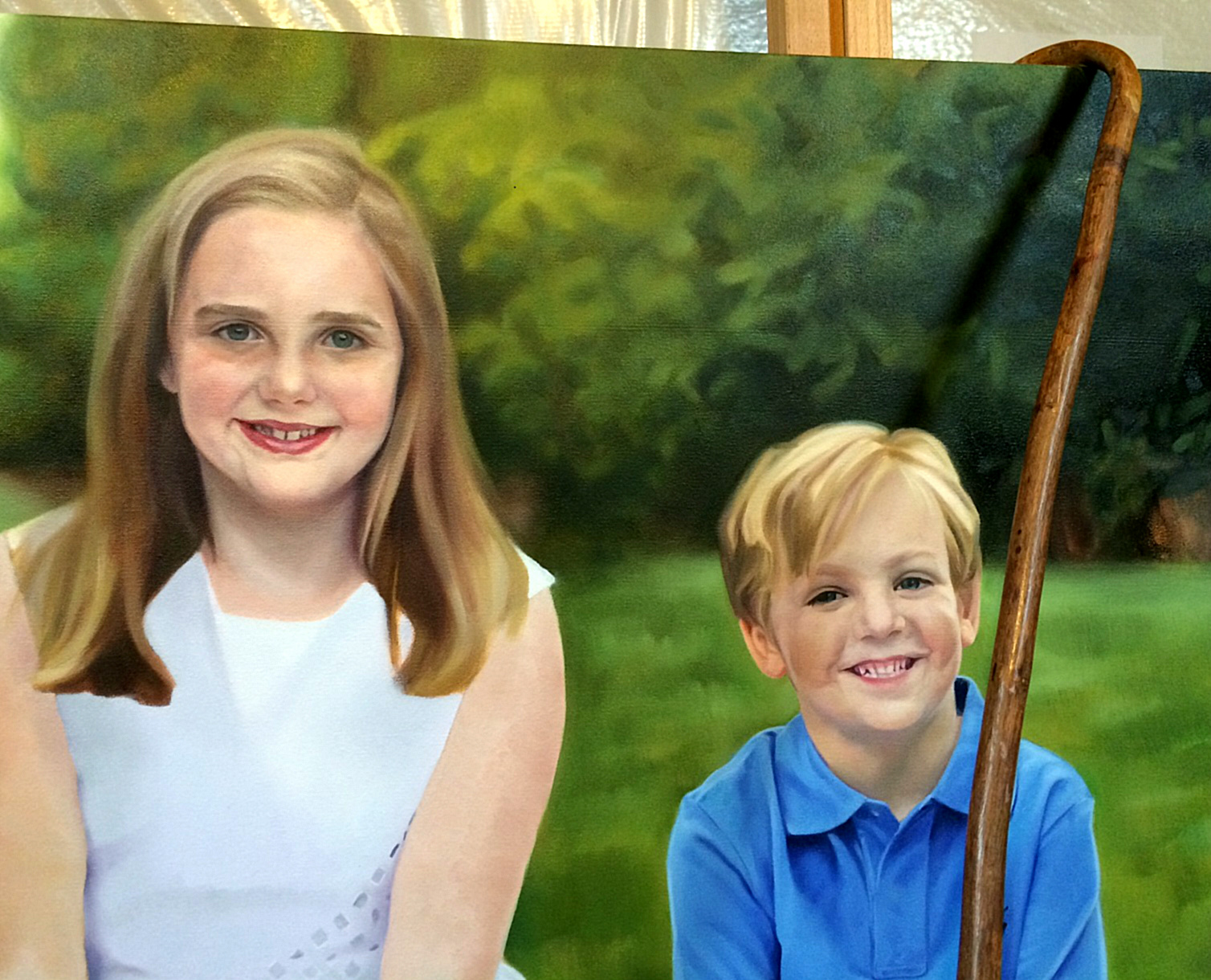
WIP photo of my current commission showcasing my sexy walking cane.
I stole this Technique Tuesday tip a couple years ago from master painter Richard Schmid who famously uses his walking cane as a mahl stick (to steady your hand in painting). I have even taken it with me to workshops and have had people laugh at me and say "I was looking for the old lady when I saw that". To which I have answered while shaking my cane in their face, "He who paints like Richard Schmid can cast the first stone!". Then I smash them over the head with it. See, it serves a dual purpose.
I also have another Mahl stick I use when traveling or copying at the National Gallery of Art. It is affordable, collapsible and very sturdy (made out of aluminum). Although don't drop the threaded end on a hard concrete floor as I did, or you may have a problem putting it back together again. You can purchase it at most art supply stores. Here is a link to one.

Technique Tuesday: Unique Toolz
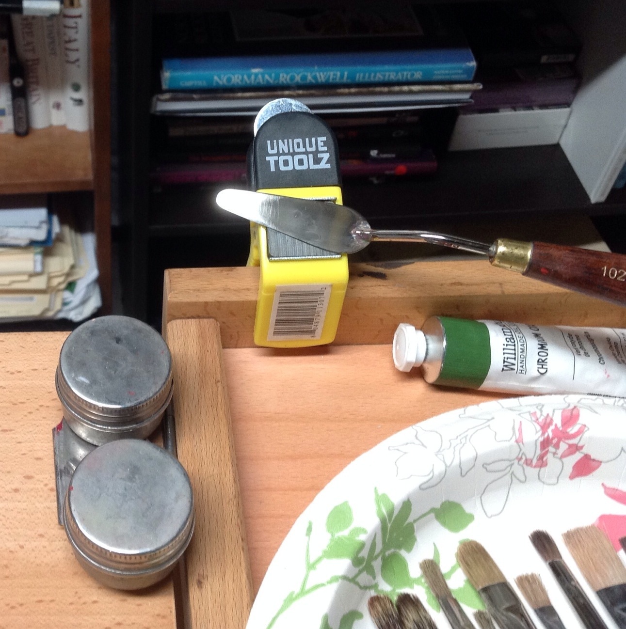
20131105-211847.jpg
Here's a quick little Technique Tuesday post. Like any artist, I love my gadgets, especially those I find in non-art stores. I bought this cool little magnetic clamp at my local WoodCraft store for under $5 and it is PERFECT for keeping my palette knife out of the way when I am painting (and for opening paint cans). Thanks to this little impulse buy I can now keep my taboret relatively tidy which is a real plus because I can be quite a hot mess when I paint.

No More "Redskins"

"Native American Portrait". Oil on birch panel. 2013. Artist, Suzanne Lago Arthur.
Here is a portrait I painted from life in Rob Liberace's class last Spring. The model is a really interesting guy--a re-enactor who makes all his costumes by hand. It is not every day that you get to paint someone dressed up like him!
This painting makes me think of course of the current controversy regarding a suggested name change for the Washington Redskins. For the record--I completely support it. That moniker hails from the days when the colonies closely associated with Native Americans as a way to emancipate themselves from their European fore fathers. But people are not symbols. We have the Bald Eagle and the Stars and Stripes for that. Dan Snyder-get over yourself! We can no longer have an NFL franchise in the 21st Century representing our Nation's noble capitol with such a degrading name as the Washington Redskins. In this day and age when the "minorities" in this country are quickly outnumbering the majority, your position is at best insensitive. And a worst--racist.

Jonathan Linton's "White Test"

20131030-110444.jpg
Today is Wednesday and for the second week in a row I have forgotten to do a "Technique Tuesday" post. In my defense I actually just have a lot excuses. My son has been home for 3 days with a fever, my husband is home in between contracts, I have not had coffee for 48 hours and I have a major commission due which I hope to share shortly. All the above issues = comatose brain cells.
But I do have one extraordinary technique tip to share with you today. My good friend and mentor, Jonathan Linton created years ago a "White Test" where he systematically tested various oil painting whites (and whites mixed with black) and then left the entire test in a window for 2 years to see what happened to them and help figure out which was the truest white over time. Think of it as an art nerd's Survivor Island.
For a complete list of the whites Jonathan used check out his original post from 2010 (above) which has been featured on other blogs including Gurney's Journey and most recently on Muddy Colors. Then see if you can figure out which white is the great survivor--and be sure to use that knowledge in your paintings going forward.

Technique Tuesday: Debra Keirce, Miniature Art and the World of Tiny Tiny Brushes
DebKeircePainting
One of my earliest memories of art is of my Aunt's miniature portrait, painted of her while she was a young woman growing up in Havana. I was completely fascinated by that painting, by its scale, by its highly realistic rendering, by the simple IDEA of it. I think that early memory has always been somehow in the back of my mind as I became an adult and an artist.
Flash forward to now. I have a good friend named Debra Keirce who is a very accomplished artist and specializes in miniature fine art paintings. Ever since I have known her she has tried to recruit me to the miniature art world. And I will admit the temptation has been there, to at least dip my toes in it, all because of my Aunt's portrait.
Contemporary miniatures are often defined as being less than 25 square inches and smaller than 1/6 original subject size. Some societies and shows define them as being smaller than 8"x10 or 12" in any dimension. All require a tightly rendered artwork such that it appears similar to a much larger painting when viewed under magnification. This is why most miniature artists, Debra included, use 5x to 20x magnifiers while painting.
Debra has graciously agreed to answer some questions for Technique Tuesday for all of you who are also curious about making miniature art.
SLA: Can you please acquaint our audience with the origins of miniature painting?
DK: Probably not as well as Google can. But basically, miniature fine art started with the manuscripts produced by scribes in Renaissance Days... 1600's. With the advent of the printing press, miniature artists began selling portraits instead of text. Wealthy Europeans prized miniature portraits that fit in their pockets. When they were away from loved ones, they would keep their miniature paintings in lockets on their persons. This is where the tiny metal frames became popular. The advent of photography caused miniature art to undergo major changes, and is really where the modern miniature fine art societies, collectors and artists were born from.
SLA: Please describe the historical substrates, mediums & traditional techniques of miniature painting:
DK: I really am not so interested in history, unless I can use it today. Google can answer that question better than I. Modern substrates include polymin and ivorine, which are smooth synthetics meant to mimic ivory. Piano keys are often used. Feathers are sometimes seen in shows. Vellum made from animal skins is a popular surface. Most of us use smooth substrates like panels, dibond, artboard, illustration board.
Mediums used today have been used for hundreds of years, but obviously they have evolved over the centuries. Oil and acrylics, gouache and transparent watercolor, egg tempera, silverpoint and other metal points, gold leaf... These are all used in modern miniature paintings.
Traditional miniature painting techniques include cross hatching and stipple.

DKeircePainting2
SLA: What modern techniques are being utilized by miniature artists today?
DK: Modern techniques vary a lot. Each artist finds their own way to adapt to the challenges of painting. I know artists who literally paint entire pieces in stipple, like a computer assembles images from pixels. Other will use a mische technique of painting in opaque and transparent layers. This is especially popular with egg tempera painters. Many painters use dozens of delicate glazes.
I can tell you what I do. I use acrylic or oil paint, and I typically first paint a grisaille underpainting, but often I will let some of my conte crayon drawing show through, along with some of the ground. I lay in the local color with a transparent glaze. Then I will paint the details and textures, but the whole time I will use an exacto blade and embossing tools to literally sculpt the paint and the top layer of substrate. In this way, I can achieve finer details and lettering. I like to paint on substrates like maple panels, illustration board, dibond, clayboard, artboard. Depending on the subject, I will choose a substrate with more or less give. Harder substrates are better when I want softer edges and less sculpting. Architecture is better on softer substrates that allow me to cut crisp edges.
SLA: What is your favorite painting tip you can share with us?
DK: My favorite painting tip is to paint what you see, not what you think you see. For me, the best part of the painting is when I go into a place of abstraction. I am painting the dark shapes, then the midtone shapes, highlights, feathering edges, etc. But I will not be thinking about the object. Instead, I am feeling the value changes, admiring the colors, sensing the light paths. Then, I step back and enjoy seeing the photo realism that sprang from that totally abstract experience.
SLA: Where do you buy your tiny tiny equipment for your miniatures, i.e. paintbrushes, frames etc?
DK: I buy paintbrushes from everywhere, but my favorites are Kalish, an Irish company when I have money, and Creative Mark when I need to budget. In either case, I prefer watercolor synthetic brushes...Rounds with very pointy tips are best. I like the number six rounds for most of my painting. I will pull in a quarter inch flat or a 20/0 liner on occasion. But mostly, I want a brush that will hold a lot of easy flowing paint and deliver alternately a very thin line or a thicker smudge.
I do my own mounting and wiring, but buy my custom frames from
. They are very reasonably priced, they have beautiful moldings, their workmanship is top notch, and they are one of the few frame suppliers with equipment suited to small miniature frames.
My magnifiers are lighted full spectrum lamps available at office supply stores, and I have several tabletop easels I use.
SLA: What miniature societies do you belong to?
DK: I am a signature member of The Hilliard Society at
http://www.hilliardsociety.org/nicholashilliard.htm
named after Nicholas Hilliard who was the official miniature portrait artist for Queen Elizabeth 1 in the 1500's.
My budget precludes me from pursuing membership in The Royal miniature Society, but it is the oldest of the miniature societies, founded in 1896. Here us a link to the history they describe on their site:
http://royal-miniature-society.org.uk/History.html
I am a signature member of The World Federation of Miniaturists and Miniature Painters Sculptors Gravers Society of Washington D.C. You are required to be part of the societies for a number of years, participate in a number of juried exhibitions and receive a number of awards to receive the invitation for signature membership. http://www.mpsgs.org/MPSGS-MemberSites.htm
I am also a member of the Miniature Art Society of Florida. I have not been a member long enough to meet the eligibility requirements for their Miniature Artists of America designation, but fully expect to be part of this prestigious group one day.
SLA: Feel free to showboat a little here. Where can we see your work in person? Where can we follow you on-line?
My website at
lists all of my social media contacts, newsletter sign up, current exhibitions, the galleries I am represented by, which include
in Rockville, MD and
in Nags Head, NC.
SLA: Thank you Debra for your thoughtful answers and for sharing your beautiful art with us!
DebraKeirceGlasses
"

Technique Tuesday: C - Thru Rulers

20131008-080231.jpg
Some fancy artists out there will use calipers to help them make adjustments to their work. You don't get fancy around here, just useful and sometimes cheap. This trick of mine falls into both categories. I use those cheap and abundant clear rulers you can pick up anywhere to measure both my subject and my paintings when they get out of whack proportionally. That is to say if I am working at life size. Normally I have a really strong sense of proportion when I am drawing or painting, but I don't always "nail it". That's when I pull out my trusty little ruler. It is such a useful tip that I keep one of them always nearby with my brushes while I am painting.
A note of caution: if you are painting from a model, they usually prefer for you to ask permission to measure them. Just saying.

Technique Tuesday: Drawing Revelations with Dan Thompson
20130930-221046.jpg
In August I attended yet another workshop with Dan Thompson. 2 actually, back to back. Both of them on drawing. I see Dan as a cosmic guide on my life long journey as an artist. He leaves little bread crumbs of wisdom to follow on the path to improvement. Most recently he left me with two life changing concepts. The first is the revelation of what "closed" and "open" drawings are. Closed drawings are those with specific contours. They are precise, drawn from the outside in and do not allow much room for alterations. Open drawings are the opposite. They are built from the inside out. They are more mass than contour, they are flexible. They are forgiving. I had never heard these terms before, perhaps because I did not attend a particularly traditional art school. Hearing these terms allowed me to understand my own frustrations with my drawing--most noticeably a tendency for strong contours. To think that I could simply reverse engineer my drawing technique to get at the quality I want in my work was literally mind blowing! And the last revelation I received from Dan's workshop was to approach each effort in drawing and painting as if making a "proposal". If you get it wrong, so what! Just alter your proposal. Brilliant right? And it totally takes the pressure off.

Technique Tuesday: Super Glue and Richard Schmid
20130924-080401.jpg
On the latest podcast of Artist Mentor's Online, artist Molly Schmid shares that her father, Richard Schmid (author of Alla Prima and Alla Prima II) often rearranges live flowers on still lifes by gluing them into place as needed to achieve the best composition. Genius, right? Well that's why he's Richard Schmid.
You heard it here first folks. OK, second. To get your own copy of Richard's Alla Prima II before its completely sold out click here.

At the Finish Line
20130906-201220.jpg
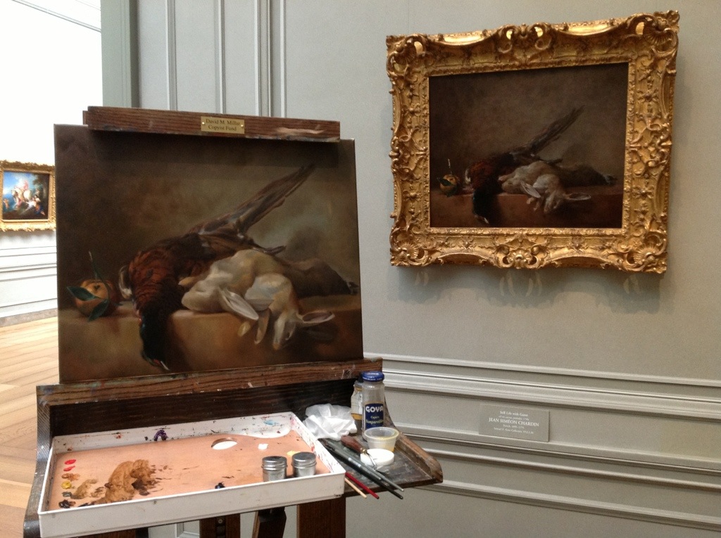
I am literally one session away from finishing my copy of Chardin's "Still life with game" in the National Gallery of Art's permanent collection. I basically have a little more refinement in the rabbits left and then I am calling it finished. Good thing too because I'll be putting my copying status on hold at the NGA while I take a full day of classes with Robert Liberace starting in a couple weeks.

20130906-201322.jpg

EDENtifying Your Writing Process: An Interview with Novelist, Elisa Nader

"Chilling, suspenseful and evocative, ESCAPE FROM EDEN is one of the most surprising love stories I’ve read in ages. Elisa Nader is an exciting new talent in YA fiction and her first novel will have people lining up to join her cult. Consider me the first member.”- Bennett Madison, Author of THE BLONDE OF THE JOKE and SEPTEMBER GIRLS
My friend Elisa Nader has done something really amazing, she has become a published author. To me that is up there with walking on the moon, winning an Olympic medal, finding the cure for cancer (ok, maybe that last one is a stretch). But it is the kind of thing that many people aspire to yet few ever achieve. As a professional in the creative arts, I pay close attention when someone like Elisa punches through the glass ceiling. And you should too no matter what your medium because a successful model in one creative field can often be applied to another. Elisa's first novel, ESCAPE FROM EDEN is a breath of fresh air in an often predictable YA genre. She has a background that many of you reading this blog can relate to as an art major with a BFA in painting and printmaking from Virginia Commonwealth University in Richmond, VA. It was at VCU that she began writing her first novel, but quickly cast it aside as her love of music took hold, and she picked up a bass guitar. Three bands and five years later, she moved back to Washington and rediscovered her love of writing, penning arts and entertainment pieces for the Washington City Paper. But, once again, writing took a back seat. After a stint at The Washington Post as a lead website designer for the Arts and Entertainment section, she began a long career at AOL as a creative director, working alongside such companies as Time Warner, Travelocity, MapQuest, Bebo, Moviefone, and many more. Since leaving AOL, she spends time writing, raising her seven-year-old daughter, and working alongside her husband in their new venture, Mag7, a User Experience Design collective.
Below is a synopsis of the plot from ESCAPE FROM EDEN:
Since the age of ten, Mia has lived under the iron fist of the fundamentalist preacher who lured her mother away to join his fanatical family of followers. In Edenton, a supposed “Garden of Eden" deep in the South American jungle, everyone follows the Reverend’s strict but arbitrary rules—even the mandate of whom they can marry. Now sixteen, Mia dreams of slipping away from the armed guards who keep the faithful in, and the curious out. When the rebellious and sexy Gabriel, a new boy, arrives with his family, Mia sees a chance to escape.
But the scandalous secrets the two discover beyond the compound’s façade are more shocking than anything they ever imagined. While Gabriel has his own terrible secrets, he and Mia bond together, more than friends and freedom fighters. But is there time to think of their undeniable attraction to each other as they race to stop the Reverend’s paranoid plan to free his flock from the corrupt world? Can two teenagers crush a criminal mastermind? And who will die in the fight to save the ones they love from a madman who’s only concerned about his own secrets?
And now, the interview.
SLA: Is Mia's artistic drive a reflection of your own? As a former art student do you still draw or sketch?
EN: I think her artistic drive comes from me. I knew I wanted her to have something forbidden in Edenton, but wasn’t sure what. I used to journal when I was in my twenties, but all my journals were essentially sketch books with drawings and random writings. I thought that would be perfect for Mia, Materials are so scarce in Edenton — paper, pens, pencils -- , she’s forced to sacrifice old drawings by erasing them from journal to create new ones. I thought it was an interesting dynamic in the story that maybe only artists would understand. Sacrificing something in order for a new idea to come to life.I don’t sketch and paint as much as I used to. Over the years, I’ve found my creativity has taken on different forms: Graphic and web design, interior decorating, writing—so much more writing.
SLA: Is famed portrait painter Nelson Shanks the inspiration for the likeness of "ginger haired" Reverend Elias Eden? It's ok to confide in us. No one reads this blog anyway.

35_1nelsonshanks
EN: While this portrait of Nelson Shanks DOES resemble the Reverend (blue shirt and all!) you’ll never guess who I had pictured in my head when I was writing the character.

ZGwatermelon
Yep. Zach Galifianakis
SLA: Please define your writing journey. How did you begin? How did you hone your craft? How did you get "discovered" and then ultimately published?
EN: I’ve always written - either in my journal or once I got a computer, I wrote on that. I started writing a story about a indie band on the road when I was in college, but it never went anywhere. I mean, I spent YEARS on that thing. Never showed it to anyone. I did some writing for The Washington City Paper, arts pieces and long-form articles (link http://www.washingtoncitypaper.com/search/site?q=elisa+nader), but web design took over my life and I spent years doing that until I left my corporate job in 2008. That’s when I decided I was just going to write already and stop thinking about writing. I took a class online at mediabistro.com. The classes are taught by publishing industry professionals, so my instructor was an editor from Harper Collins who loved the story I was workshopping (different manuscript than ESCAPE FROM EDEN) and passed on to a literary agent friend. He saw a lot of potential in it, but was so busy with clients he wasn’t taking on any new clients but he gave it to a partner in his company, Upstart Crow Literary, and she loved it. It’s funny how things work out. My agent Danielle Chiotti is the perfect agent for me. She’s very editorial, which I love, and has helped my writing immensely.
One evening, when I was trying to work on a new writing project, I got the idea for ESCAPE FROM EDEN. My old manuscript was out on submission (that means editors at publishing houses were reading it, deciding if they wanted to buy it). As soon as I had the idea for EDEN, I realized that my other manuscript wasn’t good enough. I asked Danielle to stop submitting it and she supported the idea. A year later I had EDEN written and we submitted it. It was sold two months later.
SLA: How would you describe your writing process? Did you use any specific techniques for writing and idea generation such as story boarding that you could share with us?
EN: I sit down and write. That’s pretty much it. I outline a scene before I write it — but sometimes I just see where the writing takes me.
I always have an idea where the story is going to go, and for me they have to be high concept ideas. These are stories you can describe in a sentence, for example: Teen girl living on a commune tries to escape, only to discover the deadly secrets of the cult. I like to write big and high stakes stories with plot twists. Do I always do that? No. But that’s aways my goal.
SLA: Who would be the supporting characters in your life who helped you reach the milestone of published author?
EN: My husband, Brent Canfield. He’s so, SO supportive. I’m very lucky.
My best friend for over twenty years, Kami Greene. She’s read almost everything I’ve ever written!
My critique partner Nina Berry. She’s made me such a better writer over the years. I cringe at the crappy stuff I used to send her. She’s published novels, written screenplays, wrote TV shows. She knows writing and great stories. I took the mediabistro.com class with her and discovered she gave the BEST feedback in the class. That’s when I asked her to be my crit partner snagged her up as my own.
And my agent, Danielle Chiotti. I ADORE her. She’s supportive and caring and, like I said, editorial. I sent her a box of bacon once, I love her so.
SLA: While stalking you on FaceBook & Twitter, I saw that you recently attended the Romance Writers of America conference in ATL. Please describe that experience. Was it your first writing conference? How helpful was it in terms of net working etc.
EN: This was my third writing/publishing conference. I was really there to support my crit partner Nina who has a book coming out with Harlequin Teen. I’ve also been to a couple SCBWI conferences (Society of Children’s Books Writers and Illustrators).
Conferences like that are fantastic because everyone is there for the same reason, same interests and it’s just so easy to meet and talk to people. And make industry connections. It’s such a safe haven from the outside world. I see how people become addicted to conferences - being surrounded by like-minded individuals who get you.
SLA: What peer to peer mentoring societies would you recommend to aspiring writers?
EN: First, a look at taking a writing class in whatever category you’re writing in — Non-fiction, Memoir, YA, etc. Like I mentioned, I took a class at mediabistro.com and it was really the best thing to happen for my career.Look for writers groups in your area — You can do this by joining local chapters of writers organizations. There are so many, and with a few simple search terms, you can find one that caters to what you write.
Get a critique partner. A TRUTHFUL critique partner. Someone who’s writing you respect and love. Someone who is going to tell you when your writing sucks and that you need to fix it. This person needs to be a WRITER, someone who understands the craft of writing. Not just a reader. And if you’re lucky, they are a strong writer you can learn from.
SLA: Who are your favorite authors & books? How often do you read?
EN: I read almost every night. Sometimes when I’m writing, I don’t read books until I’ve figured out the voice. I don’t want to be unintentionally influenced by someone else’s writing.
I read a lot of Young Adult, New Adult, romance, mysteries, and thrillers. I was really fortunate to get two of my absolute favorite writers to blurb ESCAPE FROM EDEN, Michael Grant and Bennett Madison. I LOVE Laini Taylor and how she can make words seduce you. I have so many favorite writers. So, so many. I think right now Matthew Quick is really at the top of his game. Can’t see where he takes his next book.
SLA: What do you have in the pipeline now as far as your writing?
EN: I’m working on a new book inspired by the movie The Legend of Billie Jean. Yeah. Exactly. We’ll see how it turns out.
SLA: If you had one really good piece of advice for aspiring writers out there, what would it be?
EN: Read Stephen King’s ON WRITING. Read that book and it will make your writing better. I promise.
SLA: What advice could you give us that would apply to anyone in the creative arts?
EN: Don’t pay attention to what the “trends” are in your creative area. Create whatever feels right to you. And don’t give up. The moment you give up creating what you love, they win. I don’t know who they are, but they win and you don’t want them to win, got it?
SLA: Please feel free to provide some shameless plugs now. Will you be making any author's appearances soon & where? Where can your fans follow you online?
EN: I LOVE SHAMELESS PLUGS!
I’ll be at the Fall for the Book festival, 9.22.13 at One More Page Books at 4pm for the YA Books Panel:
http://fallforthebook.org/2013/08/01/childrens-book-and-ya-authors/
There’s a Goodreads giveaway of ESCAPE FROM EDEN - enter for a chance to win!
http://www.goodreads.com/giveaway/show/62309-escape-from-eden
And you can find me online here:
(this is my tumblr and my blog)
Facebook.com/elisanader.author
SLA: Thank you Elisa for allowing me to pick your brain. Your answers have been extremely inspiring and enlightening. Thanks again!

This Studio Tip is Being Brought to You Today by the Letter "F"

20130718-220811.jpg
As in the letter "F" for filching, because I can't take credit for this wonderful studio tip. The bragging rights to this goes to my talented artist friend Gavin Gardner (wuz up, Gavin?). Gavin announced on Facebook a while back that he started using these little condiment containers you find at fast food restaurants to store his paint mixes in. And I thought upon reading that, "Brilliant!". So I stored that little nugget in the back of my head like a squirrel hiding nuts for Winter. And recently when I was having lunch with my son at Moe's and getting his requested servings of salsa, my eyes froze upon the image of a tower of condiment containers and the proverbial light bulb went off in my head. I grabbed a bunch of them while chuckling delightedly under my breath in a sinister evil villain laugh and brought them home with us. I did not get around to using one until tonight but man was it worth the wait--in a kind of life changing way. I am pretty sure this will become a permanent part of my studio repertoire.
Thanks Gavin!

Study Hacks on the "Deliberate Rise of Stephen King"

.
The following is an obvious statement: Those of you reading this post probably enjoy reading other blogs too. To prove my theory correct, I would like to submit to you a new blog to add to your reading repertoire.
Cal Newport, the author of Study Hacks, is a Computer Scientist and Assistant Professor at Georgetown who is interested in "why some people end up leading successful, enjoyable, meaningful lives, while so many others do not". His posts are filled with real life examples of people who have made it in their fields and on techniques for improving one's productivity. I think it is important as an artist to find inspiration and models of business outside of our narrow field. That is why I really pay attention when I am given advice by a successful person in any of the creative arts--regardless of their medium.
Below is a great post about Stephen King and how he never allowed rejection to derail his goal of becoming a successful writer. Very inspiring!
http://calnewport.com/blog/2013/06/01/the-deliberate-rise-of-stephen-king/?utm_source=feedburner&utm_medium=feed&utm_campaign=Feed%3A+StudyHacks+%28Study+Hacks%29&utm_content=My+Yahoo

Workshop Wednesday: Dan Thompson 4 Color Chalk
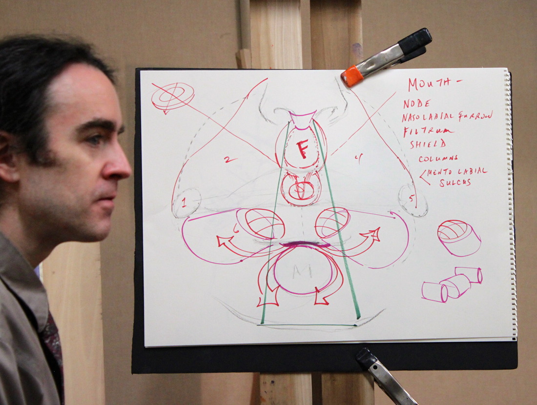
Dan Thompson with his diagram explaining the anatomy of the nose and mouth.
Back in December I had the real pleasure of attending my first Dan Thompson workshop at the Art League in Alexandria VA. Dan happens to be teaching another workshop next weekend on March 23 & 24 and believe me when I tell you that it is completely worth your time and money to attend if you can. I had pages and pages of notes from his first workshop on anatomy alone, something I had not expected from a 4 color chalk portrait drawing class.
In full disclosure, Dan and I have some shared history--as in we both attended the Corcoran School of Art back in the 90's. Dan graduated two years before me but I still remember his amazing realism and sensitive self portraits which stood apart from every one else's work simply because no one was painting like that at the Corcoran then or even since. Flash forward 18 years post his Corcoran BFA, an MFA from the Graduate School of Figurative Art of the New York Academy of Art and Dan is now a highly respected artist & teacher. In 2006 Thompson co-founded the Grand Central Academy of Art in New York. In 2008, he co-founded the Janus Collaborative School of Art in New York. In addition he has instructed privately at Studio 126 in New York and is on the faculty of Parsons the New School for Design, the New York Academy of Art, The Art Students League of New York, and Studio Incamminati, in Philadelphia, PA. In 2007, Thompson was selected an ARC Living Master Artist. To say I am proud to know this generous artist & gifted teacher is an understatement.
And now without further ado, my notes from his 4 Color Chalk Workshop, straight from my archives of workshop "awesomeness":

Thompson_4ColorChalk_Echorche
Notes of Materials & Drawing Aids
-Uses Othello & Conte pencils in red, black, yellow & white.
-Capitalize on chalk based material early on in your drawing because it is easy to remove.
-Also uses Kremer pigments, Lapis Lazuli, Smalt Blue, Red Ball chalks, vine charcoal & shammy.
-Be careful when working on a toned paper not to lift the ground when erasing.
-Best watercolor wash for paper- raw umber, ultramarine blue & dioxazine purple. Shoot for a cool colored neutral.
-READ the John H. Vanderpoel book, "The Human Figure" published in 1907. A must for understanding proper figure construction based on anatomy.
-"Figure out someone's technical model for planes of the head & use it!"
-Likes Strathmore 400 artist's series paper or semi tooth laid paper like Ingres etc. Must be ph neutral and 100% acid free.
-Get yourself a resin cast skull for serious portrait drawing ($250 --Bone Room, Berkley CA.)
-Take an écorché class (without skin) for accurate muscle awareness. Steve Perkins @ Janus School--excellent écorché instructor.
Notes on Anatomy of the Face
-The temporal ridge, where the side of the head meets the front resembles a covered bridge.
-The back of the skull resembles a pentagon in shape.
-Planes in the face follow each other, upward planes flanked by downward planes creating a rhythm.
-The underside of the cranium & jaw is shaped like a woman's high heel when viewed from the side.
-Occipital bone is the lower point on the back of the head.
-There is a "triple curve" from the outside flare of the nose stepping along the outside of the mouth.
-The eye socket drops in a series of steps & terminates in the the lower eyelid furrow. -The node of the mouth is the convergence of different muscles.
-Lines or creases form perpendicular to the muscle fiber (look for this).
-You can craft the nose out of a block, "door stop" form of the nose.
-Emphasize the under plane of the nose.
-A common mistake when rendering the nose is to not go past the eye lid with the nasal bone.
-"Alar cartilage" is the ball of the nose, shaped like an olive. It comes from the tear duct, twists & drops into a V shape
-The nose is a lesson in triangles.
-There is a rim in the enclosure of the nostril that often gets overlooked, make sure to include it.
-Develop your own secret figure reference (canon) for what anatomy should look like so that you know when it differs in an individual.
-There are 5 transitional planes in the nose when looking at it in profile beginning with the bridge, curving around the tip and ending in the plane before the lip.
-Ears will get bigger as people age.
-From the side an ear looks like a little capital D within another D.
-The ear comes out from the head like a door suspended open by the "concha" or hollow next to the ear canal.
-The helix is the upper curve of the outer ear.
-The anti-helix is the y shape with the ear.
-Draw in pairs when you can; feet, hands etc. Each completed form helps define the other.

Dan Thompson's beautiful finished 4 color chalk demo.

Detail of Dan Thompson's 4 color chalk demo.
Notes on creating the 4 chalk drawing
-Test out your pencils on your paper.
-Red pencil + stump = warm
-Red pencil +white pencil= cool pink
-Red pencil+ yellow pencil= warm orange
-Red pencil + black pencil= cool violet
-Black pencil + yellow pencil= warm green
-Helpful to have a pencil the same color as your toned paper should you erase too much of the base color away.
-Shellacking makes paper more resilient.
-Look for the simple design in light & dark.
-Think more about what's there and not adding to what you are seeing.
-Focuses on his "scanning eye" that sees quickly to give him information of the forms.
-Pulls lines through & out of drawing-trajectory.
-Works at life size of slightly smaller. -Focus on gesture, that way you get into the spirit of the pose.
-Abbreviate what you see to encourage the mobility of the eye around the portrait.
-Keep areas (measurements) open, allows flexibility to accommodate change & correction.
-Flat patterns of dark & light.
-Charcoal vines are great for the initial layout. They make you think broadly, no detail & are very forgiving.
-If you pretend not to "focus" on the model you see big forms better.
-It is useful not to think of features in the beginning, only shapes & their proportions to each other.
-Search for the 2D. Squint to see "flat" shapes.
-Find a fixed variable based on life size and note it down on your drawing. Then allow for "flex" in other directions to improve your drawing.
-Does not lighten his darks in the beginning. Instead keeps them a a false value--all shadow the same tone to help him arrive at the underlying forms.
-Pay attention to the things that artists ignore like the neck & ear. It will make you better than the average artist.
-Be careful when your drawing transitions from the 2D to the 3D. This is where the integrity of the drawing can begin to break down.
-Be aware of your eye level & what impact that has on your drawing.
-Turn the light off to see what your model's head movement is (and not what the light is doing).
-Highlights should be indicated in a directional manner along anatomy references. They are place holders.
-Often uses two whites when drawing. One is kept really sharp for detail, one more blunt for softening edges.
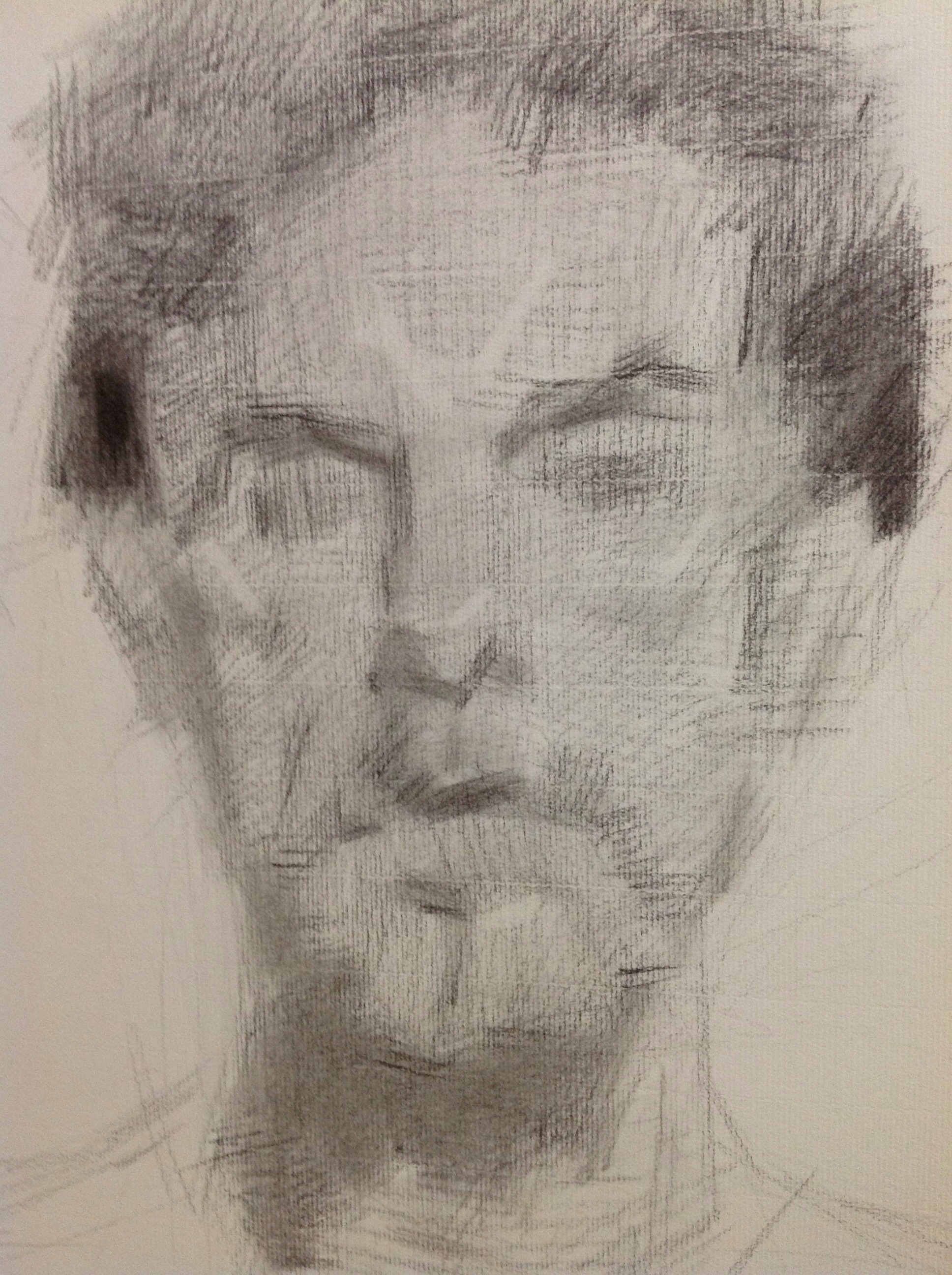
My drawing from Dan Thompson's workshop.
To register for Dan Thompson's portrait painting workshop at the Art League in Alexandria VA on March 23 & 24 click here. http://www.theartleague.org/school/course_desc.php?class_id=1075
Hope to see you all there!

Pre-Raphaelites: Victorian Art and Design, 1848-1900 @ the NGA
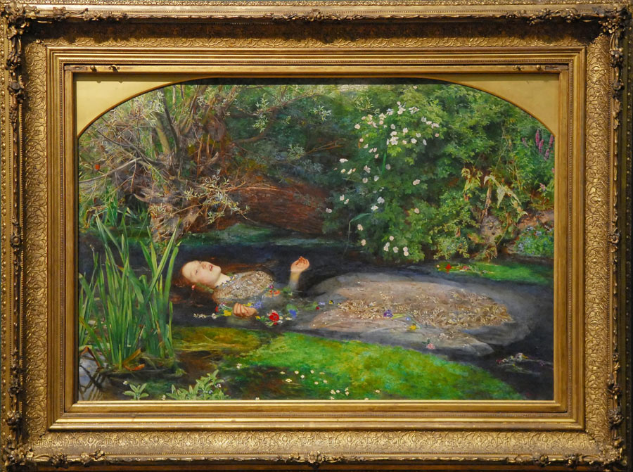
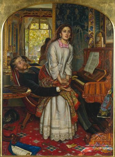
"Ophelia" by John Millais.
Last Friday I went to the National Gallery of Art (NGA) to work on my copy of Largillière’s Canoness only to discover that it had been taken down and put in storage. Apparently this happens every once in a while. I was actually OK with its disappearance because to be honest, I was getting bored of the Canoness. Soon I will be starting on a new copy of a still life by Chardin which is located in the same salon. Fickle, I know--but I am sure Ms. Canoness will get over it someday.
You may be asking yourself what I did with my suddenly wide open schedule that day. Hello! I went to see THE Pre-Raphaelite exhibit, of course! And WOW was I happy I did. This exhibit has managed to acquire some of the most famous Pre-Raphelite paintings ever painted, such as Millais' "Ophelia" and Rosetti's "The Annunciation" along with so many others. New to me is the work of William Holman Hunt, his "Valentine rescuing Sylvia from Proteus" is now one of my new favorites. The caliber of this exhibit is so good that I plan on seeing it all over again--something I rarely do.
The Pre-Raphaelite Brotherhood (PRB) founded by William Holman Hunt, John Everett Millais and Dante Gabriel Rossetti in 1848, grew to include not just painters, but poets and critics in an effort to return back to a more moral sentiment in art & literature during the Victorian period. It was essentially a reaction to the modernization and industrialization of England.
"The group's intention was to reform art by rejecting what it considered the mechanistic approach first adopted by Mannerist artists who succeeded Raphael and Michelangelo. Its members believed the Classical poses and elegant compositions of Raphael in particular had been a corrupting influence on the academic teaching of art, hence the name "Pre-Raphaelite" (Wikipedia)." The PRB embraced historical genre painting in particular, by depicting stories from the Bible and their native Arthurian legends.
I have included in this post several images of the famous works from the exhibit to whet your appetite (click to enlarge). As if you weren't hungering for it already. Enjoy!
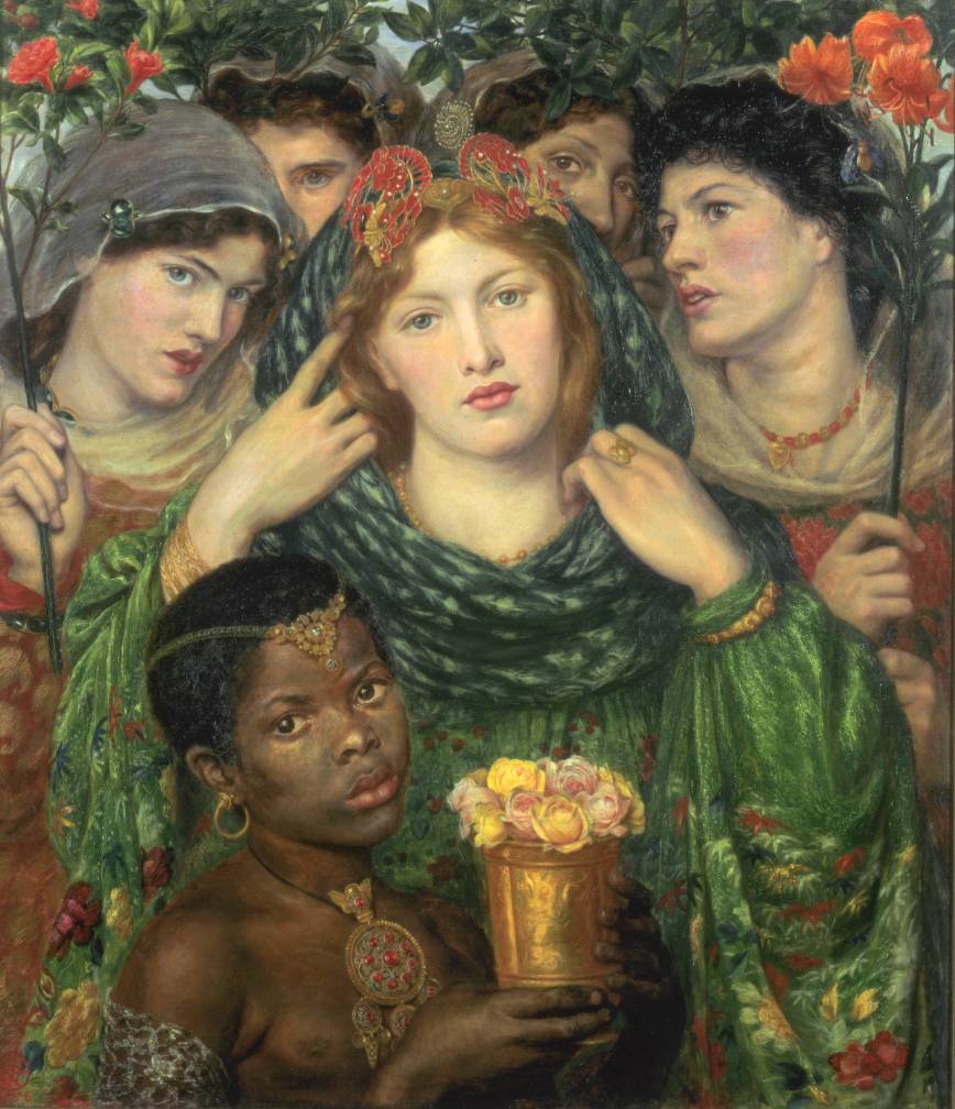
"The Beloved ('The Bride')" 1865-6, by Dante Gabriel Rossetti.


1858 Henry Wentworth Monk oil on canvas
"The Awakening Conscience" (1853). William Holman Hunt.
"The Awakening Conscience" (1853). William Holman Hunt.

Edward Burne-Jones

"The Blind girl", John Millais.
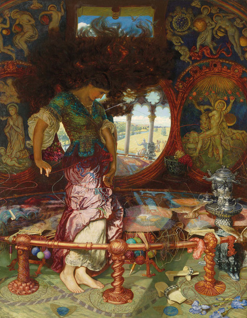
"The Lady of Shalott" (1886-1905) by William Holman Hunt
"The Lady of Shalott" (1886-1905) by William Holman Hunt

Copying at the National Gallery of Art, Washington DC
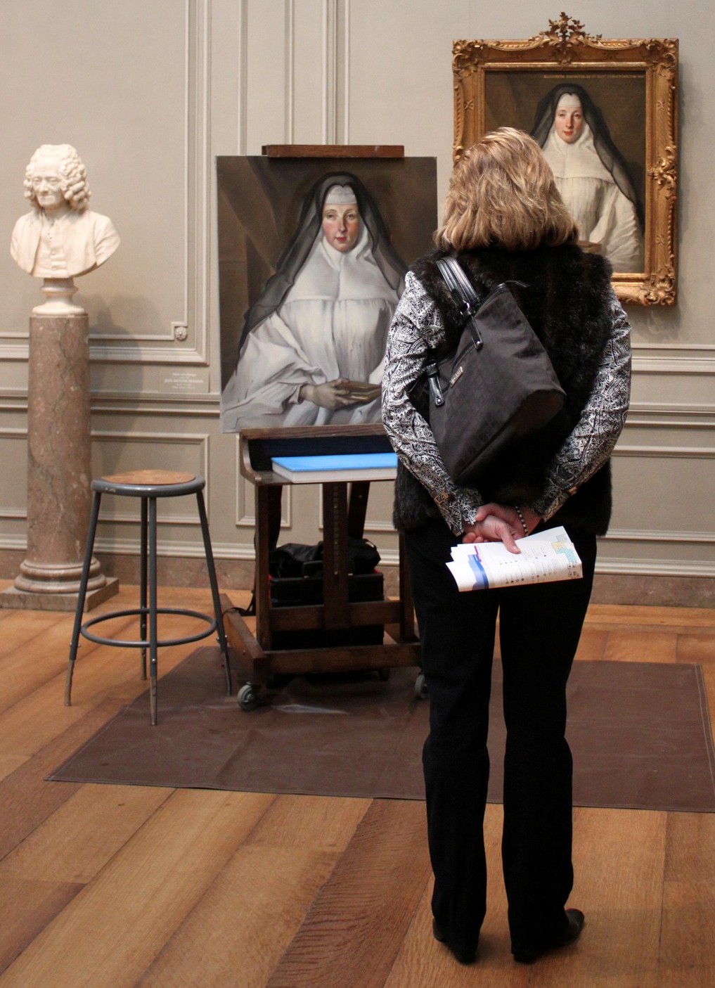
Copy of Nicolas de Largillière's "Canoness" at the National Gallery of Art.
One of the best perks about being an artist and living in the Washington DC area is the opportunity to become part of the "copyist program" at the National Gallery of Art (NGA). The copyist program, run by the Registrars Office, allows artists to apply for the privilege of painting directly from the permanent collection. I am happy to say I am one of the copyists at the NGA and you can find me painting there weekly. Painting at the NGA is a thrill for an artist but is also very challenging and in my opinion extremely humbling. After all, they don't call the artwork hanging on its walls "masterpieces" for nothing.
There are of course some constraints/factors an artist must observe when painting which include the maximum size a copy can be, proper handling and disposal of materials, dealing with variable ambient lighting (due to the large covered sky lights) and regular interruptions from well meaning, curious visitors to the gallery. Here are some of the amusing comments I hear most often while copying, along with my typical answers:
"Are you a student?". I am an artist who is working to improve her technique. Painting from masterpieces is one of the best ways to do that.
"How many hours have you been working on this". I have lost count but I paint almost every week for 2 - 3 hours at a time.
"Why are some of your colors different?". I strive to match the colors as best I can but my paint formulations are more modern & the lighting changes within the gallery which impacts how I mix color.
"Something is wrong with x, y or z...". Painting is a process, there are always areas that need refinement.
"I like your painting better". Thank you? (I never really know how to respond to that). But my goal is to copy as accurately as I can.
Another interesting aspect about copying is that there are always people taking your picture, and some even ask to pose with you! Personally I think the fascination stems from the perceived mystery around art making. People assume proficiency in painting is unattainable for the average person--it is not if you work hard enough at it. I tell visitors all the time that if I worked as hard on my golf game as I do on my painting, I would be a tremendous golfer. But my favorite aspect by far of copying at the NGA is watching the faces of the littlest visitors light up with amazement when they see me in action. I make sure to stop whatever I am doing to answer their questions and tell them with a smile, "you too can do this one day. Just make sure you never stop drawing".
Interested in applying to the copyist's program at the NGA? Click on this link for more details (scroll down to the bottom of the page). http://www.nga.gov/education/volunteer.shtm

Close up of my copy of Nicolas de Largillière's "Canoness". About 65-70% complete.

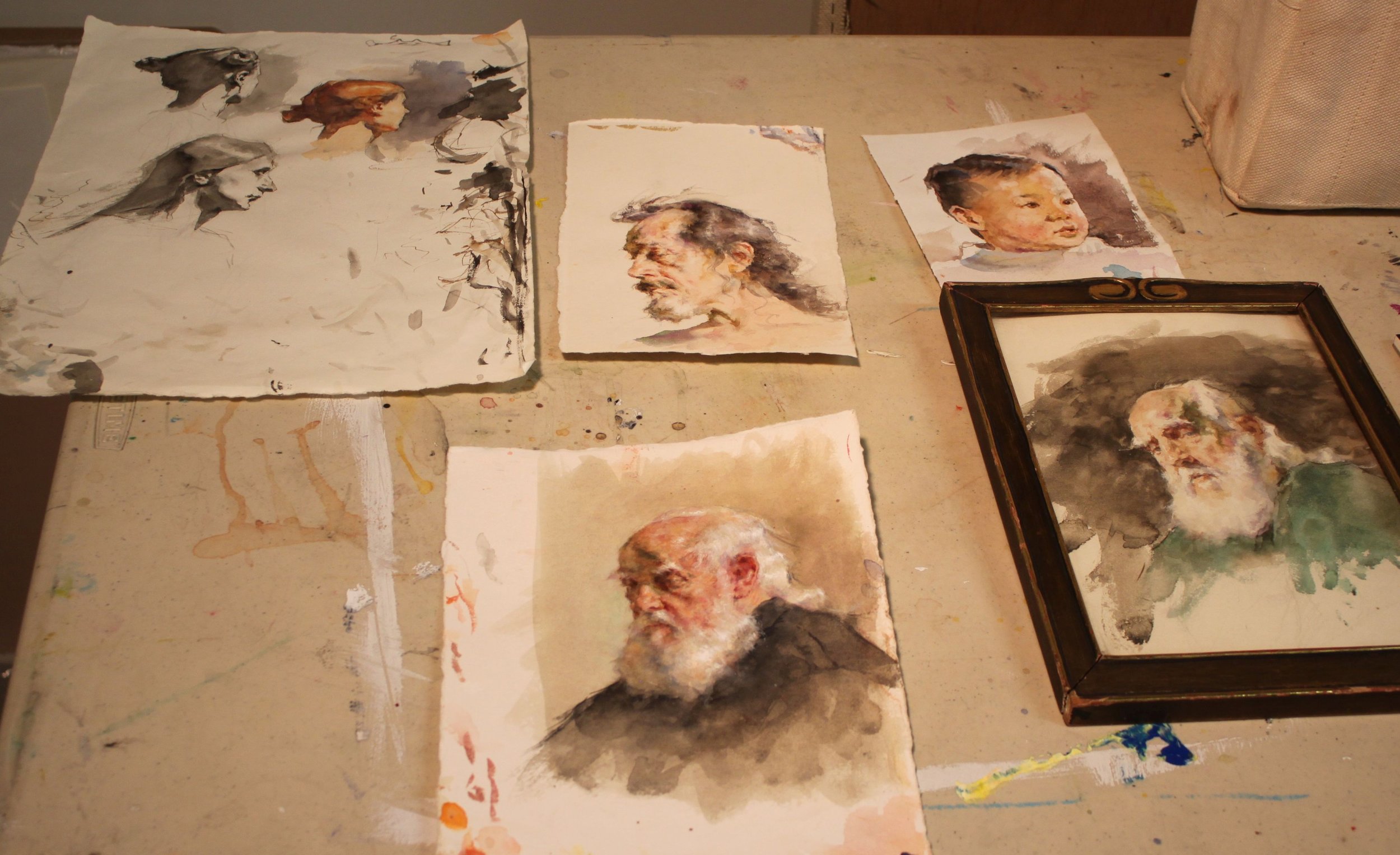
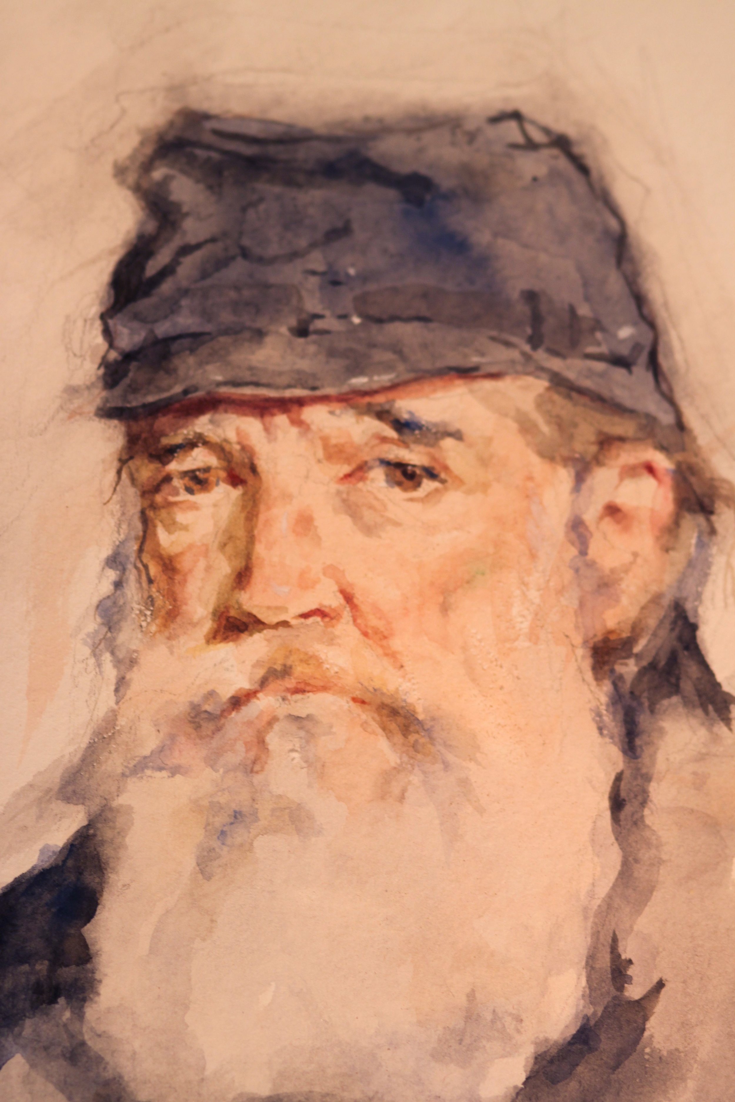
Workshop Wednesday: Robert Liberace's "The Classic Portrait from Pencil to Watercolor"
Liberace_Drawing
Several weeks ago I had the pleasure of attending yet another of Robert Liberace's fabulous workshops at the Art League in Alexandria VA, this one on drawing & painting portraits (watercolor). Every time I find myself in one of Liberace's classes, I am made aware of how much there is to learn about this thing we call "art". Specifically for me I am interested in learning how Liberace makes his work look so elegant and at the same time so dynamic. Every stroke has its purpose and I am working towards accomplishing that same thing (er... at least attempting to).
Here are the notes and photos I took from the workshop (click on the photos to enlarge). It is my honest wish dear reader, that something in the post will resonate with you (and with me) and we'll walk away as better artists or at least more enlightened ones. And how could we not when we are privy to the inner thoughts of a modern day master?
Day One, Drawing the Portrait:
Tools:
Mechanical pencils, bic
Works mostly in HB, uses harder or softer pencils occasionally to achieve his values
Anything beyond 2B gets too dark in his opinion
Nibs
Watercolor
Ink
Notes:
Follow the (Charles) Bargue idea
Strong light & shadow
Liberace loves TwinRocker paper, Canson "Mi Tientes" too
Looks at Ingres for fabric
Treat every detail of the picture like a portrait
Likes to paint in watercolor on a smaller scale like Fortuny
Box out your shadows, map them out then slowly add midtones
Ingres faces are almost decorative--like and engraving but with "spots of action"
Really study Ingres--get a good book on Ingres' drawings!
Make shapes that are so clear & obvious, terminator shading
Add pentimenti flying through there
Tieopolo liked to add "marks of 3" in his drawings, very Venetian technique. Sargent employed this as well
Looser shadow & animated but still differentiation of light & dark
(Tiepolo) Begins with charcoal before ink
Simple mass of shadow
Fortuny used black, umber & sienna in his watercolors, shadow always finding form
Zorn used monochromatic watercolor with opaque white on top for emphasis & highlight
If you ever need to steady your drawing or watercolor readdress area with a contour line
You can add a little water to a brush and dilute an area of a graphite drawing (works the same way as in a watercolor), good for evening tones or for contours

Liberace_WatercolorPortrait
RobLiberace_Watercolors
Day Two, The Portrait in Watercolor:
Notes:
Begins sketching in pencil, then jumps into watercolor
Quick assessment of light/shadow
Will often begin by doing a quick "Tiepolo" style study with one tone, maybe throw in an accent
Loosely sketch in pencil, then adds a gestural contour in watercolor
Adds mass & shadow
Try not to be too specific with lines, be more suggestive--"it is what gives that romantic feeling"
"Your job is to find out where the light is ending, the more you break that up the harder your job becomes"
"Melt" the detail into your shadows if you aren't so sure where they begin
Connect half tones to the shadow & "feather" it out
"It is really all about editing what you see"
Liberace_WatercolorPortrait_Day3
Day Three, The Portrait in Watercolor:
Palette:
Burnt Sienna,
Black,
Chinese or permanent white,
Cadmium Yellow Light (or similar bright yellow),
Cadmium Red ( or similar bright red),
Ultramarine Blue.
Optional Palette:
Alizarin Crimson,
Manganese Violet,
Cerulean Blue,
Pthalo Blue,
Viridian Green,
Pthalo or Hookers Green.
Notes:
When sketching his gesture he holds his pencil at the end
Puts in markers (enveloping)
Blocks in his "axis lines"
Liberally throws crimson wash over the whole face & "melts" it out
Drops in yellow & violet for the beard
Throws in black for the uniform
Shadow on face, a warm green made of black & yellow & sienna
On the nob of the nose uses a little extra red
Drops in extra water for the fold of the eyes--orbital fold
Draws eye, ties it in to the shadow then carefully marks the lower lid with it
Goes back and forth between different temperatures
Will add half tones in when there is not a lot of shadow to delineate form
Thinks in planes, color & temperature all the time
Ties a lot of the elements of the eye together to simplify
Soften edges
Loves TwinRocker heavy text, light art weight, calligraphy cream paper
On halftones he is careful not to leave heavy block ins
"I don't want to plan things too much. Sometimes watercolorists work to tightly--allow spontaneity"
Moves in with smaller brushes
Will use watercolor & a bristle brush to scumble areas
Puts color in shadows
Will refine edges on strokes he doesn't like so that is will dry as a mass that he can paint on later
Really "feathers" a lot of these edges out
Likes to see a lot of shape & pattern to a form like Sorolla & Fortuny
Will erase at the end with a "perfect pencil" (eraser pencil with brush at the end) & then uses a white charcoal pencil to add highlights with
Chinese white paint is used at the end over dry white paint when needed (alla Zorn)
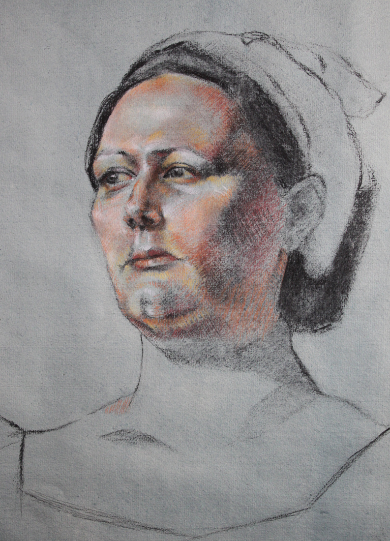
LagoArthur_OldSaltDrawingjpg
Hope your holidays were as wonderful as ours. Wishing you much artistic growth and success in the New Year!