
Workshop Wednesday: Edmond Praybe {Part 2}

The finished Week 3 Full color palette painting demo by Edmond Praybe.
This post is a continuation of last week’s post on Edmond Praybe’s 4 week “Floral” class that I took with him through the Winslow Art Center back in January of this year. The following are my notes and screen grabs that I took during the final Week 3 and Week 4 classes.
Week 3, 05 Feb 2021
-”When working in a secondary palette it is helpful to approach it as if you were working in black & white. Approach your color decisions more as temperature decisions. This is especially helpful in landscapes when you have too much green.”
-”You can introduce and element of change to a painting by repainting an object again in a slightly different location on the canvas (elevating the object, etc.) or by painting it again at a different time of the day.”
-Edmond will move an object in a painting. Often painting it out and putting it back in. “It opens up the painting in a fresh way.”
- The "Euglow approach is to look at the subject frankly each session and to redo the painting each time, not just add details on top.
-You can experiment with a fresh, (quick) first pass in acrylic and then paint in oil on top of that.
-”It is the color of the flower that draws us in. Today we let loose with a full color palette idea.”
-Consider the 4 main aspects of Color: Hue, Value, Saturation, Temperature.
-Simultaneous contrast: what color is next to a color influences the reading of the color. See Joseph Alber’s color experiments.
-”Sometimes it is the colors that are around something that are not working. It is all about the context.”
-”It is helpful to “name” what is wrong with your color. Is the temperature off? Give a vocabulary to the phenomenon that is happening in your painting. Be more analytical.”
-Edmond will sometimes use colored tissue paper as backdrops for still lifes.

Edmond Praybe’s Full Color palette
Full Color Palette Painting Demo
Palette: Titanium White, Tin Yellow, Cad Yellow Light, Indian Yellow, Cad Orange, Cad Red Medium, Quin Red, Manganese Violet, Alizarin Crimson, Ultra blue, Cobalt blue, Cerulean blue, Cobalt Green, Pthalo Green & Mars Black
-Edmond instructed us to “Use any of the above colors and any tint (color + white) mixture in your paintings this week” for our assignment. In addition we were allowed to create up to 4 specific mixtures as needed during the development of our paintings. The result of this exercise was that the majority of our paintings would be painted from the tint strings or pure color.
-”Pthalo green and Indian Yellow will make some really beautiful greens.”
-A good strategy in this exercise is to save two of the discretionary mixes for the end of the painting to use as needed. Or use only tints in the beginning and then create your mixes to bridge any color gaps.
-”The idea is to give everything a very nameable color. Be very direct with how you are seeing the color.”
-For this exercise Edmond will leave a little space blank in between objects and fill it in later so as not to unintentionally mix the adjoining colors.
-Add fast drying mediums from the beginning so it dries quickly enough to work in layers without the layers mixing.
-Edmond will do this exercise in his studio after he has been doing too many “grey” paintings to remind himself that painting is all about handling color.
-”It may be pretty blunt at first which is fine, you start fine tuning as you go. Give up the idea that this is about beautiful painting. This (exercise) is about understanding color - but there will be sections that turn out very interesting. These discoveries are what can inform future paintings.”
-”(On abstraction) Look at flat pieces of form and less modeling. Accent the idea of certain types of flatness. A flat form and then two flat forms coming together. Let them sit together not blending them too much.”
-

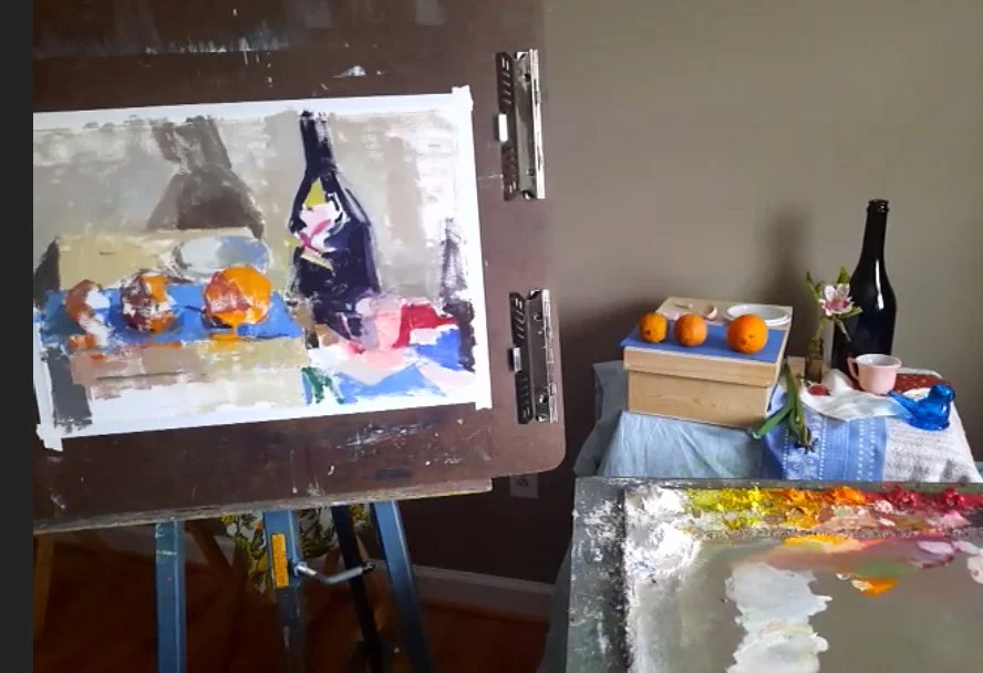
Edmond Praybe’s Week 3 Full Color Demo early on. Notice how he began first with the bottle on the left and then works his way through the composition.
-“Henshe would use the saturation of color as a light in his paintings. Even his passages of white have color in them. “
-Look at Carl Plansky’s work (founder of Williamsburg Paints).
-”Think of (this) color string assignment as a collage that you are adding pieces of color on top of each other. You can scrape down. Yes, you can refine shapes smaller and smaller as you go.”
-”Sita Saxe thought that this type of exercise got you closer to a Diebenkorn and Bay area way of painting. Pure color in shadow, etc.”
-”This exercise is meant to heighten your sense of color.”
Week 4, 12 Feb 2021
-”This week’s assignment is about complexity and composition in the floral arrangements.”
-”(On composition) Consider placement of objects: on floor, on shelf. Where is it in relation to the foreground, background? Where are the objects in relation to each other? How many things are you using and what is their placement?“
-”Start out with a couple items then decide what you want to add of take out. Then analyze and step back".

Edmond Praybe’s demo on arranging still life objects.
-”Paint” the objects (in your mind) first by how carefully you consider the set up the still life itself.”
-”There is no real right answer (compositional solution). It is about finding the balance or off balance between objects.”
-Edmond admits to often spending half a day to set up his still lifes.
-Use a color family or strong color association as your basis for your composition.
-Edmond is thinking about “fun shapes of color” when he composes. He is thinking more about the color and their relationships to objects. Composing purely on color and shape. What the objects are about is not as important. Working in this way pushes the sense of abstraction and the design of his paintings.
“Don’t neglect the power of lighting situations to create interest in your still life.”
-Think of breaking up edges in a fun way. How the color of a white plate on a white fabric flows together.
-”Paint abstractly - but with your objects.”
—”Groupings are a fun way to set up a painting. Clusters of things.”
—Edmond will tape out the edges of the composition of his still life objects so that he doesn’t “get lost”. This helps him to see the actual proportion of shape in a more complicated painting.”
-Edmond thinks that “Susan Jane Welp paintings break all composition rules”.

Edmond Praybe’s Week 4 demo showing his “quick painting” color notation approach.
Week 4 Demo
-In this week’s demo Edmond will use the approach that he calls “quick painting”. He will get some kind of notation of where the placement goes and color and then come back to it the next day so that he doesn’t get too stuck in describing it.
-”Constantly bouncing back and forth between one color or another, one element or another.”
-”It is important to get “notes”, some kind of feeling, for what is happening in the broader areas (background). I think the sooner that you get around into putting these notes of the broad areas of color, the better. It forces you to make color decisions and it will make the painting have a better sense of unity and harmony overall.”
“The important thing is not what it is but where it is. What is the main color, etc? You don’t have to draw everything perfectly but where you put things matters.”
-”This way of working (color notation) is really good for very literal painters.”
-Quadrangulating and triangulating where things will be. Considering your corners in relation to where things will be.
-”You are having a dialog of comparisons.”
-’That struggle of back and forth gives the painting a sense of energy that cannot be achieved by locking in right away.”
-”I kind of enjoy when the painting doesn’t look like anything for a while. I hold onto that feeling. The paintings come out better. There is a more pronounced sense of being seen.”
-“I try to resist the urges to finish a line, resist the urge to draw out the edges and contours of everything just because I know it is there,”
-”As I think of “notes” I am thinking of temperature shifts.”
-”Slowly things emerge out. Like the fog is lifting.”
-”Another good trick is to use brushes that are two sizes too big for what you need in the initial block in if you have a tendency to get too detailed in the beginning.”
-”If you leave too much of a “halo” around objects you don’t really understand how the colors are interacting.”
Edmond Praybe’s Week 4 demo painting at the end of the session.

The final finished painting by Edmond Praybe.
I want to thank Edmond Praybe for allowing me to share my notes and images with you during this post and the first blog post I wrote on him. He is an extremely generous teacher as you can see from all that I have shared. If you have enjoyed what I have shared with you today, then I really would encourage you to take a class with him yourself if you have the opportunity.
Thank you Edmond!

Workshop Wednesday: Edmond Praybe {Part 1}

Artist, Edmond Praybe, Oil on Yupo paper, 2020. Private Collection.
All painters have a list of other painters they admire for one aspect or another. Some artists are admired for technique, others for the conceptual idea behind the work itself. Edmond Praybe for me falls right in the middle of both considerations. He is one of my favorite contemporary painters working in a very modern feel of realism, one full of abstraction and yet his paintings are still ripe with mood, representation and sense of place. The perfect mix if you ask me. And I am not alone in my admiration of Edmond’s work. He was one of the 2021 finalists of the Bethesda Painting Award, a recipient of the Hohenburg Travel Grant, a two time Mercedes Matter Award winner and was recently profiled in the Painting Perceptions Blog by Larry Groff.
I was lucky enough to get a spot in his “Floral” class at the Winslow Art Center in January of this year when we were still under lock down and at a time before the vaccines were widely available. Winslow Art Center was one of the first to pivot to online classes during the pandemic and it continues doing so with a really robust line up of classes including more from Praybe in the future.
The following are my notes (and screen shots) that I took in class that I will happily share with you here over two blog posts (that will be published a week apart). I found his class intellectually fascinating on so many levels and definitely left feeling inspired. So much so that I taken two more classes with him since then and will happily sign up for more.
Week 1, 02 Jan 2021
-”Treat the flowers as a portrait. Treat them as an entity. (Painting flowers) can become cliché when the attention to specificity is lost.”
“Think about yourself as a botanist when approaching your flowers. The specific shapes - the light catching certain planes, the shards of color. Patterns of shape & lines & value.”
Edmond likes to save flowers after they have dried for a “spot of color” in his still lifes. (And a bonus being that they don’t change after they are dried).
Week 1 was comprised of two demos of the same hibiscus flower (students were assigned later the same exercise). In an effort to maximize his time Edmond, prepped both studies with a simple under-drawing that he did beforehand. He painted on Arches oil paper for both exercises. Same toned ground.

Week 1 , Value Study of Hibiscus Flower
First Exercise: Tonal Value study
Palette: Titanium White & a Neutral Dark (Mixed Up of Primaries).
The goal in this exercise is to decipher the internal shapes and forms of the flower, not paying too much attention to the composition. To be used more as a value study for the second color painting.

Limited palette painting of the same hibiscus flower.
Second Exercise: Limited Palette Painting of the Same Subject
Palette: Indian Yellow, Alizarin Crimson, Ultramarine Blue and Titanium White.
-“Think about basic shapes, breaking it down by values.”
-“Working with a palette knife helps you to make broad decisions about value without getting too fussy.”
-Generally starts his paintings by laying down the darkest darks and lightest lights from the start.
-Is interested in specific shapes and how they exist in space. “What is moving toward me, what is moving away.”
-“You will mostly be operating in the middle values. Ask yourself how do you translate saturation into a value that makes sense?”
-”Scrape down and simplify when things get too overly complicated. When the painting gets “too brushy” etc. Chances are it will make more sense the second time around.”
“Constantly re-evaluate the edges. How soft is it? How hard? How about the proportions? Keep your view point constant.”
“The spaces in between forms (negative shapes) will key you into what is the true form of your subject.”
-”Keep asking yourself, "What is the value next to that value?”
-”You can be as “detailed” as you want or as “open/painterly” as you want.”
-”Don’t lose sight of the big planes if you are the type of person who likes to dive into detail.”
-Uses a palette knife to soften edges and transition values.
-”Slowly a sense of the movement of the forms begins to emerge.”
“Always ask yourself: “How light is this light? How dark in that dark?”
-”Never assume that the values are the same as you move across your subject. Most of the time there is a shift. Look for the dynamism.”

Limited palette painting demo using the previously painted value study as a guide.
Limited Palette Demo
-Use the Value Study as a guide for the underpainting on the limited palette.
-In addition to using the palette knife to soften edges, Edmond also uses it to fill in surface, re-state/erase form.
-Uses Impasto Medium for thick passages (C.A.S. Alkyd Texture Impasto Medium).
-When laying out his limited palette Edmond will often mix up the secondary colors; an orange, a violet & green. Then adds white to each to make a mid-tone & light value of each (he likes to have the visual of what gamut of colors and values he has available when working with a limited palette).
-He has a solvent free brush cleaning routine. Just uses Linseed oil. soap and water to clean his brushes.
-Starts painting the red flower with a mid-tone red. Then paints a light red and the background at the same time, varying the color along the contour.
-”Striping off the excess paint with a knife allows you to get more of that ground through and makes things more luminous.”
-Will “blast in a little color” broadly & suggestively when describing form then will come back and describe negative space (which simultaneously describes the subject). This is also a good way to re-evaluate your shapes when working.
-”The color of the area that trumpets out of the flower is always the most subtle. Has more green in it, is duller. If you get it right it makes the color “pop”. A bright colored neutral scumbled in {will do it}.”
-Lays in a mass of color again at the end of the stamen - then cuts back into it to create the form.
-During the lecture portion of class he shows a slideshow of art work to consider and advises, ”Look at Conrad Gesner’s work (German botanical artist). And Margaret Meed. Also Jim Dine’s Sunflower charcoal drawing and Antonio Lopez Garcia. (Look at) Euan Uglow’s Freesia painting.”
-”Morandi painted a lot of dried flowers.”
-Edmond works from life on toned Arches oil paper saying that “Even with figurative work, the secret to (successful painting) is engagement. You get more out of it working firsthand and you get a sense of time that creeps in. It creates a sense of depth.”
-He will often follow the decay of the bloom or will use a “stunt model” and substitute a blossom as needed.
Week 2, 29 Jan 2021
Assignment: Create two paintings from a limited palette, one limited time exercise and one from long observation
-Some painters benefit from time frames to help them focus.
-Edmond sometimes works on Yupo paper. Just puts a layer of oil paint on top (it is made of plastic, no need to prime).
-”You can get away with “mushy transitions” if there is a bigger shape to hold it in. Otherwise you will get the amateur look of everything being blended to the same degree.”
-At the end of a day of painting Edmond will scrape down all of his paint in to neutral piles and add a tint of white to these mixtures. He will then use these grey piles to neutralize his colors if needed on the the next studio day. Edmond will also use these mixtures to tone his canvases and papers.
-”Find a visual lynch pin in your object then compare out from there. Especially helpful for something complicated like a pine cone. It also helps you figure out distortions.”
-”Be open to allowing the painting to develop as it wants to. If it wants to be a 2 hour painting - then let it”.

Week 2 demo. Notice how Edmond paints the objects as he goes along (as opposed to drawing the items and then filling it in with color).
Week 2 Demo
Limited Palette: Titanium White, Cad Yellow Lemon, Cad Red Medium, Cobalt blue, Thalo Green.
-Starts by adding a note of color and then draws the shape of the water in the vase.
-”This is roughly where this blue is going to be” he says while adding his notes of color & initial drawing to canvas.
-He paints very ambiguously not really defining things initially. “Be accurate with color but lose with drawing (in the beginning).”
-”If something isn’t working don’t be afraid to come back in with a rag or palette knife and get that paint off.”
-His demo grows from one point out. ”Build your form out with the paint - not just color it in.”
-If a mark is too forceful he scrapes it down to make it push back into the space better.
-Balance giving enough accuracy to make sense as an image but do not lose the gestural quality of the paint itself (which you get in faster sketches).
-”Sometimes the best solution for a tricky part is just to let it rest & come back to it.”
-Uses his palette knife a lot to incorporate the object in the background.
-As yourself, “Is it there vs. do I need to state it?”. “Do I need it to further the main goal of the painting?”
-”The areas that I try the least are the best, the areas that I focus on too much I overwork.”
-Edmond tries to approach a fast painting like a Diebenkorn with areas of transparency in the paint application.

Week 2 limited palette
Stay tuned until next week for Part 2 which will cover Weeks 3 and 4 from Edmond’s “Floral” class.
-

Workshop Wednesday: Dennis Perrin

“Sonata” by Dennis Perrin. 40” x 40” Oil on linen. Available through his website.
"My method flows from page 17 and 18 of Robert Henri's "the Art Spirit" shared Dennis Perrin on the first day of his floral painting workshop.
Over the course of 3 days in May of 2019, I had the pleasure of attending a workshop by Dennis in a private studio. We watched in rapture as he painted not one, but two beautiful demos that long weekend. What I observed was a gifted artist who was also a deep thinker, a man who was as interested in philosophy and meditation as he was in the art of painting.
Among Dennis’ many gifts, he certainly has a gift for simplifying information. It is a trait I have tried to cultivate in my own teaching practice and so his method resonated with me immediately.
The following are my notes that I took during his workshop mostly on day 2 and 3. The photos were taken by me and fellow attendee Lorrie Herman.

The first demo..
The Palette:
Winsor Newton Water Soluble Artisan Paints
Titanium White, Cad Yellow Light, Cad Red Med, Cad Red Dark, Alizarin Crimson, Cerulean Blue, Ultramarine Blue, Viridian, Ivory Black
Day 2

Early stages of the second demo. Notice the quadrant framework underpinning the composition.
-Dennis begins with a very soft gestural drawing in Alizarin Crimson.
-He looks for ”counterpoints of weight” in the four quadrants of the canvas.
-Encourages "intuitive placement" first, then checking for accuracy.
-"Ask yourself ; Do I want drama, poetry, a lyrical feeling?".
-"If background is close in value to the subject then you get poetry. It will all merge together as subject".
-"You are looking for the integration of all the elements in your painting. Bring things together in a much more subtle way".
-"The mood of top-lighting is more uplifting - convivial. In almost all classic painting the subject is light form above".

Dennis’ palette for his first demo. He began with 5 puddles of local color/value and then altered them as needed while he worked.
-Begins painting any subject by reducing the visual information to 4 or 5 values of local color and mixing them accordingly. This is based on the writings of Robert Henri where he explains that all masterworks can be reduced to 4 or 5 values. {Try analyzing any masterpiece yourself and you will see he is correct}. Dennis then alters those values within strings as needed.
-"Scumble in the lights, you want to see the pattern of light & shadow".
-"(When squinting) If shapes merge, let them merge".
- Uses a size 20(!) flat brush in the beginning stages of painting.

Blocking in the light and shadow shapes and to the right beginning to shape the forms further.
-Uses the tip of the brush when abstracting foliage.
-"Paint a mass from which the stems will emerge".
-When painting silver uses overlapping strokes of black + yellow + red for the dark value.
-"Blues (and black) put you in the right value slot, then red, yellow and orange tip the color ratio".
-When painting the roses, he used cobalt blue + cad red dark + yellow + a touch of white for the rose shadows.
-"Don't overmix your paint. If you mix with a brush you avoid that".
-"Mixing with a brush allows you to stay in flow and this is what you want".
-Will use the background color in turning the form IF the value is right.
-"Unity over diversity every time".
-Uses a palette knife to remove soiled paint into piles.
-When he has painted for a substantial amount of time he steps back from his canvas and muses, "I tell myself that I am on my way to town but that I am not there yet. So if the color, temp, etc. is off that is ok. I will get to town eventually".
-Switches to a size 16 flat or filbert brush when when beginning to refine shapes.
-"Simple statements. You don't have to be perfect, just convincing enough".
-Recommends that people read the book, "The Painted Word" by Tom Wolfe.
Day 3

Second demo close to completion and final state.
-His painting needs a little reworking because a couple of flowers expired.
-When replacing flowers, do not pull the old flowers out because you will disturb the arrangement. Instead, cut the bloom and insert the replacement with a much shorter stem so that it will merge with the arrangement".
-He paints while wearing a hat in the studio which helps when assessing values.
-Prefers a broad stroke when building form. Lays it down Horizontally and if the area needs to be smaller will look for a smaller brush width to fit it.
-He likes the look of Carol Marine's brushstrokes.

Detail from the second demo (the lower right peach rose).
-”You can create a painting from start to finish with a bright.”
-A more limited palette to try is: Cobalt, Cad Red Dark & Cad Yellow Light + White.
-Suggests keeping values to 3 for exercises.
-Try limited stroke exercises.
-He intentionally makes his table line very subtle so as not to take away from the contrast/balance of the painting.
-”Start looking at painters who say less with their paintings. It is how you build aesthetic. Search them out, study with them and them approach your work with the same intentionality.”

The set up for Dennis’ second demo. Flowers were carefully replaced as they wilted.
At this point I bet you are wondering how you can study with Dennis (smart question)! Luckily for all of us during this time of COVID, Dennis offers virtual courses and mentorship opportunities through his “genius circle” , For more information click here.

Our jubilant band of happy painters at the conclusion of the workshop (I am on the far left). A special thanks to Dennis, his wife Aimee and our dear hostess Francie Freitas for making it all possible.

Workshop Wednesday: Scott L. Christensen
Scott L. Christensen 3 hour demo.
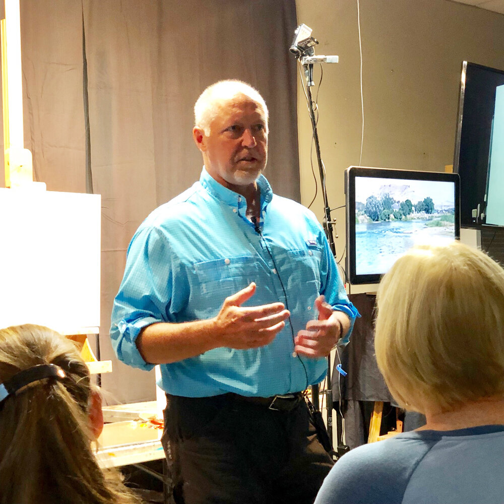
Artist, Scott L. Christensen speaking to a packed room of workshop attendees.
A special workshop just wrapped up last week at Zoll Studio School of Fine Arts in Timmonium MD. Reknown landscape painter Scott L. Christensen shared with a group of very lucky students his process and personal development as an artist during a 3 hour demo. I was one of the eager fans in attendance.
I am sharing with you here the notes and photos I took during his demo (with permission of the artist). I take copious notes during any workshop/demo I attend because I am a visual learner and it helps me to retain information better that I receive verbally (i.e., in a lecture) and also because I can revisit my notes later during my study time. Self directed learning is something I apparently have in common with Christensen who credits daily studying as one of the keys to his success.
ON THE VALUE OF STUDYING:
-Don’t try to make good paintings when doing plein air. Paint to study, to get information. Worry about the painting itself later.
-”I would rather do volume when working outside then try to wrestle a painting to the ground (by over rendering)”.
-”When you study outdoors you have to sacrifice something. Decide what the focus of your study will be.”
-He limits his palette when making studies.
-He studies for hours outdoors everyday. It is part of his regular working practice.
-”Study paintings and take them apart”. When going to museums, he often takes detail shots of paintings that he admires that have a good solution on how to paint a rock, a tree, etc. He then turns the photos into black and white and studies them more closely to see how that artist achieved that specific effect with value, form, composition… whatever information he is seeking.
-”Ask yourself why the Master did things? They did things for a reason. Figure out why”.
-He has done a lot of studying on Sargent and more recently, Fechin.
-”Study what it is that you like about an artist, and what you don’t”.
NOTES ON CHRISTENSEN’S PROCESS AND SUGGESTIONS ON PAINTING::
-Begins by writing in his notebook, trying to define the scene in front of him with words. He asks himself questions like; What is drawing him to this scene? Is it light? Color, etc? What compositional elements can he build upon? He then settles on something from this enquiry that he wants to explore further, and makes that the theme of the painting.
-He often starts exploring ideas by working on craft paper or drawing in his journal.
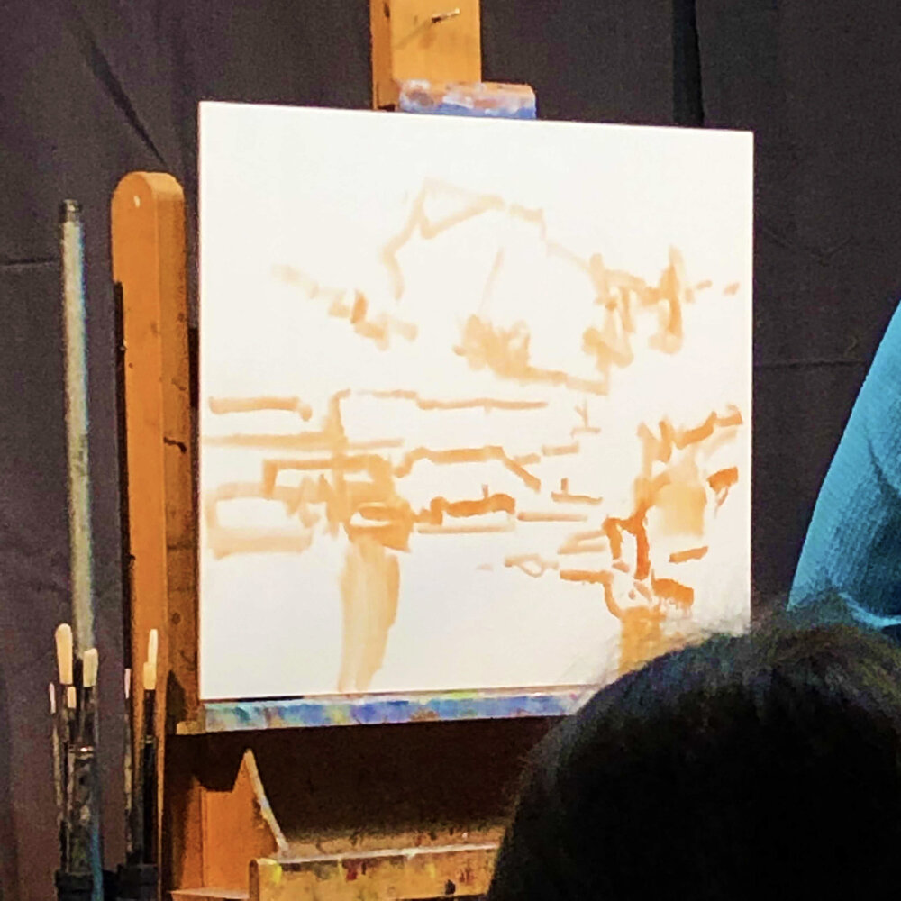
-The next step is to distill the composition down initially into “10 lines” on the blank canvas. In the demo he used just transparent red oxide and paint thinner for this step. The idea being to simplify and develop all the elements of the painting at the same time. He is after unity of subject here. Christensen says that “connectivity of things is one of the hardest things to paint”. He believes that connectivity/unity of composition is much more important than rendering a specific tree or rock perfectly.
While making his 10 marks he asks himself:
”What is different with this space compared to that space?”
”Where is my variety”
“Should I add a cloud here for tension?”
“Think connecting points and tension areas (where your eye draws to)”

Some of the beginning “10 marks”.
The entire “10 mark” composition mapped out.
-When working from reference or life, don’t allow the photo or scene in front of you to decide the placement of things. “You decide the composition”.
-He looks for “unequal distribution of shapes and scale” in his compositions. Too many shapes at similar sizes is not interesting.
-”All the detail in the world can take place AFTER you have your design down”.
-While traveling he has started using gouache. He did 100 gouache paintings in one month recently but feels that is not enough time to really know the medium.
-He preferes to paint to music.
-His palette consists of the following Vasari paints (partial list):
Cobalt, Ultramarine Blue, Kings Blue, Video Blue, Yellow Deep, Permanent Red, Ruby Violet, Transp. Red Oxide, Thalo Green, Chromium Oxide green (which he uses less often) and the Vasari neutrals that he developed with the Vasari Paint Company, “Color and Light” set.
-When mixing color he starts with one of his neutral greys and then adds a color hue into that say Bice and Cobalt blue.
-His philosophy on color is based on p. 88 of Carlson’s Guide to Landscape Painting book which reads, “good color has infinite varieties, a reserve.”

Christensen’s palette. Notice how he efficiently groups values together.

Here Christensen is beginning to lay in some of his color notes. You can see him altering his blue values as he searches for the right relationship between the water and the sky.
-He begins his paintings with brushes of all sizes (including a 2 inch brush for blending water for instance) and will then switch to palette knives after he has locked in the design and is seeking more impasto.
-Reminds us that Sargent stayed in the mid-tones most of the time. He added his darks only at the end. ”Staying in the mid-tones adds unity to a painting”.
-Quotes Carlson, “its the juncture (of values) that require thought”.
-Reminds us that a specific value can appear differently when surrounded by lights and when surrounded by darks. Keeping this is mind will help with the simplification of values.
-”Keep it all in tone. Every note must be in harmony”.
-"Put in determined value, not half value, not “sneaking up on it” value”.
-”Try to go out & do relationship painting. Try to figure out those things instead of trying to paint the perfect tree”.
-”I am big on experimenting with most of my painting”.
-Moves specific temperatures (colors) around the painting by adding it in a new area- but always alters value appropriately first.
-”Sometimes I will completely change the season of a painting”.
-Will recompose a painting as he goes along if needed “I might put something in and the take it out dozens of times”.
-”It doesn’t take long to lose a painting if you (mindlessly) just pat color down for 2 mins”. Be intentional.
-Uses a mirror once his painting is established to check for corrections.
”Landscape (painting) is learning to put parts together more than anything else”.


SOME THOUGHTS ON THE STRUCTURE OF CLOUDS:
-Clouds get warmer at the core.
-Value & temperature changes make something turn.
-The yellow in a cloud will turn to orange and then red as it recedes.

Christensen’s finished painting with palette.

Christensen’s finished 3 hour demo.
“Be willing to sacrifice your paintings to get something better overall.
Be willing to make them ugly, then fight to make them better”

Workshop Wednesday: Kathleen Speranza

“Yellow Cluster”, Oil on panel. 11” x 11”. Artist, Kathleen Speranza.
There are few floral painters today who can conjure up the sublime in their paintings, Kathleen Speranza is definitely among the best of them. There is a palatable, moody atmosphere in her paintings which envelopes her still life subjects. This atmosphere simultaneously ensconces and reveals the delicate forms of her subjects, often English roses. And since I have been in search of the sublime recently in my own work, I jumped at the opportunity to study with her when she came to the Art League in Alexandria VA this past summer.
She will be returning to the area to teach a private sold out workshop in Purcellville VA in early December 2019. If you are interested in getting on a wait list should a slot open up, please contact me directly.
The following notes and photos I took myself so that I could continue to study on my own. Hopefully they will inspire you to spark a little moody magic in your paintings.
Day One/June 11, 2019:
ON THE SUBJECT OF ROSES:
-Kathleen has been working with the subject of roses for the past 4-5 years. She is still working on unlocking the secrets of subtly.
-”The growth habit is more beautiful in a garden rose”. A living plant twists and spirals into form. In nature this is called “Equiangular Spirals” or in design it is known as “Dynamic Symmetry”. Other terms for this are the Golden Mean and the Fibonacci Spiral.
-When she does work from florist roses (long stemmed), three of her favorites are “Juliet”, “Patience” and “White O’Hara'‘, all from David Austin. She recommends purchasing the cut flowers from Florabundance.com, an on-line retailer of flowers.
-When working from the rose she thinks of it as occupying space, and the background around it as space as well.
-She often composes her arrangements with a tiny vase so that flowers spread out - not tall and narrow. Also loves using just the floral frogs to allow for “more air”.

Kathleen Speranza’s charcoal drawing on Fabriano Ingres laid paper.
ON THE SUBJECT OF DRAWING:
-She does drawings constantly. Her drawings help her to “think” about her compositions.
-She uses her prepatory drawings to help her edit her vision for the painting. Kathleen has discovered that if she works directly from the roses when painting that she often ends up painting everything and losing the essence of subtly and restraint.
-When working with charcoal she prefers Nitram and will lay down the charcoal & then lifts the light. “The light is everything”.
-She will also draw with graphite.
-Prefers Fabriano Ingres laid paper. Tip: Place a thick pad of paper behind the Ingres paper when drawing.
-She draws and paints in natural light. Natural light is ambient - it envelopes the subject.
-She thinks in term of “light to dark” and “dark to light” when setting up her still lifes and also when drawing/painting.
-”Feel the gesture, the curvilinear marks”. Create compound curves w/straight edges.
-”You can’t get momentum if you hold the pencil like you are writing - that kind of detail comes later in the drawing”.
-”Make an ugly drawing first - structural, a boxy block in”.
-Lays down several lines with each angle - “feels'“ her way through. Makes cross hatches to indicate the end of a petal. Angled dashes that break the edge.
-”The edge tells you everything about the interior. They are hugely important”.
-”Veils in” the overall shadow.
-Recommends watching Sadie Valerie’s video on shading a sphere.
-”The viewer will see your experience- not your goal. Slow down and enjoy every detail”.
-”The background creates your edges.”
-“Laid paper slows down your darks - allows for the marks to breathe. Much more interesting that way”.
-”The more shapes you put down the more variation in tone you will have”.
-”The whole thing is straight lines. Take extra care around strong contrasts. Make sure each petal is where it should be exactly at this stage of the drawing.
-”if you go into details too soon you will make it too complex. This is not what you want. You want to simplify and go for subtly”.
-Use a grey scale with 9 steps and work toward those values in your drawing.

Kathleen’s paint mixing demo using the Munsell Color System to dial in on the exact value, hue & chroma of the rose petal above.
INTRO ON THE MUNSELL COLOR SYSTEM:
-Comes out of the French Academic system.
-Hue + Value + Chroma = Subtly
-It is based on 9 value color chart.
-Kathleen creates a mixture she calls “blumber”. 2/3 ivory black + 1/3 raw umber. She then adds white to this mixture to achieve the correct value and finally adds a color hue to arrive at the final value and color of whatever she is painting.
-Always add dark to your white. If you go the other way you will use too much white. Conserve your white.
-The student Munsell book contains 60 colors.
-Practice the color system by doing master copies. Use Google Art Project for references of the highest resolution.
-Be aware that the influence of black in the Munsell color system makes everything you mix a little greenish.
-It is a good idea to tube your paint in advance (blumber + white to achieve the 9 values in a value chart).

Underpainting block in
DAY TWO/June 12, 2019:
NOTES ON PAINTING DURING HER DEMO:
-Kathleen set up a split compliment for her demo composition. Yellow & grey.
-”Color is relative- edge to edge”.
“The classic still life is light to dark, or dark to light”.
“Look for structure, large mass & contrast”.
-”I have to believe the space I am making. Sometimes I get it right away. Other times I have to sand it, mash things around first”.
-Quotes Flannery O’Connor, “I don’t know what I think until I read what I write”. Feels the same way about her work.
-Uses a colored sheet, studio wall or box as her background.
-Degreases panel first with gamsol on a brush.
-Starts the underpainting with yellow ocher and plans to work in values 1 - 5 with a little darker for the leaves.
-Her set up has a nice horizontal arc so she is creating her composition horizontally on her panel.
-Does not start with “darkest dark” works in mid tones first.
-Starts her under-paintings with a floppy brush. For this demo a large comber.
-Masses in background with fluffy brush. Leaving object as negative space within.
-“You are making a space, not an object”.
-“Don’t think roses, think midtones, large shapes etc”.
-Consider light, height and spread of plant when composing.
-Wipes out as needed.
“The one thing your eyes can hold is light. So we are after that one thing our eyes can truly hold. Think about that for a minute”.
-”You have to look at the whole thing or you won’t make a space”.
-“It is much better to do a “raw underpainting”—meaning not too developed because otherwise I won’t want to cover it.”
-“If I put an edge there it will pull everything forward. I want to delay those decisions until later”.
-”If I am struggling with a painting I will overlay a grid on it to look for the path of composition. But I don’t start out rigidly with the grid”.
-”I work around an object until I understand how something is unfolding”.
-”Keep the edges soft”.
“Save your best drawing for the end of a painting. Delayed gratification”.
“Think about the paint and not about what you are painting. You have to trust that you can paint your way out of anything”.

Underpainting with background lay in.

Establishing the darkest green shapes of the painting.
NOTES ON PAINTING WITH COLOR:
-The understanding of color is all about relationships.
-The color of roses is deepest always in the center or in the creases (unless it is red). The color compounds by the overlapping of each petal. In other words the petals are all actually the same color but they appear darker as they overlap.
-She uses just a simple yellow & black mixture for her leaves & stems. Try black + yellow ocher, black + lemon yellow, black + cad yellow med and black with indian yellow.
-For blue greens try; lemon yellow + ultramarine blue, cad yellow med + cobalt blue, or cad yellow med + cobalt blue + ultramarine blue.
-Think “dark, blueish green”. Think in 3 descriptive terms when mixing, it will help.
-When people paint flowers they tend to use too much chroma.
-Sargent is known to have said “Use fewer colors & more values”.
-Kathleen uses the following colors from Marvin Mattelson’s flesh palette (with whom she has studied) , terra rosa, indian red and yellow ocher to use when painting roses.
-”Here’s a tip for painting clouds and skys. Start at the top of the painting with ultramarine blue and as you get closer to painting the earth, switch to cobalt blue then cerulean blue and finally manganese blue. The color of the earth affects the air around it - so it becomes greener as it gets closer to the ground.”

Kathleen’s demo at the end of Day One.
FINAL MUSINGS:
-”If you copy from a photograph you are not making space”.
-Do not paint all the edges the same, it will not have a life force. It will turn out flat.
-“Hedge the whole painting with edges that are “open” so that when you harden an edge it leads the eye immediately”.
-When working, Kathleen often pushes the subject “out” and then paints the background “in” towards the subject. She then works that edge. {Sargent is said to have also worked this way}.
“Get rid of the word background. It doesn’t exist. Everything is relative in color. Color exists edge to edge.”
“Do not make pictures.
Make experiences.”

Workshop Wednesday; Casey Childs' Painting Oil Portraits From Life

 When I take my copious notes during workshops I have a system of highlighting certain passages by assigning a number of stars to them or by calling some things out as "money tips" (my terminology for thoughts that truly add value to your painting). When I looked over my notes for Casey Childs' painting workshop, I found stars and comments littered through out the pages. What I am giving you here is some of the best advice to painting that I have heard, at least that is the way it struck me. Part of Casey's genius as an instructor is that he is a really good communicator and can easily explain both his working process and (more importantly) his thought process in ways that students can digest.
The following notes I took during Casey's Painting Oil Portraits From Life Workshop in October of 2017 at Francie's Studio in Purcellville VA:
____________________________________

-Casey believes it is good for your painting to work on charcoal drawings in between, because it forces you to work on values.
-Working with a limited palette is also good if you are having problems with color.
-It is well documented that Sargent used lots of paint. You should too!
-Casey uses a palette of 3 reds, 3 blues and 3 yellows. Ivory Black, Flake White (lead white -does not use titanium white). Genuine Naples Yellow Light (Vasari), Yellow Ochre, Raw Sienna, Transparent Red Oxide, Cad Yellow, Cad Red Light, Alizarin, Ultramarine Violet, Ultramarine Blue, Cobalt Blue, Viridian, Bice (Vasari), Ultramarine Blue, [Writer's note: may not be transcribed as a complete list of his palette nor in the correct order].
-Casey believes in pushing primaries together to make subtle grays. He finds & mixes color accordingly.

-Makes his own panels with gatorboard and linen canvas that he glues together using Beva Glue Film. He hand irons it together.
-When beginning a new painting he lines up the canvas at eye level.
-Starts with a thin wash of neutral color. A red + a blue + black.
-If anything is too warm he hits it with the complementary color. He is always thinking what he needs to adjust.
-Then he begins to wipe (with a blue paper shop towel) out shapes which immediately makes him think only in regards to lights & darks.
-Raw Sienna + Alizarin + Blue for the under-drawing. Today he is pushing the mixture towards warm because of the models red hair.
-"Get the shapes to relate to each other and you can start to get a sense of likeness without even drawing."
--"This simple block in approach is so important - spend the most time on that. You can't fix poor drawing with colors or edges."
-"Try and be a perfectionist. If you are tackling portraiture you have to be."
-Maintain the relationships of light & dark. Meaning, keep the values in the general same range.
-Starts working with color by jumping into the darks (Aliz + black).
-Observing where else you can use a specific color is a good way of harmonizing a painting.
-"Think of the biggest brush you can use for something then go one brush bigger. You get better marks that way."
-Uses the following mixture as his initial flesh tones; Ultra Violet + Lead White + Cad Red Lite + Yellow Ochre + Bice.
-Lays in color swatches to test value.
-"I'm slowing down. Just looking at big shapes."
--He purposefully dulls down the flesh color so he can sneak in more primaries, pushing the greys into one chroma or another.
-Casey observes on the model a blueish tint in between the shadow & the light (known as "the last light") and paints it that way. He uses subtle color to turn form. It is one of the cornerstones of his painting.
"I am trying to build the eye without building the eye (by building the large shapes). I put in my shadows, then suggest a color and then another value change. All those little notes come together & build the eye."

-"The areas that are not necessary I blur out or leave intentionally out of focus. With eyes for instance, I take my time & detail them well and in focus."
-"I often draw something by drawing the things AROUND it."
-"People often make the value of the crease near the nose way too dark".
"You can hold more paint in a bristle brush than you can with a soft hair brush so I often switch brushes to lay in more detail."
-"As I lay down piles of paint, I utilize them in creating new colors-- it helps harmonize the whole painting." Grabbing from the "mother puddle" to create new tones.
-When working on larger paintings he often starts the under drawing in charcoal and then works in a similar way to his demo, working general to specific. He works ALL the figures up at the same time. This allows him to bring areas into fuller focus and leave other areas more finished which gives more life to a painting.
-"Notice that I haven't really drawn the eyes or nose. I've been concentrating on the big shapes but because I have done that it suggests the other parts."
-Highly recommends Harold Speed's Painting Book.
-"Sneak up around the eye. Find the eye socket first then suggest the eye --only then do you add eyelashes."
-Thinks darkest dark, lightest light. The highlight on the eye is the purest white. All other lights are local color.
-Always maintain the relationship between shadows and lights.
-Local face color usually appears in the following "banded" manner (based on the amount of blood seen under the skin)---Forehead: Yellow, Nose: Red and Jaw: Green.
-Around the eye sockets things lean more blue.
ON REFINEMENT
-"Lead your viewer to the areas you want to stand out by how much refinement you do to that area. Think Rembrandt. Closer to the light has more detail. You can focus on a couple of features and bring them to refinement--but be choosy."
-He prefers filberts in bristle rather than flats.
-Makes corrections first (color, drawing etc.) when choosing what areas to start back into.
-"I paint like I am a millionaire (meaning use paint like cost is not a concern)."
-Color has a tendency to cool as it goes into shadow (last light) although on fleshy areas like cheeks & nose it can be warmer.
-"When painting the iris I am going to make that whole circle dark & then place the color on top. It is more pleasing that way."
-Likes using Trekkel Brush Restorer for keeping the shape of his brushes.
-Likes to paint with the corner of larger flat brushes.
"I think in terms of time when painting, especially in front of the model. For instance I will say to myself "spend 20 mins on that eye and then 20 mins on the other eye."
-Eyebrows--make lighter initially and then darker as it turns.
-Paints the darker circle of the pupil and then places the highlight on top.
-Don't paint a hard edge around the pupil.
-Load up the brush and add the lead white highlight to the eye, but be careful & delicate when placing! For this application he uses a Rosemary 279 flat 0 though he would have preferred a 2 or 3.
-In general key the nostrils lighter.
-"Refinement of value is all you need to turn the form on the nose."
-"It is important to work in value strings so that you can go up and down in value as needed." Incidentally, his value strings are not grouped by color so different colors merge together according to value to create his value strings.
-"Value is more important than color. If the color is close that's good but what is important is the value."
-He built his eye (with this particular model) using the value of the neck shadow and then simply adds more strokes of value on top, either lighter or darker, to build form as needed.
ON HAIR
-Lays in a middle value then will paint the darks & lights over that. Using a #6 brush or bigger. #10 for laying in the initial color. Used a palette knife on the shoulder to scrape back a little.
"Squint and paint the passages of light over the hair. Paint hair in one session because it will change."
I will end this post with one of his best tips so far: "Start everything with the middle tone value & then paint lights or darks into that (air, jewelry, features etc). And paint back to forward, always thinking about things in terms of depth."

Casey will be returning to Francie's Studio to teach another Oil workshop this April. He is honestly one of the best instructors I have studied with. I would highly recommend him to all of you and there are still spots available in this workshop. If interested, please email me at lagoarthur_studio@yahoo.com for more details.

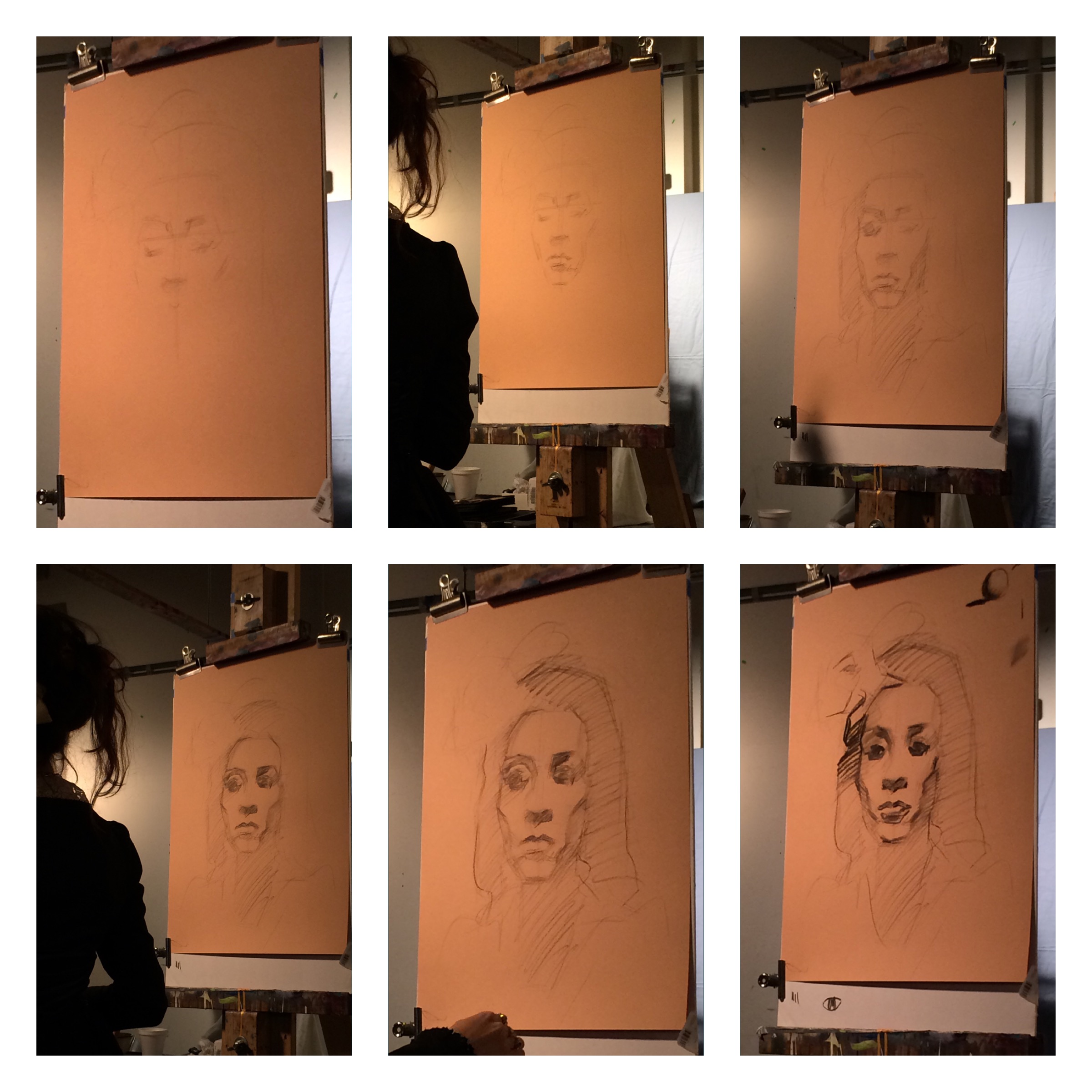
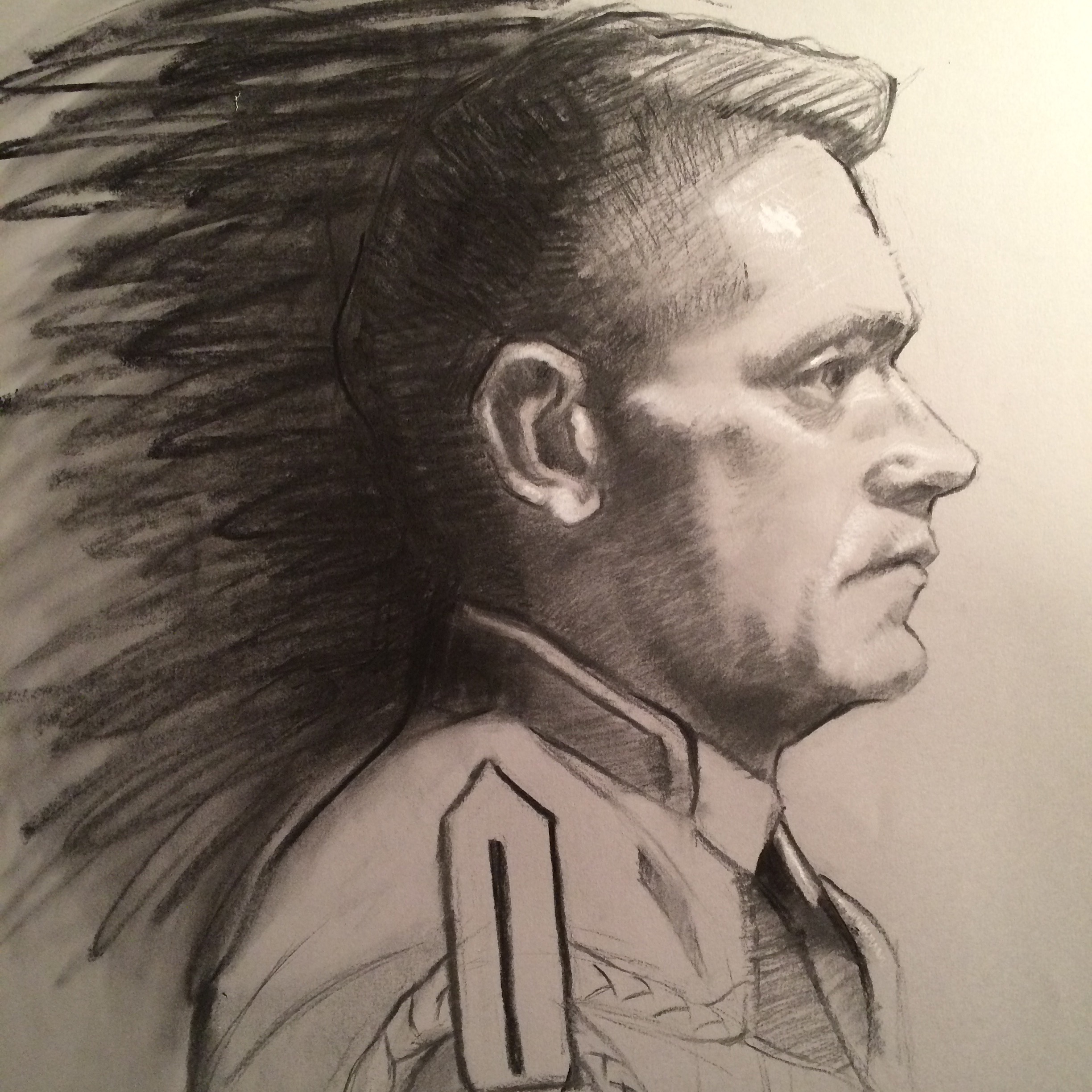
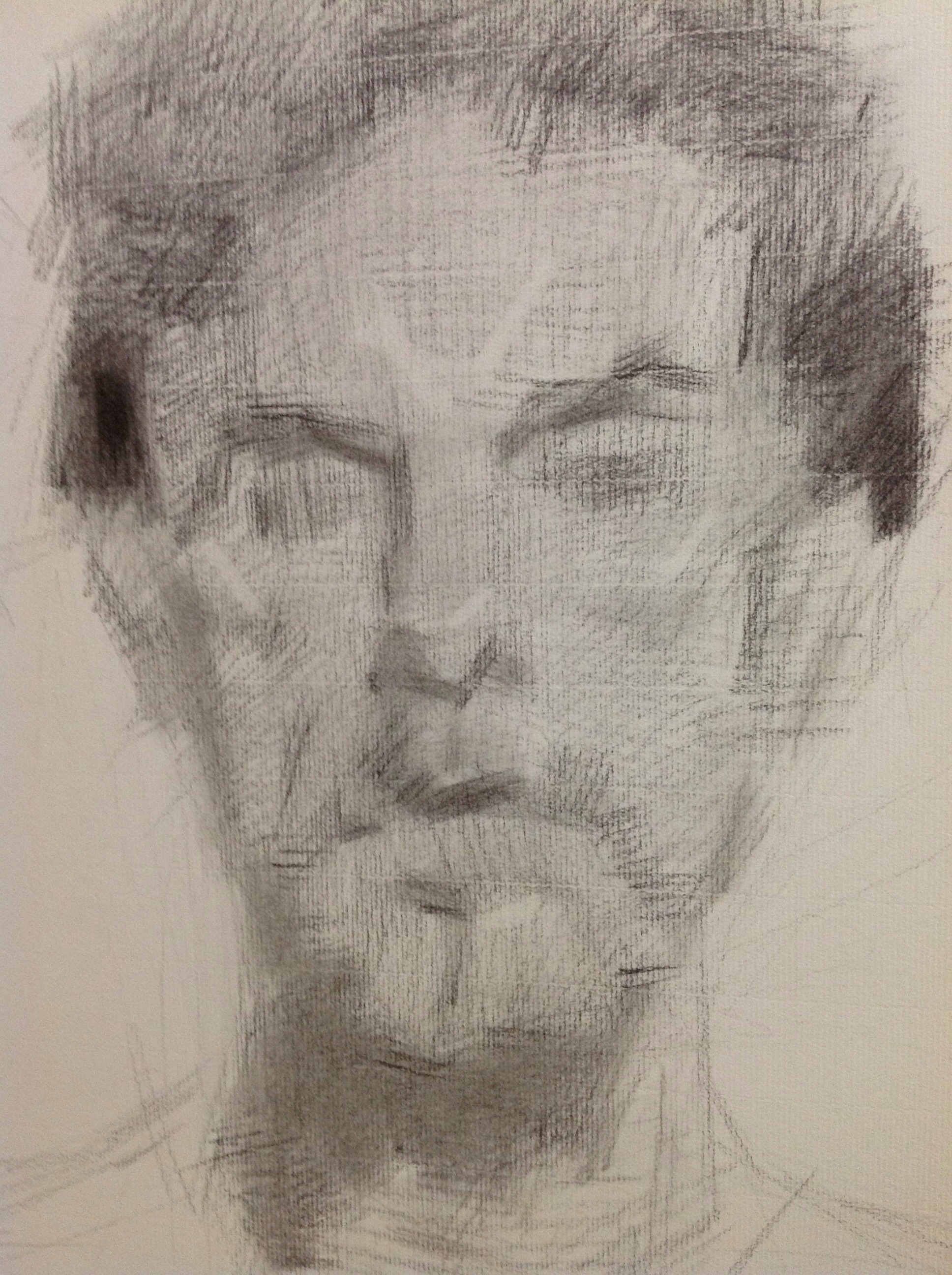
Workshop Wednesday: Casey Childs' Charcoal Portrait from Life
 The following are my personal notes that I took at Casey Childs charcoal workshop last Fall. Altogether I have taken 4 workshops with Casey. With each opportunity to study with him, I truly feel myself growing as an artist. And as a rather frequent workshop attendee--I can tell you that is a rare thing.
Normally I am happy if I can walk away with one or two new aspects of technique or approach in my painting after a workshop. Rarely do you attend a workshop where the instructor literally changes the way you THINK. And that my dear artistic friends, is really where improvements happen. We could talk all day about what brushes to buy and what paint to use but what truly matters is what you are thinking in that complex brain of yours that drives the brush in your hand. Seek enlightenment and your painting will automatically get better.
Casey himself is a friendly, laid back and humble kind of guy. He does not carry airs---he does not need to. His work speaks for itself. Casey is a regular finalist in the Portrait Society of America's International Portrait Competition. He is a sought after portrait and gallery artist and is represented by Principle Gallery, Haynes Gallery, Meyer Gallery and Illume Gallery.
Without further prologue, here are my notes from two relatively recent workshops I took with Casey at Francie's Studio, a private and intimate work space in Purcellville VA. I will divide up these notes between two blog posts that I will release over the next two Wednesdays as part of my "Workshop Wednesday" series. This particular blog post will concentrate on Casey Childs' Charcoal Portrait Drawing From Life Workshop. The second post will be on his Painting Oil Portraits From Life Workshop.

Charcoal Portrait Drawing From Life Workshop
-Casey says he draws and paints in the same way. He thinks the same things when he approaches both drawing and painting.
-He begins by taping two pieces of willow charcoal together to simulate a long handled brush. He uses a razor blade to sharpen it to a "big long needle point."
-Measures in the traditional way with his arm extended and straight taking comparative measurements, not sight size.
-Uses a brush to gently knock off or soften "area ridges" made from the charcoal line.
-Casey personally believes in using just a little bit of white chalk as an accent in his charcoal drawings. He says to look at the drawings of Fechin and you will see the same restraint.
-Prefers Canson Mi Teintes paper (in Pearl) and uses the smooth side (the side normally with the sticker).
-Be vertical with your easel and keep line of sight (eye level) right at the middle of your paper.
-Use your whole arm when starting out. Place "tick" marks to define the outer dimensions of your subject. Top & bottom, right and left etc.
-Shoot for life size of your subject or just under.
-Outline shapes. Think flat, think proportions.
-He uses the side of his charcoal too so he doesn't break the point.
-"Charcoal is similar to painting in that if you lay too much down initially you can't easily work with it."
-Often uses hard charcoal as a "stump" to push around and refine things more.
-He feels free to leave unintended marks -- "because it could add interest later on."
-He does use some lines as contour.
-Prefers to break up his drawing workshop over two days in this manner: Day 1 focus on shapes and drawing, Day 2 Finish & details.

-From the initial 2D block-in he begins to look at large forms first, turning form, thinking planes & light transitions but just on the larger forms. "Only once you have resolved that do you move on to resolving smaller forms and details."
-"The key to likeness is proportion. It is not hard to get a likeness if your drawing is correct."
-Casey uses calipers to measure proportions more accurately. He looks for areas where the vertical and horizontal are in proportion. Always measure horizontally & vertically.
-After a while trust your eyes if you have spent considerable time measuring.
-Hard charcoal is used to fill in the value (i.e. the gaps left in the paper from the initial med. charcoal pass).
-Uses soft charcoal to gradate flesh tones.
-"In the painting you can get value relationships much quicker. You must work at it in charcoal."
-Uses his mahl stick on the second day (details).
-Doesn't blend with his finger at all or stump. Doesn't like the look of smudges. Uses a piece of hard charcoal as his stump.
-He is most interested with getting his big forms right (turning forehead, shape of eyes etc. ...)
-Uses the hard charcoal to get the turning of the mid-tones.
-Recommends thinking of Andrew Loomis' "head in a box" when turning facial planes. "Helps you to think in a more structural way".

-Casey avoids working in a "window shading" kind of way (where one fully renders an area before moving on to the next) so that he doesn't get distracted. "You must be aware of the whole form."
"Form is edges. What makes an edge soft? Is it the light/shadow? Its all about relationships and how they relate."
-He takes it very slow when modeling the surface. Slow and deliberate drawing built upon observation.
_______________________
Casey will be teaching his 5th workshop at Francie's Studio April 14th-16th, 2018 and there are slots still available. As an instructor I could not recommend him more highly. If interested please contact me directly at lagoarthur_studio@yahoo.com for more information.
On a personal note I want to thank Casey for his generosity in sharing all that he knows with his students, and in particular with me. :) Thank you so much Casey!


Workshop Wednesday: Robert Johnson

RobertJohnson_IMG_4700
Twice now I have had the pleasure of taking a Robert Johnson workshop. Both at the private studio of a wonderful friend of mine in Purcellville, VA. This most recent workshop occurred during the record breaking deluge of rain we received in Northern Virginia. However, despite the rain spirits were bright and the painting "spell" cast by Johnson was magical.
Robert Johnson is a master painter of exceptional skill and technique. His marks are in essence calligraphic--and he admits to having been inspired early on by the Japanese art of Sumi-E painting. This influence is evident in his work and separates his approach to oil painting from his contemporaries. The way he applies paint is a performance all on its own. He delicately controls the lift & pressure of his brush to accurately render the ephemeral quality of his subjects. Any opportunity to study with him is not to be missed.
One of the highlights of this recent workshop for me personally, was meeting an honored participant, the noble Statesman from Virginia--Senator John Warner. Senator Warner stands with other notable Statesmen (such Winston Churchill), who have turned from politics to painting later in their career. I thoroughly enjoyed the Senator's recollections of his time both as Secretary of the Navy and as a United States Senator as well as his anecdotal stories of celebrities and personalities he has known along the way.
Below are my notes that I took during both of Robert Johnson's workshops. I have placed them in categories to make them easier to understand and apply:

RobertJohnson_IMG_2336
Composition
-Decide which direction the viewer will travel through your painting.
-Concentrate on negative shapes, variety, design. Decide whether your design will go off the canvas--if so, let it go off in several directions or it will look like a shortcoming.
-You want variety in your set - up. Its inherent in nature.
-Seek a feeling of movement. Good proportion: mass of flowers to greenery to container.
-Using the convention of "polarity"-the juxtaposition of opposites, allows both objects to acquire visual impact. i.e. vertical/horizontal, bulky/delicate.
"The function of the background is to support the "prima ballerinas". It should not detract from the main event. The background should not be as thick, the values not as saturated ed, the edges not as hard, etc."
-"Strive to get depth, even on a front to back composition."
-"The eye goes to hard edges, more paint & bright colors. Be aware of this and design accordingly."

RobertJohnson_IMG_2380
Materials
-Works on double primed lead supports.
-Preferred medium mixture: 5 parts stand oil, 5 parts Gamsol (OMS), 1 part damar varnish.
-Lays in an "imprimatura" wash with cobalt, viridian & transparent red oxide. Puts down marks on top in a rhythmic patter which he sometimes allows to show through in the final product.
"What do mediums add to your painting? They loosen up piles of paint, make longer brushstrokes like in the background and can create transparency"
-"You need flat brushes to get at the delicacy of the flowers. Paint them with the thought that if you blew on them they would move."
-"All brushes should come to a nice sharp edge. Even your filberts."
-Begins laying in his drawing very loosely-brush held way back, long brushstrokes. Thins down paint with turps (OM).
-Paints with only one glove on his "painting" hand.

RobertJohnson_IMG_2360
Rendering
-On levels of importance: Values, then Edges, then Colors
-Johnson wipes out the flower masses with paper towels from his initial drawing to set up the structure . He lifts quite often.
-He recommends creating charcoal drawings on toned paper to get used to "lifting out lights. Wipe out like an artist--your touch should have the feel of going over a peony."
-"Paint the subject as if it is a under single source light. Ignore the ambient light."
-"Don't ever leave anything on your canvas that is confusing. Make it clear."
-Johnson often redesigns as he is painting. He will mutter to himself, "Let's make this little guy (a yellow peonie bud) white."
-"The moment you touch your canvas, everything should be done with artistic intention."
-"Don't think about sugar bowls and roses-think about shapes and how they relate to one another."
-"There is no democracy in art. The big forms always win."
-"Get to your final painting stage quickly so that all you have to do are revisions. Finish the big statement as quick as you can."
-"Always remember that perpendicular planes reflect the light the most. If you are having problems seeing or drawing try to remember that principle."
-"Try to put the light down horizontally-it will stand out more. Implies ridges."
-"The Rembrandt effect": Horizontal then vertical marks, ending on the vertical.
-THE 5 MIN RULE: "When you make a bold statement there is this instant fear that you have done something wrong. When you have that urge to change it-ignore it. Take a deep breath, recognize what is happening. Give yourself permission to modify it--but only after 5 mins."
-"Strength and boldness lead to more strength and boldness. This is the purpose to the 5 min rule."
-"Learn to make good descriptive brushstrokes. As the painting evolves each stroke should be laid down as if it is never getting lifted."
-"Maximize the utility of the highlight. Give them breathing room in your design."
-"The light (within a painting) can describe the intensity of the light on the subject, the surface texture, direction of the light, the contour that it is going over."
-On painting flowers: "Start with the outside shape of the flower, get that accurate. Then strive for the dimensional -the light and dark of it. Only then have you earned the right to paint a petal. Work abstract to detail."
-"Say the most with the least. Be precise and you can get away with suggestion."
-On the second day of a painting Johnson begins reworking the canvas by reapplying the background color so he has something to paint into.
-On painting rugs: " Try to establish a pattern. Don't be a slave to it. Rugs should have a clear, paintable pattern to them. Use the weave of the canvas to describe the weave of the rug (sometimes scratches the paint away with the side of a palette knife to reveal the weave). Say the most with least. Allow the materials to do the work for you. Go back in and restate the design of the rug but avoid getting mechanical & uniform with your brushstrokes. Use a light touch, get the paint just on the tip of your brush and drag it into place."
-"Brushwork should be a muscle memory thing. You should be able to render the object just by looking at it with your eyes."
"Just lay the paint on. No scrubbing. The paint will look better if you just allow it to do what it naturally does."
-"You need a blend of soft and hard edges. Let the soft edges dominate. Use hard edges sparingly. Especially in the background. "
-"If you can do it in one stroke it looks better. Start with a very light touch and then apply pressure-the stem will be painted naturally going from thin to thick."

RobertJohnson_IMG_2373
Values/Colors
-Follows thick lights/thin darks rule.
-Gets a highlight on quickly to key in the values.
-"A trick from Sargent's portraits: Add more light/color to the shadow of a subject--just past its contour. It helps turn form more and gives a sense of air."
-"Within the dark areas there are accents. The opposite in value of highlights."
-"We never think "dark" (values) with flowers but we should."
-On foliage: "Layer light over dark, dark over light--adds dimension. Overlapping planes also give you dimensional".
"Cast shadows are extremely important. Get them in early. They keep everything honest, related. The main thing I think about here is getting them dark enough and in the right places."
-On greenery: "Ultramarine blue + Cad yellow pale + something from the red family. Always sneak red into your greens."
-On painting red roses: "Don't make lights, lighter- make darks, darker. White only makes red look chalky."
-"Be careful painting yellow roses. It is the color most easily adulterated. It turns the key way down when other colors are accidentally introduced to it".
Recommended Reading
-"Painting Techniques of the Masters", Hereward Lester Cook
-"Russia, the Land, the People"
-"The Painted Word", Tom Wolfe

RobertJohnson_IMG_4717

RobertJohnson_IMG_4718
Workshop Wednesday: Teresa Oaxaca, the Figure in Charcoal

TeresaOaxaca_LaPrimavera_3227
This past weekend I ushered in the New Year with a bang by attending Teresa Oaxaca's "Figure in Charcoal" workshop at the Art League in Alexandria, VA on Jan 2 - Jan 3rd. Considering that just the day before the workshop I was a little sleep deprived--and ok, maybe still "recovering" from the festivities, I was really happy and perhaps a little surprised when everything "clicked" for me during the workshop. But perhaps I shouldn't have been, Teresa Oaxaca has a lot to share with her fellow artists so listen up.
Full disclosure: I have been a big Teresa Oaxaca fan from the very first moment I met her in Rob Liberace's classes at the Art League. In fact, I own two of her self portrait drawings and one of her etchings (hint: when she says something is unsold over social media, that is your cue that you can purchase it). Teresa is one of my favorite contemporary artists and in my opinion the most promising. I just love the boldness of her charcoal drawings, the mixture of the gestural abstraction and rendered form. They are exquisite. And the fact that Teresa herself is super sweet and down to earth--I just knew I could learn a lot from her and I definitely did.
The following are my notes from the workshop and I hope you gain as much enlightenment from them as I did.

TeresaOaxaca_Demo
-Teresa's block-in is a big envelope, very loose, light & gestural.
-Sometimes the looseness (gesture) from the beginning is kept through the piece {I would add that it is this initial gesture that gives so much life & contrast of textures in her drawings}.
-She begins with a jumbo soft charcoal piece and initially adds a center line, eye line & forehead line followed by the shadow shapes of the eyes and nose. The rendering of the mouth and chin come second.
-Prefers Canson Mi Tientes paper (smooth side) and vine charcoal.
-Teresa uses a lot of straight hatching lines. "Easier to get structure in and keep it that way."
-Usually works life sized and steps back from the easel often to check her drawing.
-If you want to use crazy, energetic hatch lines like Sargent did in his charcoals (and Teresa does) you must have a solid geometric structure underneath {This subtle but powerful advice was one of the things that really resonated for me}.
In process shots from Teresa Oaxaca's charcoal portrait demo.
-"Geometric shapes render & anchor the drawing."
-Her subjects start off looking more exaggerated in the beginning and then get more accurate as she continues working.
-She spends most of her time developing the light & shadow areas and then will knit them together.
-The nature of charcoal is that it is just dust. Get used to the fact that you will be constantly readdressing your darks throughout the process of creating a drawing.
-Uses a brush to soften along the core shadow on a cheekbone or will just drag the charcoal across.
-Shadows are solid, mid tones are a combination of blending or hatching (veiling).
-"I like to put the directional changes in the shadow shapes."
-She will often put a little speck of white chalk highlight in order to key her values {again, advice worth the price of admission right here}.
-"If your drawing is failing it is because you are not obeying the light/dark patterns."
-Ask yourself on the simplest of Master drawings, "What makes this really work?". Dissect and understand it.
-Most of the drawing will be carried by the in-between places that are either smudged or hatched.
-Make sure the shadow pattern is correct, even on a smaller form like the eye. The big shapes still need to be rendered on the smaller forms. Same rules apply!
-If you know you don't have time, stick to developing structure.
-She often veils in highlights on the planes of the forehead.
-Sargent spent all of his time on the structure and would throw his characteristic slap-dash bravura mark at the very last minute.
-If you don't plan on rendering an area leave it as a block-in or else you will be forced to fully resolve it.
-Gesture is the foundation of a minimalist drawing.
-Take pictures every half hour, it will reveal your own process to you. It also works as a mirror to show you your mistakes.

SuzanneLagoArthur_JamesPortrait_Process
SuzanneLagoArthur_JamesPortrait
I want to personally thank Teresa for a wonderful workshop experience. Prior to this workshop, I never felt completely in control with Charcoal but I definitely feel more in control now and intend on practicing with it more often.
You can follow Teresa Oaxaca and her blog at her website www.teresaoaxaca.com, on Facebook at www.facebook.com/teresaoaxacafineart, on twitter and Instagram at @teresaoaxaca.

Impasto Logs 6: Pure Awesomeness

Impasto Logs
I have been anxiously awaiting the latest installment of David Cheifetz's awesome painting podcast. It is one of my absolute favorites to listen to when I'm in the studio. Not too long ago I went on a bender and heard ALL of them while painting and was left wanting more. So I was really happy today to discover that he had published a new one, #6 in the series, on the subject of composition which was a topic he covered in great depth at the recent workshop I took with him. Imagine my surprise then when I heard him mention my name, in particular the copious notes & blog post I wrote about his workshop. I was literally grinning from ear to ear when I heard it and somehow managed to keep a paintbrush moving in my hand. Thanks so much for the shout out, David! You totally made my day!
To listen to David Cheifetz's wonderful podcast, please click on the Impasto Logs logo above.

Technique Tuesday: Cleaning Up Your Act {and Brushes}

Last week I brought you Teresa Fischer's tip to clean your brushes with walnut oil. And because I had begun to hear similar things from other artists and because even Rosemary herself of Rosemary & Co. recommends cleaning your brushes with oil, I had decided to try it for myself. Then last Friday at my weekly class with Rob Liberace, my art cohort Carter Corbin brought in this product called Jack's Linseed Studio Soap and offered to let me try it. When I looked at the bottle I instantly remembered that I had a little sample of it waiting for me at home that I had never opened. So thanks to Carter, I then did something I never do after workshops & classes, I actually cleaned my brushes. It was such an amazing experience with this product! It is all natural, made simply of linseed oil & soap. And like conditioner on hair, my brushes eagerly soaked it in. I am proud to say I have officially reformed my ways and now clean my bushes everyday with a combination of Teresa's technique (wiping the color off with oil in between uses) and then using Jack's Linseed Studio Soap at the end of the day to thoroughly clean them. Goodbye stinky, toxic OMS! Turns out I never really needed you after all.
I want to thank Teresa & Carter for opening my eyes to this new Technique Tip and also Susan Gallagher O'Neill for serendipitously picking me up a large bottle recently at our local art store. I have the best art friends!

Technique Tuesday: Drawing Revelations with Dan Thompson
20130930-221046.jpg
In August I attended yet another workshop with Dan Thompson. 2 actually, back to back. Both of them on drawing. I see Dan as a cosmic guide on my life long journey as an artist. He leaves little bread crumbs of wisdom to follow on the path to improvement. Most recently he left me with two life changing concepts. The first is the revelation of what "closed" and "open" drawings are. Closed drawings are those with specific contours. They are precise, drawn from the outside in and do not allow much room for alterations. Open drawings are the opposite. They are built from the inside out. They are more mass than contour, they are flexible. They are forgiving. I had never heard these terms before, perhaps because I did not attend a particularly traditional art school. Hearing these terms allowed me to understand my own frustrations with my drawing--most noticeably a tendency for strong contours. To think that I could simply reverse engineer my drawing technique to get at the quality I want in my work was literally mind blowing! And the last revelation I received from Dan's workshop was to approach each effort in drawing and painting as if making a "proposal". If you get it wrong, so what! Just alter your proposal. Brilliant right? And it totally takes the pressure off.

Workshop Wednesday: Dan Thompson 4 Color Chalk
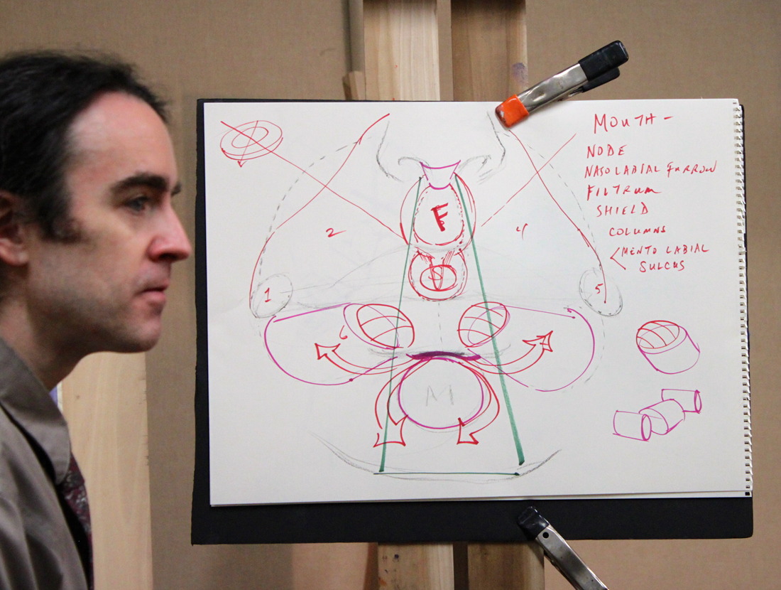
Dan Thompson with his diagram explaining the anatomy of the nose and mouth.
Back in December I had the real pleasure of attending my first Dan Thompson workshop at the Art League in Alexandria VA. Dan happens to be teaching another workshop next weekend on March 23 & 24 and believe me when I tell you that it is completely worth your time and money to attend if you can. I had pages and pages of notes from his first workshop on anatomy alone, something I had not expected from a 4 color chalk portrait drawing class.
In full disclosure, Dan and I have some shared history--as in we both attended the Corcoran School of Art back in the 90's. Dan graduated two years before me but I still remember his amazing realism and sensitive self portraits which stood apart from every one else's work simply because no one was painting like that at the Corcoran then or even since. Flash forward 18 years post his Corcoran BFA, an MFA from the Graduate School of Figurative Art of the New York Academy of Art and Dan is now a highly respected artist & teacher. In 2006 Thompson co-founded the Grand Central Academy of Art in New York. In 2008, he co-founded the Janus Collaborative School of Art in New York. In addition he has instructed privately at Studio 126 in New York and is on the faculty of Parsons the New School for Design, the New York Academy of Art, The Art Students League of New York, and Studio Incamminati, in Philadelphia, PA. In 2007, Thompson was selected an ARC Living Master Artist. To say I am proud to know this generous artist & gifted teacher is an understatement.
And now without further ado, my notes from his 4 Color Chalk Workshop, straight from my archives of workshop "awesomeness":

Thompson_4ColorChalk_Echorche
Notes of Materials & Drawing Aids
-Uses Othello & Conte pencils in red, black, yellow & white.
-Capitalize on chalk based material early on in your drawing because it is easy to remove.
-Also uses Kremer pigments, Lapis Lazuli, Smalt Blue, Red Ball chalks, vine charcoal & shammy.
-Be careful when working on a toned paper not to lift the ground when erasing.
-Best watercolor wash for paper- raw umber, ultramarine blue & dioxazine purple. Shoot for a cool colored neutral.
-READ the John H. Vanderpoel book, "The Human Figure" published in 1907. A must for understanding proper figure construction based on anatomy.
-"Figure out someone's technical model for planes of the head & use it!"
-Likes Strathmore 400 artist's series paper or semi tooth laid paper like Ingres etc. Must be ph neutral and 100% acid free.
-Get yourself a resin cast skull for serious portrait drawing ($250 --Bone Room, Berkley CA.)
-Take an écorché class (without skin) for accurate muscle awareness. Steve Perkins @ Janus School--excellent écorché instructor.
Notes on Anatomy of the Face
-The temporal ridge, where the side of the head meets the front resembles a covered bridge.
-The back of the skull resembles a pentagon in shape.
-Planes in the face follow each other, upward planes flanked by downward planes creating a rhythm.
-The underside of the cranium & jaw is shaped like a woman's high heel when viewed from the side.
-Occipital bone is the lower point on the back of the head.
-There is a "triple curve" from the outside flare of the nose stepping along the outside of the mouth.
-The eye socket drops in a series of steps & terminates in the the lower eyelid furrow. -The node of the mouth is the convergence of different muscles.
-Lines or creases form perpendicular to the muscle fiber (look for this).
-You can craft the nose out of a block, "door stop" form of the nose.
-Emphasize the under plane of the nose.
-A common mistake when rendering the nose is to not go past the eye lid with the nasal bone.
-"Alar cartilage" is the ball of the nose, shaped like an olive. It comes from the tear duct, twists & drops into a V shape
-The nose is a lesson in triangles.
-There is a rim in the enclosure of the nostril that often gets overlooked, make sure to include it.
-Develop your own secret figure reference (canon) for what anatomy should look like so that you know when it differs in an individual.
-There are 5 transitional planes in the nose when looking at it in profile beginning with the bridge, curving around the tip and ending in the plane before the lip.
-Ears will get bigger as people age.
-From the side an ear looks like a little capital D within another D.
-The ear comes out from the head like a door suspended open by the "concha" or hollow next to the ear canal.
-The helix is the upper curve of the outer ear.
-The anti-helix is the y shape with the ear.
-Draw in pairs when you can; feet, hands etc. Each completed form helps define the other.

Dan Thompson's beautiful finished 4 color chalk demo.

Detail of Dan Thompson's 4 color chalk demo.
Notes on creating the 4 chalk drawing
-Test out your pencils on your paper.
-Red pencil + stump = warm
-Red pencil +white pencil= cool pink
-Red pencil+ yellow pencil= warm orange
-Red pencil + black pencil= cool violet
-Black pencil + yellow pencil= warm green
-Helpful to have a pencil the same color as your toned paper should you erase too much of the base color away.
-Shellacking makes paper more resilient.
-Look for the simple design in light & dark.
-Think more about what's there and not adding to what you are seeing.
-Focuses on his "scanning eye" that sees quickly to give him information of the forms.
-Pulls lines through & out of drawing-trajectory.
-Works at life size of slightly smaller. -Focus on gesture, that way you get into the spirit of the pose.
-Abbreviate what you see to encourage the mobility of the eye around the portrait.
-Keep areas (measurements) open, allows flexibility to accommodate change & correction.
-Flat patterns of dark & light.
-Charcoal vines are great for the initial layout. They make you think broadly, no detail & are very forgiving.
-If you pretend not to "focus" on the model you see big forms better.
-It is useful not to think of features in the beginning, only shapes & their proportions to each other.
-Search for the 2D. Squint to see "flat" shapes.
-Find a fixed variable based on life size and note it down on your drawing. Then allow for "flex" in other directions to improve your drawing.
-Does not lighten his darks in the beginning. Instead keeps them a a false value--all shadow the same tone to help him arrive at the underlying forms.
-Pay attention to the things that artists ignore like the neck & ear. It will make you better than the average artist.
-Be careful when your drawing transitions from the 2D to the 3D. This is where the integrity of the drawing can begin to break down.
-Be aware of your eye level & what impact that has on your drawing.
-Turn the light off to see what your model's head movement is (and not what the light is doing).
-Highlights should be indicated in a directional manner along anatomy references. They are place holders.
-Often uses two whites when drawing. One is kept really sharp for detail, one more blunt for softening edges.
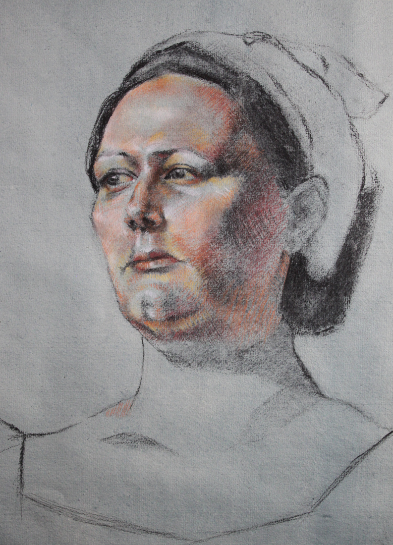
My drawing from Dan Thompson's workshop.
To register for Dan Thompson's portrait painting workshop at the Art League in Alexandria VA on March 23 & 24 click here. http://www.theartleague.org/school/course_desc.php?class_id=1075
Hope to see you all there!

Workshop Wednesday: Robert Liberace's "The Classic Portrait from Pencil to Watercolor"
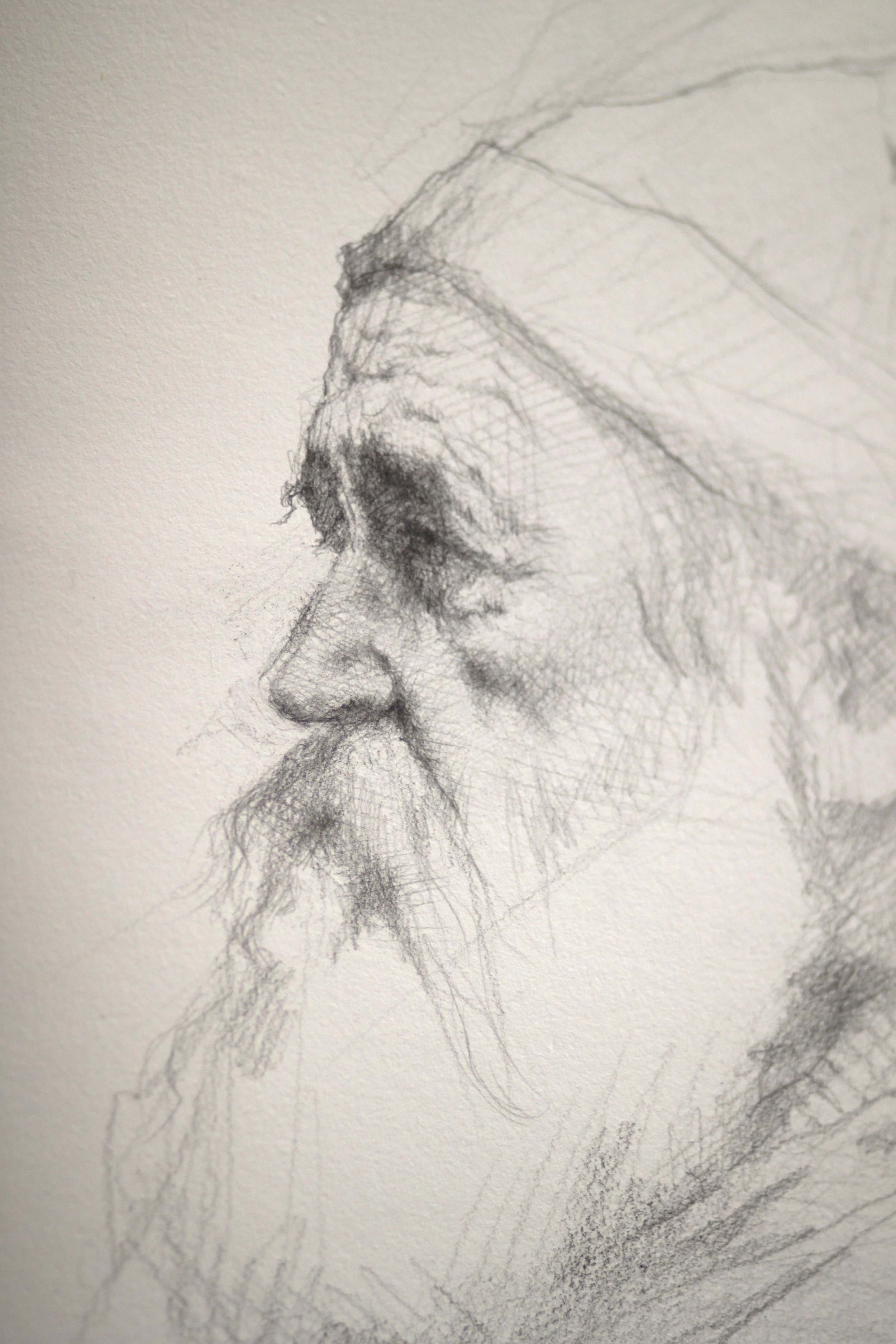
Liberace_Drawing
Several weeks ago I had the pleasure of attending yet another of Robert Liberace's fabulous workshops at the Art League in Alexandria VA, this one on drawing & painting portraits (watercolor). Every time I find myself in one of Liberace's classes, I am made aware of how much there is to learn about this thing we call "art". Specifically for me I am interested in learning how Liberace makes his work look so elegant and at the same time so dynamic. Every stroke has its purpose and I am working towards accomplishing that same thing (er... at least attempting to).
Here are the notes and photos I took from the workshop (click on the photos to enlarge). It is my honest wish dear reader, that something in the post will resonate with you (and with me) and we'll walk away as better artists or at least more enlightened ones. And how could we not when we are privy to the inner thoughts of a modern day master?
Day One, Drawing the Portrait:
Tools:
Mechanical pencils, bic
Works mostly in HB, uses harder or softer pencils occasionally to achieve his values
Anything beyond 2B gets too dark in his opinion
Nibs
Watercolor
Ink
Notes:
Follow the (Charles) Bargue idea
Strong light & shadow
Liberace loves TwinRocker paper, Canson "Mi Tientes" too
Looks at Ingres for fabric
Treat every detail of the picture like a portrait
Likes to paint in watercolor on a smaller scale like Fortuny
Box out your shadows, map them out then slowly add midtones
Ingres faces are almost decorative--like and engraving but with "spots of action"
Really study Ingres--get a good book on Ingres' drawings!
Make shapes that are so clear & obvious, terminator shading
Add pentimenti flying through there
Tieopolo liked to add "marks of 3" in his drawings, very Venetian technique. Sargent employed this as well
Looser shadow & animated but still differentiation of light & dark
(Tiepolo) Begins with charcoal before ink
Simple mass of shadow
Fortuny used black, umber & sienna in his watercolors, shadow always finding form
Zorn used monochromatic watercolor with opaque white on top for emphasis & highlight
If you ever need to steady your drawing or watercolor readdress area with a contour line
You can add a little water to a brush and dilute an area of a graphite drawing (works the same way as in a watercolor), good for evening tones or for contours

Liberace_WatercolorPortrait
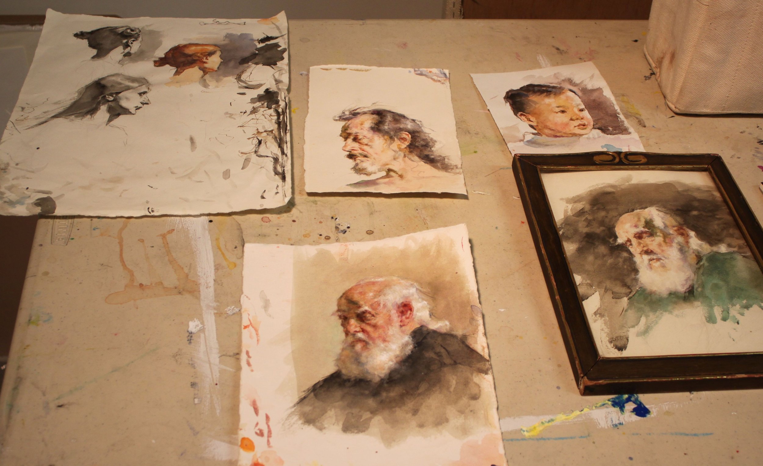
RobLiberace_Watercolors
Day Two, The Portrait in Watercolor:
Notes:
Begins sketching in pencil, then jumps into watercolor
Quick assessment of light/shadow
Will often begin by doing a quick "Tiepolo" style study with one tone, maybe throw in an accent
Loosely sketch in pencil, then adds a gestural contour in watercolor
Adds mass & shadow
Try not to be too specific with lines, be more suggestive--"it is what gives that romantic feeling"
"Your job is to find out where the light is ending, the more you break that up the harder your job becomes"
"Melt" the detail into your shadows if you aren't so sure where they begin
Connect half tones to the shadow & "feather" it out
"It is really all about editing what you see"
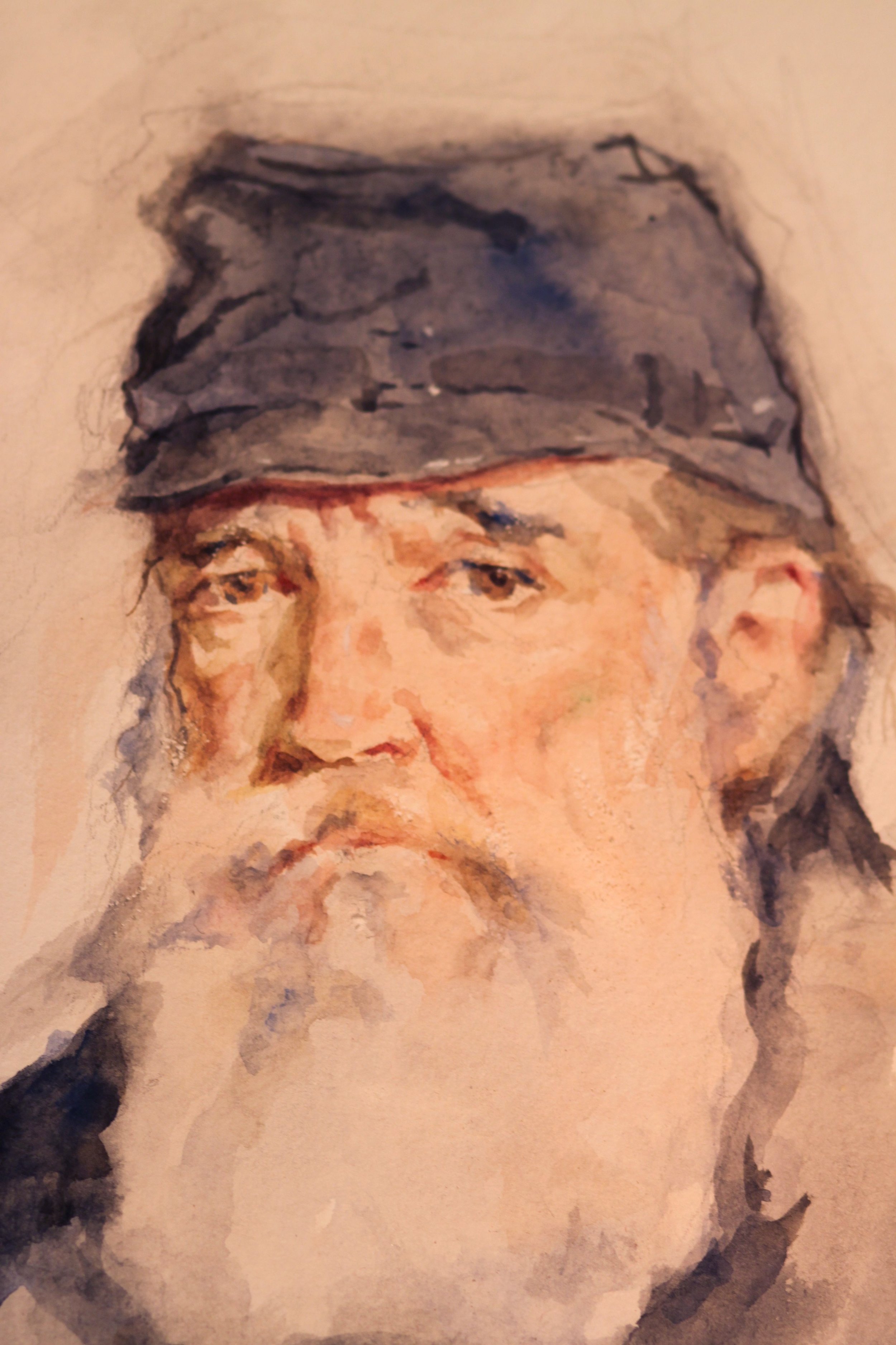
Liberace_WatercolorPortrait_Day3
Day Three, The Portrait in Watercolor:
Palette:
Burnt Sienna,
Black,
Chinese or permanent white,
Cadmium Yellow Light (or similar bright yellow),
Cadmium Red ( or similar bright red),
Ultramarine Blue.
Optional Palette:
Alizarin Crimson,
Manganese Violet,
Cerulean Blue,
Pthalo Blue,
Viridian Green,
Pthalo or Hookers Green.
Notes:
When sketching his gesture he holds his pencil at the end
Puts in markers (enveloping)
Blocks in his "axis lines"
Liberally throws crimson wash over the whole face & "melts" it out
Drops in yellow & violet for the beard
Throws in black for the uniform
Shadow on face, a warm green made of black & yellow & sienna
On the nob of the nose uses a little extra red
Drops in extra water for the fold of the eyes--orbital fold
Draws eye, ties it in to the shadow then carefully marks the lower lid with it
Goes back and forth between different temperatures
Will add half tones in when there is not a lot of shadow to delineate form
Thinks in planes, color & temperature all the time
Ties a lot of the elements of the eye together to simplify
Soften edges
Loves TwinRocker heavy text, light art weight, calligraphy cream paper
On halftones he is careful not to leave heavy block ins
"I don't want to plan things too much. Sometimes watercolorists work to tightly--allow spontaneity"
Moves in with smaller brushes
Will use watercolor & a bristle brush to scumble areas
Puts color in shadows
Will refine edges on strokes he doesn't like so that is will dry as a mass that he can paint on later
Really "feathers" a lot of these edges out
Likes to see a lot of shape & pattern to a form like Sorolla & Fortuny
Will erase at the end with a "perfect pencil" (eraser pencil with brush at the end) & then uses a white charcoal pencil to add highlights with
Chinese white paint is used at the end over dry white paint when needed (alla Zorn)
LagoArthur_OldSaltDrawingjpg
Hope your holidays were as wonderful as ours. Wishing you much artistic growth and success in the New Year!

Jonathan Linton's "Art Group"

JonathanLinton_Alex
The life of a professional artist is often an eremitic existence. We toil away by ourselves in our studios without human contact (except for the frequent face book checking--ok, maybe that part is just me) and often regret that we don't have another set of eyes to look upon the evolution of our paintings. Jonathan Linton, award winning portrait painter, children's book illustrator and co-founder of the Horizons Art School in Ashburn, VA has a brilliant solution to that problem and calls it--the "Art group". Jonathan is opening up his studio space at the Horizons Art School for a select group of artists to get together every Tuesday to paint, discuss art, share technical expertise and critique each other's work for a nominal weekly fee. I am beyond thrilled to have been asked to join the group and look forward to working more closely with Jonathan, an artist I truly admire.
Below is a candid snap shot taken just this morning from our first painting session together. All of us had a blast working on our individual projects and talking "shop". Personally, I think Jonathan looks rather fetching in his bow tie, don't you?

Art Group
Interested in joining? Jonathan has a few slots available. Check out the Horizons Art School web site for more details and contact information. One word of caution--since I am one of the first members of the group I have elected myself responsible for the hazing of new recruits. I hope you like painting in togas. Muahahahahaha.
http://www.horizonsartschool.com/
And for a look at Jonathan Linton's work please click below.

Neal, Whyte & Lindstrom: "The Various Paths to Success"

Step into my time machine back to the date May 27th, 2012 when I attended a panel discussion by artistic luminaries, Michael Shane Neal, Mary Whyte and Bart Lindstrom at the 2012 Art of the Portrait Conference in Philly. I take a lot of notes during classes, workshops and conferences. Some of them never surface again, and some like these lucky notes born under the right astrological sign, actually make it into a blog post. You might not always get the latest breaking news here (try CNN for that) but if you are seeking a blog about painting & technique served with a little witty banter on the side--then you have come to the right place! Now please sit still while I adjust the flux capacitor on this thing. This is what makes time travel possible: the flux capacitor! First, you turn the time circuits on. This one tells you where you're going. This one tells you where you are. This one tells you where you were. You input your destination time on this keypad. Say you want to see the signing of the Declaration of Independence [Jul. 4, 1776] or witness the birth of Christ [Dec. 25, 0000]. For this trip we'll be traveling way back in time, er 3 months back to May 27th, 2012 so you can experience this panel discussion in person. Hold on!

Graffiti_500x500
Mary Whyte: On Promoting Work & Income
You must have a web site, an on-line presence.
Put up only your best work.
Make sure to have contact info up front; phone, email etc.
Make a "take away" brochure that holds dates, relevant publications featuring your work.
Press-how can you get more of it? Donate a portrait of a community person.
Make a contact everyday--reconnect with old contacts. Contact your "wish list" of people you want to buy your work.

Lindstrom_kimandkimberly
Bart Lindstrom:
Keep a log of who are your collectors.
Create relationships with these people. Remember them, remember details about them. You become "their" artist!
Courtship, friendship--it is the same idea with your collectors.
Donate portraits to private schools. Entry level products that they can upgrade to something else you offer. Why private schools? Because these parents have the resources.
Keep your work current on your website. Always be culling (removing). Better to show a consistent painting style & have less.
Make it easy for people to find you.
MichaelShaneNeal_Rachel.
Michael Shane Neal:
Attend high-end private school football games and throw up your cards during touchdowns!
Get out of your studio. Get people to know you & understand your work. Make sure what you write about your work is concise & frequent.
Diversity is important. Paint everything, every subject. It opens up your clientele!
Stay positive! Develop a support structure.
Don't undervalue good old-fashioned hard work. It will make up for a lot of shortfalls.
When you get in the studio strive to improve as an artist every single day.
The business side is important but more important is becoming a better artist. You must do both.
Google people out there who are retiring and introduce your work to them.
You can even set a "Google alert" for people retiring from specific fields i.e. Universities.
Bart Lindstrom:
Make yourself enjoyable to be with. 1). Learn how to make an exquisite product. 2). Show it to as many people as possible.
Agencies need an amazing example of your work & then photographs of consistent work. They are looking for someone who is easy to work with.
Take the initiative (with agencies), get their email & send them your best images. You have to make these relationships.
Learn how to do demos and do them often.
Michael Shane Neal:
Get a list of everybody that is there at your art events & contact them personally.
Consider speaking--create a 20 min power point presentation showing your images & studio shots. Talk to your audience about your work and your images.
Mary Whyte
Will host small dinner parties in galleries & then give a small tour of her work.
Michael Shane Neal:
Spend some time teaching. You will always find people who know less than you do. It helps to build name recognition.
Mary Whyte
Has a manager and an assistant. Her husband makes her frames & he has his own frame making assistant.
Michael Shane Neal:
Began by doing everything himself. After 10 or 12 years he paid an intern to work for him.
Bart Lindstrom:
Trade your art for services. Stop excessive spending so you have more time in the studio (less bills to pay)
When you talk about your work to someone else allow for a "moment of reflection" ( to bloom). Allow your message to sink in as they are viewing it.
Michael Shane Neal:
Be quiet when people are looking at your work. Let them absorb it. Kinstler calls it the "deafening silence". Get comfortable with it.
And one last thing Marty, I'm sure that in 2020, plutonium is available in every corner drugstore, but in 2012, it's a little hard to come by so I am afraid you are stuck in Philly. Sorry. But look on the bright side-at least you will have time to really see the relocated Barnes collection!

Workshop Wednesday: Robert Liberace's "Velázquez to Sorolla", Days 4 & 5
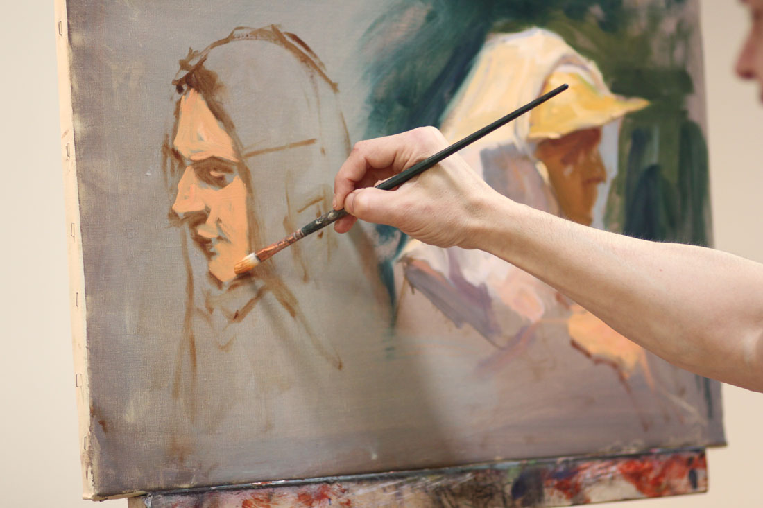
Liberace’s Sorolla Demo start.
Some of my best pictures from Rob Liberace's recent Velázquez to Sorolla Workshop come from Days 4 & 5. So you are in for a real treat here! Sorolla often painted his subjects outside from direct observation, following the effect of light on his models as they enjoyed a day at the beach or a picnic in the grass. Rob's palette below really showcases those atmospheric qualities.
Thalo Blue and Green
Cad Yellow, Orange, Red and Rose
Ultramarine Violet
Viridian
Lead White
Umber
Stand Medium (Linseed oil)
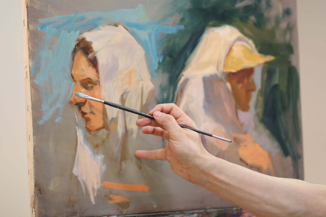

Liberace’s Sorolla demo detail.
Here are the notes I took during Days 4 & 5:
Lay down your colors so they have good body and mass to them.
Whites are warm, warmed by the sun.
Shadows cool.
Always have a definite end to your light.
Cast shadows will not receive a whole lot of reflections.
Quick & strong strokes--don't blend. You will only "muddy" it.
"Blast in" lights.
Blue in core shadows, gold in reflected light (in shadows) are a classic Sorolla treatment. Use White + Orange for gold.
Realist painting requires "hump, ridge, terminator, core".
Make sure your highlights are applied with small brushes if you are working on small scale.
You should be able to cut (theoretically speaking) pure color out of a Sorolla painting. He did not use much blending.
Cad Red, Cad Yellow, touch of Cad Rose + White is the recipe for the Sorolla flesh tone.
Masses in big planes first and then breaks up that base color with light & shadow.
"Each time the model poses pick one area to bring to a full alla prima finish. Then move on to another area when he/she poses again."
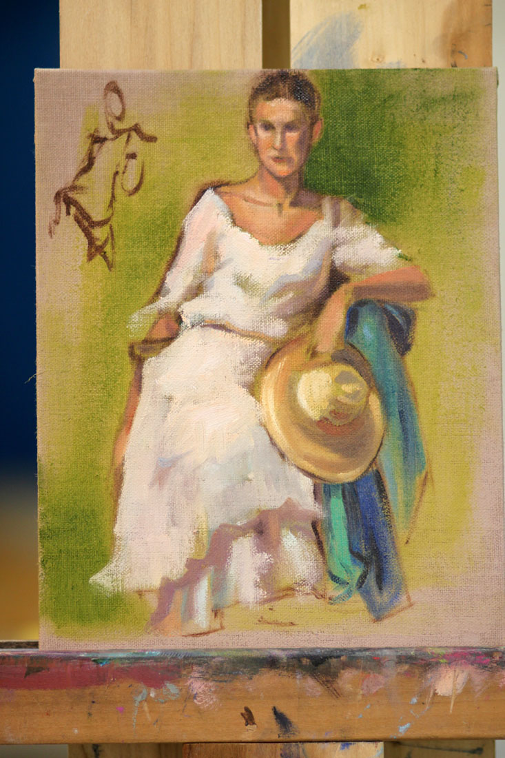
My painting inspired by Sorolla on Day 4.

Workshop Wednesday: Robert Liberace’s "Velázquez to Sorolla", Day 3

Liberace_Fortuny_Gesture
On the third day of his Velázquez to Sorolla Workshop, Rob Liberace covered the working methods of Fortuny (Mariano Fortuny Marsal) 1838-1874. He painted the full figure (as seen above) to take advantage of the wonderful costumes the models were wearing. This for me was one of the most exciting aspects of the workshop. How often do you get to paint a guy in swash buckling boots like the ones the model is wearing? Um, not often enough.
Rob's Fortuny palette consisted of many of the paints used for his Velázquez palette with the addition of Flemish White, Cadmium Red, Yellow and Orange and Alizarin (which back then would have been fugitive).
Here are my notes taken from that day:
In the 1870s new colors were beginning to appear like chrome yellow & cadmiums so artists began to see more color in the transitions of light. Greens & purples in the shadows, lemon in the highlights.
Fortuny did not use white in his underpaintings--essentially taking out a step & then jumped into his color.
Begins with a gestural drawing in Umber over a Sienna wash to wet the canvas.
Don't smooth or polish over the anatomy of your paintings. It makes them look like mannequins.
"The few curves that I put in are purely decorative. Draw in angles."
Angle, angle, angle. Find the shape of things, the "high ground".
Try to find the "high points" or directions in the fabric.
Applies paint on the face thickly on the large planes of light & thins it carefully around the features.
"My brush is a pencil, not a brush. If I think of it like that I can get a better handle on the detail."
"On the lips don't draw severe lines. Use color to dapple & disintegrate the line. Fortuny did this a lot. Watteau too."
"Everything I do I want my surfaces to look really good".
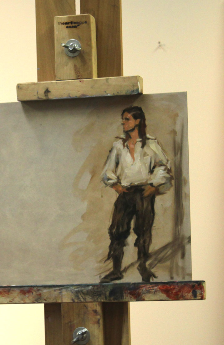
Liberace_Fortuny_FigurePainting_Detail
Here is the first painting I was happy with at the workshop. Felt like I made an alla prima break thru with it.

LagoArthur_Fortuny_Day3Painting
And for a little more info on Fortuny, check out this link to Armand Cabrera's Art and Influence blog.

Workshop Wednesday: Robert Liberace's "Velázquez to Sorolla", Days 1 & 2

Liberace_Day_1_Demo
Today wrapped up the 5th day of Rob Liberace's Velázquez to Sorolla workshop and I count myself extremely fortunate to have been one of the attendees. I have taken several of Rob's classes locally here at the Art League in Alexandria VA, but this is my first workshop experience and I have to say I am now a big fan of them! Having 5 consecutive 6-hour days with Rob's excellent instruction helped me to really discover some bad habits that I fall back on in my alla prima painting. There is something about the directness of alla prima. The speed at which you need to commit to your decisions--that really allows you to see the flaws in your work. So what are my flaws when it comes to alla prima? Well for one I have a tendency to round out everything in my gesture and use a strong contour line. I have 2 theories for why I do this. 1). I am a reincarnated WPA artist. 2). My alma matter should have beat it the sh*t out of me while I was back in school. Instead I was actually encouraged to follow it as it was viewed as part of my "unique style" and "identity". Well dear readers, do you know what is the quickest way to kill realism in your alla prima? Adding curves!! Hence you can understand my frustration and my desire to break this dirty little habit. Luckily for me, Rob Liberace literally has all the answers and being in his workshop this past week lit the proverbial "eureka" light bulb above my head. Hallelujah!

Liberaces_Velazquez_Palette
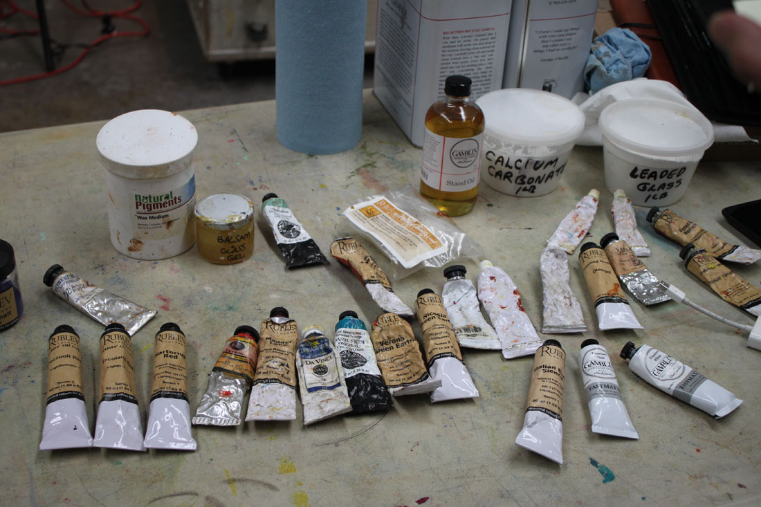
Liberace_Paint
The following is the historically accurate palette he used for the Velázquez part of his workshop. Most of the paint is from Natural Pigments, Da Vinci and Daniel Smith:
Vine Black
Iron Oxide paints (Umbers & Siennas)
Yellow Ocher
True Naples Yellow made from lead
Vermillion
Madder Lake (for purple) or Carmine Red
Lapis Lazuli
Cobalt Smalt
"Sleeping Beauty" Turquoise (Daniel Smith)
Earth Green
Malachite
Medium-Linseed + lead (Maroger medium)
Calcite Powder
Leaded Glass Powder
Wax
And here are some of the copious notes I took during his workshop. I hope you find them as enlightening as I did:
Try not to use the word "hard", think "firm" or "soft" when thinking about edges
Fuse like values, an elegant painterly device
Use "feathery" edges where distinct facets of light intersect
Begins by putting in little "tick marks" to lay in composition & proportions, quick gestural drawing
Make sure you stay very sharp and angular when laying down your figure
Contours and shadows have "highs & lows" that the paint must forcibly lead too
You must amplify the color notes hinting in your subject
Paints on denim, cotton, linen, cotton & silk herringbone fabric he finds in the fabric store
He is fastidious about his surfaces and will size his fabrics first before applying coats of gesso. The right surface is essential in the overall success of a painting!
Spreads calcite, umber & oil on his canvas before beginning (in Velázquez manner) to give a little "cushion" for his paint
Uses bristle filberts in the initial painting stages
Uses shadow masses to help delineate form, chiaroscuro. Academic stuff, lots of planes. Hatches in the shadow.
Puts in the nasal line and "sweeps" across it to blend it in with the face
Step one is monochromatic underpainting
He is sure to extend his lines and exaggerate gesture for a better composition
Uses a wedge of paper towel to cut in lights in his underpainting
Often employs the back of his brush handle to break up paint ridges and "erase"
Goes for the big masses first when laying down paint and spreads it out
Get your anatomy down in the underpainting
Big mass of value, one light source, bigger brush
"Zipper like" approach to edges of value to get a more volumetric feel
Every stroke is "crumbly, jiggly & wiggly"
Know where the "hump" of a form is so that you can decide how obvious to make it--softer or firmer
Use the opposite color temps in your glazes, on a warm ground use cool etc.
On day 2 he will reactivate the shadows by adding umber to them but no color, also a little black as needed
Begins glazing over his underpainting by applying a thin amount of wax & green glaze to the face to help knock back the warm temp and give him something to paint into
Turns his brush to make it not such an "obvious mark" (holds brush at the end & perpendicular to the canvas)
Takes hard edges & relaxes them by feathering across them
Will add a little color to his shadows as long as there is no white (use a clean brush!)
"You see a lot of scumbly broken strokes in Spanish painting"
On painting hair, "follow the light as it jumps from one strand to another"
Velázquez was extremely aware of the topography of his forms and is subtle. Does not blend but feathers & hatches his edges instead
If an edge becomes too soft he will re-establish it, always making corrections, a back & forth of edge handling

Liberace_Velázquez_DetailOfOldMan