Face Off Heavy Hitters
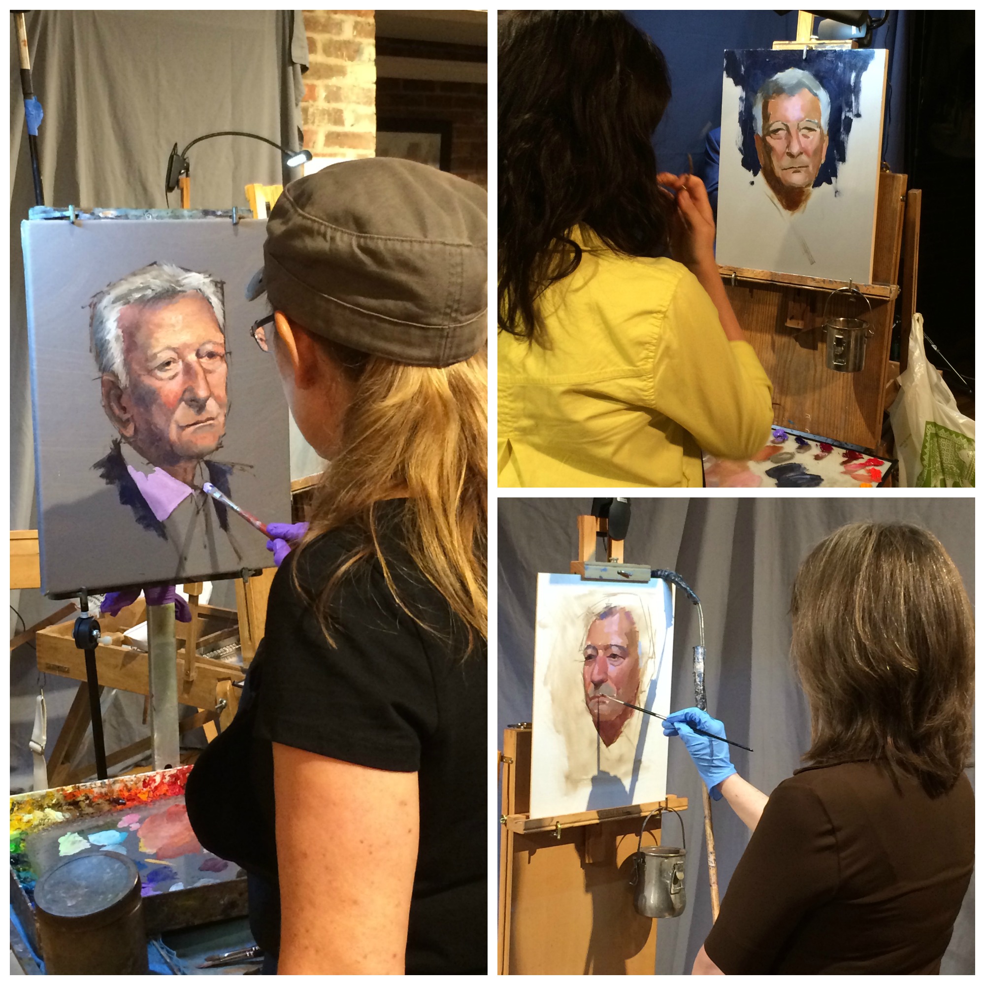
The most happening place to be last Friday was at the Principle Gallery in Old Town Alexandria for their annual alla prima portrait "Face Off" featuring gallery heavy hitters; Mia Bergeron, Elizabeth Floyd and Cindy Procious.
What is that you say? You didn't know about it? Well I guess that just proves you're not as cool as me. Luckily I am feeling generous today and will give you this brief little wrap up.
Veteran Face Off champions Mia Bergeron and Cindy Procious went toe to toe with a new tenacious challenger, Elizabeth Floyd over 3 hours with plenty of breaks in between for schmoozing and attending to their adoring fans. It was obvious early on that all of them had a good likeness of the model, Mr. Franco Landini, who is the owner of several Old Town restaurants including Landini Brothers and is something of a local celebrity.
Events such as these at the Principle Gallery always attract the hippest artists from the local painting scene. Besides my fabulous self in attendance were Jonathan Linton, Rena Selim, Susan Gallagher O'Neill and Abigail Davis Muncy.
Honestly, next time you should really just come see it for yourself. But until then you will be able to watch it on Youtube and I will post that link here when the Principle makes it available.
No More "Redskins"
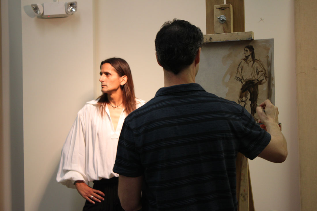
Here is a portrait I painted from life in Rob Liberace's class last Spring. The model is a really interesting guy--a re-enactor who makes all his costumes by hand. It is not every day that you get to paint someone dressed up like him!
This painting makes me think of course of the current controversy regarding a suggested name change for the Washington Redskins. For the record--I completely support it. That moniker hails from the days when the colonies closely associated with Native Americans as a way to emancipate themselves from their European fore fathers. But people are not symbols. We have the Bald Eagle and the Stars and Stripes for that. Dan Snyder-get over yourself! We can no longer have an NFL franchise in the 21st Century representing our Nation's noble capitol with such a degrading name as the Washington Redskins. In this day and age when the "minorities" in this country are quickly outnumbering the majority, your position is at best insensitive. And a worst--racist.
Technique Tuesday: Drawing Revelations with Dan Thompson
In August I attended yet another workshop with Dan Thompson. 2 actually, back to back. Both of them on drawing. I see Dan as a cosmic guide on my life long journey as an artist. He leaves little bread crumbs of wisdom to follow on the path to improvement. Most recently he left me with two life changing concepts. The first is the revelation of what "closed" and "open" drawings are. Closed drawings are those with specific contours. They are precise, drawn from the outside in and do not allow much room for alterations. Open drawings are the opposite. They are built from the inside out. They are more mass than contour, they are flexible. They are forgiving. I had never heard these terms before, perhaps because I did not attend a particularly traditional art school. Hearing these terms allowed me to understand my own frustrations with my drawing--most noticeably a tendency for strong contours. To think that I could simply reverse engineer my drawing technique to get at the quality I want in my work was literally mind blowing! And the last revelation I received from Dan's workshop was to approach each effort in drawing and painting as if making a "proposal". If you get it wrong, so what! Just alter your proposal. Brilliant right? And it totally takes the pressure off.
Workshop Wednesday: Dan Thompson 4 Color Chalk
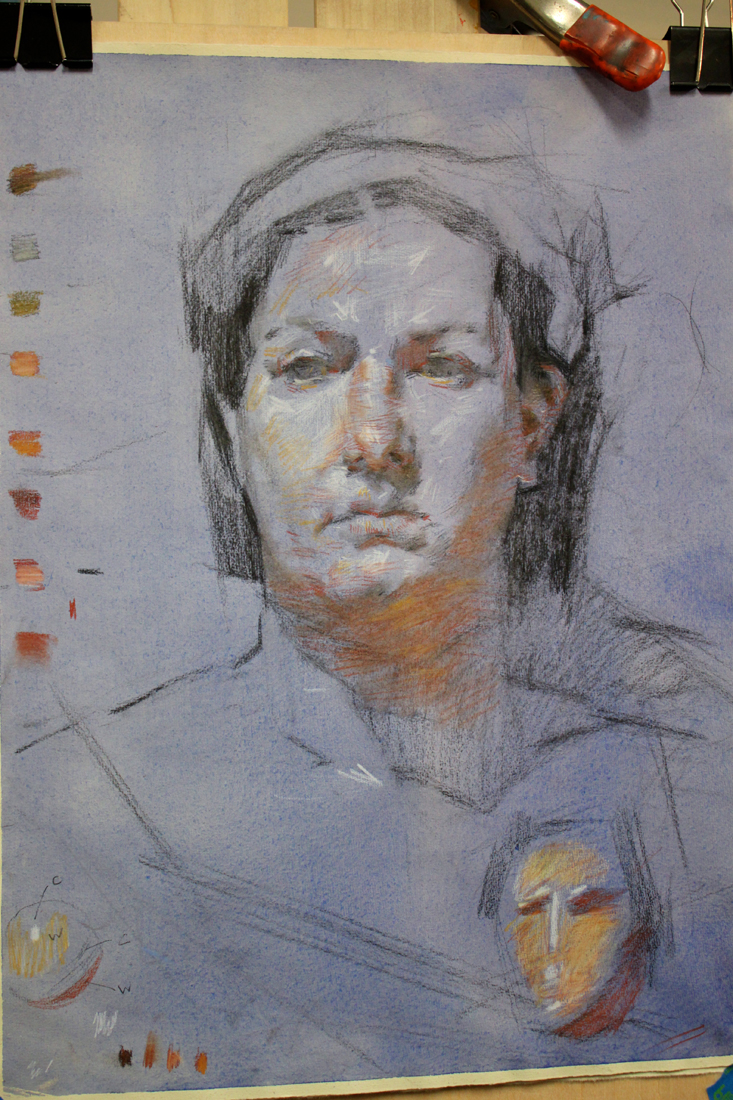
Back in December I had the real pleasure of attending my first Dan Thompson workshop at the Art League in Alexandria VA. Dan happens to be teaching another workshop next weekend on March 23 & 24 and believe me when I tell you that it is completely worth your time and money to attend if you can. I had pages and pages of notes from his first workshop on anatomy alone, something I had not expected from a 4 color chalk portrait drawing class.
In full disclosure, Dan and I have some shared history--as in we both attended the Corcoran School of Art back in the 90's. Dan graduated two years before me but I still remember his amazing realism and sensitive self portraits which stood apart from every one else's work simply because no one was painting like that at the Corcoran then or even since. Flash forward 18 years post his Corcoran BFA, an MFA from the Graduate School of Figurative Art of the New York Academy of Art and Dan is now a highly respected artist & teacher. In 2006 Thompson co-founded the Grand Central Academy of Art in New York. In 2008, he co-founded the Janus Collaborative School of Art in New York. In addition he has instructed privately at Studio 126 in New York and is on the faculty of Parsons the New School for Design, the New York Academy of Art, The Art Students League of New York, and Studio Incamminati, in Philadelphia, PA. In 2007, Thompson was selected an ARC Living Master Artist. To say I am proud to know this generous artist & gifted teacher is an understatement.
And now without further ado, my notes from his 4 Color Chalk Workshop, straight from my archives of workshop "awesomeness":
Notes of Materials & Drawing Aids
-Uses Othello & Conte pencils in red, black, yellow & white.
-Capitalize on chalk based material early on in your drawing because it is easy to remove.
-Also uses Kremer pigments, Lapis Lazuli, Smalt Blue, Red Ball chalks, vine charcoal & shammy.
-Be careful when working on a toned paper not to lift the ground when erasing.
-Best watercolor wash for paper- raw umber, ultramarine blue & dioxazine purple. Shoot for a cool colored neutral.
-READ the John H. Vanderpoel book, "The Human Figure" published in 1907. A must for understanding proper figure construction based on anatomy.
-"Figure out someone's technical model for planes of the head & use it!"
-Likes Strathmore 400 artist's series paper or semi tooth laid paper like Ingres etc. Must be ph neutral and 100% acid free.
-Get yourself a resin cast skull for serious portrait drawing ($250 --Bone Room, Berkley CA.)
-Take an écorché class (without skin) for accurate muscle awareness. Steve Perkins @ Janus School--excellent écorché instructor.
Notes on Anatomy of the Face
-The temporal ridge, where the side of the head meets the front resembles a covered bridge.
-The back of the skull resembles a pentagon in shape.
-Planes in the face follow each other, upward planes flanked by downward planes creating a rhythm.
-The underside of the cranium & jaw is shaped like a woman's high heel when viewed from the side.
-Occipital bone is the lower point on the back of the head.
-There is a "triple curve" from the outside flare of the nose stepping along the outside of the mouth.
-The eye socket drops in a series of steps & terminates in the the lower eyelid furrow. -The node of the mouth is the convergence of different muscles.
-Lines or creases form perpendicular to the muscle fiber (look for this).
-You can craft the nose out of a block, "door stop" form of the nose.
-Emphasize the under plane of the nose.
-A common mistake when rendering the nose is to not go past the eye lid with the nasal bone.
-"Alar cartilage" is the ball of the nose, shaped like an olive. It comes from the tear duct, twists & drops into a V shape
-The nose is a lesson in triangles.
-There is a rim in the enclosure of the nostril that often gets overlooked, make sure to include it.
-Develop your own secret figure reference (canon) for what anatomy should look like so that you know when it differs in an individual.
-There are 5 transitional planes in the nose when looking at it in profile beginning with the bridge, curving around the tip and ending in the plane before the lip.
-Ears will get bigger as people age.
-From the side an ear looks like a little capital D within another D.
-The ear comes out from the head like a door suspended open by the "concha" or hollow next to the ear canal.
-The helix is the upper curve of the outer ear.
-The anti-helix is the y shape with the ear.
-Draw in pairs when you can; feet, hands etc. Each completed form helps define the other.
Notes on creating the 4 chalk drawing
-Test out your pencils on your paper.
-Red pencil + stump = warm
-Red pencil +white pencil= cool pink
-Red pencil+ yellow pencil= warm orange
-Red pencil + black pencil= cool violet
-Black pencil + yellow pencil= warm green
-Helpful to have a pencil the same color as your toned paper should you erase too much of the base color away.
-Shellacking makes paper more resilient.
-Look for the simple design in light & dark.
-Think more about what's there and not adding to what you are seeing.
-Focuses on his "scanning eye" that sees quickly to give him information of the forms.
-Pulls lines through & out of drawing-trajectory.
-Works at life size of slightly smaller. -Focus on gesture, that way you get into the spirit of the pose.
-Abbreviate what you see to encourage the mobility of the eye around the portrait.
-Keep areas (measurements) open, allows flexibility to accommodate change & correction.
-Flat patterns of dark & light.
-Charcoal vines are great for the initial layout. They make you think broadly, no detail & are very forgiving.
-If you pretend not to "focus" on the model you see big forms better.
-It is useful not to think of features in the beginning, only shapes & their proportions to each other.
-Search for the 2D. Squint to see "flat" shapes.
-Find a fixed variable based on life size and note it down on your drawing. Then allow for "flex" in other directions to improve your drawing.
-Does not lighten his darks in the beginning. Instead keeps them a a false value--all shadow the same tone to help him arrive at the underlying forms.
-Pay attention to the things that artists ignore like the neck & ear. It will make you better than the average artist.
-Be careful when your drawing transitions from the 2D to the 3D. This is where the integrity of the drawing can begin to break down.
-Be aware of your eye level & what impact that has on your drawing.
-Turn the light off to see what your model's head movement is (and not what the light is doing).
-Highlights should be indicated in a directional manner along anatomy references. They are place holders.
-Often uses two whites when drawing. One is kept really sharp for detail, one more blunt for softening edges.
To register for Dan Thompson's portrait painting workshop at the Art League in Alexandria VA on March 23 & 24 click here. http://www.theartleague.org/school/course_desc.php?class_id=1075
Hope to see you all there!
Workshop Wednesday: Robert Liberace's "The Classic Portrait from Pencil to Watercolor"
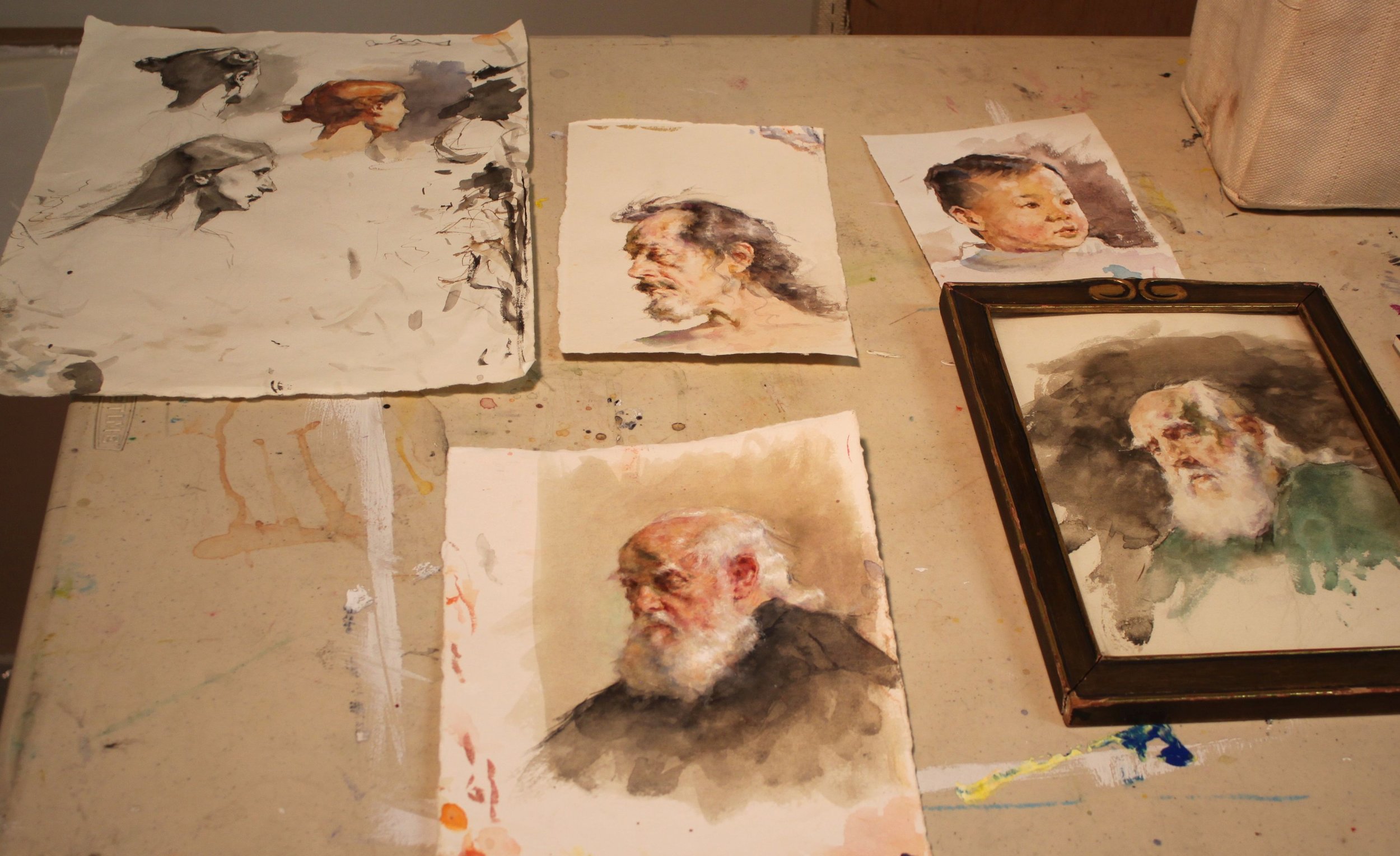
Several weeks ago I had the pleasure of attending yet another of Robert Liberace's fabulous workshops at the Art League in Alexandria VA, this one on drawing & painting portraits (watercolor). Every time I find myself in one of Liberace's classes, I am made aware of how much there is to learn about this thing we call "art". Specifically for me I am interested in learning how Liberace makes his work look so elegant and at the same time so dynamic. Every stroke has its purpose and I am working towards accomplishing that same thing (er... at least attempting to).
Here are the notes and photos I took from the workshop (click on the photos to enlarge). It is my honest wish dear reader, that something in the post will resonate with you (and with me) and we'll walk away as better artists or at least more enlightened ones. And how could we not when we are privy to the inner thoughts of a modern day master?
Day One, Drawing the Portrait:
Tools:
Mechanical pencils, bic
Works mostly in HB, uses harder or softer pencils occasionally to achieve his values
Anything beyond 2B gets too dark in his opinion
Nibs
Watercolor
Ink
Notes:
Follow the (Charles) Bargue idea
Strong light & shadow
Liberace loves TwinRocker paper, Canson "Mi Tientes" too
Looks at Ingres for fabric
Treat every detail of the picture like a portrait
Likes to paint in watercolor on a smaller scale like Fortuny
Box out your shadows, map them out then slowly add midtones
Ingres faces are almost decorative--like and engraving but with "spots of action"
Really study Ingres--get a good book on Ingres' drawings!
Make shapes that are so clear & obvious, terminator shading
Add pentimenti flying through there
Tieopolo liked to add "marks of 3" in his drawings, very Venetian technique. Sargent employed this as well
Looser shadow & animated but still differentiation of light & dark
(Tiepolo) Begins with charcoal before ink
Simple mass of shadow
Fortuny used black, umber & sienna in his watercolors, shadow always finding form
Zorn used monochromatic watercolor with opaque white on top for emphasis & highlight
If you ever need to steady your drawing or watercolor readdress area with a contour line
You can add a little water to a brush and dilute an area of a graphite drawing (works the same way as in a watercolor), good for evening tones or for contours
Day Two, The Portrait in Watercolor:
Notes:
Begins sketching in pencil, then jumps into watercolor
Quick assessment of light/shadow
Will often begin by doing a quick "Tiepolo" style study with one tone, maybe throw in an accent
Loosely sketch in pencil, then adds a gestural contour in watercolor
Adds mass & shadow
Try not to be too specific with lines, be more suggestive--"it is what gives that romantic feeling"
"Your job is to find out where the light is ending, the more you break that up the harder your job becomes"
"Melt" the detail into your shadows if you aren't so sure where they begin
Connect half tones to the shadow & "feather" it out
"It is really all about editing what you see"
Day Three, The Portrait in Watercolor:
Palette:
Burnt Sienna,
Black,
Chinese or permanent white,
Cadmium Yellow Light (or similar bright yellow),
Cadmium Red ( or similar bright red),
Ultramarine Blue.
Optional Palette:
Alizarin Crimson,
Manganese Violet,
Cerulean Blue,
Pthalo Blue,
Viridian Green,
Pthalo or Hookers Green.
Notes:
When sketching his gesture he holds his pencil at the end
Puts in markers (enveloping)
Blocks in his "axis lines"
Liberally throws crimson wash over the whole face & "melts" it out
Drops in yellow & violet for the beard
Throws in black for the uniform
Shadow on face, a warm green made of black & yellow & sienna
On the nob of the nose uses a little extra red
Drops in extra water for the fold of the eyes--orbital fold
Draws eye, ties it in to the shadow then carefully marks the lower lid with it
Goes back and forth between different temperatures
Will add half tones in when there is not a lot of shadow to delineate form
Thinks in planes, color & temperature all the time
Ties a lot of the elements of the eye together to simplify
Soften edges
Loves TwinRocker heavy text, light art weight, calligraphy cream paper
On halftones he is careful not to leave heavy block ins
"I don't want to plan things too much. Sometimes watercolorists work to tightly--allow spontaneity"
Moves in with smaller brushes
Will use watercolor & a bristle brush to scumble areas
Puts color in shadows
Will refine edges on strokes he doesn't like so that is will dry as a mass that he can paint on later
Really "feathers" a lot of these edges out
Likes to see a lot of shape & pattern to a form like Sorolla & Fortuny
Will erase at the end with a "perfect pencil" (eraser pencil with brush at the end) & then uses a white charcoal pencil to add highlights with
Chinese white paint is used at the end over dry white paint when needed (alla Zorn)
Hope your holidays were as wonderful as ours. Wishing you much artistic growth and success in the New Year!
Workshop Wednesday: Robert Liberace's "Velázquez to Sorolla", Days 4 & 5
Some of my best pictures from Rob Liberace's recent Velázquez to Sorolla Workshop come from Days 4 & 5. So you are in for a real treat here! Sorolla often painted his subjects outside from direct observation, following the effect of light on his models as they enjoyed a day at the beach or a picnic in the grass. Rob's palette below really showcases those atmospheric qualities.
Thalo Blue and Green
Cad Yellow, Orange, Red and Rose
Ultramarine Violet
Viridian
Lead White
Umber
Stand Medium (Linseed oil)
Here are the notes I took during Days 4 & 5:
Lay down your colors so they have good body and mass to them.
Whites are warm, warmed by the sun.
Shadows cool.
Always have a definite end to your light.
Cast shadows will not receive a whole lot of reflections.
Quick & strong strokes--don't blend. You will only "muddy" it.
"Blast in" lights.
Blue in core shadows, gold in reflected light (in shadows) are a classic Sorolla treatment. Use White + Orange for gold.
Realist painting requires "hump, ridge, terminator, core".
Make sure your highlights are applied with small brushes if you are working on small scale.
You should be able to cut (theoretically speaking) pure color out of a Sorolla painting. He did not use much blending.
Cad Red, Cad Yellow, touch of Cad Rose + White is the recipe for the Sorolla flesh tone.
Masses in big planes first and then breaks up that base color with light & shadow.
"Each time the model poses pick one area to bring to a full alla prima finish. Then move on to another area when he/she poses again."
Workshop Wednesday: Robert Liberace’s "Velázquez to Sorolla", Day 3
On the third day of his Velázquez to Sorolla Workshop, Rob Liberace covered the working methods of Fortuny (Mariano Fortuny Marsal) 1838-1874. He painted the full figure (as seen above) to take advantage of the wonderful costumes the models were wearing. This for me was one of the most exciting aspects of the workshop. How often do you get to paint a guy in swash buckling boots like the ones the model is wearing? Um, not often enough.
Rob's Fortuny palette consisted of many of the paints used for his Velázquez palette with the addition of Flemish White, Cadmium Red, Yellow and Orange and Alizarin (which back then would have been fugitive).
Here are my notes taken from that day:
In the 1870s new colors were beginning to appear like chrome yellow & cadmiums so artists began to see more color in the transitions of light. Greens & purples in the shadows, lemon in the highlights.
Fortuny did not use white in his underpaintings--essentially taking out a step & then jumped into his color.
Begins with a gestural drawing in Umber over a Sienna wash to wet the canvas.
Don't smooth or polish over the anatomy of your paintings. It makes them look like mannequins.
"The few curves that I put in are purely decorative. Draw in angles."
Angle, angle, angle. Find the shape of things, the "high ground".
Try to find the "high points" or directions in the fabric.
Applies paint on the face thickly on the large planes of light & thins it carefully around the features.
"My brush is a pencil, not a brush. If I think of it like that I can get a better handle on the detail."
"On the lips don't draw severe lines. Use color to dapple & disintegrate the line. Fortuny did this a lot. Watteau too."
"Everything I do I want my surfaces to look really good".
Here is the first painting I was happy with at the workshop. Felt like I made an alla prima break thru with it.
And for a little more info on Fortuny, check out this link to Armand Cabrera's Art and Influence blog.
Workshop Wednesday: Robert Liberace's "Velázquez to Sorolla", Days 1 & 2
Today wrapped up the 5th day of Rob Liberace's Velázquez to Sorolla workshop and I count myself extremely fortunate to have been one of the attendees. I have taken several of Rob's classes locally here at the Art League in Alexandria VA, but this is my first workshop experience and I have to say I am now a big fan of them! Having 5 consecutive 6-hour days with Rob's excellent instruction helped me to really discover some bad habits that I fall back on in my alla prima painting. There is something about the directness of alla prima. The speed at which you need to commit to your decisions--that really allows you to see the flaws in your work. So what are my flaws when it comes to alla prima? Well for one I have a tendency to round out everything in my gesture and use a strong contour line. I have 2 theories for why I do this. 1). I am a reincarnated WPA artist. 2). My alma matter should have beat it the sh*t out of me while I was back in school. Instead I was actually encouraged to follow it as it was viewed as part of my "unique style" and "identity". Well dear readers, do you know what is the quickest way to kill realism in your alla prima? Adding curves!! Hence you can understand my frustration and my desire to break this dirty little habit. Luckily for me, Rob Liberace literally has all the answers and being in his workshop this past week lit the proverbial "eureka" light bulb above my head. Hallelujah!
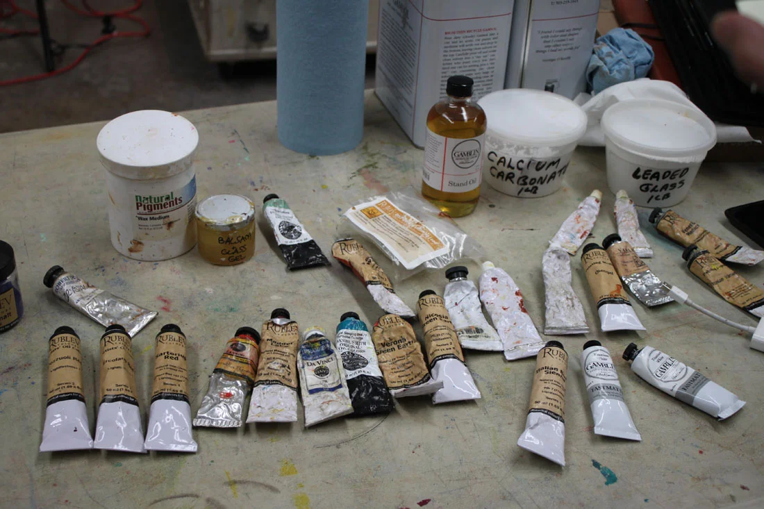
The following is the historically accurate palette he used for the Velázquez part of his workshop. Most of the paint is from Natural Pigments, Da Vinci and Daniel Smith:
Vine Black
Iron Oxide paints (Umbers & Siennas)
Yellow Ocher
True Naples Yellow made from lead
Vermillion
Madder Lake (for purple) or Carmine Red
Lapis Lazuli
Cobalt Smalt
"Sleeping Beauty" Turquoise (Daniel Smith)
Earth Green
Malachite
Medium-Linseed + lead (Maroger medium)
Calcite Powder
Leaded Glass Powder
Wax
And here are some of the copious notes I took during his workshop. I hope you find them as enlightening as I did:
Try not to use the word "hard", think "firm" or "soft" when thinking about edges
Fuse like values, an elegant painterly device
Use "feathery" edges where distinct facets of light intersect
Begins by putting in little "tick marks" to lay in composition & proportions, quick gestural drawing
Make sure you stay very sharp and angular when laying down your figure
Contours and shadows have "highs & lows" that the paint must forcibly lead too
You must amplify the color notes hinting in your subject
Paints on denim, cotton, linen, cotton & silk herringbone fabric he finds in the fabric store
He is fastidious about his surfaces and will size his fabrics first before applying coats of gesso. The right surface is essential in the overall success of a painting!
Spreads calcite, umber & oil on his canvas before beginning (in Velázquez manner) to give a little "cushion" for his paint
Uses bristle filberts in the initial painting stages
Uses shadow masses to help delineate form, chiaroscuro. Academic stuff, lots of planes. Hatches in the shadow.
Puts in the nasal line and "sweeps" across it to blend it in with the face
Step one is monochromatic underpainting
He is sure to extend his lines and exaggerate gesture for a better composition
Uses a wedge of paper towel to cut in lights in his underpainting
Often employs the back of his brush handle to break up paint ridges and "erase"
Goes for the big masses first when laying down paint and spreads it out
Get your anatomy down in the underpainting
Big mass of value, one light source, bigger brush
"Zipper like" approach to edges of value to get a more volumetric feel
Every stroke is "crumbly, jiggly & wiggly"
Know where the "hump" of a form is so that you can decide how obvious to make it--softer or firmer
Use the opposite color temps in your glazes, on a warm ground use cool etc.
On day 2 he will reactivate the shadows by adding umber to them but no color, also a little black as needed
Begins glazing over his underpainting by applying a thin amount of wax & green glaze to the face to help knock back the warm temp and give him something to paint into
Turns his brush to make it not such an "obvious mark" (holds brush at the end & perpendicular to the canvas)
Takes hard edges & relaxes them by feathering across them
Will add a little color to his shadows as long as there is no white (use a clean brush!)
"You see a lot of scumbly broken strokes in Spanish painting"
On painting hair, "follow the light as it jumps from one strand to another"
Velázquez was extremely aware of the topography of his forms and is subtle. Does not blend but feathers & hatches his edges instead
If an edge becomes too soft he will re-establish it, always making corrections, a back & forth of edge handling
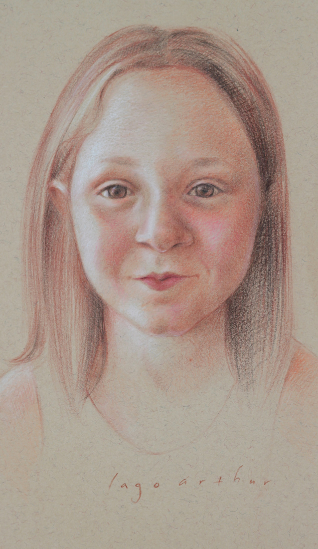
Portraits and "Derecho-geddon
What do portraits and "Derecho-geddon" (the severe storm system that ravaged a path from Chicago to the East Coast on June 29th) have in common? Nothing! Except that I drew this portrait as a thank you for the wonderful hospitality shown to us by good friends during the many days that we were without power. I want to officially thank Don & Arlene for our little "stay-cation", and especially for Don's killer Daiquiris. Your portrait is on its way.

