Workshop Wednesday: Robert Johnson
RobertJohnson_IMG_4700
Twice now I have had the pleasure of taking a Robert Johnson workshop. Both at the private studio of a wonderful friend of mine in Purcellville, VA. This most recent workshop occurred during the record breaking deluge of rain we received in Northern Virginia. However, despite the rain spirits were bright and the painting "spell" cast by Johnson was magical.
Robert Johnson is a master painter of exceptional skill and technique. His marks are in essence calligraphic--and he admits to having been inspired early on by the Japanese art of Sumi-E painting. This influence is evident in his work and separates his approach to oil painting from his contemporaries. The way he applies paint is a performance all on its own. He delicately controls the lift & pressure of his brush to accurately render the ephemeral quality of his subjects. Any opportunity to study with him is not to be missed.
One of the highlights of this recent workshop for me personally, was meeting an honored participant, the noble Statesman from Virginia--Senator John Warner. Senator Warner stands with other notable Statesmen (such Winston Churchill), who have turned from politics to painting later in their career. I thoroughly enjoyed the Senator's recollections of his time both as Secretary of the Navy and as a United States Senator as well as his anecdotal stories of celebrities and personalities he has known along the way.
Below are my notes that I took during both of Robert Johnson's workshops. I have placed them in categories to make them easier to understand and apply:
RobertJohnson_IMG_2336
Composition
-Decide which direction the viewer will travel through your painting.
-Concentrate on negative shapes, variety, design. Decide whether your design will go off the canvas--if so, let it go off in several directions or it will look like a shortcoming.
-You want variety in your set - up. Its inherent in nature.
-Seek a feeling of movement. Good proportion: mass of flowers to greenery to container.
-Using the convention of "polarity"-the juxtaposition of opposites, allows both objects to acquire visual impact. i.e. vertical/horizontal, bulky/delicate.
"The function of the background is to support the "prima ballerinas". It should not detract from the main event. The background should not be as thick, the values not as saturated ed, the edges not as hard, etc."
-"Strive to get depth, even on a front to back composition."
-"The eye goes to hard edges, more paint & bright colors. Be aware of this and design accordingly."
RobertJohnson_IMG_2380
Materials
-Works on double primed lead supports.
-Preferred medium mixture: 5 parts stand oil, 5 parts Gamsol (OMS), 1 part damar varnish.
-Lays in an "imprimatura" wash with cobalt, viridian & transparent red oxide. Puts down marks on top in a rhythmic patter which he sometimes allows to show through in the final product.
"What do mediums add to your painting? They loosen up piles of paint, make longer brushstrokes like in the background and can create transparency"
-"You need flat brushes to get at the delicacy of the flowers. Paint them with the thought that if you blew on them they would move."
-"All brushes should come to a nice sharp edge. Even your filberts."
-Begins laying in his drawing very loosely-brush held way back, long brushstrokes. Thins down paint with turps (OM).
-Paints with only one glove on his "painting" hand.
RobertJohnson_IMG_2360
Rendering
-On levels of importance: Values, then Edges, then Colors
-Johnson wipes out the flower masses with paper towels from his initial drawing to set up the structure . He lifts quite often.
-He recommends creating charcoal drawings on toned paper to get used to "lifting out lights. Wipe out like an artist--your touch should have the feel of going over a peony."
-"Paint the subject as if it is a under single source light. Ignore the ambient light."
-"Don't ever leave anything on your canvas that is confusing. Make it clear."
-Johnson often redesigns as he is painting. He will mutter to himself, "Let's make this little guy (a yellow peonie bud) white."
-"The moment you touch your canvas, everything should be done with artistic intention."
-"Don't think about sugar bowls and roses-think about shapes and how they relate to one another."
-"There is no democracy in art. The big forms always win."
-"Get to your final painting stage quickly so that all you have to do are revisions. Finish the big statement as quick as you can."
-"Always remember that perpendicular planes reflect the light the most. If you are having problems seeing or drawing try to remember that principle."
-"Try to put the light down horizontally-it will stand out more. Implies ridges."
-"The Rembrandt effect": Horizontal then vertical marks, ending on the vertical.
-THE 5 MIN RULE: "When you make a bold statement there is this instant fear that you have done something wrong. When you have that urge to change it-ignore it. Take a deep breath, recognize what is happening. Give yourself permission to modify it--but only after 5 mins."
-"Strength and boldness lead to more strength and boldness. This is the purpose to the 5 min rule."
-"Learn to make good descriptive brushstrokes. As the painting evolves each stroke should be laid down as if it is never getting lifted."
-"Maximize the utility of the highlight. Give them breathing room in your design."
-"The light (within a painting) can describe the intensity of the light on the subject, the surface texture, direction of the light, the contour that it is going over."
-On painting flowers: "Start with the outside shape of the flower, get that accurate. Then strive for the dimensional -the light and dark of it. Only then have you earned the right to paint a petal. Work abstract to detail."
-"Say the most with the least. Be precise and you can get away with suggestion."
-On the second day of a painting Johnson begins reworking the canvas by reapplying the background color so he has something to paint into.
-On painting rugs: " Try to establish a pattern. Don't be a slave to it. Rugs should have a clear, paintable pattern to them. Use the weave of the canvas to describe the weave of the rug (sometimes scratches the paint away with the side of a palette knife to reveal the weave). Say the most with least. Allow the materials to do the work for you. Go back in and restate the design of the rug but avoid getting mechanical & uniform with your brushstrokes. Use a light touch, get the paint just on the tip of your brush and drag it into place."
-"Brushwork should be a muscle memory thing. You should be able to render the object just by looking at it with your eyes."
"Just lay the paint on. No scrubbing. The paint will look better if you just allow it to do what it naturally does."
-"You need a blend of soft and hard edges. Let the soft edges dominate. Use hard edges sparingly. Especially in the background. "
-"If you can do it in one stroke it looks better. Start with a very light touch and then apply pressure-the stem will be painted naturally going from thin to thick."
RobertJohnson_IMG_2373
Values/Colors
-Follows thick lights/thin darks rule.
-Gets a highlight on quickly to key in the values.
-"A trick from Sargent's portraits: Add more light/color to the shadow of a subject--just past its contour. It helps turn form more and gives a sense of air."
-"Within the dark areas there are accents. The opposite in value of highlights."
-"We never think "dark" (values) with flowers but we should."
-On foliage: "Layer light over dark, dark over light--adds dimension. Overlapping planes also give you dimensional".
"Cast shadows are extremely important. Get them in early. They keep everything honest, related. The main thing I think about here is getting them dark enough and in the right places."
-On greenery: "Ultramarine blue + Cad yellow pale + something from the red family. Always sneak red into your greens."
-On painting red roses: "Don't make lights, lighter- make darks, darker. White only makes red look chalky."
-"Be careful painting yellow roses. It is the color most easily adulterated. It turns the key way down when other colors are accidentally introduced to it".
Recommended Reading
-"Painting Techniques of the Masters", Hereward Lester Cook
-"Russia, the Land, the People"
-"The Painted Word", Tom Wolfe
RobertJohnson_IMG_4717
RobertJohnson_IMG_4718
Art Tourist: Seeking Andrew Wyeth
Suzanne Lago Arthur outside of Andrew Wyeth’s studio
Last November, my family and I made a very special pilgrimage to the Brandywine Museum, but more specifically to the studio of the late great Andrew Wyeth and to the Kuerner Farm that he immortalized. I have been a huge fan of Andrew since my childhood and a couple of years back was also able to visit the Olson property in Maine that he made famous in his painting "Cristina's World". Little did I realize that the great man is buried there or I would have introduced myself to him properly, paid my respects and thanked him for all the years of inspiration.
Every year since my trip to Maine, I have promised myself that I would go see his studio in Chadds Ford, which is only open for part of the year. And every year it seems I would miss the window. But finally during last November I made it and on the very last weekend that it was open. Hooray!
So you may be asking yourself why I am writing this post now? Because the studio is open again for tours from April 1st - Nov 20th. Chadds Ford is beautiful during this time of the year. If you are a fan of the Wyeths as I am, you will not want to miss the opportunity to experience their world and the huge impression they left behind in the Pennsylvanian countryside.
Andrew Wyeth Studio, Chadds Ford, PA
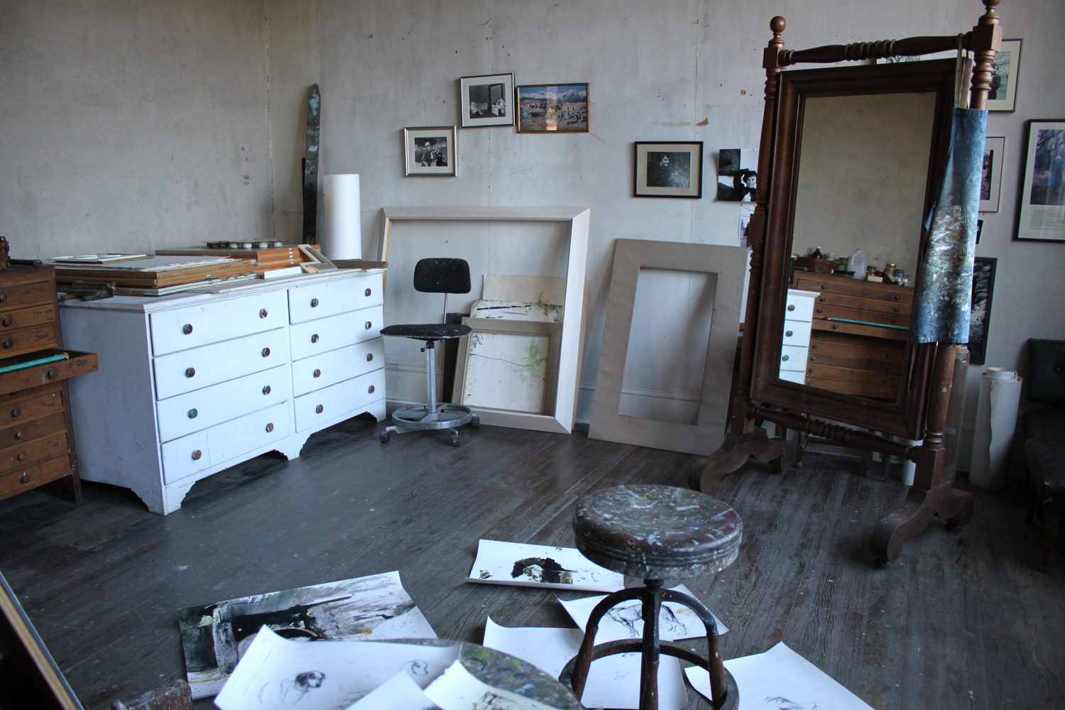
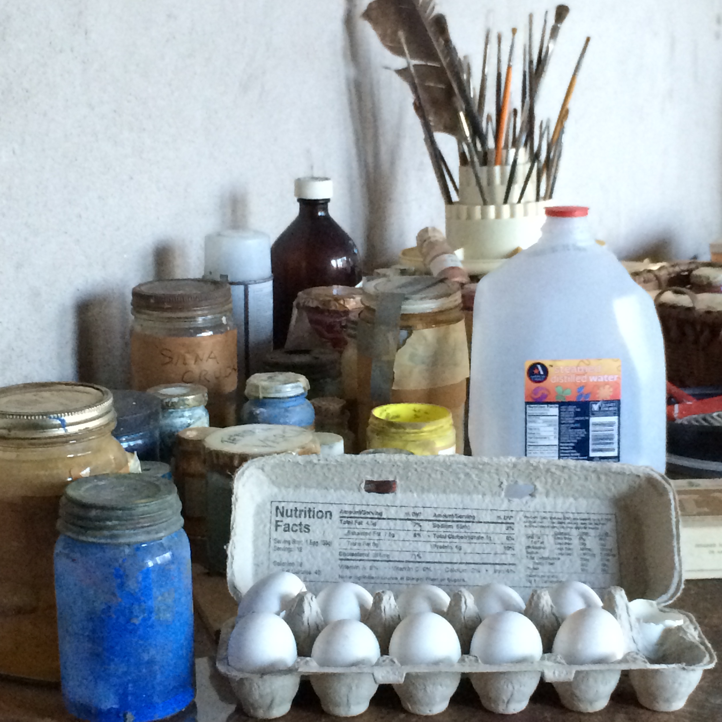
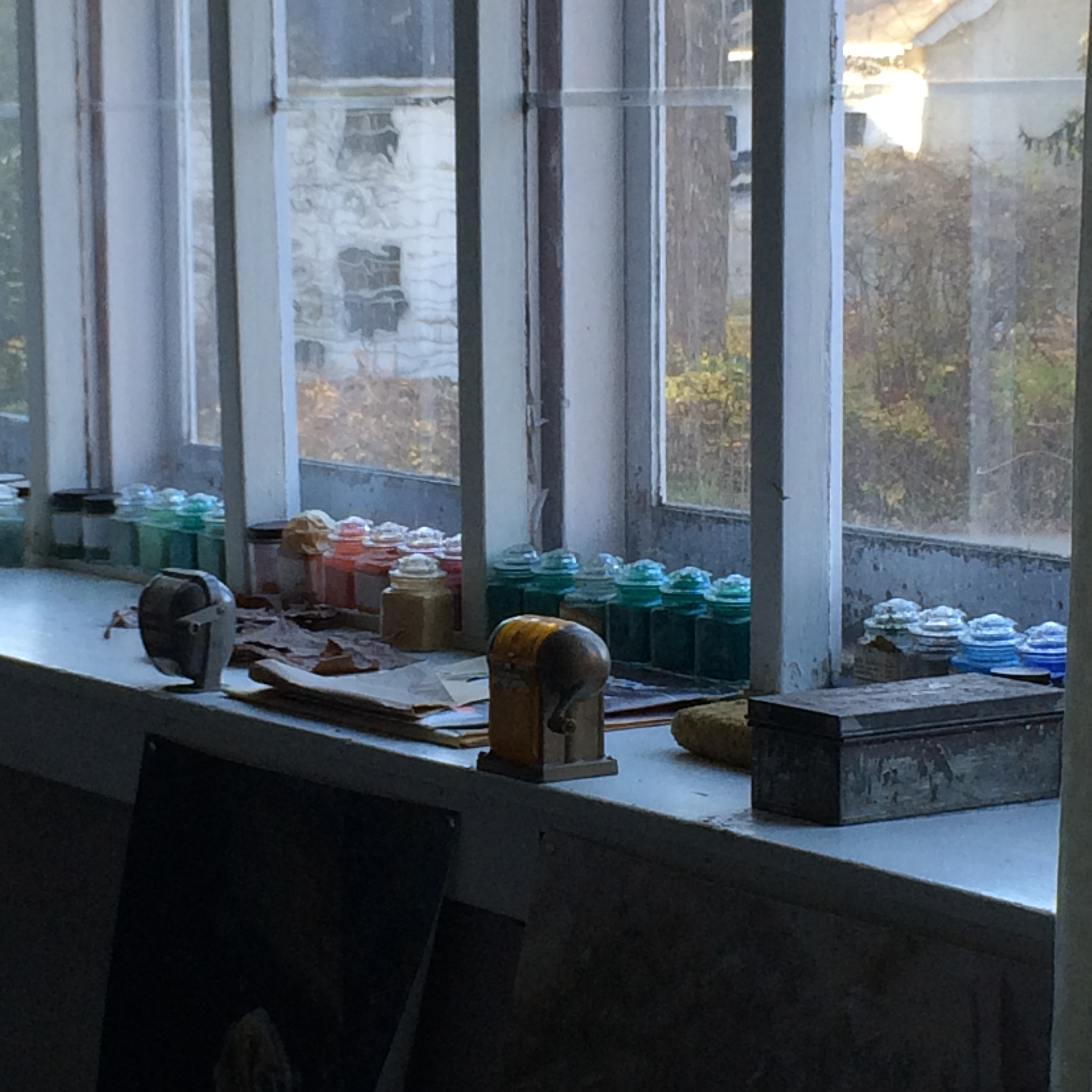
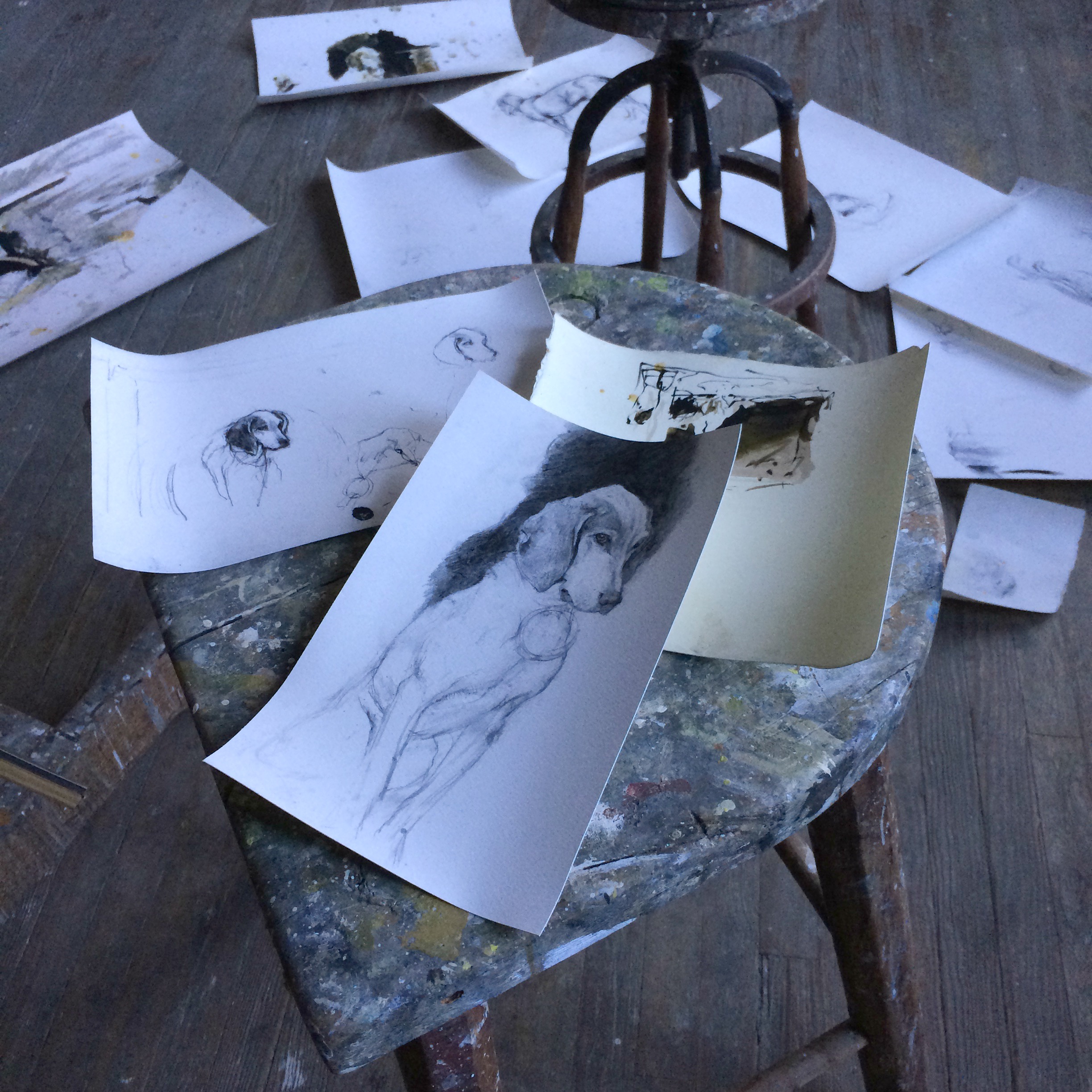
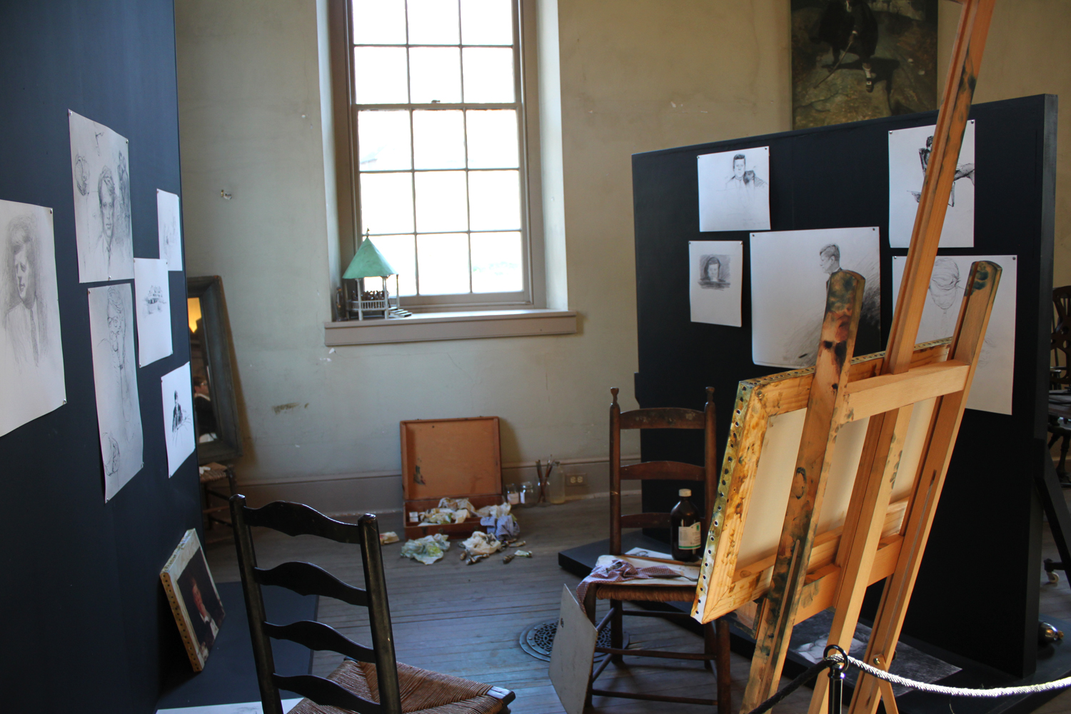
Andrew's studio is set up exactly as the artist left it. As if he has just stepped out of his studio for one of his regular walks in the surrounding countryside. There are drawings (reproductions) strewn throughout the floor. Egg tempera supplies still await his skillful hands and jars of luminous dry pigments line a window's ledge.
Copy of Andrew Wyeth drawings
Jamie Wyeth’s Corner, Chadds Ford, PA
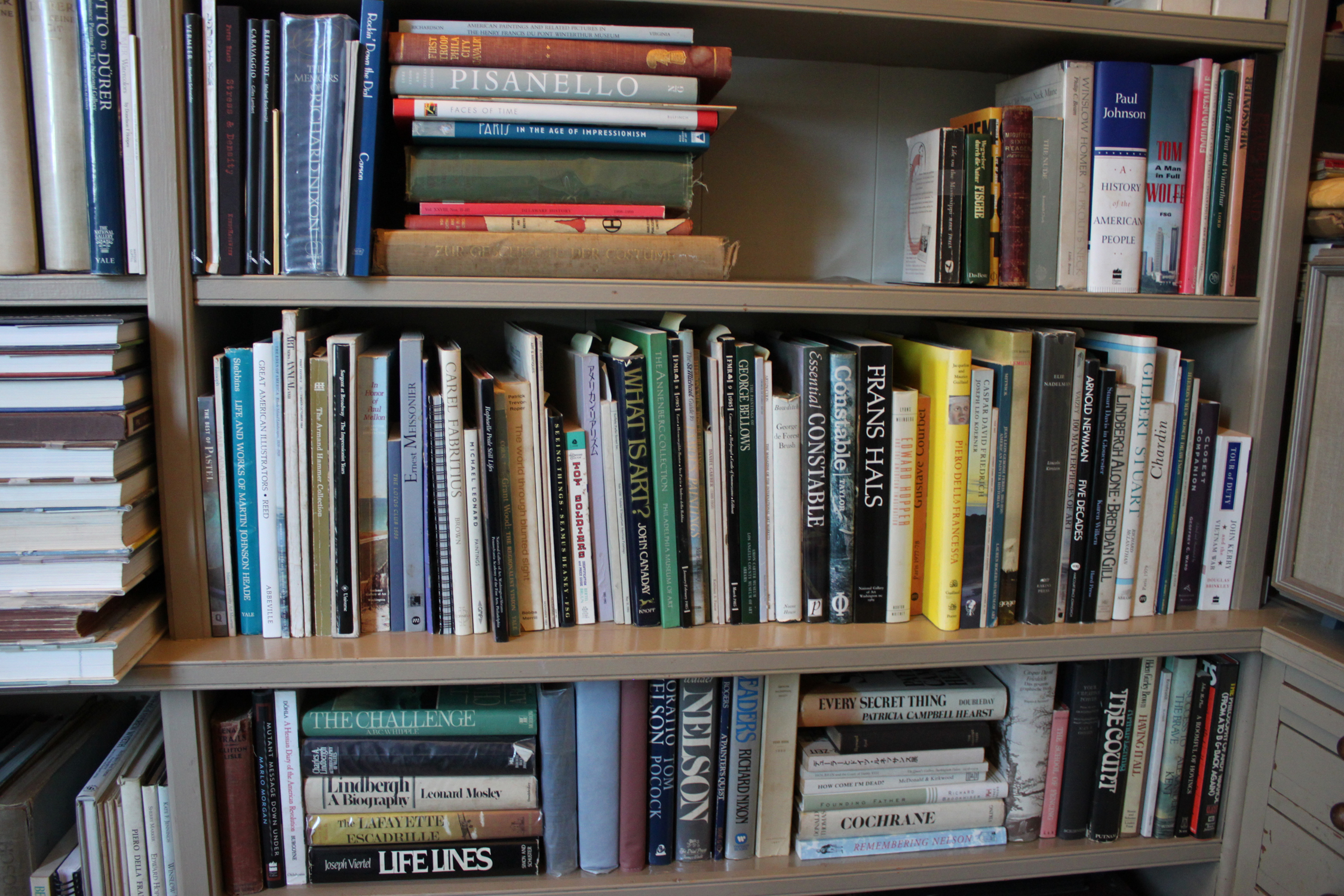
Andrew Wyeth’s Book Collection, Chadds Ford, PA
We were able to see the Kuerner Farm as well which was a huge treat considering that Andrew produced over 370 works of art on the property. There is a wonderful book documenting his time and productivity on the farm called "Wyeth at Kuerners". It is out of print now but if you are able to get a hold of a copy, I would highly recommend it. It contains a personal narrative told by Andrew on each of his paintings from this series including all the preliminary drawings. It is an invaluable insight into the process of a great American master artist. I got my treasured copy from a wonderful friend (thank you again, Karen) but I have seen them available any where from $8 - $249. The curatorial staff at the Brandywine even reads from it during their tours.
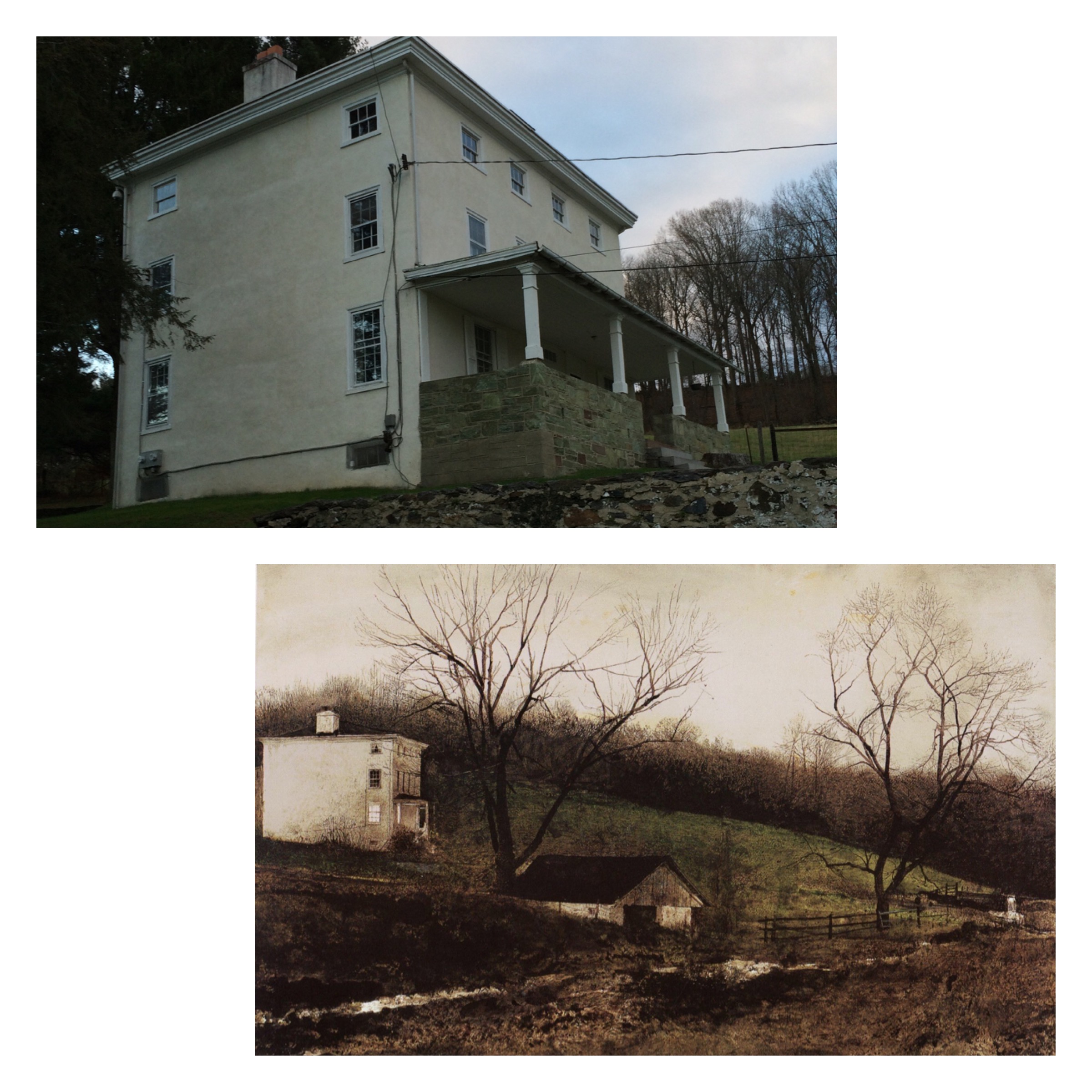
The Kuerner House
Kuerner House, “Evening At The Kuerner’s”, Andrew Wyeth
Above the sink in Kuerner's Barn. Painting by Andrew Wyeth, “Spring Fed”
My tired son enjoying the view on the Kuerner front porch after a long day of “arting” with Mom.
Workshop Wednesday: Teresa Oaxaca, the Figure in Charcoal
TeresaOaxaca_LaPrimavera_3227
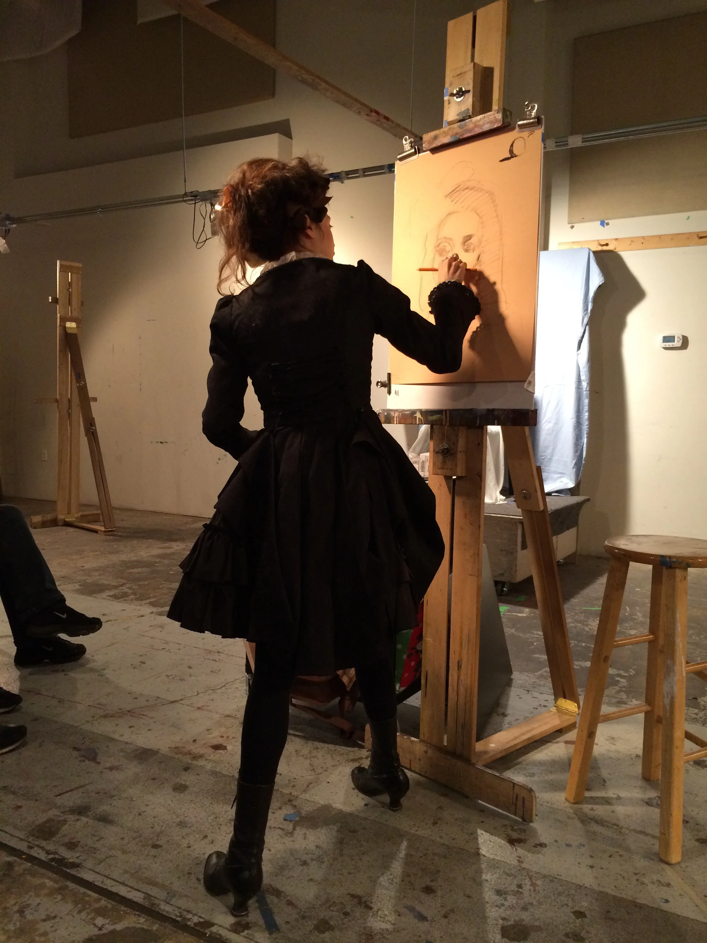
This past weekend I ushered in the New Year with a bang by attending Teresa Oaxaca's "Figure in Charcoal" workshop at the Art League in Alexandria, VA on Jan 2 - Jan 3rd. Considering that just the day before the workshop I was a little sleep deprived--and ok, maybe still "recovering" from the festivities, I was really happy and perhaps a little surprised when everything "clicked" for me during the workshop. But perhaps I shouldn't have been, Teresa Oaxaca has a lot to share with her fellow artists so listen up.
Full disclosure: I have been a big Teresa Oaxaca fan from the very first moment I met her in Rob Liberace's classes at the Art League. In fact, I own two of her self portrait drawings and one of her etchings (hint: when she says something is unsold over social media, that is your cue that you can purchase it). Teresa is one of my favorite contemporary artists and in my opinion the most promising. I just love the boldness of her charcoal drawings, the mixture of the gestural abstraction and rendered form. They are exquisite. And the fact that Teresa herself is super sweet and down to earth--I just knew I could learn a lot from her and I definitely did.
The following are my notes from the workshop and I hope you gain as much enlightenment from them as I did.
-Teresa's block-in is a big envelope, very loose, light & gestural.
-Sometimes the looseness (gesture) from the beginning is kept through the piece {I would add that it is this initial gesture that gives so much life & contrast of textures in her drawings}.
-She begins with a jumbo soft charcoal piece and initially adds a center line, eye line & forehead line followed by the shadow shapes of the eyes and nose. The rendering of the mouth and chin come second.
-Prefers Canson Mi Tientes paper (smooth side) and vine charcoal.
-Teresa uses a lot of straight hatching lines. "Easier to get structure in and keep it that way."
-Usually works life sized and steps back from the easel often to check her drawing.
-If you want to use crazy, energetic hatch lines like Sargent did in his charcoals (and Teresa does) you must have a solid geometric structure underneath {This subtle but powerful advice was one of the things that really resonated for me}.
-"Geometric shapes render & anchor the drawing."
-Her subjects start off looking more exaggerated in the beginning and then get more accurate as she continues working.
-She spends most of her time developing the light & shadow areas and then will knit them together.
-The nature of charcoal is that it is just dust. Get used to the fact that you will be constantly readdressing your darks throughout the process of creating a drawing.
-Uses a brush to soften along the core shadow on a cheekbone or will just drag the charcoal across.
-Shadows are solid, mid tones are a combination of blending or hatching (veiling).
-"I like to put the directional changes in the shadow shapes."
-She will often put a little speck of white chalk highlight in order to key her values {again, advice worth the price of admission right here}.
-"If your drawing is failing it is because you are not obeying the light/dark patterns."
-Ask yourself on the simplest of Master drawings, "What makes this really work?". Dissect and understand it.
-Most of the drawing will be carried by the in-between places that are either smudged or hatched.
-Make sure the shadow pattern is correct, even on a smaller form like the eye. The big shapes still need to be rendered on the smaller forms. Same rules apply!
-If you know you don't have time, stick to developing structure.
-She often veils in highlights on the planes of the forehead.
-Sargent spent all of his time on the structure and would throw his characteristic slap-dash bravura mark at the very last minute.
-If you don't plan on rendering an area leave it as a block-in or else you will be forced to fully resolve it.
-Gesture is the foundation of a minimalist drawing.
-Take pictures every half hour, it will reveal your own process to you. It also works as a mirror to show you your mistakes.
I want to personally thank Teresa for a wonderful workshop experience. Prior to this workshop, I never felt completely in control with Charcoal but I definitely feel more in control now and intend on practicing with it more often.
You can follow Teresa Oaxaca and her blog at her website www.teresaoaxaca.com, on Facebook at www.facebook.com/teresaoaxacafineart, on twitter and Instagram at @teresaoaxaca.
Suggested Reading: "Summer in February"
A recent trip to San Francisco allowed me the luxury of doing something I seldom do anymore, start a novel and finish it within one week. But this book, "Summer in February" by Jonathan Smith, about a community of artists living and working on the coast of West Cornwall during the last throes of the Edwardian era, had me in its spell from the very first chapter. The brightest star among them was the boisterous and infamous equestrian and landscape painter, Sir Alfred Munnings. It is the story of his ascent into the art world, and of his marriage to the budding artist Florence Carter-Wood. But it is not their romance, which is based on true events, that you pine for at the end of the novel. There is another storyline woven in here, both haunting and heartbreaking that has stayed with me ever since I put the book down. It is no wonder that the novel has already been turned into a movie. You can watch the movie for free if you are an Amazon Prime subscriber.
Mastering Work Flow: Jiro Dreams Of Sushi
A while back I came across this amazing documentary of Master Sushi Chef Jiro Ono, owner of Sukiyabashi Jiro, a Michelin three-star restaurant. I told anyone who would listen, especially artists, that they HAD to see this mind blowing film. You may be asking yourself now "what does a sushi master and an artist (or any other profession for that matter) have in common?" The answer is deceptively simple, mastery of one's craft through a conscious and disciplined daily practice.
Right from start of the film, Jiro issues this edict: "Once you decide upon an occupation you must immerse yourself in your work. You have to fall in love with your work. Never complain about your job. You must dedicate your life to mastering your skill. That's the secret of success and is the key to being regarded honorably."
Jiro approaches his craft in the way of "Shokunin" (meaning artisan), the Shinto belief in executing everything perfectly, every single day, over an entire lifetime. Anything can be approached in the Shokunin way, no job is considered inferior or beneath oneself. The wisdom here is obvious and applicable to anyone's life.
I kept having to stop the movie to take notes. Here is some more advice worth remembering:
"It really comes down to making an effort & repeating everyday"
"It has to be better than the last time. That is why I am always tasting during preparation"
"Each of our vendors are specialists in their field (i.e. surround yourself with excellence and use only the best materials)"
"All I want to do is make better sushi. I improve bit by bit, day after day and progress forward. But no one knows where the top is"
"In order to make delicious food you must eat delicious food (in other words, in order to make great paintings you must see great paintings)"
"Without good taste, you cannot make good food (educate your tastes)"
"If your taste is not better than your customers how will you impress them?"
http://www.youtube.com/watch?v=rhXEML1yKwQ
Jiro Dreams of Sushi is available on DVD through Amazon and streaming via Netflix and ITunes.
Art Video Review: Donato Giancola's "Joan of Arc"
This post is the first in a series of reviews of art videos I have in my personal collection.
Several months ago we made the decision to lose the extra cable box we had in our bedroom and use the bedroom TV to watch videos exclusively. Little did I know that this decision would lead to me being more productive & organized as I have taken to folding laundry while watching my many art DVDs. Before now, I never seemed to find the time to do either. Now it is something I dare say, I almost look forward to.
What sets Donato's video apart from other art videos I have seen is that he shares his entire process from conceptualization (which includes thumbnail sketching), compositional design, historical research, photography of models and source materials to preparing a surface, underdrawing, underpainting and through all the stages of painting his large multi-figurative narrative piece, "Joan of Arc". Joan of Arc by the way is one of my favorite saints because she is the patron saint of female bad assery. Donato is a much revered artist in the illustration and imaginative realism fields and has studied with some big names in the fine art world including Vincent Desiderio and Jerome Witkin. I think it is his unique perspective as an artist in these particularly deadline driven fields that has allowed him to create and hone such a strong working process which for me tends to be a bit of a moving target.
My favorite take aways are these:
-Use chroma shifts to help turn a form, not just value shifts. This was a timely nugget to absorb as I was able to use this technique a lot on my current portrait commission. -Donato refers to his paint palette as his "mud pile" and will pre-mix all his colors along with all the chroma shifts possible prior to painting his subject. -Keep a good book on anatomy handy as you model the form and constantly refer back to it for greater definition of the figure. -Donato is constantly referencing a lot of Master painters and their paintings to help inform his painting such as Rubens, Van Dyck and Bouguereau which I found really inspiring.
To purchase Donato Giancola's "Joan of Arc" click here. I highly recommend it.
What are you painting?
I'm only about 9 hours into copying this hand study of a portrait by Gerard Soest at the National Gallery of Art here in Washington DC. The reaction to my copy by the public has been extremely entertaining and at times has had me in stitches, like today. I guess visitors are not used to seeing a person paint only a small portion of a painting in the collection, and the oval shape I chose to emphasize the dramatic swirl of the dress and the gesture of her hand is unexpected and definitely throwing people off. But what seems to be the icing on the proverbial cake is that it appears to people that I am not painting the picture in the right color. Um, what gives?!! [Insert Valley Girl tone here]
Well there are some really good reasons for all the choices I have made so far in regards to this painting. The first decision I made, that of doing only a hand study of the larger painting is because I only have the months of July & August to copy and I thought by narrowing my subject I could get more accomplished in that time. Second, the oval shape is an intentional decision as far as the composition. In addition, if I have more time, I will paint another oval of her other hand to have a matching pair. And lastly, the colors you see before you are just the underpainting known as a "grisaille". The areas that are more grey are called a "closed grisaille" meaning they include white, plus the umber I used previously and prussian blue to achieve the overall modeling and value relationships. Those are the areas that I painted today. I will indeed get around to the actual color of the painting, eventually, in thin glazes of color. It is the way this painting was painted and since I am more of a direct painter, learning this technique is part of what drew me to the painting.
Below are some of the amusing things I have overheard/ or been asked directly while painting in order of frequency:
"What are you painting?" (Um, a hand and her dress....)
"Are you trying to paint abstractly?" (Yes, actually. A strong abstract design is the basis of all realistic painting)
"Dad, I don't get itttt!" (Snicker)
"Esa mano esta horrible/That hand is horrible" (Said by someone who doesn't know I speak Spanish. Ouch? ;)
I'll end this post by saying that painting is a process that is sometimes not self evident. So hang in there with me, eventually you will be staring at the exact doppelganger of that hand. Just don't hold your breath waiting.
Technique Tuesday: David Cheifetz Workshop Notes
"Paint with paint"
The mantra most frequently uttered by the masterful David Cheifetz at the 3 day painting workshop I recently participated in was simply, "Paint with paint". And David really meant it. In his demos his brush or palette knife was always fully loaded with a glob of yummy paint every single time he touched his canvas. We quickly discovered that he wanted each of us to do the same.
It was such a frequent utterance that fellow painter J Lyndon Douglas cheekily observed, "Amazing that paintings are made with paint. I think what I have been producing until now could be called smudgings." After laughing and probably snorting at his statement, I realized that J was really on to something. To see the amount of paint David Cheifetz skillfully uses while painting is a true revelation. Anything less just looks flat & lifeless in comparison. It has me very much rethinking how much paint I use in my own paintings, or smudgings as J would say.
Here are my personal notes from the workshop to share with you all. Many of these concepts were new to me. Enjoy!:
-Emphasize the values in your primary subject and dilute them everywhere else. You want your darkest dark and your lightest light on your primary subject.
-When setting up a still life, contrast secondary objects by picking darker subjects against the light of your primary subject. Always think dark vs. light.
-Think groupings. Don't scatter your subjects too much so or else they will compete against each other.
-"I always go for fear in a painting. If you are uncomfortable about something in your painting that is a good thing, it pushes you. Try to have at least one thing in each painting that makes you feel that way."
-Before you start a painting get a clear mental picture of what you want to paint. Sit, stare at it. Imagine it completely in your head the composition, area of focus, values and edges. Then begin to paint, and only then.
-Think surface/fabric. Do the folds add to your area of focus? If not take them out. Simplify.
-Make sure the light is directed on your primary subject.
-Example: When painting a ball of yarn, subdue any strings that leave the main form (skein). It should not compete with the ball of yarn itself.
-Example: Killing an apple (secondary object). Subdue it by not rendering it as well, more flat. Subdue chroma, value, everything.
-Your set up (composition) is just a tool for your narrative. Don't feel chained to it if it is not right.
-Cheifetz prefers to paint small. Mostly 9 x 12, 8 x 10 or 11 x 14.
-He sets his palette up from transparent colors to opaque. His colors include (but not in order): ivory black, phthalo blue, ultramarine blue, alizarin crimson, cadmium red, cadmium orange, burnt umber, raw umber, yellow ochre, cadmium yellow, cadmium lemon and titanium white.
-You want your lights to be painted in mostly opaque colors because they attract the most light rays visually.
-Begin your under drawing by getting in the abstract shape of the shadows.
-Indicates the table line. Positions objects within the composition by making vertical and horizontal marks.
-He prefers compositions that are eye level. They elevate ordinary objects by bringing it to a "human scale".
-He prefers to paint on a dry panel (no oiling in).
-Use enough medium to be able to draw. Prefers Gamblin's Megilp.
-A tip on drawing straight vertical lines by hand: Make micro adjustments back and forth as you lay down the line. The overall impression will be a straight line.
-Jumps right into massing the objects & shadows (like an open grissaile). He immediately moves into his lights with color (direct painting) working first on the highlight of his main subject and moving out from there.
-Put one or two generous strokes of paint before changing colors. PAINT WITH PAINT!
-Paint your backgrounds as lovingly as your objects.
-Lays his color down with filberts in long tiles.
-When painting a portrait, pick your area of focus and then let everything else melt out.
-Begin your painting with your subject and end it there.
I want to personally thank our host for the workshop, artist Tricia Ratliff of Agile Arts Atelier for conceiving this workshop and inviting me to participate. And thanks above all to David Cheifetz for his exceptional instruction and the individual attention he gave to each of us. I'd like to also add that David hosts his own awesome podcasts called The Impasto Logs that are all about painting and are especially wonderful to listen to when painting, or smudging.
Technique Tuesday: Drawing Revelations with Dan Thompson
In August I attended yet another workshop with Dan Thompson. 2 actually, back to back. Both of them on drawing. I see Dan as a cosmic guide on my life long journey as an artist. He leaves little bread crumbs of wisdom to follow on the path to improvement. Most recently he left me with two life changing concepts. The first is the revelation of what "closed" and "open" drawings are. Closed drawings are those with specific contours. They are precise, drawn from the outside in and do not allow much room for alterations. Open drawings are the opposite. They are built from the inside out. They are more mass than contour, they are flexible. They are forgiving. I had never heard these terms before, perhaps because I did not attend a particularly traditional art school. Hearing these terms allowed me to understand my own frustrations with my drawing--most noticeably a tendency for strong contours. To think that I could simply reverse engineer my drawing technique to get at the quality I want in my work was literally mind blowing! And the last revelation I received from Dan's workshop was to approach each effort in drawing and painting as if making a "proposal". If you get it wrong, so what! Just alter your proposal. Brilliant right? And it totally takes the pressure off.
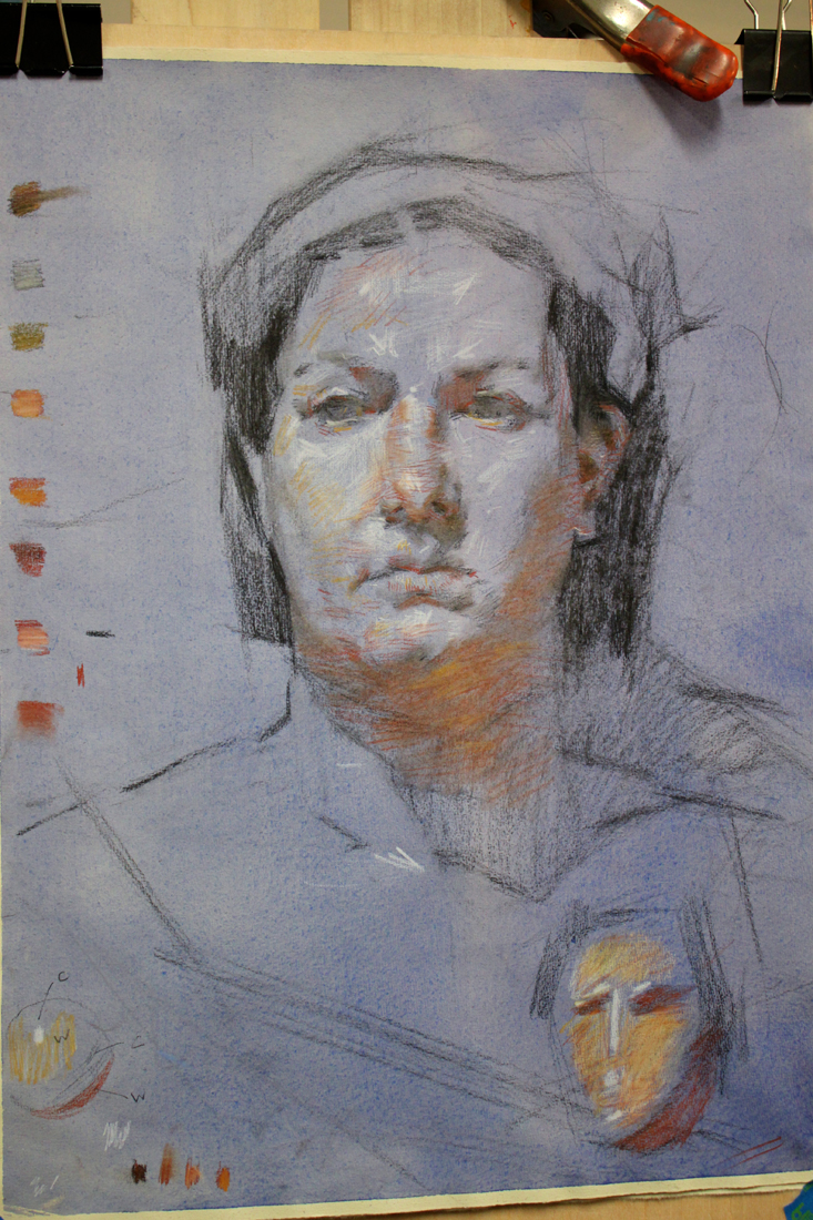
Workshop Wednesday: Dan Thompson 4 Color Chalk
Back in December I had the real pleasure of attending my first Dan Thompson workshop at the Art League in Alexandria VA. Dan happens to be teaching another workshop next weekend on March 23 & 24 and believe me when I tell you that it is completely worth your time and money to attend if you can. I had pages and pages of notes from his first workshop on anatomy alone, something I had not expected from a 4 color chalk portrait drawing class.
In full disclosure, Dan and I have some shared history--as in we both attended the Corcoran School of Art back in the 90's. Dan graduated two years before me but I still remember his amazing realism and sensitive self portraits which stood apart from every one else's work simply because no one was painting like that at the Corcoran then or even since. Flash forward 18 years post his Corcoran BFA, an MFA from the Graduate School of Figurative Art of the New York Academy of Art and Dan is now a highly respected artist & teacher. In 2006 Thompson co-founded the Grand Central Academy of Art in New York. In 2008, he co-founded the Janus Collaborative School of Art in New York. In addition he has instructed privately at Studio 126 in New York and is on the faculty of Parsons the New School for Design, the New York Academy of Art, The Art Students League of New York, and Studio Incamminati, in Philadelphia, PA. In 2007, Thompson was selected an ARC Living Master Artist. To say I am proud to know this generous artist & gifted teacher is an understatement.
And now without further ado, my notes from his 4 Color Chalk Workshop, straight from my archives of workshop "awesomeness":
Notes of Materials & Drawing Aids
-Uses Othello & Conte pencils in red, black, yellow & white.
-Capitalize on chalk based material early on in your drawing because it is easy to remove.
-Also uses Kremer pigments, Lapis Lazuli, Smalt Blue, Red Ball chalks, vine charcoal & shammy.
-Be careful when working on a toned paper not to lift the ground when erasing.
-Best watercolor wash for paper- raw umber, ultramarine blue & dioxazine purple. Shoot for a cool colored neutral.
-READ the John H. Vanderpoel book, "The Human Figure" published in 1907. A must for understanding proper figure construction based on anatomy.
-"Figure out someone's technical model for planes of the head & use it!"
-Likes Strathmore 400 artist's series paper or semi tooth laid paper like Ingres etc. Must be ph neutral and 100% acid free.
-Get yourself a resin cast skull for serious portrait drawing ($250 --Bone Room, Berkley CA.)
-Take an écorché class (without skin) for accurate muscle awareness. Steve Perkins @ Janus School--excellent écorché instructor.
Notes on Anatomy of the Face
-The temporal ridge, where the side of the head meets the front resembles a covered bridge.
-The back of the skull resembles a pentagon in shape.
-Planes in the face follow each other, upward planes flanked by downward planes creating a rhythm.
-The underside of the cranium & jaw is shaped like a woman's high heel when viewed from the side.
-Occipital bone is the lower point on the back of the head.
-There is a "triple curve" from the outside flare of the nose stepping along the outside of the mouth.
-The eye socket drops in a series of steps & terminates in the the lower eyelid furrow. -The node of the mouth is the convergence of different muscles.
-Lines or creases form perpendicular to the muscle fiber (look for this).
-You can craft the nose out of a block, "door stop" form of the nose.
-Emphasize the under plane of the nose.
-A common mistake when rendering the nose is to not go past the eye lid with the nasal bone.
-"Alar cartilage" is the ball of the nose, shaped like an olive. It comes from the tear duct, twists & drops into a V shape
-The nose is a lesson in triangles.
-There is a rim in the enclosure of the nostril that often gets overlooked, make sure to include it.
-Develop your own secret figure reference (canon) for what anatomy should look like so that you know when it differs in an individual.
-There are 5 transitional planes in the nose when looking at it in profile beginning with the bridge, curving around the tip and ending in the plane before the lip.
-Ears will get bigger as people age.
-From the side an ear looks like a little capital D within another D.
-The ear comes out from the head like a door suspended open by the "concha" or hollow next to the ear canal.
-The helix is the upper curve of the outer ear.
-The anti-helix is the y shape with the ear.
-Draw in pairs when you can; feet, hands etc. Each completed form helps define the other.
Notes on creating the 4 chalk drawing
-Test out your pencils on your paper.
-Red pencil + stump = warm
-Red pencil +white pencil= cool pink
-Red pencil+ yellow pencil= warm orange
-Red pencil + black pencil= cool violet
-Black pencil + yellow pencil= warm green
-Helpful to have a pencil the same color as your toned paper should you erase too much of the base color away.
-Shellacking makes paper more resilient.
-Look for the simple design in light & dark.
-Think more about what's there and not adding to what you are seeing.
-Focuses on his "scanning eye" that sees quickly to give him information of the forms.
-Pulls lines through & out of drawing-trajectory.
-Works at life size of slightly smaller. -Focus on gesture, that way you get into the spirit of the pose.
-Abbreviate what you see to encourage the mobility of the eye around the portrait.
-Keep areas (measurements) open, allows flexibility to accommodate change & correction.
-Flat patterns of dark & light.
-Charcoal vines are great for the initial layout. They make you think broadly, no detail & are very forgiving.
-If you pretend not to "focus" on the model you see big forms better.
-It is useful not to think of features in the beginning, only shapes & their proportions to each other.
-Search for the 2D. Squint to see "flat" shapes.
-Find a fixed variable based on life size and note it down on your drawing. Then allow for "flex" in other directions to improve your drawing.
-Does not lighten his darks in the beginning. Instead keeps them a a false value--all shadow the same tone to help him arrive at the underlying forms.
-Pay attention to the things that artists ignore like the neck & ear. It will make you better than the average artist.
-Be careful when your drawing transitions from the 2D to the 3D. This is where the integrity of the drawing can begin to break down.
-Be aware of your eye level & what impact that has on your drawing.
-Turn the light off to see what your model's head movement is (and not what the light is doing).
-Highlights should be indicated in a directional manner along anatomy references. They are place holders.
-Often uses two whites when drawing. One is kept really sharp for detail, one more blunt for softening edges.
To register for Dan Thompson's portrait painting workshop at the Art League in Alexandria VA on March 23 & 24 click here. http://www.theartleague.org/school/course_desc.php?class_id=1075
Hope to see you all there!
Workshop Wednesday: Robert Liberace's "The Classic Portrait from Pencil to Watercolor"
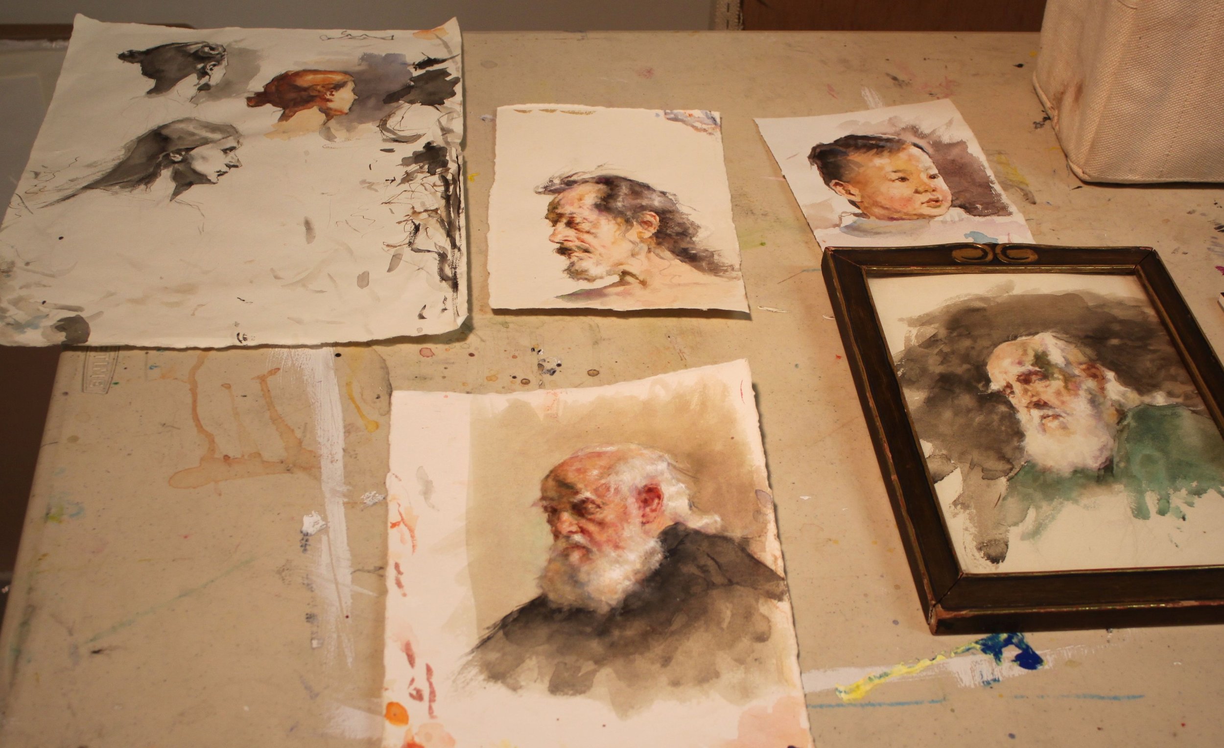
Several weeks ago I had the pleasure of attending yet another of Robert Liberace's fabulous workshops at the Art League in Alexandria VA, this one on drawing & painting portraits (watercolor). Every time I find myself in one of Liberace's classes, I am made aware of how much there is to learn about this thing we call "art". Specifically for me I am interested in learning how Liberace makes his work look so elegant and at the same time so dynamic. Every stroke has its purpose and I am working towards accomplishing that same thing (er... at least attempting to).
Here are the notes and photos I took from the workshop (click on the photos to enlarge). It is my honest wish dear reader, that something in the post will resonate with you (and with me) and we'll walk away as better artists or at least more enlightened ones. And how could we not when we are privy to the inner thoughts of a modern day master?
Day One, Drawing the Portrait:
Tools:
Mechanical pencils, bic
Works mostly in HB, uses harder or softer pencils occasionally to achieve his values
Anything beyond 2B gets too dark in his opinion
Nibs
Watercolor
Ink
Notes:
Follow the (Charles) Bargue idea
Strong light & shadow
Liberace loves TwinRocker paper, Canson "Mi Tientes" too
Looks at Ingres for fabric
Treat every detail of the picture like a portrait
Likes to paint in watercolor on a smaller scale like Fortuny
Box out your shadows, map them out then slowly add midtones
Ingres faces are almost decorative--like and engraving but with "spots of action"
Really study Ingres--get a good book on Ingres' drawings!
Make shapes that are so clear & obvious, terminator shading
Add pentimenti flying through there
Tieopolo liked to add "marks of 3" in his drawings, very Venetian technique. Sargent employed this as well
Looser shadow & animated but still differentiation of light & dark
(Tiepolo) Begins with charcoal before ink
Simple mass of shadow
Fortuny used black, umber & sienna in his watercolors, shadow always finding form
Zorn used monochromatic watercolor with opaque white on top for emphasis & highlight
If you ever need to steady your drawing or watercolor readdress area with a contour line
You can add a little water to a brush and dilute an area of a graphite drawing (works the same way as in a watercolor), good for evening tones or for contours
Day Two, The Portrait in Watercolor:
Notes:
Begins sketching in pencil, then jumps into watercolor
Quick assessment of light/shadow
Will often begin by doing a quick "Tiepolo" style study with one tone, maybe throw in an accent
Loosely sketch in pencil, then adds a gestural contour in watercolor
Adds mass & shadow
Try not to be too specific with lines, be more suggestive--"it is what gives that romantic feeling"
"Your job is to find out where the light is ending, the more you break that up the harder your job becomes"
"Melt" the detail into your shadows if you aren't so sure where they begin
Connect half tones to the shadow & "feather" it out
"It is really all about editing what you see"
Day Three, The Portrait in Watercolor:
Palette:
Burnt Sienna,
Black,
Chinese or permanent white,
Cadmium Yellow Light (or similar bright yellow),
Cadmium Red ( or similar bright red),
Ultramarine Blue.
Optional Palette:
Alizarin Crimson,
Manganese Violet,
Cerulean Blue,
Pthalo Blue,
Viridian Green,
Pthalo or Hookers Green.
Notes:
When sketching his gesture he holds his pencil at the end
Puts in markers (enveloping)
Blocks in his "axis lines"
Liberally throws crimson wash over the whole face & "melts" it out
Drops in yellow & violet for the beard
Throws in black for the uniform
Shadow on face, a warm green made of black & yellow & sienna
On the nob of the nose uses a little extra red
Drops in extra water for the fold of the eyes--orbital fold
Draws eye, ties it in to the shadow then carefully marks the lower lid with it
Goes back and forth between different temperatures
Will add half tones in when there is not a lot of shadow to delineate form
Thinks in planes, color & temperature all the time
Ties a lot of the elements of the eye together to simplify
Soften edges
Loves TwinRocker heavy text, light art weight, calligraphy cream paper
On halftones he is careful not to leave heavy block ins
"I don't want to plan things too much. Sometimes watercolorists work to tightly--allow spontaneity"
Moves in with smaller brushes
Will use watercolor & a bristle brush to scumble areas
Puts color in shadows
Will refine edges on strokes he doesn't like so that is will dry as a mass that he can paint on later
Really "feathers" a lot of these edges out
Likes to see a lot of shape & pattern to a form like Sorolla & Fortuny
Will erase at the end with a "perfect pencil" (eraser pencil with brush at the end) & then uses a white charcoal pencil to add highlights with
Chinese white paint is used at the end over dry white paint when needed (alla Zorn)
Hope your holidays were as wonderful as ours. Wishing you much artistic growth and success in the New Year!
Jonathan Linton's "Art Group"
The life of a professional artist is often an eremitic existence. We toil away by ourselves in our studios without human contact (except for the frequent face book checking--ok, maybe that part is just me) and often regret that we don't have another set of eyes to look upon the evolution of our paintings. Jonathan Linton, award winning portrait painter, children's book illustrator and co-founder of the Horizons Art School in Ashburn, VA has a brilliant solution to that problem and calls it--the "Art group". Jonathan is opening up his studio space at the Horizons Art School for a select group of artists to get together every Tuesday to paint, discuss art, share technical expertise and critique each other's work for a nominal weekly fee. I am beyond thrilled to have been asked to join the group and look forward to working more closely with Jonathan, an artist I truly admire.
Below is a candid snap shot taken just this morning from our first painting session together. All of us had a blast working on our individual projects and talking "shop". Personally, I think Jonathan looks rather fetching in his bow tie, don't you?
Interested in joining? Jonathan has a few slots available. Check out the Horizons Art School web site for more details and contact information. One word of caution--since I am one of the first members of the group I have elected myself responsible for the hazing of new recruits. I hope you like painting in togas. Muahahahahaha.
http://www.horizonsartschool.com/
And for a look at Jonathan Linton's work please click below.
Good Artists Evolve into GREAT Artists {If they work hard enough for it}
I have been doing this whole art career thing for a little while now, albeit it a little off and on due to the joys of parenthood. And I have learned a couple of things over that time and here is one of them: Greatness does not instantly manifest itself in an artist--an artist has to WORK AT IT. Now this is not something that the top dogs in the art world might admit to. I would imagine that they would prefer that we all see them as some kind of Greek god who sprung perfectly formed out of the elbow of their mothers. But I have proof that what I say is in fact true! Allow me to present to you 3 artists of immense fame & talent who once, not too long ago, were making not as great art. Exhibit A: Daniel Sprick{ b. 1953 }
Sprick has to be one of my most favorite living artists. His oil paintings exude a sense of place, time & mood unlike anyone else except for perhaps Claudio Bravo (who sometime Sprick's work reminds me of). Below is an example of the work we have come to love and recognize him by.
And here is an older painting of his recently sold on Ebay for $2,995.00.
There are 16 years that separate the creation of these two paintings. Although the older work is relatively "good" in execution and has some nice variety in its brush strokes and edges, it is a rather ordinary painting and certainly not at all in the same league as its modern day counterpart. I would not have linked these two paintings as having been created by the same great artist. Do you see what I am getting at here? Gives the rest of us hope, doesn't it?
Exhibit B: Lucien Freud {1922 - 2011}
Lucien Freud is an artist who comes to mind immediately when I think of the evolution of a great artist. His work was always very psychologically charged (the apple here did not fall far from his Grandfather's tree, Sigmund Freud) but there is most definitely a crudeness to his earlier work which was very much nurtured by what was happening back then in modern painting. However, he did eventually evolve into a highly realistic artist with great technical ability who worked until the very day he died at 88 years of age. Below is a typical example of the work he became known for.
And here is a painting from early on in his career.
Again, there is a 38 year difference between these two paintings and just look at how different they are from each other. One is extremely flat and the other extremely convincing in its realistic rendering. Now I think that Freud could have been satisfied with with his early style as it is most definitely engaging (looks a lot like an Alex Katz here to me), however he chose to evolve in his artwork and what he evolved into is something truly remarkable with highly realized skills in painting a subject from life. Not an easy thing to do, believe me!
Exhibit C: Salvador Dali {1904 - 1989}
This summer I went to visit the Salvador Dali Museum in St. Petersburg FL and I was floored when I noticed the technical gap between Dali's earliest work and the work in the prime of his career. The tour guide made sure to point out to us that day how exceptional his work was back then and how within it you could see the "seeds of his greatness". I could not have disagreed with her more! I found his early work to be very average in both the traditional techniques in which he studied and his experimentation with modern styles. And it was this enlightening discovery which gave me the idea for this post and has encouraged me along the way. Below is a painting that I saw in person at the museum which was created when he was already well established. It blew my socks in wonder over its highly technical rendering.
And here is one of his early works when he was still trying to figure out his style & direction. I think I could find something similar in a local yard sale.
My take away message from this post is this: Do not allow yourself to be discouraged from achieving great things in both your work and your career. You only have to put in the hard work and persevere over time to achieve it. Now that doesn't sound so unattainable, does it? So what are you waiting for? Go get your buns back in the studio!
Artist Mentors On-Line, Blog Talk Radio
I recently stumbled across this really informative Blog Talk Radio show called Artist Mentors On-Line that I have been listening to in my studio. They have had a great line up of artist interviews leading up to the Weekend with the Masters Art Conference in San Diego including Jeffrey Watts, Juliette Aristedes and Tony Pro. However, I can't get that SNL "Schweddy Balls" sketch out of my head when I am listening to it. Anyone else having that problem or is it just me?
Check out this recent episode of AMO featuring the amazing Jeffrey Watts: http://www.blogtalkradio.com/artistmentorsonliine/2012/07/25/jeffrey-watts-weekend-with-the-masters-series-interview
And to see the infamous SNL "Schweddy Balls" sketch I am referring to, simply click on the photo above.


