
2012 "Expressions" Portrait Competition Finalists

KurtSchwarz
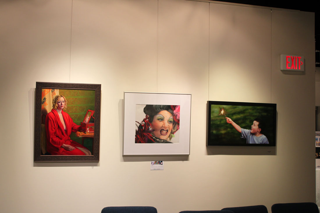
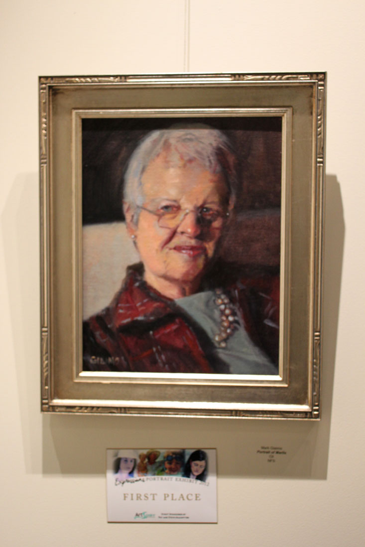
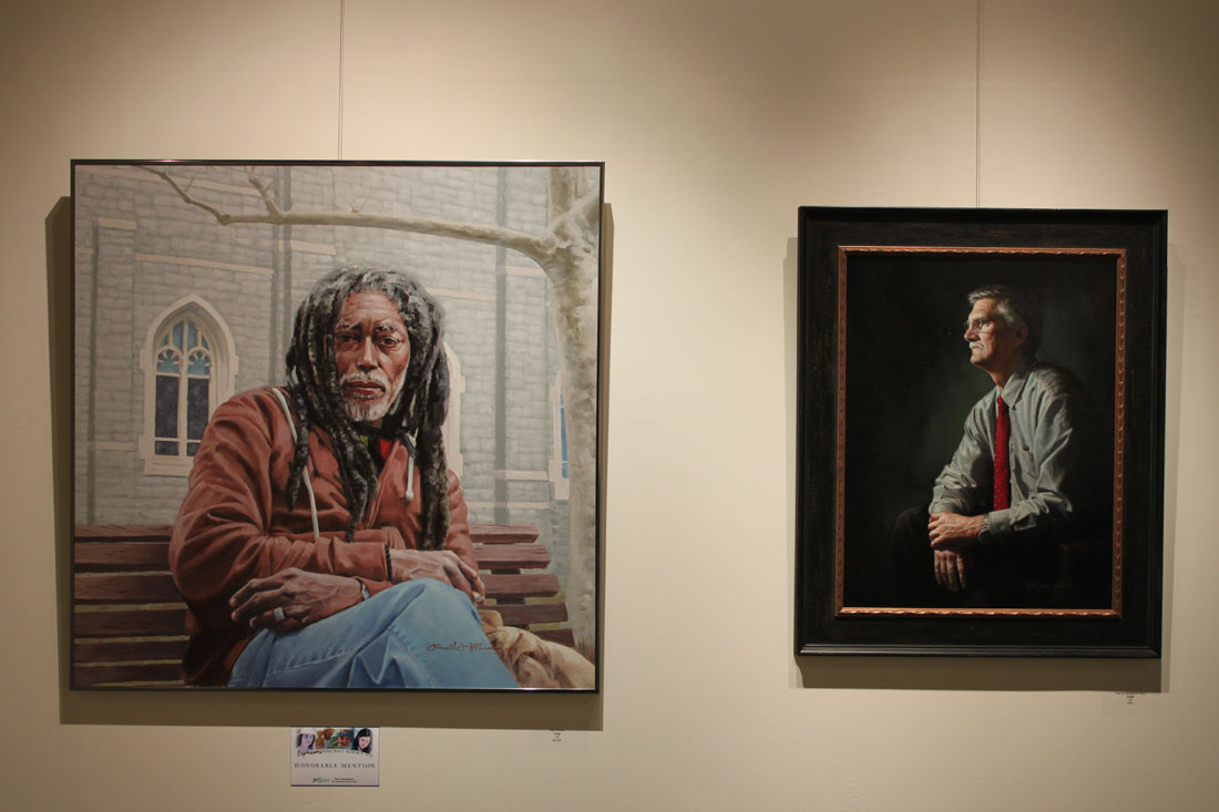
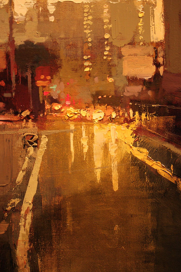
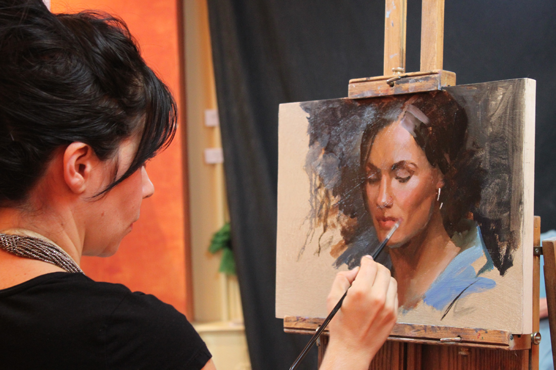
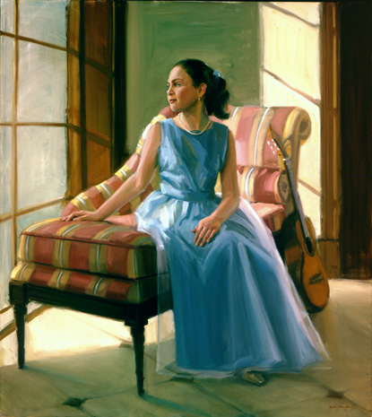
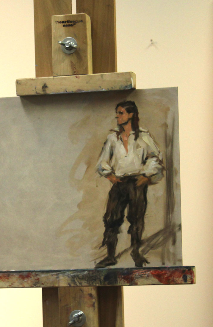
Saturday night I had the pleasure of attending the opening for the 2012 "Expressions" portrait competition at Artspace Herndon. This is my second year as a finalist and I can proudly tell you that the caliber of this year's show is exceptional. The jurors, artist Tricia Cherrington Ratliff and Caron Broadway Moody, of Broadway Gallery did a wonderful job pairing down the 107 submissions into a show of 25 portraits showcasing a strong display of technical achievements. Of those 25, Judge Kurt Schwarz had the difficult task of selecting the winners and after much admitted deliberation, awarded 1st place honors to Mark Giaimo, "Portrait of Marlis" (oil), 2nd place honors to Lorena Selim, "Waiting for Mr. Right" (oil) and 3rd place honors to Gavin Glakas, "Decisions (My Wife Jasmine)" (oil). Two Honorable Mentions went out to Suzanne Vigil, "La Rue" (colored pencil) and Ron Primm, "Dray" (oil).
Below are just a sample of the paintings on display, including one of my own (click on the images to enlarge them). The exhibit will be up through December 9th. Click here for directions and a link to the Artspace Herndon Website. If you live in the DMV it is a show not to be missed!
Expressions2012_2

Expressions2012_3
Expressions2012_7

Expressions2012_1

Expressions2012_4

2012_11_10_2672
Expressions2012_6

Expressions2012_9

Who's the Man? Jeremy Mann!
JeremyMann10
Last Friday I attended the opening of Jeremy Mann's "The Realness" show at the Principle Gallery in Old Town Alexandria mostly due to his hype as American Artist Magazine's, "25 Artists of Tomorrow". And you know what I found out? He more than lives up to it!
Mann is what I would call a "painter's painter". His paintings completely seduce you with his play on textures, predominantly tertiary color harmony and lost & found edges, all while maintaining a strong level of realism. He is known for working with non traditional tools such a squeegees and brayers (that last one I wrestled out of him) as well as his brushes. Mann admitted to me that he likes to use which ever tool will achieve the most ambiguous mark as in "how the hell did he do that?" Personally I find his work extremely inspiring because getting more "painterly" with my technique is exactly what I am gunning for now. You can be sure I have already placed a couple of brayers in my Amazon shopping cart. I am sure Mann would be thrilled to know this.
I managed to take several detail photos of his paintings to share his brilliance with you (click on the photos to enlarge them). What I did not manage to do was write down any of the titles. Luckily the Principle Gallery's website provides all those great little details! Want to see more of The Realness show than what I am showing you here? Then check out their link at http://www.principlegallery.com/artistView.new.pl?artist=155

JeremyMann11

JeremyMann3

JeremyMann4
"After the Storm". 48" x 48". Oil on Panel. Artist, Jeremy Mann.
JeremyMann5

JeremyMann7
"Still Moments in Teal". 21" x 21". Oil on Panel. Artist, Jeremy Mann.

JeremyMann8
And to see more of Mann's amazing work visit his website @ http://www.redrabbit7.com/

Jonathan Linton's "Art Group"

JonathanLinton_Alex
The life of a professional artist is often an eremitic existence. We toil away by ourselves in our studios without human contact (except for the frequent face book checking--ok, maybe that part is just me) and often regret that we don't have another set of eyes to look upon the evolution of our paintings. Jonathan Linton, award winning portrait painter, children's book illustrator and co-founder of the Horizons Art School in Ashburn, VA has a brilliant solution to that problem and calls it--the "Art group". Jonathan is opening up his studio space at the Horizons Art School for a select group of artists to get together every Tuesday to paint, discuss art, share technical expertise and critique each other's work for a nominal weekly fee. I am beyond thrilled to have been asked to join the group and look forward to working more closely with Jonathan, an artist I truly admire.
Below is a candid snap shot taken just this morning from our first painting session together. All of us had a blast working on our individual projects and talking "shop". Personally, I think Jonathan looks rather fetching in his bow tie, don't you?

Art Group
Interested in joining? Jonathan has a few slots available. Check out the Horizons Art School web site for more details and contact information. One word of caution--since I am one of the first members of the group I have elected myself responsible for the hazing of new recruits. I hope you like painting in togas. Muahahahahaha.
http://www.horizonsartschool.com/
And for a look at Jonathan Linton's work please click below.

Good Artists Evolve into GREAT Artists {If they work hard enough for it}
I have been doing this whole art career thing for a little while now, albeit it a little off and on due to the joys of parenthood. And I have learned a couple of things over that time and here is one of them: Greatness does not instantly manifest itself in an artist--an artist has to WORK AT IT. Now this is not something that the top dogs in the art world might admit to. I would imagine that they would prefer that we all see them as some kind of Greek god who sprung perfectly formed out of the elbow of their mothers. But I have proof that what I say is in fact true! Allow me to present to you 3 artists of immense fame & talent who once, not too long ago, were making not as great art. Exhibit A: Daniel Sprick{ b. 1953 }
Sprick has to be one of my most favorite living artists. His oil paintings exude a sense of place, time & mood unlike anyone else except for perhaps Claudio Bravo (who sometime Sprick's work reminds me of). Below is an example of the work we have come to love and recognize him by.
Daniel Sprick 25
And here is an older painting of his recently sold on Ebay for $2,995.00.

Older Daniel Sprick painting
There are 16 years that separate the creation of these two paintings. Although the older work is relatively "good" in execution and has some nice variety in its brush strokes and edges, it is a rather ordinary painting and certainly not at all in the same league as its modern day counterpart. I would not have linked these two paintings as having been created by the same great artist. Do you see what I am getting at here? Gives the rest of us hope, doesn't it?
Exhibit B: Lucien Freud {1922 - 2011}
Lucien Freud is an artist who comes to mind immediately when I think of the evolution of a great artist. His work was always very psychologically charged (the apple here did not fall far from his Grandfather's tree, Sigmund Freud) but there is most definitely a crudeness to his earlier work which was very much nurtured by what was happening back then in modern painting. However, he did eventually evolve into a highly realistic artist with great technical ability who worked until the very day he died at 88 years of age. Below is a typical example of the work he became known for.

lucien freud I
And here is a painting from early on in his career.

kitty freud
Again, there is a 38 year difference between these two paintings and just look at how different they are from each other. One is extremely flat and the other extremely convincing in its realistic rendering. Now I think that Freud could have been satisfied with with his early style as it is most definitely engaging (looks a lot like an Alex Katz here to me), however he chose to evolve in his artwork and what he evolved into is something truly remarkable with highly realized skills in painting a subject from life. Not an easy thing to do, believe me!
Exhibit C: Salvador Dali {1904 - 1989}
This summer I went to visit the Salvador Dali Museum in St. Petersburg FL and I was floored when I noticed the technical gap between Dali's earliest work and the work in the prime of his career. The tour guide made sure to point out to us that day how exceptional his work was back then and how within it you could see the "seeds of his greatness". I could not have disagreed with her more! I found his early work to be very average in both the traditional techniques in which he studied and his experimentation with modern styles. And it was this enlightening discovery which gave me the idea for this post and has encouraged me along the way. Below is a painting that I saw in person at the museum which was created when he was already well established. It blew my socks in wonder over its highly technical rendering.
SalvadorDali-Table
And here is one of his early works when he was still trying to figure out his style & direction. I think I could find something similar in a local yard sale.
dali-self-1919_640x794
My take away message from this post is this: Do not allow yourself to be discouraged from achieving great things in both your work and your career. You only have to put in the hard work and persevere over time to achieve it. Now that doesn't sound so unattainable, does it? So what are you waiting for? Go get your buns back in the studio!

Artist Mentors On-Line, Blog Talk Radio

SNL’s Schweddy-balls sketch
I recently stumbled across this really informative Blog Talk Radio show called Artist Mentors On-Line that I have been listening to in my studio. They have had a great line up of artist interviews leading up to the Weekend with the Masters Art Conference in San Diego including Jeffrey Watts, Juliette Aristedes and Tony Pro. However, I can't get that SNL "Schweddy Balls" sketch out of my head when I am listening to it. Anyone else having that problem or is it just me?
Check out this recent episode of AMO featuring the amazing Jeffrey Watts: http://www.blogtalkradio.com/artistmentorsonliine/2012/07/25/jeffrey-watts-weekend-with-the-masters-series-interview
And to see the infamous SNL "Schweddy Balls" sketch I am referring to, simply click on the photo above.

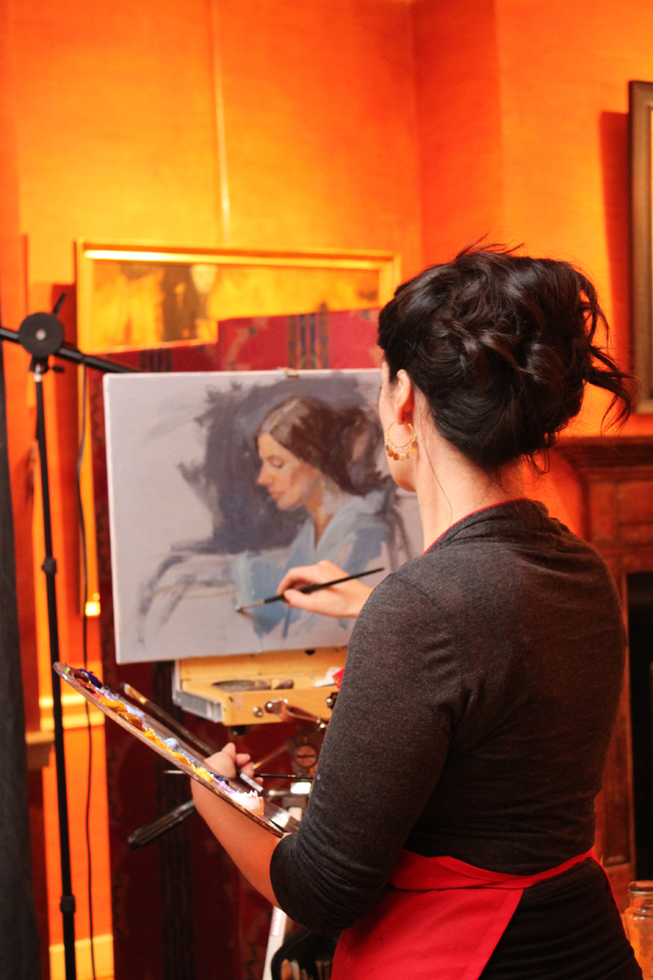
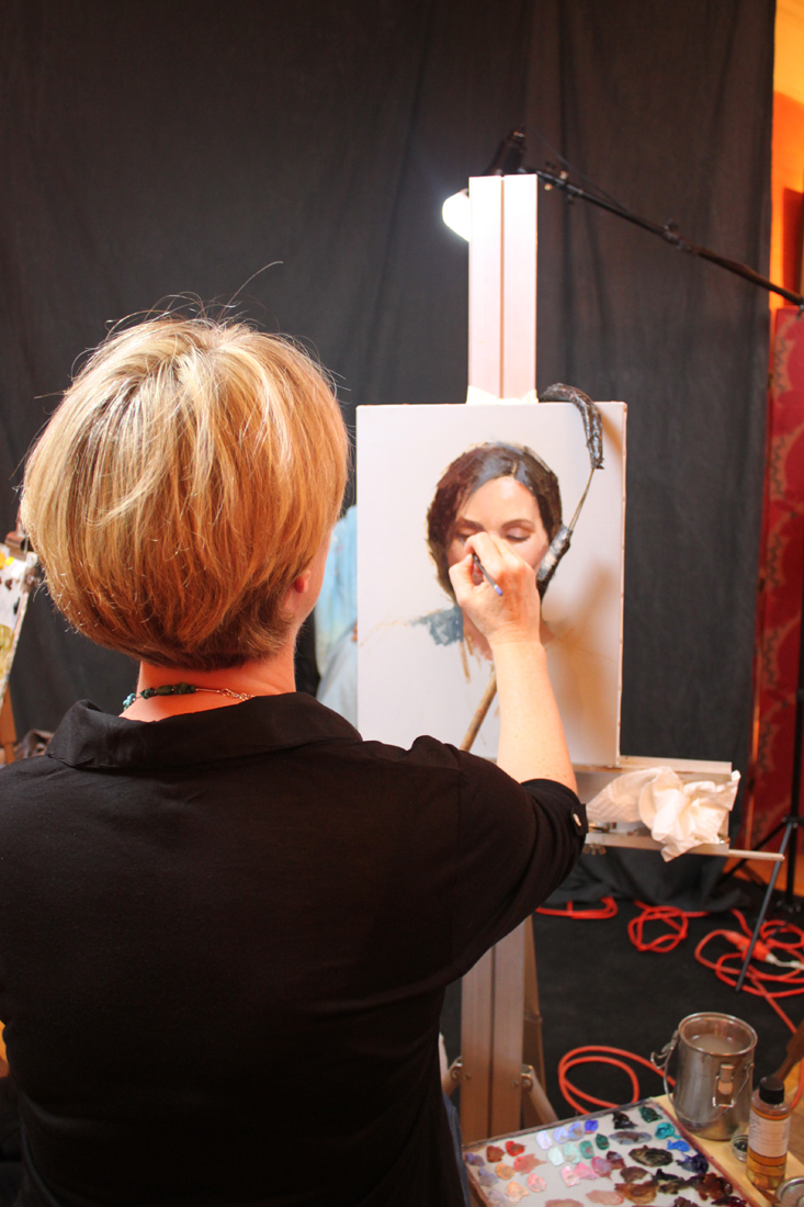
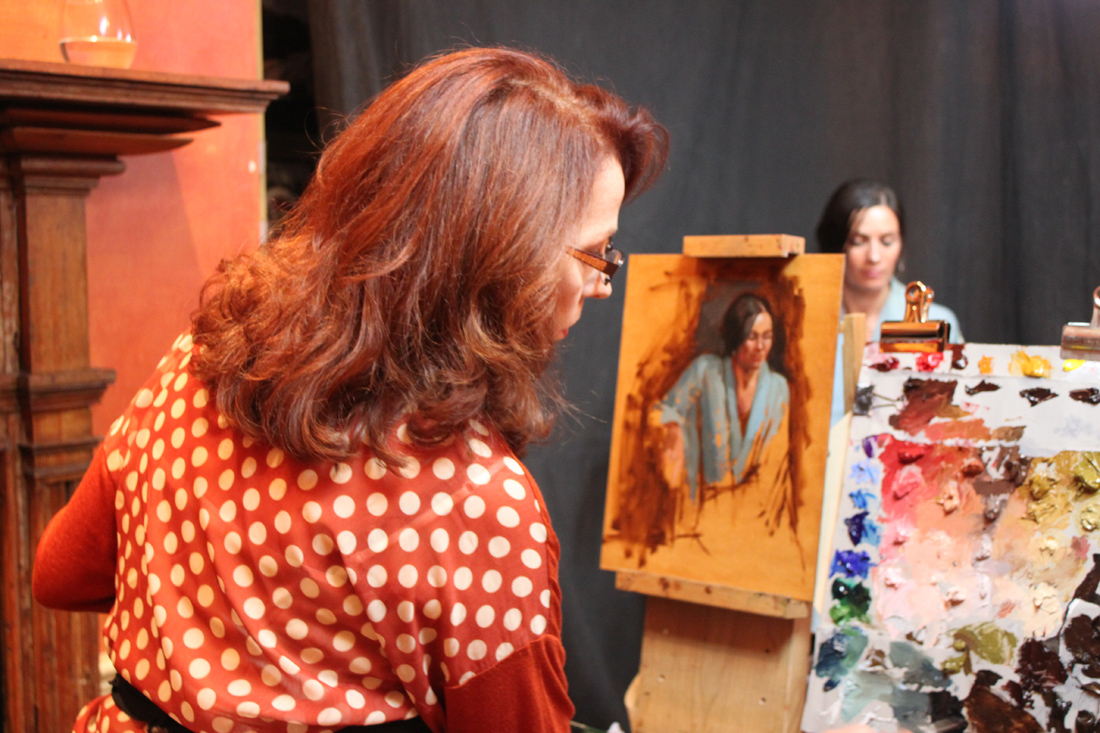
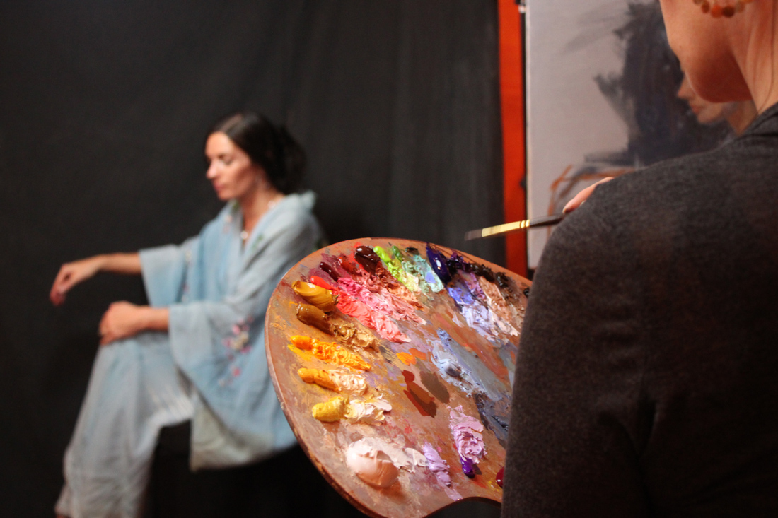
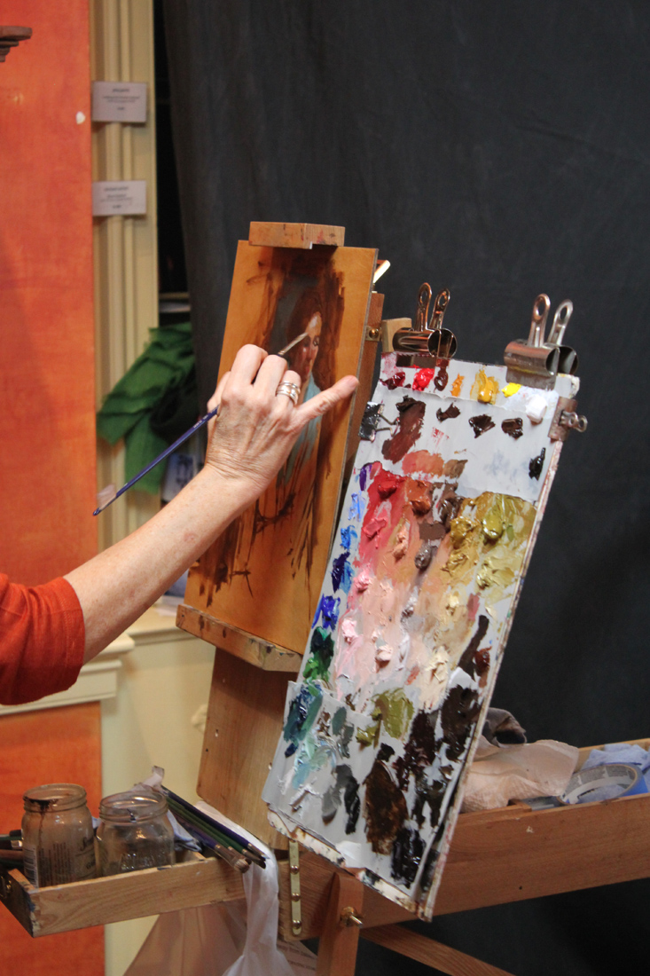
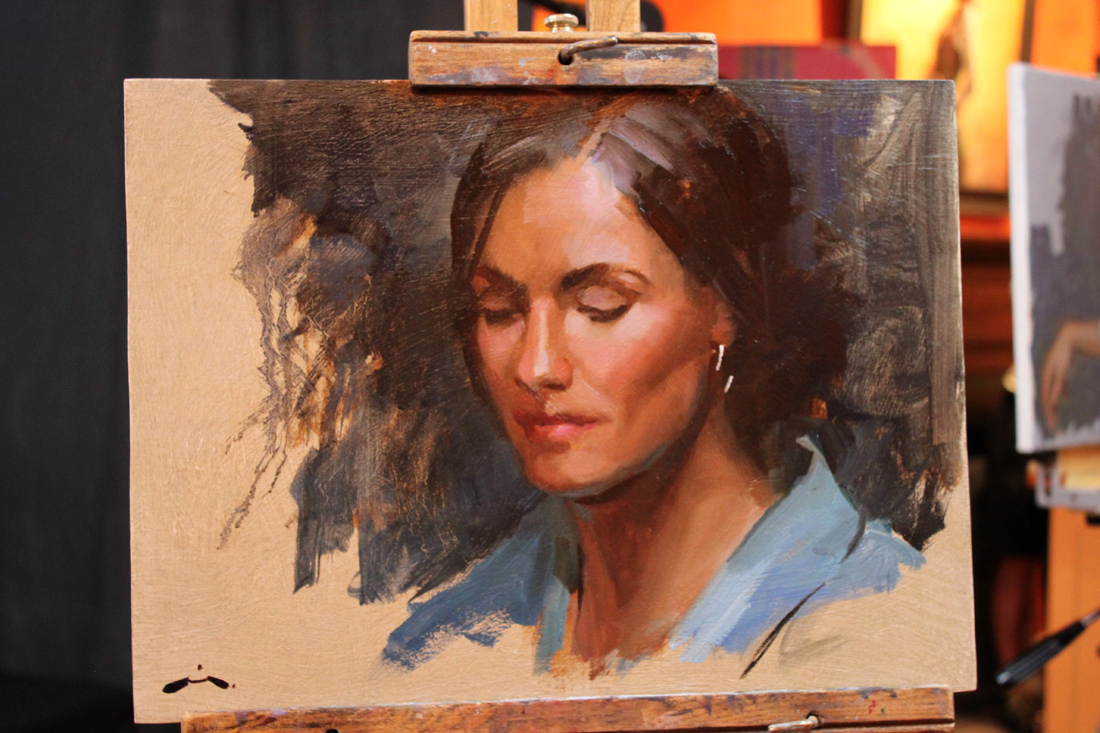
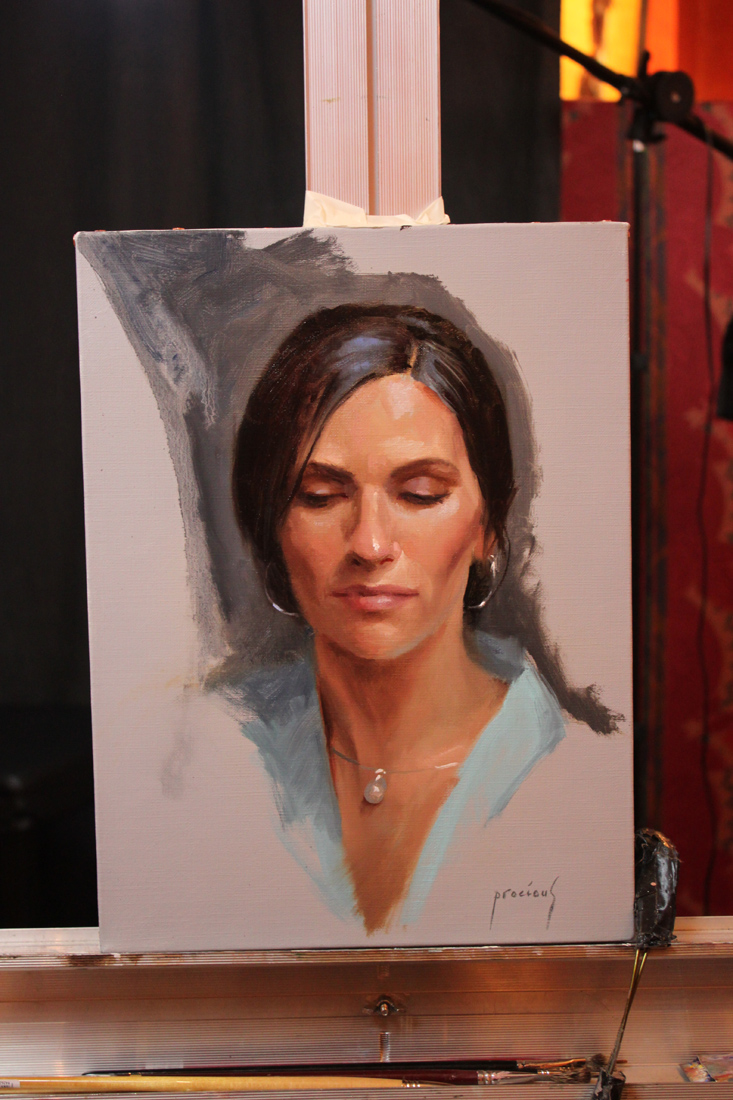
Women Painting Women "Face Off"--Taking Names and Kicking A$$!

WPW_FaceOff_1
"Veni, Vidi, Vici" was the apparent motto for Mia Bergeron, Rachel Constantine, Cindy Procious & Terry Stickland this past Friday night when they came to town to show off their mad painting skills during the Women Painting Women "Face Off" at the Principle Gallery. The WPW ladies were set up in the middle of the gallery and painted from the same model with periodic breaks from 6:30 - 9:00 PM. I'd like to tell you that I took copious notes to share with you about their alla prima technique but that would be a lie as I spent most of the time two fisted, juggling my camera and glass of wine. And in complete disclosure, me and my homie arrived half an hour late so we didn't get to see their initial block-ins. But I can tell you that by the time we arrived they all already had really strong starts on their paintings and it only got better from there on out.
On a personal note I want to thank Mia, Rachel, Cindy, Terry, Alex & Diane for a great GNO (as well as my homies Dana, Tricia & Liz)! And thanks to Michelle, Clint & Meghan at the Principle Gallery who really know how to throw an awesome opening.
Here are some pictures I took from that night. If any of them are blurry, blame it on the yummy chardonnay.
WPW_FaceOff_MiaBergeron1
WPW_FaceOff_RachelConstantine1
WPW_FaceOff_CindyProcious1
WPW_FaceOff_TerryStrickland1
WPW_FaceOff_RachelConstantine2
WPW_FaceOff_TerryStrickland2
WPW_FaceOff_MiaBergeron2
WPW_FaceOff_CindyProcious2

WPW_FaceOff_2

Neal, Whyte & Lindstrom: "The Various Paths to Success"

Step into my time machine back to the date May 27th, 2012 when I attended a panel discussion by artistic luminaries, Michael Shane Neal, Mary Whyte and Bart Lindstrom at the 2012 Art of the Portrait Conference in Philly. I take a lot of notes during classes, workshops and conferences. Some of them never surface again, and some like these lucky notes born under the right astrological sign, actually make it into a blog post. You might not always get the latest breaking news here (try CNN for that) but if you are seeking a blog about painting & technique served with a little witty banter on the side--then you have come to the right place! Now please sit still while I adjust the flux capacitor on this thing. This is what makes time travel possible: the flux capacitor! First, you turn the time circuits on. This one tells you where you're going. This one tells you where you are. This one tells you where you were. You input your destination time on this keypad. Say you want to see the signing of the Declaration of Independence [Jul. 4, 1776] or witness the birth of Christ [Dec. 25, 0000]. For this trip we'll be traveling way back in time, er 3 months back to May 27th, 2012 so you can experience this panel discussion in person. Hold on!

Graffiti_500x500
Mary Whyte: On Promoting Work & Income
You must have a web site, an on-line presence.
Put up only your best work.
Make sure to have contact info up front; phone, email etc.
Make a "take away" brochure that holds dates, relevant publications featuring your work.
Press-how can you get more of it? Donate a portrait of a community person.
Make a contact everyday--reconnect with old contacts. Contact your "wish list" of people you want to buy your work.

Lindstrom_kimandkimberly
Bart Lindstrom:
Keep a log of who are your collectors.
Create relationships with these people. Remember them, remember details about them. You become "their" artist!
Courtship, friendship--it is the same idea with your collectors.
Donate portraits to private schools. Entry level products that they can upgrade to something else you offer. Why private schools? Because these parents have the resources.
Keep your work current on your website. Always be culling (removing). Better to show a consistent painting style & have less.
Make it easy for people to find you.
MichaelShaneNeal_Rachel.
Michael Shane Neal:
Attend high-end private school football games and throw up your cards during touchdowns!
Get out of your studio. Get people to know you & understand your work. Make sure what you write about your work is concise & frequent.
Diversity is important. Paint everything, every subject. It opens up your clientele!
Stay positive! Develop a support structure.
Don't undervalue good old-fashioned hard work. It will make up for a lot of shortfalls.
When you get in the studio strive to improve as an artist every single day.
The business side is important but more important is becoming a better artist. You must do both.
Google people out there who are retiring and introduce your work to them.
You can even set a "Google alert" for people retiring from specific fields i.e. Universities.
Bart Lindstrom:
Make yourself enjoyable to be with. 1). Learn how to make an exquisite product. 2). Show it to as many people as possible.
Agencies need an amazing example of your work & then photographs of consistent work. They are looking for someone who is easy to work with.
Take the initiative (with agencies), get their email & send them your best images. You have to make these relationships.
Learn how to do demos and do them often.
Michael Shane Neal:
Get a list of everybody that is there at your art events & contact them personally.
Consider speaking--create a 20 min power point presentation showing your images & studio shots. Talk to your audience about your work and your images.
Mary Whyte
Will host small dinner parties in galleries & then give a small tour of her work.
Michael Shane Neal:
Spend some time teaching. You will always find people who know less than you do. It helps to build name recognition.
Mary Whyte
Has a manager and an assistant. Her husband makes her frames & he has his own frame making assistant.
Michael Shane Neal:
Began by doing everything himself. After 10 or 12 years he paid an intern to work for him.
Bart Lindstrom:
Trade your art for services. Stop excessive spending so you have more time in the studio (less bills to pay)
When you talk about your work to someone else allow for a "moment of reflection" ( to bloom). Allow your message to sink in as they are viewing it.
Michael Shane Neal:
Be quiet when people are looking at your work. Let them absorb it. Kinstler calls it the "deafening silence". Get comfortable with it.
And one last thing Marty, I'm sure that in 2020, plutonium is available in every corner drugstore, but in 2012, it's a little hard to come by so I am afraid you are stuck in Philly. Sorry. But look on the bright side-at least you will have time to really see the relocated Barnes collection!

Workshop Wednesday: Robert Liberace's "Velázquez to Sorolla", Days 4 & 5
Liberace’s Sorolla Demo start.
Some of my best pictures from Rob Liberace's recent Velázquez to Sorolla Workshop come from Days 4 & 5. So you are in for a real treat here! Sorolla often painted his subjects outside from direct observation, following the effect of light on his models as they enjoyed a day at the beach or a picnic in the grass. Rob's palette below really showcases those atmospheric qualities.
Thalo Blue and Green
Cad Yellow, Orange, Red and Rose
Ultramarine Violet
Viridian
Lead White
Umber
Stand Medium (Linseed oil)

Liberace’s Sorolla demo detail.
Here are the notes I took during Days 4 & 5:
Lay down your colors so they have good body and mass to them.
Whites are warm, warmed by the sun.
Shadows cool.
Always have a definite end to your light.
Cast shadows will not receive a whole lot of reflections.
Quick & strong strokes--don't blend. You will only "muddy" it.
"Blast in" lights.
Blue in core shadows, gold in reflected light (in shadows) are a classic Sorolla treatment. Use White + Orange for gold.
Realist painting requires "hump, ridge, terminator, core".
Make sure your highlights are applied with small brushes if you are working on small scale.
You should be able to cut (theoretically speaking) pure color out of a Sorolla painting. He did not use much blending.
Cad Red, Cad Yellow, touch of Cad Rose + White is the recipe for the Sorolla flesh tone.
Masses in big planes first and then breaks up that base color with light & shadow.
"Each time the model poses pick one area to bring to a full alla prima finish. Then move on to another area when he/she poses again."
My painting inspired by Sorolla on Day 4.

Workshop Wednesday: Robert Liberace’s "Velázquez to Sorolla", Day 3

Liberace_Fortuny_Gesture
On the third day of his Velázquez to Sorolla Workshop, Rob Liberace covered the working methods of Fortuny (Mariano Fortuny Marsal) 1838-1874. He painted the full figure (as seen above) to take advantage of the wonderful costumes the models were wearing. This for me was one of the most exciting aspects of the workshop. How often do you get to paint a guy in swash buckling boots like the ones the model is wearing? Um, not often enough.
Rob's Fortuny palette consisted of many of the paints used for his Velázquez palette with the addition of Flemish White, Cadmium Red, Yellow and Orange and Alizarin (which back then would have been fugitive).
Here are my notes taken from that day:
In the 1870s new colors were beginning to appear like chrome yellow & cadmiums so artists began to see more color in the transitions of light. Greens & purples in the shadows, lemon in the highlights.
Fortuny did not use white in his underpaintings--essentially taking out a step & then jumped into his color.
Begins with a gestural drawing in Umber over a Sienna wash to wet the canvas.
Don't smooth or polish over the anatomy of your paintings. It makes them look like mannequins.
"The few curves that I put in are purely decorative. Draw in angles."
Angle, angle, angle. Find the shape of things, the "high ground".
Try to find the "high points" or directions in the fabric.
Applies paint on the face thickly on the large planes of light & thins it carefully around the features.
"My brush is a pencil, not a brush. If I think of it like that I can get a better handle on the detail."
"On the lips don't draw severe lines. Use color to dapple & disintegrate the line. Fortuny did this a lot. Watteau too."
"Everything I do I want my surfaces to look really good".
Liberace_Fortuny_FigurePainting_Detail
Here is the first painting I was happy with at the workshop. Felt like I made an alla prima break thru with it.

LagoArthur_Fortuny_Day3Painting
And for a little more info on Fortuny, check out this link to Armand Cabrera's Art and Influence blog.

Workshop Wednesday: Robert Liberace's "Velázquez to Sorolla", Days 1 & 2

Liberace_Day_1_Demo
Today wrapped up the 5th day of Rob Liberace's Velázquez to Sorolla workshop and I count myself extremely fortunate to have been one of the attendees. I have taken several of Rob's classes locally here at the Art League in Alexandria VA, but this is my first workshop experience and I have to say I am now a big fan of them! Having 5 consecutive 6-hour days with Rob's excellent instruction helped me to really discover some bad habits that I fall back on in my alla prima painting. There is something about the directness of alla prima. The speed at which you need to commit to your decisions--that really allows you to see the flaws in your work. So what are my flaws when it comes to alla prima? Well for one I have a tendency to round out everything in my gesture and use a strong contour line. I have 2 theories for why I do this. 1). I am a reincarnated WPA artist. 2). My alma matter should have beat it the sh*t out of me while I was back in school. Instead I was actually encouraged to follow it as it was viewed as part of my "unique style" and "identity". Well dear readers, do you know what is the quickest way to kill realism in your alla prima? Adding curves!! Hence you can understand my frustration and my desire to break this dirty little habit. Luckily for me, Rob Liberace literally has all the answers and being in his workshop this past week lit the proverbial "eureka" light bulb above my head. Hallelujah!

Liberaces_Velazquez_Palette
Liberace_Paint
The following is the historically accurate palette he used for the Velázquez part of his workshop. Most of the paint is from Natural Pigments, Da Vinci and Daniel Smith:
Vine Black
Iron Oxide paints (Umbers & Siennas)
Yellow Ocher
True Naples Yellow made from lead
Vermillion
Madder Lake (for purple) or Carmine Red
Lapis Lazuli
Cobalt Smalt
"Sleeping Beauty" Turquoise (Daniel Smith)
Earth Green
Malachite
Medium-Linseed + lead (Maroger medium)
Calcite Powder
Leaded Glass Powder
Wax
And here are some of the copious notes I took during his workshop. I hope you find them as enlightening as I did:
Try not to use the word "hard", think "firm" or "soft" when thinking about edges
Fuse like values, an elegant painterly device
Use "feathery" edges where distinct facets of light intersect
Begins by putting in little "tick marks" to lay in composition & proportions, quick gestural drawing
Make sure you stay very sharp and angular when laying down your figure
Contours and shadows have "highs & lows" that the paint must forcibly lead too
You must amplify the color notes hinting in your subject
Paints on denim, cotton, linen, cotton & silk herringbone fabric he finds in the fabric store
He is fastidious about his surfaces and will size his fabrics first before applying coats of gesso. The right surface is essential in the overall success of a painting!
Spreads calcite, umber & oil on his canvas before beginning (in Velázquez manner) to give a little "cushion" for his paint
Uses bristle filberts in the initial painting stages
Uses shadow masses to help delineate form, chiaroscuro. Academic stuff, lots of planes. Hatches in the shadow.
Puts in the nasal line and "sweeps" across it to blend it in with the face
Step one is monochromatic underpainting
He is sure to extend his lines and exaggerate gesture for a better composition
Uses a wedge of paper towel to cut in lights in his underpainting
Often employs the back of his brush handle to break up paint ridges and "erase"
Goes for the big masses first when laying down paint and spreads it out
Get your anatomy down in the underpainting
Big mass of value, one light source, bigger brush
"Zipper like" approach to edges of value to get a more volumetric feel
Every stroke is "crumbly, jiggly & wiggly"
Know where the "hump" of a form is so that you can decide how obvious to make it--softer or firmer
Use the opposite color temps in your glazes, on a warm ground use cool etc.
On day 2 he will reactivate the shadows by adding umber to them but no color, also a little black as needed
Begins glazing over his underpainting by applying a thin amount of wax & green glaze to the face to help knock back the warm temp and give him something to paint into
Turns his brush to make it not such an "obvious mark" (holds brush at the end & perpendicular to the canvas)
Takes hard edges & relaxes them by feathering across them
Will add a little color to his shadows as long as there is no white (use a clean brush!)
"You see a lot of scumbly broken strokes in Spanish painting"
On painting hair, "follow the light as it jumps from one strand to another"
Velázquez was extremely aware of the topography of his forms and is subtle. Does not blend but feathers & hatches his edges instead
If an edge becomes too soft he will re-establish it, always making corrections, a back & forth of edge handling

Liberace_Velázquez_DetailOfOldMan

Portraits and "Derecho-geddon
Jordyn
What do portraits and "Derecho-geddon" (the severe storm system that ravaged a path from Chicago to the East Coast on June 29th) have in common? Nothing! Except that I drew this portrait as a thank you for the wonderful hospitality shown to us by good friends during the many days that we were without power. I want to officially thank Don & Arlene for our little "stay-cation", and especially for Don's killer Daiquiris. Your portrait is on its way.