Who's the Man? Jeremy Mann!
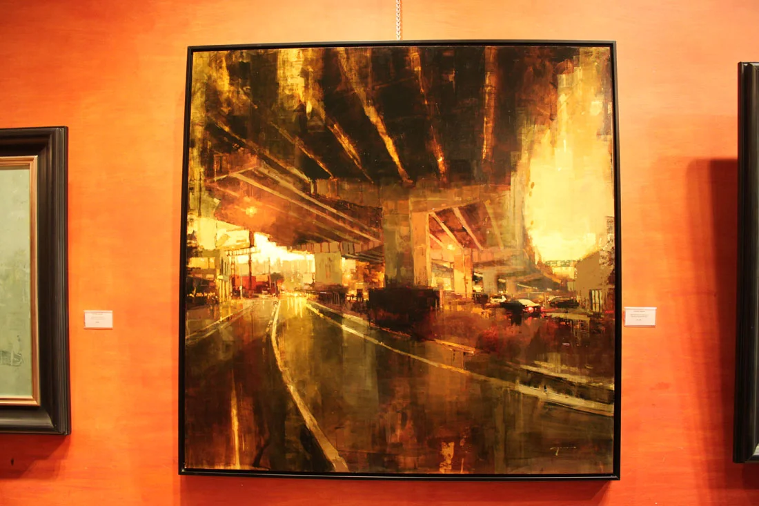
Last Friday I attended the opening of Jeremy Mann's "The Realness" show at the Principle Gallery in Old Town Alexandria mostly due to his hype as American Artist Magazine's, "25 Artists of Tomorrow". And you know what I found out? He more than lives up to it!
Mann is what I would call a "painter's painter". His paintings completely seduce you with his play on textures, predominantly tertiary color harmony and lost & found edges, all while maintaining a strong level of realism. He is known for working with non traditional tools such a squeegees and brayers (that last one I wrestled out of him) as well as his brushes. Mann admitted to me that he likes to use which ever tool will achieve the most ambiguous mark as in "how the hell did he do that?" Personally I find his work extremely inspiring because getting more "painterly" with my technique is exactly what I am gunning for now. You can be sure I have already placed a couple of brayers in my Amazon shopping cart. I am sure Mann would be thrilled to know this.
I managed to take several detail photos of his paintings to share his brilliance with you (click on the photos to enlarge them). What I did not manage to do was write down any of the titles. Luckily the Principle Gallery's website provides all those great little details! Want to see more of The Realness show than what I am showing you here? Then check out their link at http://www.principlegallery.com/artistView.new.pl?artist=155
"After the Storm". 48" x 48". Oil on Panel. Artist, Jeremy Mann.
"Still Moments in Teal". 21" x 21". Oil on Panel. Artist, Jeremy Mann.
And to see more of Mann's amazing work visit his website @ http://www.redrabbit7.com/
Workshop Wednesday: Robert Liberace's "Velázquez to Sorolla", Days 4 & 5
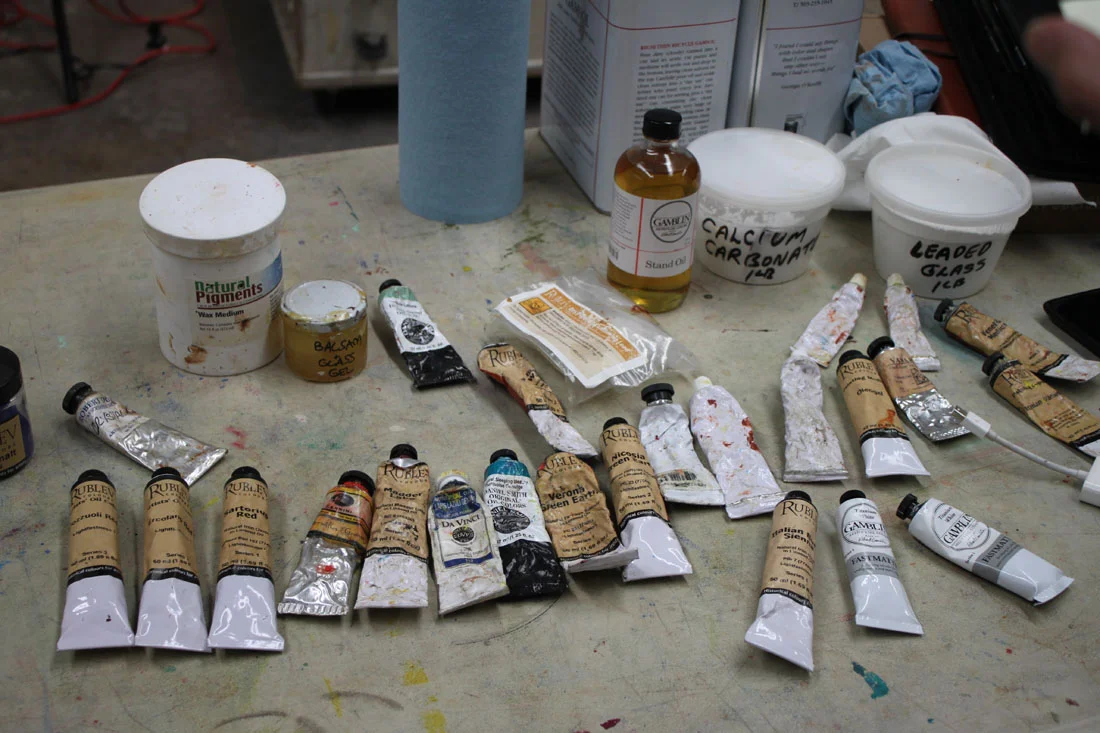
Some of my best pictures from Rob Liberace's recent Velázquez to Sorolla Workshop come from Days 4 & 5. So you are in for a real treat here! Sorolla often painted his subjects outside from direct observation, following the effect of light on his models as they enjoyed a day at the beach or a picnic in the grass. Rob's palette below really showcases those atmospheric qualities.
Thalo Blue and Green
Cad Yellow, Orange, Red and Rose
Ultramarine Violet
Viridian
Lead White
Umber
Stand Medium (Linseed oil)
Here are the notes I took during Days 4 & 5:
Lay down your colors so they have good body and mass to them.
Whites are warm, warmed by the sun.
Shadows cool.
Always have a definite end to your light.
Cast shadows will not receive a whole lot of reflections.
Quick & strong strokes--don't blend. You will only "muddy" it.
"Blast in" lights.
Blue in core shadows, gold in reflected light (in shadows) are a classic Sorolla treatment. Use White + Orange for gold.
Realist painting requires "hump, ridge, terminator, core".
Make sure your highlights are applied with small brushes if you are working on small scale.
You should be able to cut (theoretically speaking) pure color out of a Sorolla painting. He did not use much blending.
Cad Red, Cad Yellow, touch of Cad Rose + White is the recipe for the Sorolla flesh tone.
Masses in big planes first and then breaks up that base color with light & shadow.
"Each time the model poses pick one area to bring to a full alla prima finish. Then move on to another area when he/she poses again."
Workshop Wednesday: Robert Liberace’s "Velázquez to Sorolla", Day 3
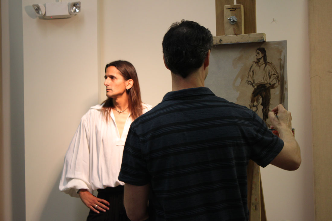
On the third day of his Velázquez to Sorolla Workshop, Rob Liberace covered the working methods of Fortuny (Mariano Fortuny Marsal) 1838-1874. He painted the full figure (as seen above) to take advantage of the wonderful costumes the models were wearing. This for me was one of the most exciting aspects of the workshop. How often do you get to paint a guy in swash buckling boots like the ones the model is wearing? Um, not often enough.
Rob's Fortuny palette consisted of many of the paints used for his Velázquez palette with the addition of Flemish White, Cadmium Red, Yellow and Orange and Alizarin (which back then would have been fugitive).
Here are my notes taken from that day:
In the 1870s new colors were beginning to appear like chrome yellow & cadmiums so artists began to see more color in the transitions of light. Greens & purples in the shadows, lemon in the highlights.
Fortuny did not use white in his underpaintings--essentially taking out a step & then jumped into his color.
Begins with a gestural drawing in Umber over a Sienna wash to wet the canvas.
Don't smooth or polish over the anatomy of your paintings. It makes them look like mannequins.
"The few curves that I put in are purely decorative. Draw in angles."
Angle, angle, angle. Find the shape of things, the "high ground".
Try to find the "high points" or directions in the fabric.
Applies paint on the face thickly on the large planes of light & thins it carefully around the features.
"My brush is a pencil, not a brush. If I think of it like that I can get a better handle on the detail."
"On the lips don't draw severe lines. Use color to dapple & disintegrate the line. Fortuny did this a lot. Watteau too."
"Everything I do I want my surfaces to look really good".
Here is the first painting I was happy with at the workshop. Felt like I made an alla prima break thru with it.
And for a little more info on Fortuny, check out this link to Armand Cabrera's Art and Influence blog.
Workshop Wednesday: Robert Liberace's "Velázquez to Sorolla", Days 1 & 2
Today wrapped up the 5th day of Rob Liberace's Velázquez to Sorolla workshop and I count myself extremely fortunate to have been one of the attendees. I have taken several of Rob's classes locally here at the Art League in Alexandria VA, but this is my first workshop experience and I have to say I am now a big fan of them! Having 5 consecutive 6-hour days with Rob's excellent instruction helped me to really discover some bad habits that I fall back on in my alla prima painting. There is something about the directness of alla prima. The speed at which you need to commit to your decisions--that really allows you to see the flaws in your work. So what are my flaws when it comes to alla prima? Well for one I have a tendency to round out everything in my gesture and use a strong contour line. I have 2 theories for why I do this. 1). I am a reincarnated WPA artist. 2). My alma matter should have beat it the sh*t out of me while I was back in school. Instead I was actually encouraged to follow it as it was viewed as part of my "unique style" and "identity". Well dear readers, do you know what is the quickest way to kill realism in your alla prima? Adding curves!! Hence you can understand my frustration and my desire to break this dirty little habit. Luckily for me, Rob Liberace literally has all the answers and being in his workshop this past week lit the proverbial "eureka" light bulb above my head. Hallelujah!
The following is the historically accurate palette he used for the Velázquez part of his workshop. Most of the paint is from Natural Pigments, Da Vinci and Daniel Smith:
Vine Black
Iron Oxide paints (Umbers & Siennas)
Yellow Ocher
True Naples Yellow made from lead
Vermillion
Madder Lake (for purple) or Carmine Red
Lapis Lazuli
Cobalt Smalt
"Sleeping Beauty" Turquoise (Daniel Smith)
Earth Green
Malachite
Medium-Linseed + lead (Maroger medium)
Calcite Powder
Leaded Glass Powder
Wax
And here are some of the copious notes I took during his workshop. I hope you find them as enlightening as I did:
Try not to use the word "hard", think "firm" or "soft" when thinking about edges
Fuse like values, an elegant painterly device
Use "feathery" edges where distinct facets of light intersect
Begins by putting in little "tick marks" to lay in composition & proportions, quick gestural drawing
Make sure you stay very sharp and angular when laying down your figure
Contours and shadows have "highs & lows" that the paint must forcibly lead too
You must amplify the color notes hinting in your subject
Paints on denim, cotton, linen, cotton & silk herringbone fabric he finds in the fabric store
He is fastidious about his surfaces and will size his fabrics first before applying coats of gesso. The right surface is essential in the overall success of a painting!
Spreads calcite, umber & oil on his canvas before beginning (in Velázquez manner) to give a little "cushion" for his paint
Uses bristle filberts in the initial painting stages
Uses shadow masses to help delineate form, chiaroscuro. Academic stuff, lots of planes. Hatches in the shadow.
Puts in the nasal line and "sweeps" across it to blend it in with the face
Step one is monochromatic underpainting
He is sure to extend his lines and exaggerate gesture for a better composition
Uses a wedge of paper towel to cut in lights in his underpainting
Often employs the back of his brush handle to break up paint ridges and "erase"
Goes for the big masses first when laying down paint and spreads it out
Get your anatomy down in the underpainting
Big mass of value, one light source, bigger brush
"Zipper like" approach to edges of value to get a more volumetric feel
Every stroke is "crumbly, jiggly & wiggly"
Know where the "hump" of a form is so that you can decide how obvious to make it--softer or firmer
Use the opposite color temps in your glazes, on a warm ground use cool etc.
On day 2 he will reactivate the shadows by adding umber to them but no color, also a little black as needed
Begins glazing over his underpainting by applying a thin amount of wax & green glaze to the face to help knock back the warm temp and give him something to paint into
Turns his brush to make it not such an "obvious mark" (holds brush at the end & perpendicular to the canvas)
Takes hard edges & relaxes them by feathering across them
Will add a little color to his shadows as long as there is no white (use a clean brush!)
"You see a lot of scumbly broken strokes in Spanish painting"
On painting hair, "follow the light as it jumps from one strand to another"
Velázquez was extremely aware of the topography of his forms and is subtle. Does not blend but feathers & hatches his edges instead
If an edge becomes too soft he will re-establish it, always making corrections, a back & forth of edge handling


