Art Tourist: Stepping Into a Thomas Moran Painting
“Grand Canyon of the Yellowstone” Thomas Moran. 1872.
I just got back from a family vacation, our first since Covid began, to Yellowstone National Park. As you can imagine, the views were spectacular especially to an East Coaster like me who was seeing the Rocky Mountains and surrounding areas for the first time. Many of the stops in the park had artistically inspired names such as the geyser area trails known as “Fountain Paint Pots” and “Artist’s Paint Pots”. I was not particularly enthused to see yet another similar sounding named sight along the Southern Trail called “Artisit’s Point”. So when my husband turned to me and asked, “Should we go see it?”. I answered “Sure”, in a rather dismissive voice—not expecting much. But boy was I wrong!
What awaited us was nothing less that the jaw dropping view of Yellowstone made famous by Thomas Moran himself, famed Hudson River School landscape painter and as such is considered to be associated with the “Transcendentalist” art movement of the 1830s & 1840s. He is credited with the American embrace of the West and inspiring many to embark upon their own journeys of Westward Expansion.
As soon as I encountered the view I was gob smacked. I had such an intense feeling of Deja-Vu that I knew I had seen this view before. Then it dawned on me, I had— in the art of Thomas Moran!
It is not an exaggeration to say that Thomas Moran’s work is responsible for the creation of the Yellowstone National Park itself. As Chief Illustrator for the popular magazine Scribner’s, Moran was invited in 1871 by Dr. Ferdinand Hayden, director of the United States Geological Survey to join the survey team of the Hayden Geological Survey of 1871 as they explored the Yellowstone region. Moran produced over 30 images of locations on that trip and it is these paintings and sketches along with the photographs of William Henry Jackson that persuaded President Grant and the US Congress to make Yellowstone our first national park in 1872. My visit coincided with its 150th anniversary.
Moran was so closely associated with his paintings of Yellowstone (and Teton National Park) that he eventually began signing his work simply with the initials T.Y.M. - for Thomas “Yellowstone” Moran.
Some argue that the actual view used by Thomas Moran to paint his famous painting is located on the North Rim Overlook currently called “Look Out Point” as this is the place from which he made his sketches during the Hayden Geological Survey. However, Yellowstone Park Photographer, F. J. Hayes, attributed this location on the official map to Moran’s painting and so it continues to be linked to it. I personally think it is possible that he made the painting based on several different views including the North Rim Overlook and Artist’s Point views as is common practice among artists seeking the best composition in a painting.
Moran’s painting “Grand Canyon of Yellowstone” (seen above) was purchased by the US Government for $10,000 and can be seen on long-term loan from the U. S. Department of the Interior at the Smithsonian American Art Museum in Washington DC. And now we have come full circle because it was indeed at this museum where I first saw this view—within Moran’s painting—for the very first time.
My husband and I doing the touristy thing in front of “Artists Point” Yellowstone NP (also known as “Moran’s View”).
Workshop Wednesday: Scott L. Christensen
Scott L. Christensen 3 hour demo.
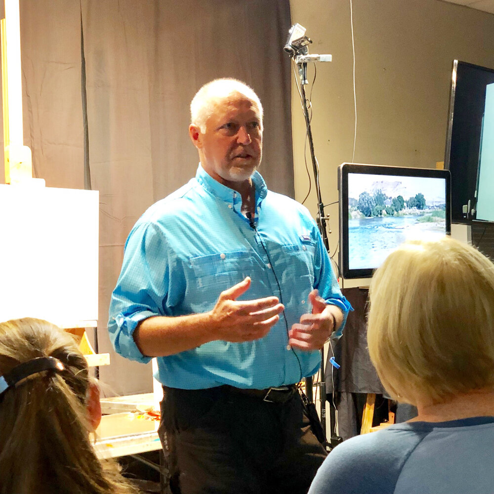
Artist, Scott L. Christensen speaking to a packed room of workshop attendees.
A special workshop just wrapped up last week at Zoll Studio School of Fine Arts in Timmonium MD. Reknown landscape painter Scott L. Christensen shared with a group of very lucky students his process and personal development as an artist during a 3 hour demo. I was one of the eager fans in attendance.
I am sharing with you here the notes and photos I took during his demo (with permission of the artist). I take copious notes during any workshop/demo I attend because I am a visual learner and it helps me to retain information better that I receive verbally (i.e., in a lecture) and also because I can revisit my notes later during my study time. Self directed learning is something I apparently have in common with Christensen who credits daily studying as one of the keys to his success.
ON THE VALUE OF STUDYING:
-Don’t try to make good paintings when doing plein air. Paint to study, to get information. Worry about the painting itself later.
-”I would rather do volume when working outside then try to wrestle a painting to the ground (by over rendering)”.
-”When you study outdoors you have to sacrifice something. Decide what the focus of your study will be.”
-He limits his palette when making studies.
-He studies for hours outdoors everyday. It is part of his regular working practice.
-”Study paintings and take them apart”. When going to museums, he often takes detail shots of paintings that he admires that have a good solution on how to paint a rock, a tree, etc. He then turns the photos into black and white and studies them more closely to see how that artist achieved that specific effect with value, form, composition… whatever information he is seeking.
-”Ask yourself why the Master did things? They did things for a reason. Figure out why”.
-He has done a lot of studying on Sargent and more recently, Fechin.
-”Study what it is that you like about an artist, and what you don’t”.
NOTES ON CHRISTENSEN’S PROCESS AND SUGGESTIONS ON PAINTING::
-Begins by writing in his notebook, trying to define the scene in front of him with words. He asks himself questions like; What is drawing him to this scene? Is it light? Color, etc? What compositional elements can he build upon? He then settles on something from this enquiry that he wants to explore further, and makes that the theme of the painting.
-He often starts exploring ideas by working on craft paper or drawing in his journal.
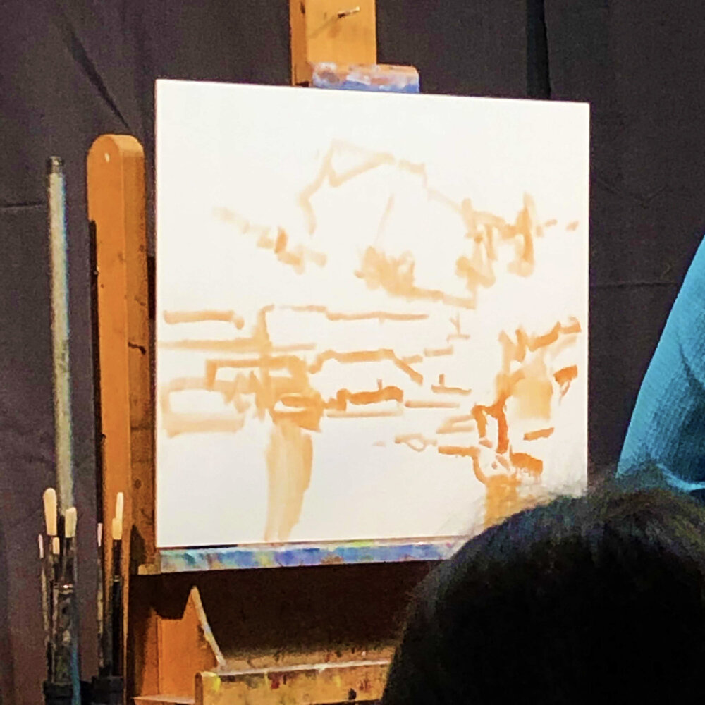
-The next step is to distill the composition down initially into “10 lines” on the blank canvas. In the demo he used just transparent red oxide and paint thinner for this step. The idea being to simplify and develop all the elements of the painting at the same time. He is after unity of subject here. Christensen says that “connectivity of things is one of the hardest things to paint”. He believes that connectivity/unity of composition is much more important than rendering a specific tree or rock perfectly.
While making his 10 marks he asks himself:
”What is different with this space compared to that space?”
”Where is my variety”
“Should I add a cloud here for tension?”
“Think connecting points and tension areas (where your eye draws to)”
Some of the beginning “10 marks”.
The entire “10 mark” composition mapped out.
-When working from reference or life, don’t allow the photo or scene in front of you to decide the placement of things. “You decide the composition”.
-He looks for “unequal distribution of shapes and scale” in his compositions. Too many shapes at similar sizes is not interesting.
-”All the detail in the world can take place AFTER you have your design down”.
-While traveling he has started using gouache. He did 100 gouache paintings in one month recently but feels that is not enough time to really know the medium.
-He preferes to paint to music.
-His palette consists of the following Vasari paints (partial list):
Cobalt, Ultramarine Blue, Kings Blue, Video Blue, Yellow Deep, Permanent Red, Ruby Violet, Transp. Red Oxide, Thalo Green, Chromium Oxide green (which he uses less often) and the Vasari neutrals that he developed with the Vasari Paint Company, “Color and Light” set.
-When mixing color he starts with one of his neutral greys and then adds a color hue into that say Bice and Cobalt blue.
-His philosophy on color is based on p. 88 of Carlson’s Guide to Landscape Painting book which reads, “good color has infinite varieties, a reserve.”
Christensen’s palette. Notice how he efficiently groups values together.
Here Christensen is beginning to lay in some of his color notes. You can see him altering his blue values as he searches for the right relationship between the water and the sky.
-He begins his paintings with brushes of all sizes (including a 2 inch brush for blending water for instance) and will then switch to palette knives after he has locked in the design and is seeking more impasto.
-Reminds us that Sargent stayed in the mid-tones most of the time. He added his darks only at the end. ”Staying in the mid-tones adds unity to a painting”.
-Quotes Carlson, “its the juncture (of values) that require thought”.
-Reminds us that a specific value can appear differently when surrounded by lights and when surrounded by darks. Keeping this is mind will help with the simplification of values.
-”Keep it all in tone. Every note must be in harmony”.
-"Put in determined value, not half value, not “sneaking up on it” value”.
-”Try to go out & do relationship painting. Try to figure out those things instead of trying to paint the perfect tree”.
-”I am big on experimenting with most of my painting”.
-Moves specific temperatures (colors) around the painting by adding it in a new area- but always alters value appropriately first.
-”Sometimes I will completely change the season of a painting”.
-Will recompose a painting as he goes along if needed “I might put something in and the take it out dozens of times”.
-”It doesn’t take long to lose a painting if you (mindlessly) just pat color down for 2 mins”. Be intentional.
-Uses a mirror once his painting is established to check for corrections.
”Landscape (painting) is learning to put parts together more than anything else”.
SOME THOUGHTS ON THE STRUCTURE OF CLOUDS:
-Clouds get warmer at the core.
-Value & temperature changes make something turn.
-The yellow in a cloud will turn to orange and then red as it recedes.
Christensen’s finished painting with palette.
Christensen’s finished 3 hour demo.
“Be willing to sacrifice your paintings to get something better overall.
Be willing to make them ugly, then fight to make them better”
Suggested Reading: "Summer in February"
A recent trip to San Francisco allowed me the luxury of doing something I seldom do anymore, start a novel and finish it within one week. But this book, "Summer in February" by Jonathan Smith, about a community of artists living and working on the coast of West Cornwall during the last throes of the Edwardian era, had me in its spell from the very first chapter. The brightest star among them was the boisterous and infamous equestrian and landscape painter, Sir Alfred Munnings. It is the story of his ascent into the art world, and of his marriage to the budding artist Florence Carter-Wood. But it is not their romance, which is based on true events, that you pine for at the end of the novel. There is another storyline woven in here, both haunting and heartbreaking that has stayed with me ever since I put the book down. It is no wonder that the novel has already been turned into a movie. You can watch the movie for free if you are an Amazon Prime subscriber.


